https://ift.tt/H7ipXCF The fastest way to build a data science portfolio is to stop reading about projects and start finishing them. This l...
The fastest way to build a data science portfolio is to stop reading about projects and start finishing them. This list gives you 30 data science projects from beginner to advanced, each with source code, a real dataset, and step-by-step instructions.
A completed project does something a certificate can’t: it shows an employer exactly what you can do with messy, real-world data. Three solid projects on GitHub will move you further than a dozen tutorials you never finished.
Many of the projects below are available as guided experiences on Dataquest, where you write real code in your browser with instant feedback. The rest link directly to datasets and source code so you can get started on your own.
Table of Contents
- Beginner Data Science Projects
- Intermediate Data Science Projects
- Project 7: House Price Prediction
- Project 8: Storytelling Data Visualization on Exchange Rates
- Project 9: Employee Exit Surveys
- Project 10: Star Wars Survey Analysis
- Project 11: Finding Heavy Traffic Indicators on I-94
- Project 12: Nasdaq Data Link API Analysis
- Project 13: Popular Data Science Questions on Stack Overflow
- Project 14: Lottery Addiction Probability App
- Project 15: Winning Jeopardy
- Advanced Data Science Projects
- Project 16: Predicting Heart Disease with KNN
- Project 17: Building a Spam Filter with Naive Bayes
- Project 18: Predicting Insurance Costs
- Project 19: NYC High School Data Analysis
- Project 20: Decision Trees for Employee Productivity
- Project 21: Credit Card Customer Segmentation
- Project 22: Predicting Stock Market Returns
- Project 23: Forest Fire Prediction with Regression
- Project 24: IPO Market Listing Gain Prediction with PyTorch
- AI and Machine Learning Projects
- How to Choose the Right Projects for Your Portfolio
- How to Prepare for a Data Science Job
- FAQ
Beginner Data Science Projects
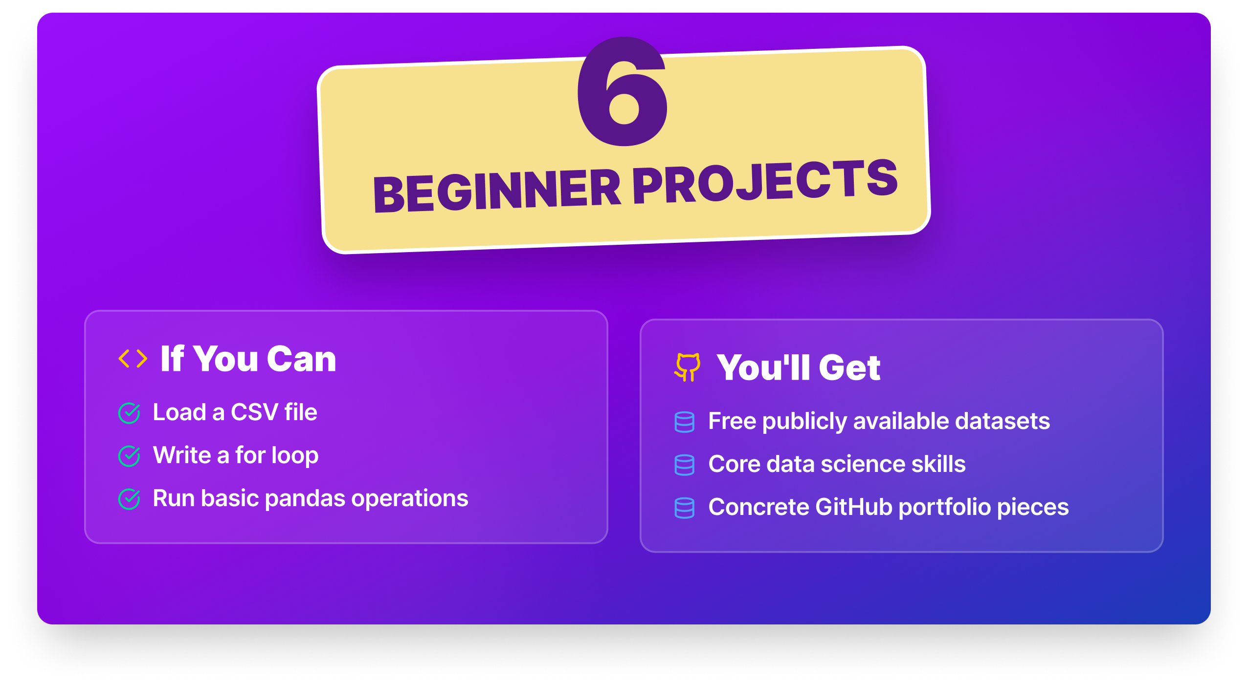
These six projects are the right starting point if you can load a CSV, write a loop, and run basic pandas operations. Each one uses a free publicly available dataset, teaches a core data science skill, and gives you something concrete to document on GitHub.
| Project | Key Skill | Dataset | Time Estimate |
|---|---|---|---|
| Data Science Survey Analysis | EDA · pandas | Kaggle Survey | 4–6 hrs |
| Profitable App Profiles | Data cleaning · frequency analysis | Kaggle | 5–8 hrs |
| COVID-19 Data Exploration | Time series visualization | Our World in Data | 5–8 hrs |
| Exploring Hacker News Posts | String handling · datetime | Kaggle | 4–6 hrs |
| eBay Car Sales Data | Data cleaning · outlier handling | Kaggle | 5–8 hrs |
| Analyzing Fandango Movie Ratings | Distribution comparison · visualization | FiveThirtyEight | 5–8 hrs |
Project 1: Data Science Survey Analysis ● ○ ○
What tools do working data scientists actually use? Which skills come up most in job postings? In this project you’ll analyze real Kaggle survey data to answer those questions, and the findings are directly relevant to your own learning decisions.
Skills you’ll practice: pandas · data cleaning · groupby · frequency analysis · matplotlib
Dataset: Kaggle ML & DS Survey
Step-by-Step Instructions:
- Load the survey dataset and inspect its structure: column names, data types, missing values.
- Clean the data: standardize inconsistent responses and handle nulls.
- Analyze which programming languages, tools, and platforms are most commonly reported.
- Break down results by experience level or job title.
- Visualize findings with bar charts and frequency tables.
- Write a short summary: what would the data tell someone starting in data science today?
Take it further: Filter results to data science roles specifically and compare tool usage against analyst or engineering roles. A side-by-side comparison tells a much more useful story than a single frequency chart.
Why employers care: EDA and the ability to extract a clear takeaway from survey data is a daily task in most analytics and data science roles. This project also signals self-awareness as you’re not just doing a random dataset, you’re studying the field you’re entering.
Where to start: Kaggle Data Science Survey guided project on Dataquest (Free). Dataquest's Pandas and NumPy Fundamentals course if you want to strengthen your EDA foundations before starting.
Project 2: Profitable App Profiles for the App Store and Google Play ● ○ ○
You’re a data analyst for a company that builds free mobile apps. Revenue comes from in-app ads, so user volume is everything. Your job: identify which kinds of apps attract the most users on both the App Store and Google Play , using base Python, no pandas required.
Skills you’ll practice: Python base · CSV handling · loops · frequency tables · business framing
Dataset: App Store · Google Play
Step-by-Step Instructions:
- Open both CSV files and explore each dataset.
- Remove duplicate entries and filter to free, English-language apps.
- Identify the most common genres on each platform.
- Identify which genres have the most users (installs or ratings as proxy).
- Write a recommendation for what kind of app to build.
Take it further: Weight your genre analysis by average installs rather than frequency count — a genre with 5 apps averaging 10M downloads is more interesting than one with 50 apps averaging 100K.
Why employers care: Framing analysis as a business recommendation — not just a list of findings — is the skill that separates a data scientist from a data reporter. This project forces you to make a call, and that judgment is what employers in product and strategy roles are hiring for.
Where to start: Profitable App Profiles guided project on Dataquest (Free)
Project 3: COVID-19 Data Exploration ● ○ ○
The Our World in Data COVID dataset is one of the most complete public health datasets ever assembled with 60+ variables covering cases, deaths, vaccinations, and testing across 200+ countries. This project has you building a visualization-heavy EDA that surfaces real patterns from real data.
Skills you’ll practice: pandas · matplotlib · seaborn · time series filtering · data aggregation
Dataset: Our World in Data COVID-19
Step-by-Step Instructions:
- Download and load the dataset to explore the column list carefully.
- Filter to a set of countries you want to compare.
- Visualize case trends over time using line charts.
- Calculate death rates and vaccination rates per 100,000 people.
- Create a multi-country comparison chart.
- Write a brief summary of your findings.
Take it further: Add a rolling 7-day average to smooth out reporting noise. Then annotate key events (lockdowns, vaccine rollout dates) directly on the chart, annotated time series are far more readable and show you know how to communicate with data.
Why employers care: Working with large, messy public datasets and producing clean, annotated visualizations is a genuine job skill in public health, policy, journalism, and any data role that interfaces with non-technical stakeholders.
Where to start: Dataquest's Data Visualization Fundamentals course covers the matplotlib and time series plotting skills you'll need | Starter notebooks on Kaggle
Project 4: Exploring Hacker News Posts ● ○ ○
Hacker News is a popular technology news site where users submit links and ask questions. You’ll analyze two post types, “Ask HN” and “Show HN” to figure out what makes a post get traction. Clean data, real questions, solid practice with Python string handling and datetime analysis.
Skills you’ll practice: Python strings · datetime module · loops · frequency analysis · conditional logic
Dataset: Hacker News Posts on Kaggle
Step-by-Step Instructions:
- Load the CSV and explore the columns: title, URL, points, comments, time.
- Separate posts into “Ask HN”, “Show HN”, and other categories.
- Calculate average comments for each type.
- Parse the created_at column using the datetime module.
- Find which hours produce the most comments for Ask HN posts.
- Summarize findings in plain language.
Take it further: Extend the analysis to points (upvotes) in addition to comments, and compare whether the peak engagement hour is the same for both metrics. Two conflicting findings are more interesting, and more honest than one clean result.
Why employers care: String manipulation and datetime handling are everyday tasks in data engineering and analytics pipelines. This project also shows you can work with unstructured, user-generated text data, a skill that transfers to log analysis, support ticket categorization, and social media monitoring.
Where to start: Exploring Hacker News Posts guided project on Dataquest (Free)
Project 5: eBay Car Sales Data ● ○ ○
The eBay Kleinanzeigen dataset is messy in the way real data always is: column names in German, outlier prices in the millions, registration years in the future, and inconsistent formatting throughout. Cleaning it properly, and being transparent about your decisions, is the whole project.
Skills you’ll practice: pandas · data cleaning · outlier detection · string manipulation · EDA
Dataset: eBay Kleinanzeigen Car Sales on Kaggle
Step-by-Step Instructions:
- Load the data and inspect column names and data types.
- Clean column names and convert to snake_case.
- Identify and handle outliers in price and mileage.
- Explore the relationship between price and brand, mileage, and age.
- Calculate mean prices by brand and identify which brands hold value best.
- Summarize findings with visualizations.
Take it further: Build a simple price estimator: given brand, mileage, and age, what’s the expected price range? It doesn’t need to be a machine learning model, even a grouped average lookup table turns an EDA project into something interactive.
Why employers care: Data cleaning is widely reported as 60–80% of real data science work. A project where you document cleaning decisions transparently, and explain what you did about outliers and why which demonstrates the kind of rigorous, audit-ready thinking that analytics teams value.
Where to start: Dataquest's Exploring eBay Car Sales Data guide project. This project walkthrough video is free if you want to preview the approach first. Dataquest's Introduction to Pandas and NumPy for Data Analysis course walks through the pandas cleaning techniques this project relies on.
Project 6: Analyzing Fandango Movie Ratings ● ○ ○
In 2015, data journalist Walt Hickey published an investigation suggesting Fandango’s movie ratings were inflated, films with poor reviews were showing 4–5 stars on the site. You’ll step into the role of data journalist and use real rating data to test that claim statistically.
Skills you’ll practice: pandas · matplotlib · distribution comparison · data journalism framing
Dataset: FiveThirtyEight Fandango Dataset
Step-by-Step Instructions:
- Load the dataset and understand each rating column with several different scales are involved.
- Compare Fandango’s displayed stars to the true rating hidden in the HTML.
- Compare Fandango’s ratings to Metacritic, Rotten Tomatoes, and IMDB.
- Create visualizations showing the distribution of ratings on each platform.
- State your conclusion: is there evidence of bias?
Take it further: Extend the analysis using a newer year’s Fandango data (post-2015) to test whether the behavior changed after Hickey’s article was published. A before/after comparison gives your project a narrative arc.
Why employers care: Evaluating whether data supports or contradicts a specific claim, and communicating that conclusion clearly — is core to any analyst or data science role. This project also demonstrates familiarity with real investigative data journalism, which is valued in media, consulting, and policy organizations.
Where to start: Analyzing Accuracy in Data Presentation guided project on Dataquest (Free)
Intermediate Data Science Projects
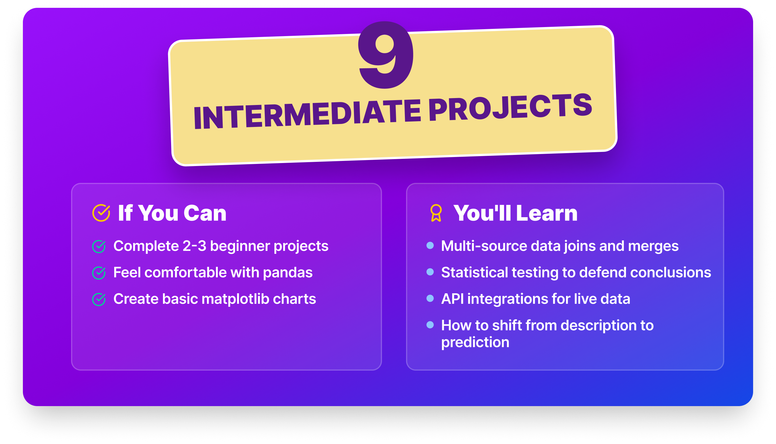
These nine projects introduce the complexity that separates classroom data science from real-world data science: multi-source data joins, statistical testing, API integrations, and the shift from description to prediction. If you’ve completed two or three beginner projects and feel comfortable with pandas and matplotlib, you’re ready.
| Project | Key Skill | Key Challenge | Dataset | Time Estimate |
|---|---|---|---|---|
| House Price Prediction | Linear regression | Feature engineering | Kaggle (Ames) | 8–12 hrs |
| Exchange Rate Visualization | Explanatory viz | Annotated time series | Kaggle | 6–10 hrs |
| Employee Exit Surveys | Multi-source data join | Column standardization | Australian Gov | 8–12 hrs |
| Star Wars Survey | Survey data cleaning | Multi-level column headers | FiveThirtyEight | 6–8 hrs |
| I-94 Traffic Analysis | Time series EDA | Subplot grids | UCI | 6–8 hrs |
| Nasdaq API Analysis | API · financial data | Time series alignment | Nasdaq Data Link | 8–10 hrs |
| Stack Overflow Analysis | SQL · trend analysis | Live database querying | Stack Exchange | 6–8 hrs |
| Lottery Probability App | Probability · functions | Building from scratch | Kaggle | 6–8 hrs |
| Winning Jeopardy | Chi-square testing | Hypothesis formation | Reddit dataset | 8–12 hrs |
Project 7: House Price Prediction ● ● ○
The Ames Housing dataset gives you 79 variables: square footage, neighborhood, garage type, year built, and dozens more. Most of the value in this project comes from thoughtful feature engineering — deciding how to handle “no pool” vs. missing pool data is a more interesting problem than picking the right algorithm.
Skills you’ll practice: linear regression · feature engineering · categorical encoding · RMSE/R² · Ridge/Lasso
Dataset: Ames Housing Dataset on Kaggle
Step-by-Step Instructions:
- Load and explore the data — read the data description; this dataset rewards careful reading.
- Handle missing values strategically (PoolQC nulls mean “no pool,” not missing data).
- Encode categorical variables using ordinal vs. nominal strategies where appropriate.
- Train a linear regression baseline and evaluate with RMSE and R².
- Iterate: try Ridge, Lasso, or a gradient boosting model.
- Identify the top 10 features driving price and explain them in plain language.
Take it further: Build a simple Streamlit app where a user inputs home features and gets an estimated price. Turning a regression model into a user-facing tool makes it immediately understandable to any interviewer.
Why employers care: Feature engineering and thoughtful handling of categorical variables are foundational skills in any ML or analytics role. The Ames dataset is rich enough to show real decision-making, not just tutorial-following — and your README documentation of those decisions is what employers actually read.
Where to start: Dataquest's Linear Regression Modeling in Python course or watch the project walkthrough video.
Project 8: Storytelling Data Visualization on Exchange Rates ● ● ○
Most visualization work is exploratory — you’re figuring things out for yourself. This project focuses on the other kind: explanatory visualization, where you’re communicating a story to an audience. You’ll analyze historical Euro exchange rates and build a series of charts that tell a coherent narrative about how rates moved over time.
Skills you’ll practice: matplotlib · time series plotting · rolling averages · annotations · explanatory design
Dataset: Euro Exchange Rates on Kaggle
Step-by-Step Instructions:
- Load the data and parse dates correctly.
- Plot EUR/USD over the full time period and identify key inflection points.
- Create a rolling average to smooth out short-term noise.
- Compare EUR against at least two other currencies on the same chart.
- Add titles, annotations, and explanatory context to your final visualizations.
- Write a 200-word narrative explaining the story your charts tell.
Take it further: Replace the standard line chart with a small multiples layout, one panel per currency for a more publication-ready result. Then add a written interpretation section, as if you were publishing this in a data journalism outlet.
Why employers care: The ability to produce visualizations that communicate to a non-technical audience. not just charts that are technically correct, is one of the most consistently cited gaps in junior data science candidates. This project is direct evidence you can bridge that gap.
Where to start: Where to start: Storytelling Data Visualization on Exchange Rates guided project on Dataquest | Source code
Project 9: Employee Exit Surveys ● ● ○
You’re given exit surveys from employees of the Queensland Department of Education. Your job: determine whether dissatisfaction rates differ between new employees and long-tenured ones. This requires combining two datasets with different structures, standardizing inconsistent column values, and answering a specific business question from the result.
Skills you’ll practice: pandas merge · string cleaning · derived columns · groupby · data storytelling
Dataset: DETE and TAFE Exit Surveys — Australian Government
Step-by-Step Instructions:
- Load both datasets and examine their different column structures.
- Standardize column names and response values across both datasets.
- Create a column indicating whether each respondent left due to dissatisfaction.
- Categorize employees by service length: new, experienced, veteran.
- Answer the core question: are newer employees more likely to leave due to dissatisfaction?
- Create supporting visualizations and write up findings.
Take it further: Extend the analysis by department or role type. A breakdown that reveals which specific teams are losing new employees fastest turns this from a general finding into an actionable HR recommendation.
Why employers care: Combining datasets from different sources, handling inconsistent schemas, and framing conclusions as actionable recommendations for a specific stakeholder is exactly what data analysts do every day. This project is a realistic simulation of that workflow, not a cleaned-up tutorial dataset.
Where to start: Where to start: Clean and Analyze Employee Exit Surveys guided project on Dataquest | Source code
Project 10: Star Wars Survey Analysis ● ● ○
FiveThirtyEight ran a survey asking Americans about the Star Wars franchise, which films they liked best, who shot first, and whether they consider themselves fans. The resulting dataset has multi-level column headers, Yes/No responses stored as strings, and ranking columns that need careful interpretation. Cleaning it properly is satisfying, and the findings are genuinely fun to present.
Skills you’ll practice: pandas · boolean indexing · column renaming · survey data patterns · matplotlib
Dataset: Star Wars Survey — FiveThirtyEight GitHub
Step-by-Step Instructions:
- Load and inspect the data. Note the multi-level column headers and inconsistent values.
- Clean boolean columns (Yes/No stored as strings).
- Rename and reorganize ranking columns so they’re interpretable.
- Calculate which film is most seen and most liked overall.
- Break down results by respondent gender.
- Settle the Han vs. Greedo debate definitively (with a bar chart).
Take it further: Segment the results by age group in addition to gender. Generational differences in Star Wars fandom are a natural story, and a project that tells a surprising story is more memorable in an interview than one with expected results.
Why employers care: Survey data cleaning is a core skill in market research, UX research, and product analytics. This project also demonstrates you can work with opinionated, loosely structured data, the kind that comes from real stakeholder surveys, and produce something presentable from it.
Where to start: Where to start: Star Wars Survey guided project on Dataquest. This project walkthrough video is free if you want to preview the approach first \ Source code
Project 11: Finding Heavy Traffic Indicators on I-94 ● ● ○
The Metro Interstate Traffic Volume dataset records hourly traffic data on the I-94 in Minnesota, paired with weather conditions and holiday flags. You’ll use visualization to identify which factors — time of day, day of week, temperature, weather events — correlate most strongly with heavy traffic. It’s a practical introduction to using charts to surface patterns in time series data.
Skills you’ll practice: pandas · matplotlib subplot grids · time series filtering · correlation analysis
Dataset: Metro Interstate Traffic Volume — UCI
Step-by-Step Instructions:
- Load the data and parse the date_time column.
- Separate the data into daytime and nighttime subsets.
- Identify the hours and days with the most traffic.
- Examine weather effects: does rain, snow, or fog correlate with volume?
- Create a grid of subplots comparing all major factors.
- Summarize which factors most strongly predict heavy traffic.
Take it further: Build a heatmap of average traffic volume by hour of day × day of week. A single heatmap communicates the same information as six separate bar charts, and doing so shows visual design judgment that raw technical output doesn’t.
Why employers care: Time series analysis and pattern identification are foundational skills in operations, logistics, and any domain that involves forecasting. This project also shows you can design a multi-panel visualization that tells a coherent story, a presentation skill as much as a technical one.
Where to start: Finding Heavy Traffic Indicators on I-94 guided project on Dataquest | Source code
Project 12: Nasdaq Data Link API Analysis ● ● ○
Financial data is everywhere, and knowing how to pull it programmatically via API is a foundational skill. You’ll connect to the Nasdaq Data Link API, pull historical economic or commodity data, and build a multi-panel visualization comparing trends and correlations across two or more assets.
Skills you’ll practice: API calls · pandas · time series alignment · rolling correlation · matplotlib
Dataset: Nasdaq Data Link API (free tier)
Step-by-Step Instructions:
- Create a free account at data.nasdaq.com and get your API key.
- Pull historical data for at least two assets using the nasdaq-data-link Python library.
- Align both datasets by date using pandas.
- Plot each time series and calculate summary statistics.
- Calculate the rolling 30-day correlation between the two series.
- Annotate significant events on the chart and write a two-paragraph summary.
Take it further: Add a third asset and calculate a rolling correlation matrix over time. A correlation that shifts significantly during a crisis period (2008, 2020) is a finding worth highlighting explicitly in your README.
Why employers care: API integration is a standard skill for data engineers, analysts, and data scientists working with live data sources. A financial domain project also signals quantitative reasoning, a valued signal in fintech, trading, and investment analytics roles.
Where to start: Where to start: Dataquest's APIs and Web Scraping in Python course covers the API integration skills this project requires | Source code
Project 13: Popular Data Science Questions on Stack Overflow ● ● ○
Where do data scientists go when they get stuck? Stack Overflow. You’ll use the Stack Exchange Data Explorer to query the live database directly, analyze which data science topics get the most questions, and how topic popularity has shifted over time. It’s real SQL against a real production database.
Skills you’ll practice: SQL · pandas · trend analysis · matplotlib · data-driven storytelling
Dataset: Stack Exchange Data Explorer (live, free)
Step-by-Step Instructions:
- Write SQL queries to pull question counts and answer rates for data science tags (python, pandas, scikit-learn, etc.).
- Export results to CSV and load into pandas.
- Create a bar chart of the top 20 most-asked data science tags.
- Query question counts by year for 5 tags and plot growth over time.
- Identify which tags have the lowest answer rates.
- Write up three insights from your analysis.
Take it further: Pull the same analysis for data engineering or ML engineer tags and compare growth trajectories. A side-by-side showing that dbt and Airflow questions are growing faster than scikit-learn questions is a finding that signals market awareness, a quality interviewers notice.
Why employers care: SQL fluency is non-negotiable in data roles. This project also demonstrates initiative, you’re not using a pre-packaged dataset, you’re querying a live database and deciding what questions to ask. That’s a behavior that maps directly to how analysts work on the job.
Where to start:Where to start: Dataquest's SQL Fundamentals skill path builds the querying skills you'll apply against a live database here.
Project 14: Lottery Addiction Probability App ● ● ○
A medical institute wants to build an app that helps lottery players understand their actual odds. You’ll write Python functions that calculate probabilities for various lottery scenarios and display results in clear, user-friendly language, building the math from scratch rather than importing it.
Skills you’ll practice: combinatorics · probability · Python functions · conditional logic · user-facing output
Dataset: Canada 6/49 Lottery Historical Data on Kaggle
Step-by-Step Instructions:
- Review the rules of the 6/49 lottery (6 numbers from 1–49).
- Write factorial() and combinations() functions from scratch (no math import).
- Write a one_ticket_probability() function showing odds for a single ticket.
- Write a check_historical_occurrence() function using the Canada lottery dataset.
- Write a multi_ticket_probability() function showing how odds change with more tickets.
- Write functions for matching 2, 3, 4, or 5 numbers (secondary prizes).
Take it further: Package the functions into a simple Streamlit app. A user enters their numbers, and the app shows their odds in plain language alongside how many tickets would be needed to reach a 1-in-1000 chance of winning. Public health + interactive app = a memorable portfolio piece.
Why employers care: Building clean, reusable functions with clear inputs and outputs is software engineering practice, not just data analysis. This project shows you can write production-style Python code with a user in mind, a quality that separates candidates who know Python from candidates who can actually build with it.
Where to start: Dataquest's Probability Basics course covers the combinatorics and probability math you'll implement from scratch | Source code
Project 15: Winning Jeopardy ● ● ○
You’ve been hired by a Jeopardy contestant who wants to prepare strategically. Using 200,000+ historical questions, you’ll test hypotheses: do high-value questions use harder vocabulary? Are certain answers recycled? Does studying old questions actually help? The chi-square test makes your conclusions statistically defensible.
Skills you’ll practice: chi-square testing · pandas · text analysis · hypothesis formation · scipy
Dataset: 200K+ Jeopardy Questions (Reddit dataset)
Step-by-Step Instructions:
- Load the JSON dataset and explore the columns: categories, values, air dates, questions, answers.
- Write a function to test whether keywords appear in question text.
- Analyze whether high-value questions use more complex language.
- Test whether answers recur across questions over time.
- Run a chi-square test on your primary hypothesis.
- Summarize what a strategic Jeopardy contestant should actually study.
Take it further: Build a category difficulty score based on answer overlap and vocabulary complexity. Ranking Jeopardy categories from easiest to hardest, with statistical backing, is a finding specific enough to be genuinely interesting on a resume.
Why employers care: Hypothesis testing and translating a real-world question into a statistically rigorous analysis is the core loop of data science. This project demonstrates you can move from “I have a question” to “here is a defensible answer”, which is what employers are hiring for.
Where to start: Where to start: Winning Jeopardy guided project on Dataquest | Source code
Advanced Data Science Projects
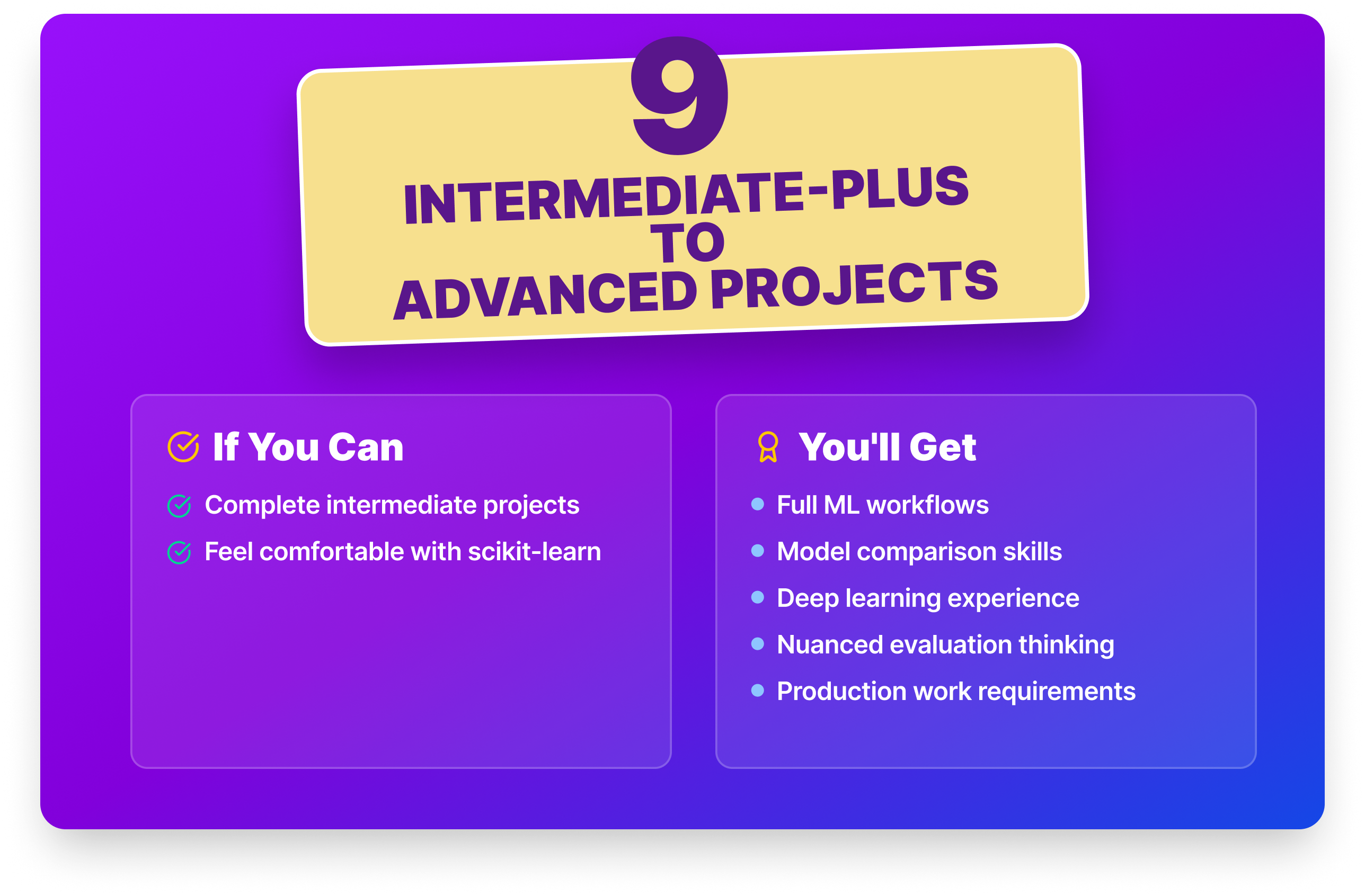
These nine projects introduce full ML workflows, model comparison, deep learning, and the kind of nuanced evaluation thinking that real production work requires. If you’ve completed intermediate projects and are comfortable with scikit-learn, you’re ready.
| Project | Key Skill | Key Challenge | Dataset | Time Estimate |
|---|---|---|---|---|
| Heart Disease (KNN) | KNN · evaluation metrics | Medical data tradeoffs | UCI | 6–8 hrs |
| Spam Filter | Naive Bayes from scratch | Building without scikit-learn | UCI | 6–8 hrs |
| Insurance Costs | Linear regression | Target variable skew | Kaggle | 6–8 hrs |
| NYC High Schools | Multi-dataset merge | Geographic visualization | NYC Open Data | 10–14 hrs |
| Employee Productivity Trees | Decision trees | Overfitting / depth tuning | Kaggle | 8–10 hrs |
| Credit Card Segmentation | K-means clustering | Feature scaling · elbow method | Kaggle | 8–10 hrs |
| Stock Market Returns | Random forest · backtesting | Temporal data leakage | Yahoo Finance | 10–14 hrs |
| Forest Fire Regression | Multi-model comparison | Noisy target variable | UCI | 8–10 hrs |
| IPO Prediction (PyTorch) | PyTorch · regularization | Neural network tuning | Kaggle | 12–16 hrs |
Project 16: Predicting Heart Disease with K-Nearest Neighbors ● ● ○
Using a heart disease prediction dataset of patient clinical measurements, you’ll build a classification model predicting heart disease risk. The evaluation step is where this project gets interesting, accuracy alone isn’t the right metric when false negatives have real consequences.
Skills you’ll practice: KNN · scikit-learn · train/test split · precision/recall · hyperparameter tuning
Dataset: Heart Disease — UCI ML Repository
Step-by-Step Instructions:
- Load and explore the data to understand what each clinical variable represents.
- Handle missing values and encode categorical variables.
- Split into training and test sets.
- Train a KNN classifier.
- Evaluate with accuracy, sensitivity, and specificity to explain the tradeoffs.
- Test different values of K and plot the accuracy curve.
Take it further: Compare KNN performance against logistic regression and random forest. A model comparison section with a documented rationale for which you’d deploy, and why, is a significantly stronger portfolio piece than a single model in isolation.
Why employers care: Healthcare ML roles, and any domain where false negatives carry serious consequences, require candidates who understand evaluation beyond accuracy. Choosing sensitivity as your primary metric and explaining why demonstrates the kind of judgment that separates a careful data scientist from someone who just runs
.fit().
Where to start:Where to start: Predicting Heart Disease guided project on Dataquest (Free). Dataquest's Intro to Supervised Learning course covers KNN and the evaluation metrics this project focuses on.
Project 17: Building a Spam Filter with Naive Bayes ● ● ○
You’ll build a Naive Bayes spam classifier from scratch, without using scikit-learn’s implementation. Walking through the conditional probability math yourself makes the algorithm genuinely intuitive, and you’ll understand exactly what the model is doing when you eventually use library implementations.
Skills you’ll practice: Naive Bayes · conditional probability · text preprocessing · vocabulary building · Python functions
Dataset: SMS Spam Collection — UCI
Step-by-Step Instructions:
- Explore the data: spam/ham ratio, most common words in each class.
- Create an 80/20 training/test split.
- Calculate prior probabilities P(spam) and P(ham).
- Build a vocabulary from the training set and calculate word conditional probabilities.
- Implement the Naive Bayes classification function.
- Evaluate on the test set — aim for accuracy above 97%.
Starter code:
import pandas as pd
from collections import defaultdict

df = pd.read_csv("SMSSpamCollection", sep="\t", header=None, names=["label", "text"])
df["label_int"] = (df["label"] == "spam").astype(int)

# Count word frequencies per class
spam_words = defaultdict(int)
ham_words = defaultdict(int)
for _, row in df.iterrows():
    for word in row["text"].lower().split():
        if row["label"] == "spam":
            spam_words[word] += 1
        else:
            ham_words[word] += 1
Take it further: Compare your from-scratch implementation to scikit-learn’s MultinomialNB on the same test set. Documenting that your implementation reaches comparable accuracy shows you truly understand what the library is doing under the hood.
Why employers care: Building an algorithm from scratch, rather than importing it, demonstrates conceptual depth. Candidates who understand the math behind their models can debug them, explain them to stakeholders, and adapt them when the library doesn’t quite fit the problem.
Where to start: Building a Spam Filter with Naive Bayes guided project on Dataquest | Source code
Project 18: Predicting Insurance Costs ● ● ○
A medical insurance company wants to estimate costs for new customers based on demographic and health data. This project teaches you to interpret regression coefficients in plain language, understanding that smokers pay roughly 3× more, controlling for age, is a finding a business stakeholder can act on.
Skills you’ll practice: linear regression · coefficient interpretation · log transformation · seaborn · RMSE/R²
Dataset: Medical Cost Personal Dataset on Kaggle
Step-by-Step Instructions:
- Explore relationships between each variable and charges using scatter plots.
- Encode categorical variables (sex, smoker, region).
- Train a linear regression model and evaluate with RMSE and R².
- Examine the coefficients — which features drive cost the most?
- Try log-transforming the target to handle its skew, then compare results.
- Summarize findings in business terms.
Take it further: Visualize residuals against each predictor variable to check for heteroskedasticity. Identifying where your model consistently over- or under-predicts, and explaining why — turns a standard regression into a thoughtful analysis.
Why employers care: Model interpretation and communicating results to non-technical stakeholders are skills that separate analysts from ML practitioners. Employers in insurance, healthcare, and financial services value candidates who can explain not just what a model predicts, but why a particular input drives cost in the direction it does.
Where to start: Dataquest's Linear Regression Modeling in Python course builds the regression and coefficient interpretation skills this project needs. Or watch the predicting insurance costs project walkthrough video first to preview the approach.
Project 19: NYC High School Data Analysis ● ● ○
Are SAT scores a fair measure of academic ability, or do they reflect socioeconomic factors? You’ll combine NYC school datasets with SAT scores and demographic data to explore that question, merging multiple datasets, handling geographic data, and producing visualizations that make the patterns visible.
Skills you’ll practice: pandas merge · correlation analysis · matplotlib · folium (optional) · data ethics framing
Dataset: NYC Schools and SAT Data — NYC Open Data
Step-by-Step Instructions:
- Load all relevant datasets and explore each structure separately.
- Merge on school name or DBN code.
- Calculate correlations between SAT scores and race, income proxy, English learner percentage.
- Create scatter plots showing the strongest correlations.
- Optionally, map school performance by borough using folium.
- Write a 300-word summary of findings and their limitations.
Take it further: Add a section explicitly discussing the limitations of your analysis — what confounders you can’t control for, and what conclusions would require additional data. A project that acknowledges its own limits is more credible, not less.
Why employers care: Multi-dataset analysis, geographic visualization, and responsible interpretation of sensitive data are all advanced skills. The data ethics framing of this project, explicitly discussing what the data can and can’t tell you, is increasingly valued in policy, healthcare, and civic tech roles.
Where to start: Where to start: Analyzing NYC High School Data guided project on Dataquest or watch the step-by-step walkthrough video first | Source code
Project 20: Decision Trees for Employee Productivity ● ● ○
A company wants to understand which factors predict high employee performance. You’ll build a decision tree classifier and interpret it visually, tracing exactly which features drive each prediction. Decision trees are one of the most explainable ML models, which makes them a strong choice for any domain where stakeholders need to trust and understand model output.
Skills you’ll practice: decision trees · scikit-learn · overfitting/regularization · feature importance · plot_tree
Dataset: HR Analytics Dataset on Kaggle
Step-by-Step Instructions:
- Explore the data: class balance, variable relationships, distributions.
- Handle class imbalance if needed.
- Encode categorical variables and split into train/test sets.
- Train a decision tree and start with no depth limit, then add max_depth to control overfitting.
- Visualize the tree using scikit-learn’s plot_tree.
- Identify the most important features and explain what the tree is “learning.”
Take it further: Compare the depth-limited decision tree to a random forest on the same data. A brief discussion of why ensemble methods generally outperform single trees, and when you’d still prefer a decision tree for interpretability, demonstrates the kind of model selection thinking employers are looking for.
Why employers care: Interpretable ML is a growing priority in HR analytics, healthcare, finance, and any domain subject to regulatory oversight. Demonstrating that you can choose a model for its explainability, not just its accuracy and signals maturity beyond most beginner portfolios.
Where to start: Dataquest's Decision Trees and Random Forests course in the Machine Learning in Python skill path covers the tree-building and overfitting concepts at the core of this project. Or watch the Predicting Employee Productivity Using Tree Models walkthrough first to preview the project | Source code
Project 21: Credit Card Customer Segmentation ● ● ○
A credit card company wants to group customers into segments to tailor marketing and product offerings. You’ll use K-means clustering to identify natural groupings based on spending habits, credit limits, and payment behavior, then translate cluster profiles into plain-language business descriptions.
Skills you’ll practice: K-means · StandardScaler · elbow method · PCA visualization · business interpretation
Dataset: Credit Card Dataset for Clustering on Kaggle
Step-by-Step Instructions:
- Explore and clean the data to handle missing values in MINIMUM_PAYMENTS and CREDIT_LIMIT.
- Scale features using StandardScaler.
- Use the elbow method to find the optimal number of clusters.
- Train K-means and assign cluster labels.
- Profile each cluster in terms of spending and payment behavior.
- Write a business brief describing each segment and a recommended marketing approach for each.
Take it further: Use PCA to reduce the data to two dimensions and plot the clusters visually. A scatter plot showing clearly separated customer groups is far more compelling in a portfolio or presentation than a table of cluster centroids.
Why employers care: Unsupervised learning is underrepresented in most beginner portfolios. The ability to translate cluster results into business language, “high-value loyalists” vs. “revolvers at churn risk”, is exactly the analytical communication that marketing, product, and strategy teams hire for.
Where to start: Credit Card Customer Segmentation guided project or watch the walkthrough video. Dataquest's Intro to Unsupervised Learning course covers K-means, the elbow method, and PCA visualization.
Project 22: Predicting Stock Market Returns ● ● ○
Can historical price data predict tomorrow’s direction? You’ll build a random forest classifier on S&P 500 data, but the most important skill here isn’t the model, it’s understanding why naive train/test splits completely fail on temporal data and implementing backtesting correctly instead.
Skills you’ll practice: random forest · time series splits · look-ahead bias · feature engineering · backtesting
Dataset: S&P 500 historical data via Yahoo Finance
Step-by-Step Instructions:
- Download S&P 500 historical data.
- Create a binary target: 1 if tomorrow’s close is higher than today’s.
- Engineer features: rolling averages, volatility, momentum indicators.
- Guard against look-ahead bias to ensure no future data leaks into features.
- Train with a time-based split (never random for temporal data).
- Evaluate with accuracy and a confusion matrix against a naive “always predict up” baseline.
Take it further: Implement a proper walk-forward validation: train on months 1–12, test on month 13; train on months 1–13, test on month 14; and so on. Documenting that your results hold up across multiple test windows is the difference between a portfolio project and a real analysis.
Why employers care: Backtesting and the understanding of why temporal data leakage invalidates results are fundamental concepts in quantitative finance and any time series ML role. Candidates who know how to implement walk-forward validation stand out immediately in fintech and financial services interviews.
Where to start: Dataquest's Predict the Stock Market Using Machine Learning guided project walks through all the core steps including temporal splitting and adding rolling predictors. Watch the project walkthrough video for free if you want to preview the approach first. | Source code
Project 23: Forest Fire Prediction with Regression ● ● ○
Can weather and environmental data predict how large a forest fire will become? You’ll use the UCI Forest Fires dataset to build a regression model predicting burned area, and learn an important lesson: sometimes the honest conclusion is that a dataset is too small and noisy to support confident predictions.
Skills you’ll practice: multiple regression · target transformation · model comparison · MAE/RMSE/R² · honest assessment
Dataset: Forest Fires — UCI ML Repository
Step-by-Step Instructions:
- Explore the data to note the heavily skewed burned area variable.
- Log-transform the target variable to handle the skew.
- Encode temporal columns (month, day) using cyclical or one-hot encoding.
- Train and compare linear regression, decision tree, and random forest.
- Evaluate with MAE, RMSE, and R².
- Reflect honestly in your README: why is this problem hard? What would a better model require?
Take it further: Add a limitations section to your README explaining why small, noisy environmental datasets are genuinely hard to model and what additional data sources would improve the predictions. A project that demonstrates epistemic humility is more credible than one that cherry-picks results.
Why employers care: Honest model assessment, including articulating why a model underperforms and what its limitations are, is a sign of scientific maturity. Employers who have dealt with overconfident data science work actively look for candidates who can distinguish between “the model works” and “the model works on this data, in these conditions.”
Where to start: Dataquest's Linear Regression Modeling in Python and Optimizing ML Models courses in the Machine Learning in Python skill path cover the multi-model comparison and evaluation approach this project requires. | Source code
Project 24: IPO Market Listing Gain Prediction with PyTorch ● ● ●
You’ll build a regularized deep learning model to predict whether an IPO will be profitable on its listing date. This is your introduction to PyTorch, and the finance domain makes the regularization techniques feel concrete, because you can see exactly how dropout and weight decay affect your model’s behavior on held-out data.
Skills you’ll practice: PyTorch · dropout regularization · batch normalization · financial feature engineering · model comparison
Dataset: Indian IPO Market Dataset on Kaggle
Step-by-Step Instructions:
- Explore: IPO price, issue size, subscription rate, grey market premium, listing gain.
- Clean and scale features using StandardScaler.
- Train a baseline linear regression model.
- Build a neural network in PyTorch with two hidden layers and ReLU activations.
- Add dropout regularization to reduce overfitting.
- Compare the neural network to the linear regression baseline using RMSE and R².
Take it further: Experiment with different regularization strategies, dropout rates, L2 weight decay, early stopping, and compare their effect on validation loss. A documented ablation study makes this a genuinely strong advanced portfolio piece.
Why employers care: PyTorch fluency and hands-on experience with regularization are increasingly expected for ML engineering and research roles. A finance-domain deep learning project is also a rare combination, most PyTorch beginner projects use image or text data, so the domain specificity alone makes this stand out in a stack of portfolios.
Where to start: Predicting Listing Gains in the Indian IPO Market guided project on Dataquest (Free). Dataquest's Deep Learning with TensorFlow course introduces the neural network fundamentals you'll apply here in PyTorch.
Applied ML Projects
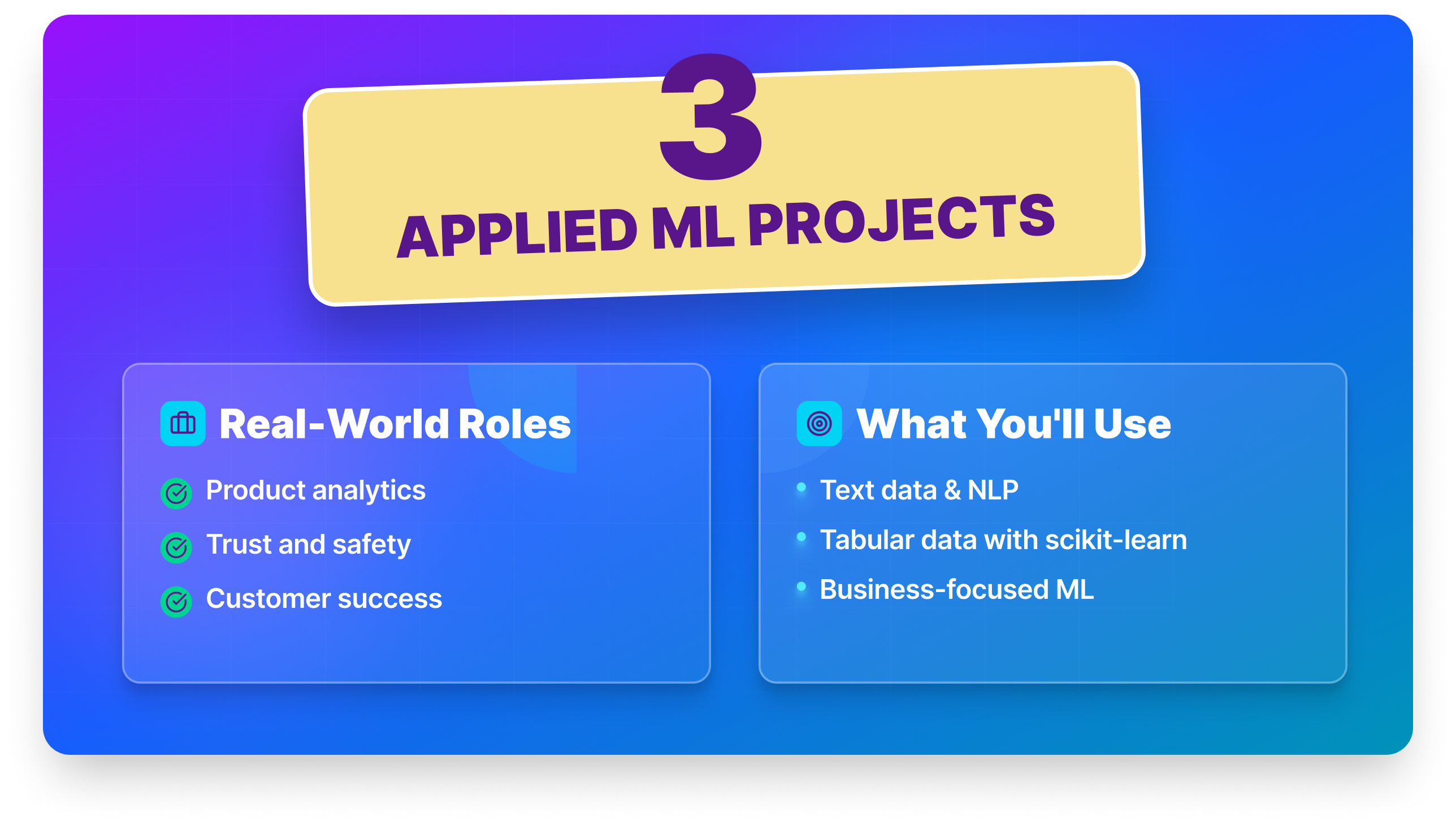
These three projects apply machine learning to text and tabular data, the kind of work you’ll find in product analytics, trust and safety, and customer success roles. If you’re comfortable with scikit-learn and want to move into NLP and business-focused ML, start here.
| Project | Key Skill | Key Challenge | Dataset | Time Estimate |
|---|---|---|---|---|
| Sentiment Analysis | TF-IDF · NLP pipeline | Large unstructured text | AWS Open Data | 8–10 hrs |
| Fake News Detection | Text classification | Model error analysis | University of Victoria | 8–12 hrs |
| Customer Churn Prediction | Random forest · SMOTE | Class imbalance | Kaggle | 8–12 hrs |
Project 25: Sentiment Analysis on Product Reviews ● ● ○
Sentiment analysis, determining whether text expresses a positive, negative, or neutral opinion, is one of the most commonly applied NLP techniques in real businesses. You’ll build a sentiment classifier using real Amazon product review data, taking the text from raw strings to a working model.
Skills you’ll practice: TF-IDF · text preprocessing · logistic regression · precision/recall/F1 · NLTK or spaCy
Dataset: Amazon Customer Reviews — AWS Open Data
Step-by-Step Instructions:
- Download a product category subset from AWS Open Data.
- Explore star rating distribution and review lengths.
- Create a binary label: 4–5 stars = positive, 1–2 stars = negative (drop 3-star reviews).
- Preprocess text: lowercase, remove punctuation, tokenize, remove stop words.
- Vectorize using TF-IDF.
- Train a logistic regression classifier and evaluate with precision, recall, and F1.
- Test on a few reviews you write yourself.
Take it further: Compare your TF-IDF + logistic regression baseline against a pretrained HuggingFace model (e.g., DistilBERT). Documenting the accuracy jump, and the compute cost tradeoff, shows you understand when to reach for a heavier model and when a simpler one is good enough.
Why employers care: Text classification appears in customer support automation, content moderation, brand monitoring, and product feedback analysis. Understanding the full NLP preprocessing pipeline, not just calling a pretrained model, signals you can build and debug text systems at the component level, not just use them as black boxes.
Where to start: Dataquest's Logistic Regression Modeling in Python course covers the classification fundamentals at the core of this project. The Machine Learning in Python skill path is the logical next step if you want to go deeperSource code
Project 26: Fake News Detection ● ● ○
You’ll build a classifier distinguishing real news from fake using the ISOT Fake News Dataset, practicing the full NLP pipeline from text cleaning through model evaluation. The error analysis step, examining what kinds of articles fool the model, is what makes this project genuinely interesting.
Skills you’ll practice: TF-IDF · PassiveAggressiveClassifier · confusion matrix · text preprocessing · error analysis
Dataset: ISOT Fake News Dataset — University of Victoria
Step-by-Step Instructions:
- Load the true and fake datasets and combine with a binary label column.
- Explore word frequency differences between real and fake articles.
- Preprocess: remove URLs, lowercase, remove punctuation, tokenize.
- Vectorize using TF-IDF (try word-level and character n-gram approaches).
- Train a PassiveAggressiveClassifier and evaluate with a confusion matrix.
- Examine misclassified examples — what patterns do they share?
Take it further: Visualize the top TF-IDF features for each class as a word cloud or bar chart. Then write a section in your README discussing why automated fake news detection is hard, what kinds of misinformation would your model consistently miss, and why. That level of critical reflection is rare in beginner portfolios.
Why employers care: NLP, binary text classification, and media/misinformation-related problems are high-priority areas in tech, policy, and journalism. An error analysis section, where you explicitly discuss where the model fails to demonstrates scientific rigor that employers in trust and safety, policy research, and content moderation roles specifically value.
Where to start: Dataquest's Intro to Supervised Learning course covers the classification and evaluation fundamentals; the text preprocessing steps build on those foundations. | Source code
Project 27: Customer Churn Prediction ● ● ○
Churn prediction is one of the highest-value ML applications in business, retaining an existing customer costs far less than acquiring a new one. You’ll build a model predicting which telecom customers are at risk of canceling, then frame your results in terms a product or marketing team can act on.
Skills you’ll practice: random forest · SMOTE · class imbalance · precision/recall/F1 · feature importance
Dataset: Telco Customer Churn on Kaggle
Step-by-Step Instructions:
- Explore the data to note the class imbalance (churn is the minority class).
- Clean and encode categorical variables.
- Train a random forest baseline and evaluate performance.
- Address class imbalance using class_weight=‘balanced’ or SMOTE.
- Compare accuracy, recall, precision, and F1 to explain why recall matters more here.
- Identify top churn predictors and explain them in business terms.
Starter code:
from sklearn.ensemble import RandomForestClassifier
from sklearn.metrics import classification_report
from imblearn.over_sampling import SMOTE

sm = SMOTE(random_state=42)
X_res, y_res = sm.fit_resample(X_train, y_train)
model = RandomForestClassifier(class_weight='balanced', n_estimators=100, random_state=42)
model.fit(X_res, y_res)
print(classification_report(y_test, model.predict(X_test)))
Take it further: Build a Streamlit app where a product manager can input a customer profile and see their predicted churn probability. Framing a classification model as a decision-support tool that a non-technical stakeholder would actually use is a strong differentiator.
Why employers care: Customer retention is one of the highest-value ML applications across SaaS, telecom, finance, and subscription businesses. Demonstrating that you understand class imbalance, can select evaluation metrics with business context in mind, and can frame predictions as actionable recommendations signals readiness for a real data science role.
Where to start: Dataquest's Decision Trees and Random Forests course in the Machine Learning in Python skill path covers the random forest modeling and class imbalance handling at the center of this project. | Source code
AI Application Projects
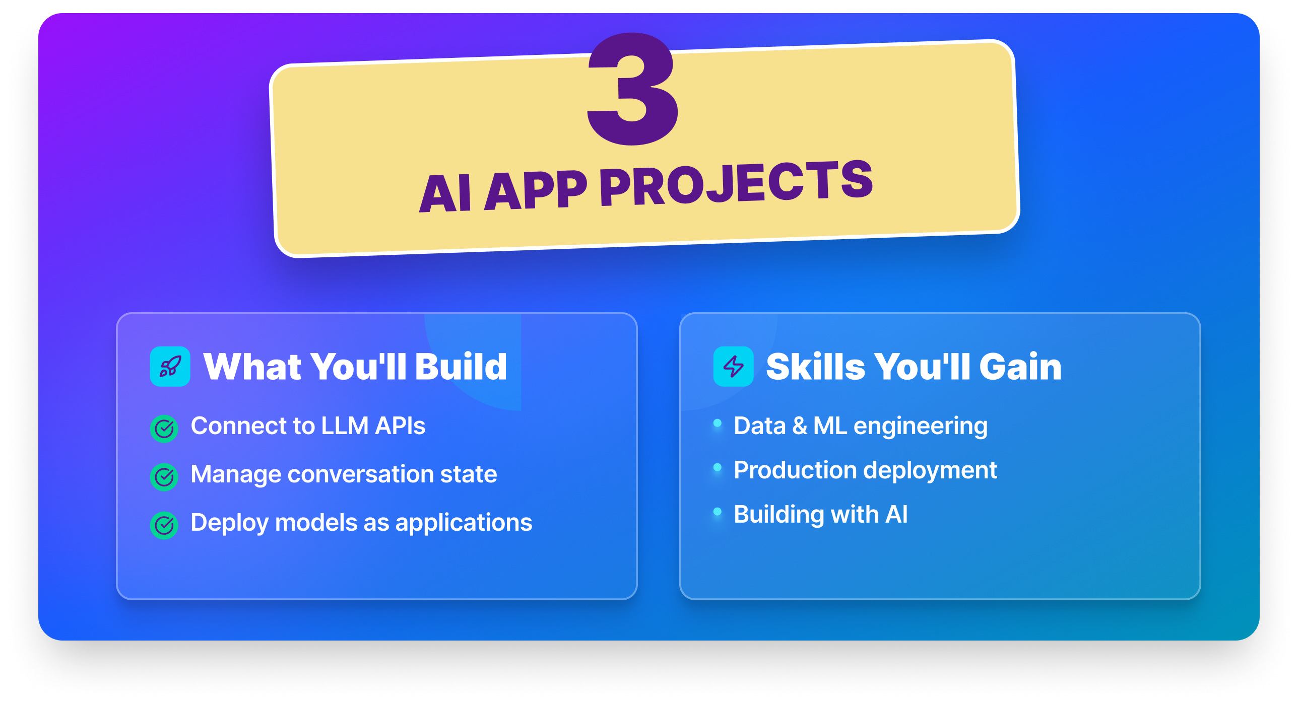
These three projects focus on building with AI, connecting to LLM APIs, managing conversation state, and deploying models as working applications. The skills here reflect what’s increasingly expected in data and ML engineering roles.
| Project | Key Skill | Key Challenge | Dataset | Time Estimate |
|---|---|---|---|---|
| AI Chatbot with Streamlit | LLM API · Streamlit | Session state management | OpenAI API | 6–10 hrs |
| Dynamic AI Chatbot | Prompt engineering | Context window limits | OpenAI API | 10–14 hrs |
| Weather Prediction | Time series ML | Temporal train/test split | NOAA / Open-Meteo | 8–12 hrs |
Project 28: Building an AI Chatbot with Streamlit ● ● ○
LLMs have made it possible to build functional AI applications in a small amount of code. You’ll build a working chatbot interface using Streamlit and the OpenAI API — similar to a lightweight ChatGPT — focusing on how to structure conversation history, manage API calls, and build a clean UI around an LLM.
Skills you’ll practice: OpenAI API · Streamlit · session state · prompt engineering · LLM app architecture
Dataset / API: OpenAI API
Step-by-Step Instructions:
- Set up a virtual environment and install Streamlit and the OpenAI library.
- Write a simple script that sends a message and prints the response.
- Build a Streamlit UI with a chat input and message history display.
- Maintain conversation history in session state so the model has context across turns.
- Add a system prompt that gives the chatbot a specific persona or purpose.
- Document how to run the app locally in a clear README.
Starter code:
import streamlit as st
from openai import OpenAI

client = OpenAI()
if "messages" not in st.session_state:
    st.session_state.messages = [{"role": "system", "content": "You are a helpful assistant."}]

prompt = st.chat_input("Ask me anything")
if prompt:
    st.session_state.messages.append({"role": "user", "content": prompt})
    response = client.chat.completions.create(
        model="gpt-4o-mini", messages=st.session_state.messages
    )
    reply = response.choices[0].message.content
    st.session_state.messages.append({"role": "assistant", "content": reply})
    st.chat_message("assistant").write(reply)
Take it further: Give the chatbot a domain-specific persona like a cooking assistant, a Python tutor, a resume reviewer, and build a landing page around that use case. A chatbot with a clear purpose is more impressive than a generic one.
Why employers care: End-to-end ownership of an AI application, from API integration to a deployed UI, demonstrates software engineering awareness that purely analytical projects don’t. LLM application development is one of the fastest-growing skill areas in data and engineering roles, and a working app is the clearest possible evidence you can build with these tools.
Where to start: Dataquest's Building an AI Chatbot with Streamlit guided project (Free) walks through every step from API setup to the deployed UI. Then explore the Generative AI Fundamentals skill path for deeper LLM architecture coverage. OpenAI API documentation | Streamlit documentation
Project 29: Dynamic AI Chatbot with Persona Switching ● ● ●
This project extends the basic chatbot concept into genuinely advanced territory. You’ll build a chatbot that switches between multiple personas mid-conversation like customer service agent, coding assistant, friendly tutor, while maintaining coherent context across role changes and handling context window limits gracefully.
Skills you’ll practice: prompt engineering · conversation state management · context window handling · multi-persona design · OpenAI API
Dataset / API: OpenAI API
Step-by-Step Instructions:
- Define at least three distinct personas with different system prompts.
- Build a conversation history manager in a structured format.
- Implement persona switching via a system message inserted at the transition point.
- Handle context window limits with a sliding window retaining recent messages.
- Add a user memory mechanism: let the chatbot retain facts across persona switches.
- Test edge cases: what happens when a user asks about a previous conversation in a new persona?
- Document your architecture decisions in your README.
Take it further: Implement a “memory store” that persists across sessions using a local JSON file. A chatbot that actually remembers returning users, not just the current conversation, crosses the threshold from demo to product.
Why employers care: Advanced prompt engineering, stateful conversation management, and production-aware thinking about context limits are skills at the intersection of software engineering and AI. These capabilities are directly applicable to building customer service bots, AI tutors, and internal tooling, all high-growth areas in AI product development.
WWhere to start: Dataquest's Developing a Dynamic AI Chatbot guided project covers persona switching and conversation state management directly. The LLM Chatbots course in the Generative AI Fundamentals skill path builds the prompt engineering foundation this project extends. OpenAI API documentation | Source code
Project 30: Predicting Weather with Machine Learning ● ● ○
Weather forecasting is one of the oldest prediction problems in data science, and it remains genuinely hard. You’ll use historical weather data to predict tomorrow’s temperature, practicing time series feature engineering, model comparison, and thinking carefully about what evaluation means when your data has temporal structure.
Skills you’ll practice: lag features · time series splits · ridge regression · gradient boosting · MAE · baseline comparison
Dataset/API: NOAA Climate Data Online or Open-Meteo API
Step-by-Step Instructions:
- Download historical weather data for a city of your choice.
- Explore the data: temperature, precipitation, wind speed, humidity.
- Engineer lag features: yesterday’s temperature, 7-day rolling average, day of year.
- Use a time-based train/test split (never random for time series).
- Train a baseline model (predict tomorrow = today) and measure MAE.
- Train ridge regression and gradient boosting. Compare both to the baseline.
- Analyze where your model makes the biggest errors — is it seasonal? Related to extreme weather?
Take it further: Build a small Streamlit dashboard that pulls live weather data from the Open-Meteo API and displays your model’s prediction for the next day alongside the actual forecast. A live prediction app based on real incoming data is a significant step up from a static notebook.
Why employers care: Time series ML, with correct temporal splitting and proper baseline comparison, appears across climate science, logistics, finance, and operations. Candidates who understand why “random split = data leakage” in time series contexts, and implement walk-forward validation correctly, stand out in any role that involves forecasting.
Where to start: Dataquest's Linear Regression Modeling in Python course builds the regression foundation this project needs. Once you've completed the project, Optimizing Machine Learning Models in Python is a natural next step for improving and tuning your modelsOr watch this step-by-step walkthrough video | Source code
How to Choose the Right Projects for Your Portfolio
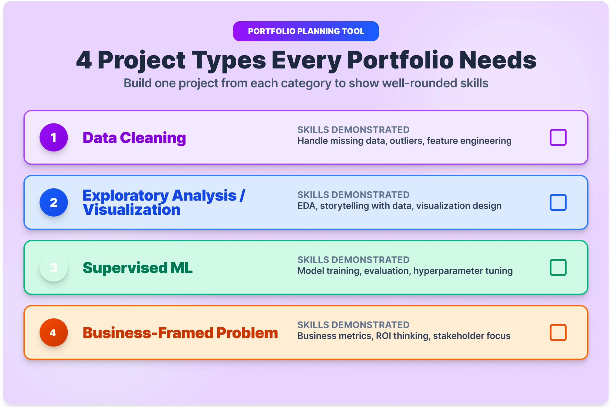
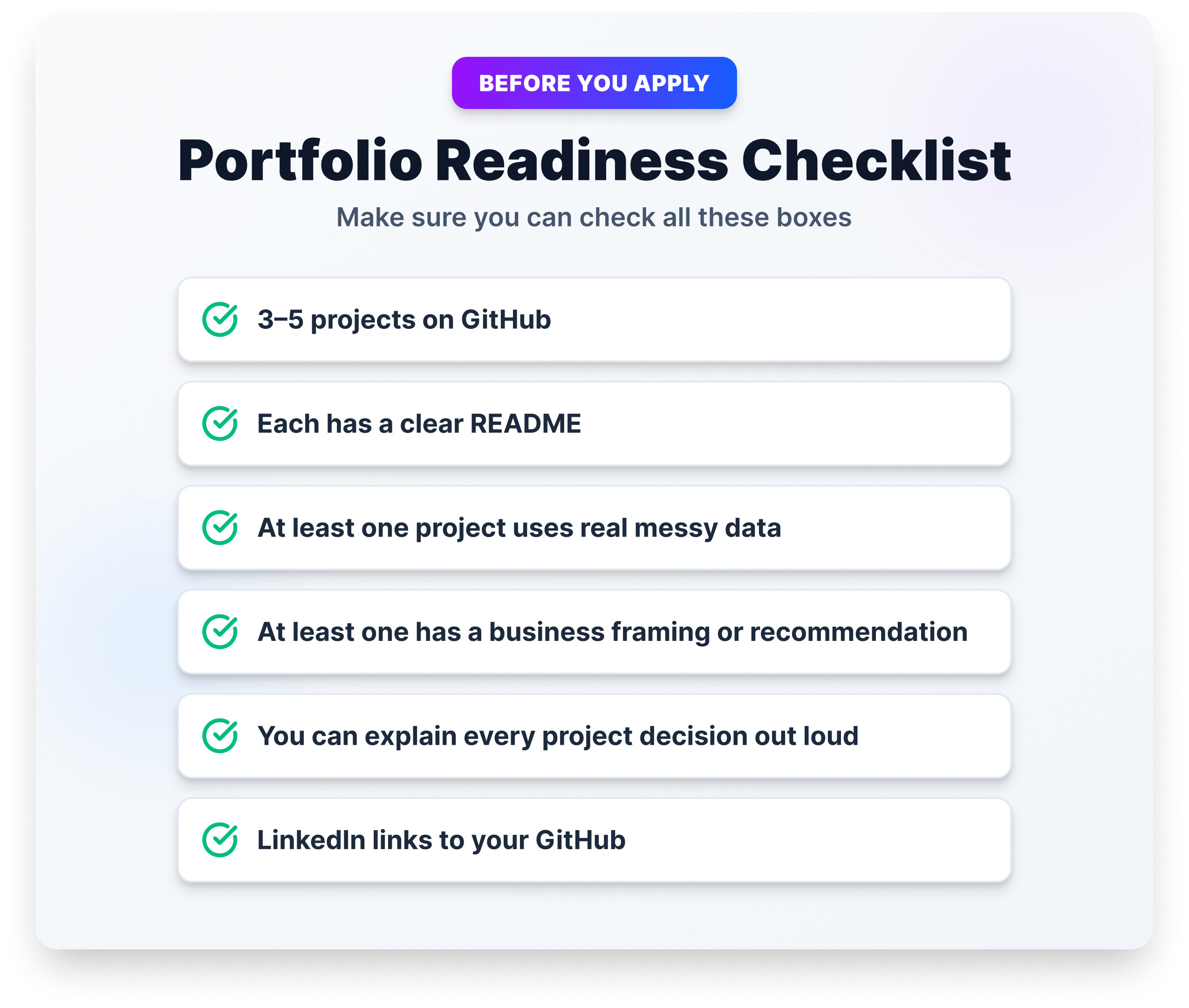
Don’t try to do all 30 of these. Three to five strong, well-documented projects will do more for your job search than a dozen half-finished ones.
When choosing, balance three factors: your current skill level, topics you’re genuinely curious about, and what the market rewards. The sweet spot is a project that stretches you without stopping you, something you can realistically finish in two to four weeks with focused effort.
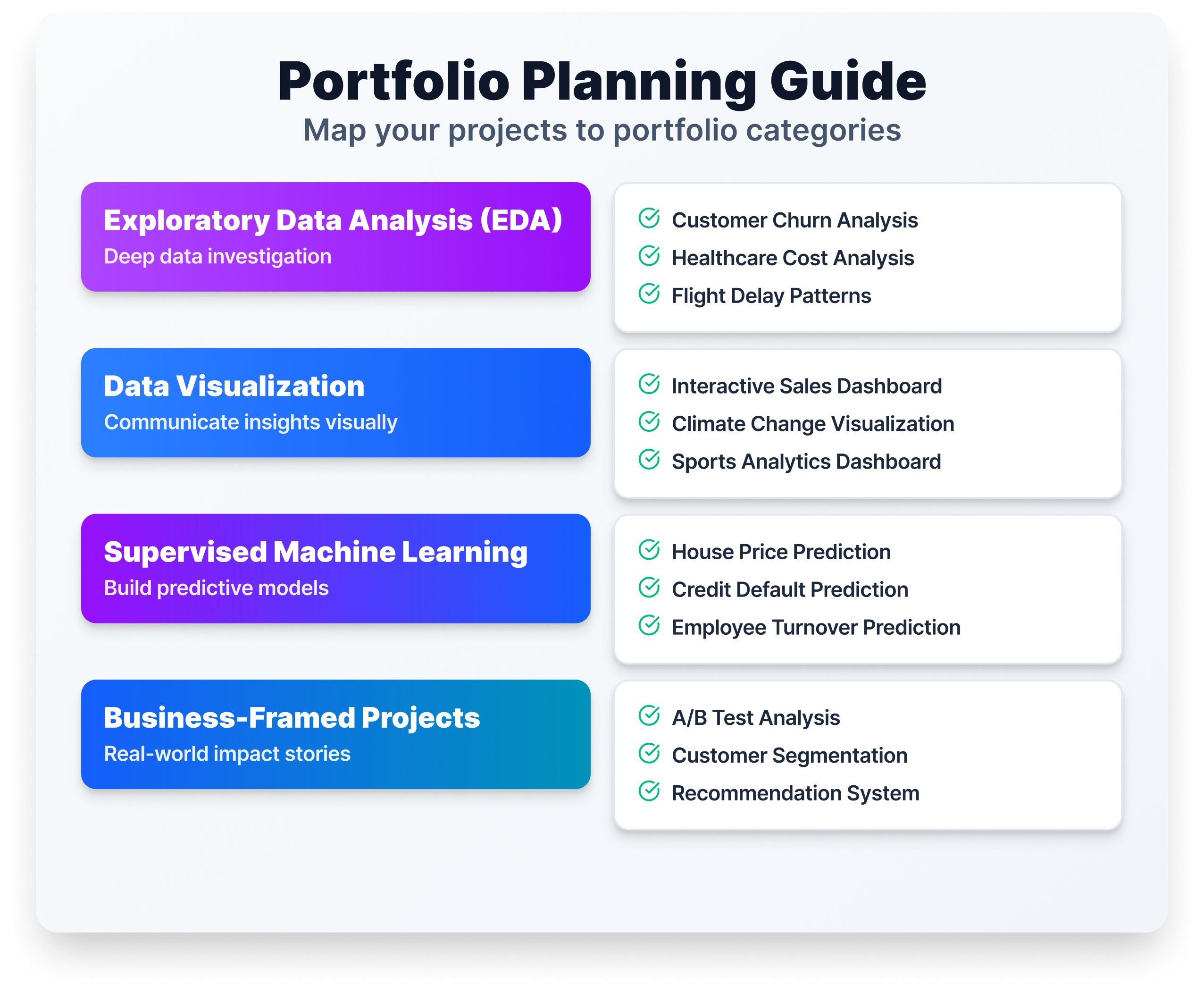
A well-rounded beginner portfolio typically includes one data cleaning and EDA project, one visualization project, one supervised learning project, and one project with a clear business framing. That covers the core skills most hiring managers evaluate in a first screen.
Our Project Recommendations for Starters
Not sure where to begin? These five projects are the best entry points, each one teaches core skills, uses real data, and produces something you can show on GitHub.
- Data Science Survey Analysis: A beginner-friendly project using real Kaggle survey data to uncover insights about data science careers and skills.
- Analyzing App Market Data: Great first project for Python fundamentals and exploratory data analysis.
- Exploring Hacker News Posts: Teaches string handling, date parsing, and working with real-world text data.
- Predicting Heart Disease: Introduces machine learning with a meaningful real-world problem.
- eBay Car Sales Data: Hands-on data cleaning with a genuinely messy dataset.
Choose one that sounds interesting and start there. You’ll learn more from finishing one project than browsing all thirty.
How to Prepare for a Data Science Job
Once you have three or more completed projects, shift focus to presenting them well. Push everything to GitHub with a clear README for each project, describe the problem, your approach, and your findings in language a non-technical hiring manager could follow.
Be selective on your resume. Your top two or three projects are more effective than listing everything you’ve touched. For each project, prepare to walk through it in an interview: what was the problem, what data did you use, what choices did you make, and what did you learn?
Job boards like Indeed, LinkedIn, and Glassdoor are useful for volume. Some of the best early-career opportunities come through communities like Kaggle, r/datascience, and the Dataquest Community, places where you can get feedback on your work and make connections before you’re actively searching.
Next Steps
A data science portfolio isn’t built in a day. But every project you finish gets you closer to the role you’re working toward ,and each one teaches you something the next employer’s problem will require.
Start with one project from the beginner list that genuinely interests you. Finish it. Document it. Push it to GitHub. Then pick the next one.
If you want structured guidance through the process, Dataquest’s Data Scientist Career Path includes guided versions of many projects on this list, with a built-in code editor, step-by-step instructions, and a community of learners working through the same material.
FAQ
Do I need to know Python before starting these projects?
For most projects on this list, yes — basic Python is the minimum.
If you’re not there yet, Dataquest’s Python Basics for Data Analysis skill path is a free starting point.
Projects 1–6 are designed for learners who know Python fundamentals but haven’t done much data work yet.
How long does a typical data science project take?
Beginner projects typically take one to two weeks at a few hours per day.
Intermediate and advanced projects usually run two to four weeks.
AI-focused projects depend on whether you’re building from scratch or using a managed API. Projects 28 and 29 can be completed in a weekend once you’re comfortable working with APIs.
How many projects do I need to get a job?
Three to five finished, well-documented projects are enough for most entry-level applications.
Quality matters more than quantity. A recruiter spending 90 seconds on your GitHub will form a faster impression from one clear, polished project than from ten incomplete ones.
Should I use Kaggle datasets or find my own data?
Both have value.
Kaggle datasets are clean, well-documented, and widely recognized, making them great for demonstrating technical skills.
Sourcing your own data shows initiative and often produces projects that stand out more.
If you’re early in your learning, start with curated datasets. Move to original data collection once you’re comfortable with the full analysis workflow.
What’s the difference between a data science project and a machine learning project?
Data science is the broader field. It includes data cleaning, exploratory analysis, visualization, and communicating findings.
Machine learning is one technique within data science.
Many strong portfolio projects don’t involve ML at all. A well-executed exploratory analysis with clear business insights can be just as compelling as a classification model.
Can I use AI tools like ChatGPT while working on these projects?
Yes. Professional data scientists use AI tools regularly.
The key is understanding what your code does, not just running it.
If you can’t explain a block of code in an interview, it won’t help you. Use AI to unblock yourself and debug faster, but make sure the thinking behind the project is yours.
from Dataquest https://ift.tt/YKvHn7t
via RiYo Analytics


No comments