https://ift.tt/9Cxz7dr Easily get deeper insights into your categorical data by using these two methods Photo by John Schnobrich on Uns...
Easily get deeper insights into your categorical data by using these two methods

When comparing the distributions of categorical data with a numerical target variable the three most used plots are generally the boxplot, violinplot and stripplot. Let’s take a look at these graphs plotted using Python’s seaborn library and analyze how we can extract more information from these plots. We’ll use a hypothetical data set about big cats and their weights, which I generated using their weight statistics from Wikipedia.
import seaborn a sns
import pandas as pd
df = pd.read_csv('big_cats.csv')
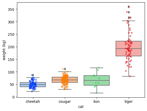
sns.boxplot(df, x='cat', y='weight (kg)')
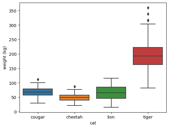
From these boxplots we can extract the following information:
- The weight of which 50% of each big cat species’ data points are (the coloured box). This is also called the Interquartile Range (IQR).
- Each big cat species’ median weight, by looking at the middle horizontal line in the IQR.
- The 25th and 75th percentile are called respectively Q1 and Q3. The lightest 25% of a big cat is up until the start of its coloured box and the heaviest 25% of a big cat is above the coloured box.
- Any outliers, which are individual big cats within a species with a weight 1.5* IQR less or more than respectively Q1 and Q3.
As most people might know, tigers are the biggest (and heaviest) of the big cats, which is clearly reflected in the plot. However, the difference between the weights of tigers and lions seems too big: more than 75% of the tigers are heavier than any lion in this data set. Something weird is going on here, but the boxplot doesn’t give us much more information. Let’s try a violinplot using sns.violinplot
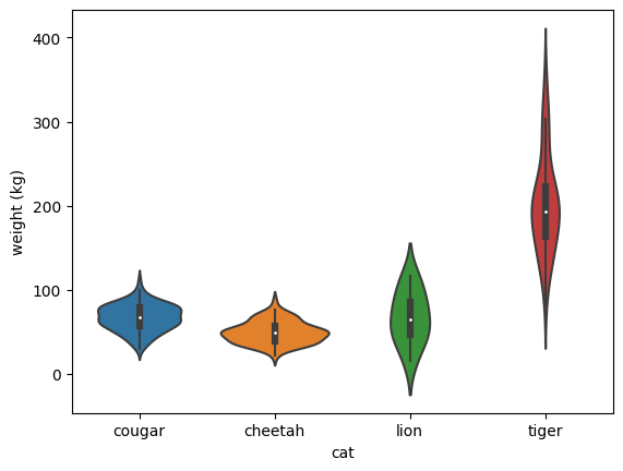
A violinplot adds a layer on top of the boxplot, in which the thickness of the violin implies the density of the data. Still, this doesn’t answer our question of why the lions in this data set are so lightweight. We can try to use one more plot: a stripplot, which plots individual data points:
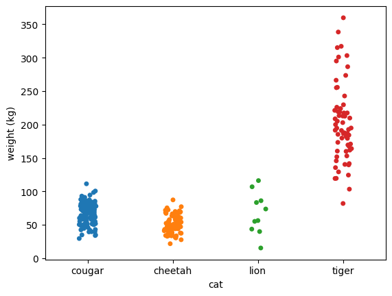
Finally, we seem to be able to hypothesize why the lion’s weights are unexpected: there are just a few data points. Perhaps all the lions in the data set are lionesses, which in general weigh less than male lions, or perhaps the few lions that are in the data set are all youngsters and not full-grown yet.
Now, of course, we could apply both a boxplot and a stripplot for every categorical variable, but this is not a very efficient solution.
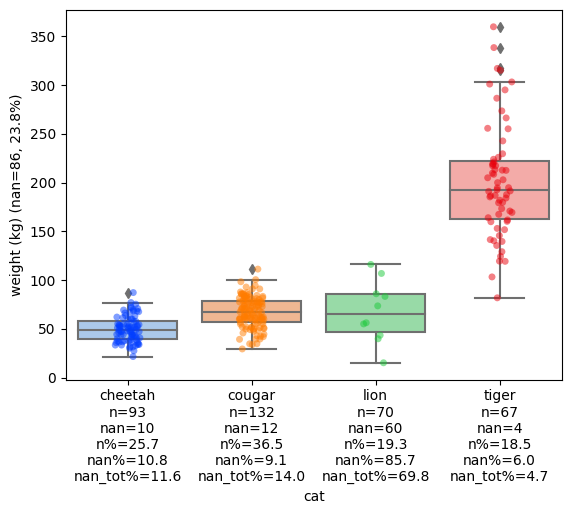
One simple solution to this problem is to use add_count_info_to_xticks from the package extra-datascience-tools and apply it to our first boxplot:
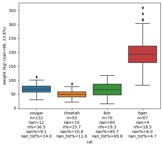
By adding the count information we can easily spot that something weird is going on with the lion data. Of the 70 observations, 60 are nan, which is 85.7%. That means that the lion’s boxplot is only based on 10 data points, which is important to take into account and which is why we needed to plot the stripplot earlier on. We can also extract other information like what amount of data points are lions (19.3%), how many of all the nan values come from lions (69.8%), and how many nan values the total data set has: 86, which is 23.8% (see the y-axis label).
Using add_count_info_to_xticks and its sibling add_count_info_to_yticks we can extract much more information from a single plot, while still choosing the plot of our preference.
Because visualizations are still nice, and perhaps a little prettier, we can also use extra-datascience-tool’s stripboxplot to create the following plot:
Using this stripboxplot we can both extract all the information a boxplot can give us, as well as a stripplot’s information about individual data points and quantities per category. Using stripboxplot ‘s count_info parameter we can even more easily add the count statistics to the graph:
import pandas as pd
from extra_ds_tools.plots import stripboxplot
df = pd.read_csv('big_cats.csv')
stripboxplot(df, x_col='cat', y_col='weight (kg)', count_info=True)
Conclusion
Boxplots, violinplots and stripplots can be very useful for comparing categorical distributions. Still, each has its own strength and weaknesses. Using a stripboxplot and/or extra count information on the axis can help to easily extract much more relevant information from a single plot than when using standard plots!
If you’re still interested in how to apply new explorative data analysis methods on categorical variables make sure to read my other article about this too:
AdvancedValueCounts: a new method to explore categorical variables
How to extract more information from categorical plots was originally published in Towards Data Science on Medium, where people are continuing the conversation by highlighting and responding to this story.
from Towards Data Science - Medium https://ift.tt/7yc5MpE
via RiYo Analytics


No comments