https://ift.tt/3n5LSH4 And why they influence the rest of your work I already showed in previous blogs that models are inherently insecure...
And why they influence the rest of your work
I already showed in previous blogs that models are inherently insecure and that it is important to nurture that insecurity. I have also already mentioned that science is fluid and that opportunities are conditional. In summary, this means that fact-checking is useless, because ‘facts’ are subservient to current knowledge and opportunities dependent on other opportunities. Classifying policy by groups is therefore only possible if you are also very clear about who those groups are. An indexation based on a single variable is therefore highly unlikely and certainly highly undesirable.
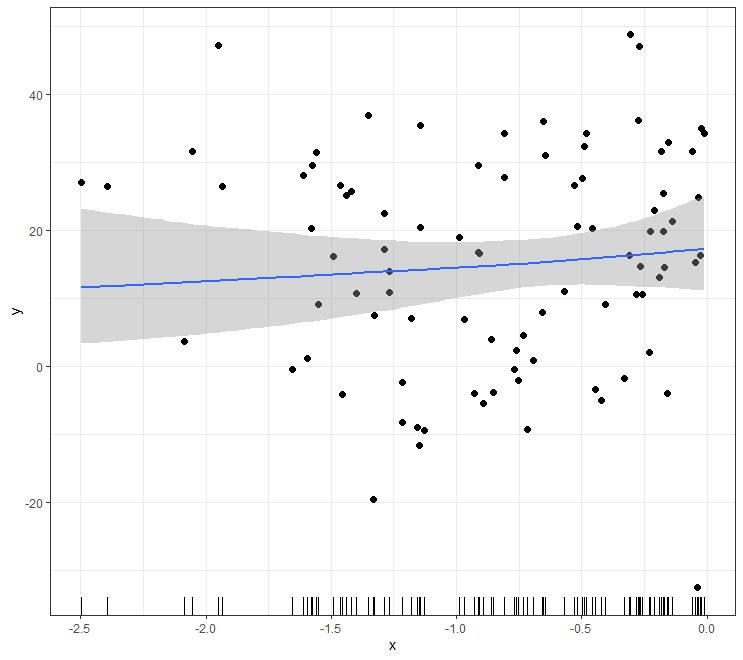
What I want to talk about today is that the last stretch isn’t the hardest when it comes to modeling. No, this is about the first steps. When you start making a model, it is important to quickly clarify what you want to model and why. Wanting to be ‘fast’ can sometimes get in the way of the process, because you keep making assumptions. It’s about how heavily you make them count, especially if there is little data available. In addition, it is not so much the amount of data that matters, but how the data was created.
Many of us start with a dataset and when we talk about the first steps we are talking about creating a first model based on a dataset. With a virus such as Covid-19, the situation is slightly different. Data comes in daily and it is precisely the goal of your model in that initial stage that determines the action. Paradoxically, it can even be the case that the uncertainty in the beginning determines the further course because the actions in response to the virus also affect that virus. For example, it is quite possible that using different initial assumptions in a model would have let to a different policy which would have led to a different course.
All of this is now spilled water under the bridge, but it is important to realize that every model is vulnerable, especially in the beginning.
Just look at the following exponential curve:
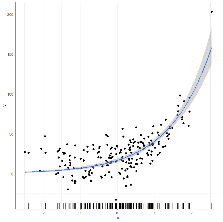
The dangerous thing about such graphs is that the data here is already quite advanced. Advanced enough to release an exponential curve (y ~ b1*(1+b2)^x). Even if you are not sure about the coefficients of the formula, the data is sufficient to find coefficients and draw out a curve. In other words, when you collect data at this stage, you have a good idea of what you are looking at.
library(brms)
library(tidyverse)
library(cmdstanr)
library(kinfitr)
library(nls.multstart)
library(nlme)
library(hrbrthemes)
library(broom)
library(viridis)
library(epifitter)
library(nls2)
library(nlstools)
library(lattice)
library(bayesrules)
library(tidyverse)
library(janitor)
library(rstanarm)
library(bayesplot)
library(tidybayes)
library(broom.mixed)
library(modelr)
library(e1071)
library(forcats)
library(grid)
library(gridExtra)
library(fitdistrplus)
library(ggpubr)
set.seed(1123)
b <- c(10, 3
x <- rnorm(200)
y <- rnorm(200, mean = b[1]*(1+(b[2])^x), sd=15)
dat1 <- data.frame(x, y)
plot(dat1$x,dat1$y)
prior1 <- prior(normal(10,30), nlpar = "b1") +
prior(normal(4, 16), nlpar = "b2")
fit1 <- brm(bf(y ~ b1*(1+b2)^x, b1 + b2 ~ 1, nl = TRUE),
data = dat1,
prior = prior1,
sample_prior = T,
chains=4,
cores = getOption("mc.cores", 8),
threads =16,
backend="cmdstanr")
summary(fit1)
plot(fit1)
plot(conditional_effects(fit1),
points = TRUE,
rug=TRUE,
theme=theme_bw()))
dat1 %>
add_fitted_draws(fit1, n = 150) %>%
ggplot(aes(x = x, y = y)) +
geom_line(aes(y = .value, group = .draw), alpha = 0.05) +
geom_point(data = dat1, size = 0.05)+theme_bw()
dat1 %>%
add_predicted_draws(fit1, ndraws = 4) %>%
ggplot(aes(x = x, y = y)) +
geom_point(color="black", alpha=0.2)+
geom_point(aes(x = x,
y = .prediction,
group = .draw, colour=((y-.prediction)))) +
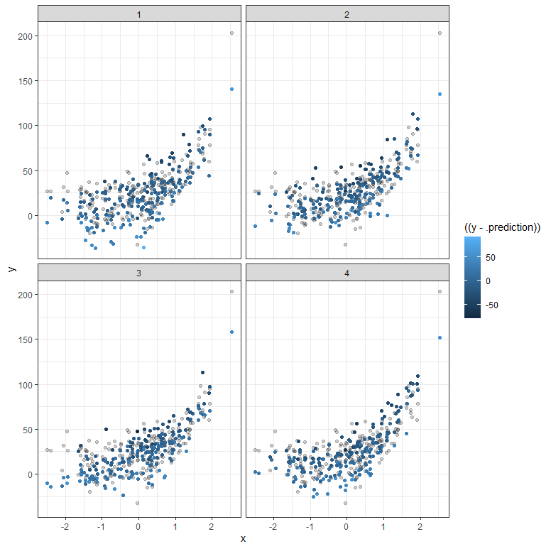
facet_wrap(~ .draw) + theme_bw()
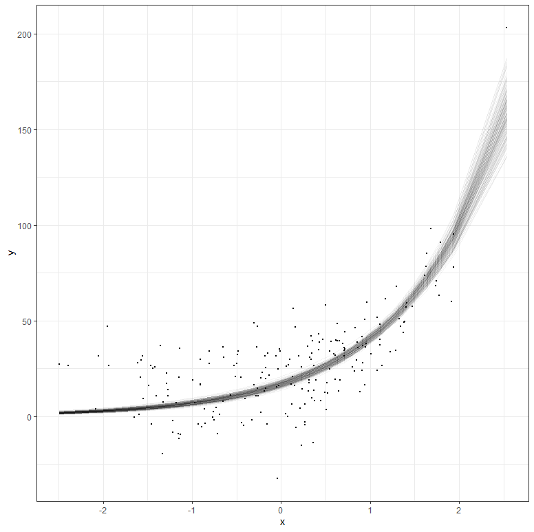
But what if your data does not extend beyond the very beginning? What if I just remove some of that data and then reparametrize the model? It’s not so hard to see that I know very little at this stage, and that when I try to extrapolate my model i will go all over the place. Since the model I made is Bayesian, the prior now takes the majority of the weight and the curve will look exponential., but it is all based on assumptions.
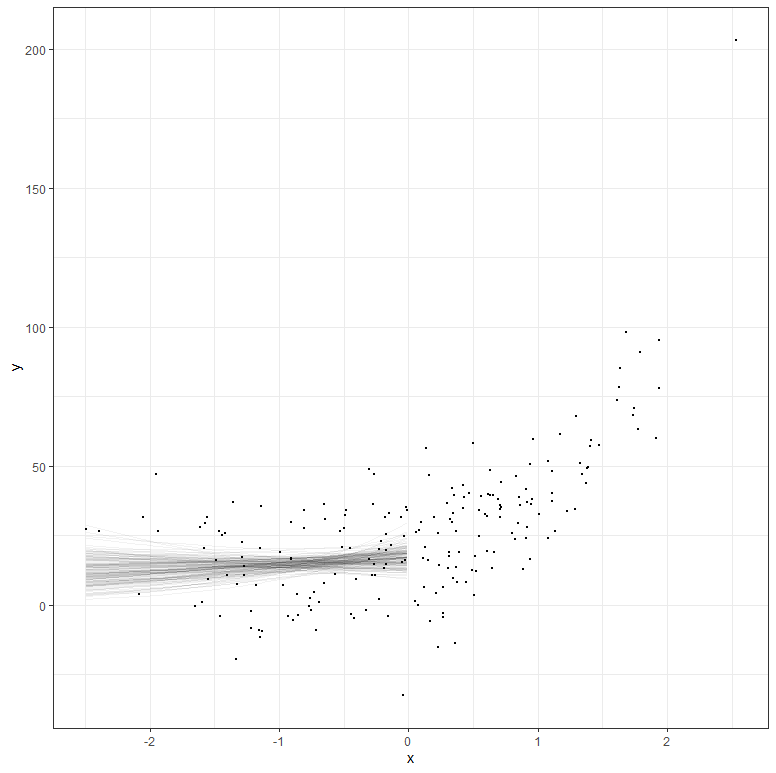
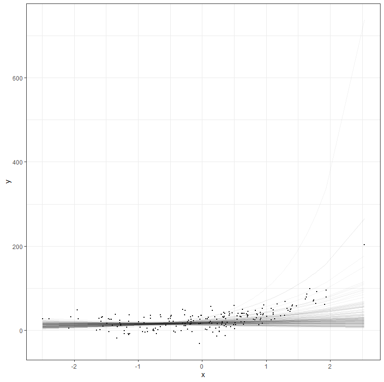
The graph above shows hypothetical trajectories, based on incomplete data, along with the entire dataset. It can go either way. There is even a prediction that is beyond imagination, which is a clear sign of the prior not connecting to the likelihood.
Another example I want to show is based on the Gompertz curve. The Gompertz formula is shown below and is used for many processes. For example, the growth of a human being can be captured in a Gompertz as well as the growth of a pig. It also helps to monitor viral infections and so below it has been used to capture the estimation of the increase in the “UK variant”. What concerns me is the model estimate, which extends far beyond what the observations coming from germination surveillance can already tell. In Bayesian terms — the prior far overrules the likelihood. This is not a problem, since data is coming in as we speak, but it does warrant continuous updating.
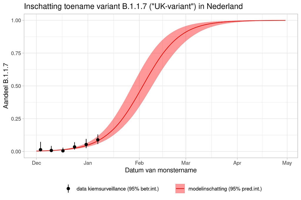
National Institute for Public Health and the Environment; Ministry of Health, Welfare and Sport.
The graph above is actually not possible from a modeling point of view because the data does not even get past the inflection point. The inflection point is the boundary between increasing growth and decreasing growth. Now it is the case that the graph very clearly says that the red curve comes from a model, but what it does not say is based on which data that model was produced. We do not know prior assumptions.
Let me simulate data to show you what I mean.
dat<-sim_gompertz(N = 10
dt = 0.5,
y0 = 0.01,
r = 0.07,
K = 1,
n = 20,
alpha = 1)
dat<-as.data.frame(dat)
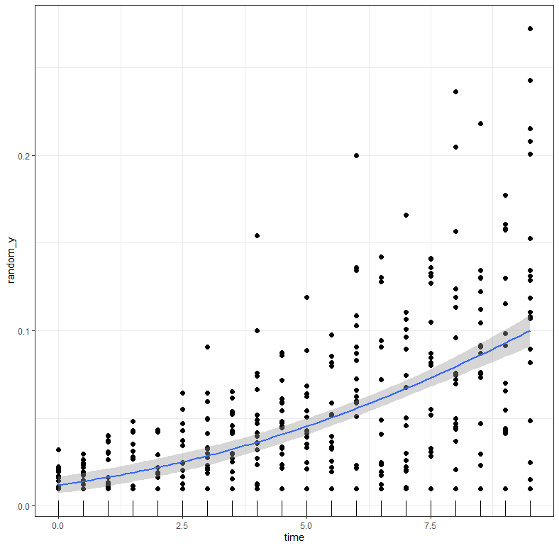
plot(dat$time, dat$random_y)
g1<-ggplot(dat, aes(x=time))+
geom_line(aes(y=y)) +
geom_point(aes(y=random_y), color="grey", alpha=0.2)+
labs(title="Gompertz Curve",
x="Total time course of the epidemic",
y="Disease Intensity")+theme_bw()
g2<-ggplot(dat, aes(x=time))+
geom_boxplot(aes(y=random_y, group=time), color="grey", alpha=0.2)+
geom_line(aes(y=y)) +
labs(title="Gompertz Curve",
x="Total time course of the epidemic",
y="Disease Intensity")+theme_bw()
g3<-ggplot(dat, aes(x=time, y=random_y))+
stat_summary(fun.data = "mean_cl_boot", colour = "black", size = 0.2)+
geom_smooth(color="red", alpha=0.5)+
labs(title="GAM model",
x="Total time course of the epidemic",
y="Disease Intensity")+theme_bw()
g4<-ggplot(dat, aes(x=time, y=random_y))+
geom_point(color="black", alpha=0.2)+
geom_smooth(aes(color=as.factor(replicates),
fill=as.factor(replicates)), alpha=0.2)+
facet_wrap(~replicates)+
labs(title="LOESS model",
x="Total time course of the epidemic",
y="Disease Intensity")+
theme_bw()+theme(legend.position = "none")
ggarrange(g1,g2,g3,g4)
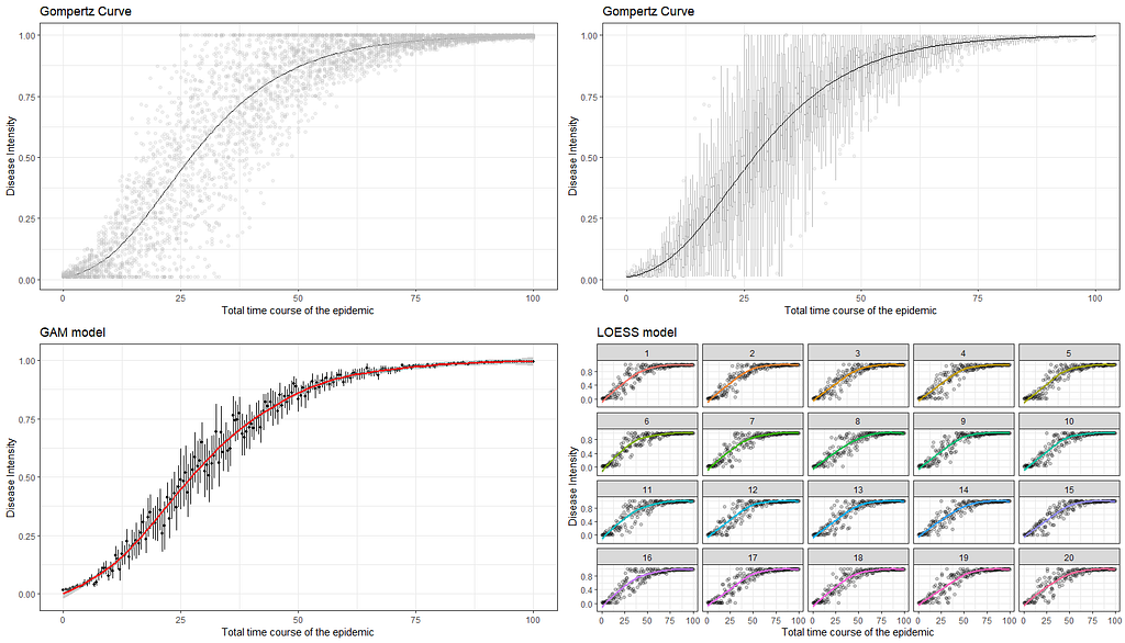
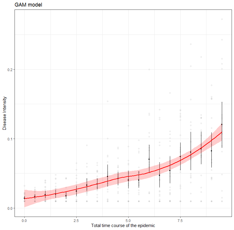
The graph at the bottom left perhaps best illustrates what I mean by models and little data. The model was not obtained on the basis of a Gompertz, but on the basis of a GAM model — a statistical model that looks at the data. If I were to chop off the data until only a very small part on the left is leftover, the GAM would not show the same curve. A non-linear model based on a Gompertz function could still do this, but the model would have to be based on a lot of assumptions. Compare it to forecasting the weather for the rest of the day while being confined in a dark room with only a slight ray of light to guide you.
dat<-sim_gompertz(N = 10
dt = 0.5,
y0 = 0.01,
r = 0.07,
K = 1,
n = 20,
alpha = 1)
dat<-as.data.frame(dat);dat$x<-dat$tim
fitgomp<-fit_nlin2(time = dat$time,
y = dat$y,
starting_par = list(y0 = 0.01, r = 0.07, K = 1),
maxiter = 1024)
fitgomp
g1<-function(x,a,b,c){
a*exp(-b*exp(-c*x))
}
g2 <- function(x, y0, ymax, k, lag){
y0+(ymax-y0)*exp(-exp(k*(lag-x)/(ymax-y0)+1))
}
g3<-function(x,n0,nI,b){
n0*exp(log(nI/n0)*(1-exp(-b*x)))
}
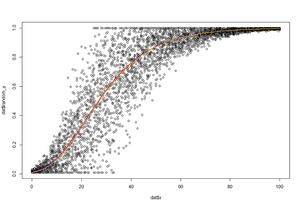
plot(dat$x, dat$random_y)
curve(g1(x, a=1, b=4.5, c=0.07), add=T, col="red", lwd=2)
curve(g2(x, y0=0.01, ymax=1, k=0.07, lag=8), add=T, col="blue", lwd=2)
curve(g3(x, n0=0.01,nI=1,b=0.07), add=T, col="orange", lwd=2)
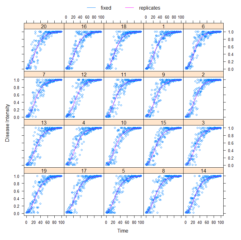
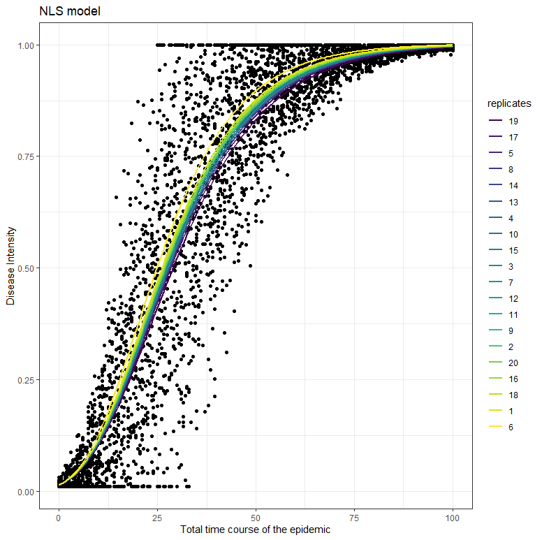
Fortunately, models can handle uncertainty well once they have collected quite a bit of data. Here I will use a specific non-linear model that is able to include sources of uncertainty. Let’s say we’ve collected data from the top 20 cities.
dat_new<-groupedData(random_y~time|replicates,
data=dat,
FUN=mean,
labels=list(x="Time", y="Disease Intensity"))
fit<-nlme(random_y~n0*exp(log(nI/n0)*(1-exp(-r*time)))
data=dat_new,
fixed=n0+nI+r~1,
random=r~1,
start=c(0.01,1,0.07),
method="ML",
control=nlmeControl(maxIter=100000, msMaxIter = 100))
plot(augPred(fit, level=0:1))
fitpreds <- dat_new %>% mutate(.fitted=predict(fit, newdata=dat_new))
ggplot(dat_new, aes(x=time, y=random_y))
geom_point() +
geom_line(data=fitpreds, aes(y=.fitted,
group=replicates,
colour=replicates),size=1) +theme_bw()+labs(title="NLS model",
x="Total time course of the epidemic",
y="Disease Intensity")
To get a little better of the uncertainty in which we model, even when we already have a lot of data, I will apply a Bayesian model on the same data.
gompprior <- c
  set_prior("beta(1, 20)",       nlpar = "n0", lb=0, ub=1),
  set_prior("gamma(1, 1)",       nlpar = "nI", lb=0, ub=1),
  set_prior("normal(0, 1)",      nlpar = "r",  lb=0),
  set_prior("normal(0.05, 0.2)", class="sigma"))
gomp_bayes <- bf(random_y ~ n0*exp(log(nI/n0)*(1-exp(-r*time))),
                             n0 + nI + r ~ 1,
                             nl = TRUE)
options(mc.cores=parallel::detectCores())
gomp_bayes_fit <- brm(
gomp_bayes,
family=gaussian(),
data = dat_new,
prior = gompprior )
plot(gomp_bayes_fit)
pairs(gomp_bayes_fit)
predtimes <- unique(dat_new$time)
gomp_bayes_fitted <- fitted(gomp_bayes_fit,
newdata=list(time = predtimes))%>%as_tibble()
gomp_bayes_pred <- predict(gomp_bayes_fit,
newdata=list(time = predtimes))%>%as_tibble()
gomp_bayes_ribbons <- tibble(
time = predtimes,
random_y=gomp_bayes_fitted$Estimate,
Estimate = gomp_bayes_fitted$Estimate,
pred_lower = gomp_bayes_pred$Q2.5,
pred_upper = gomp_bayes_pred$Q97.5,
fitted_lower = gomp_bayes_fitted$Q2.5,
fitted_upper = gomp_bayes_fitted$Q97.5)
ggplot(dat_new, aes(x=time, y=random_y)) +
geom_point(size=2, alpha=0.2) +
geom_ribbon(data=gomp_bayes_ribbons, aes(ymin=pred_lower, ymax=pred_upper),
alpha=0.2, fill=colourcodes[3]) +
geom_ribbon(data=gomp_bayes_ribbons, aes(ymin=fitted_lower, ymax=fitted_upper),
alpha=0.5, fill=colourcodes[3]) +
geom_line(data=gomp_bayes_ribbons, aes(y=Estimate), colour=colourcodes[3],
size=1) + labs(title="Bayesian model",
x="Total time course of the epidemic",
y="Disease Intensity")+
theme_bw()+theme(legend.position = "none")
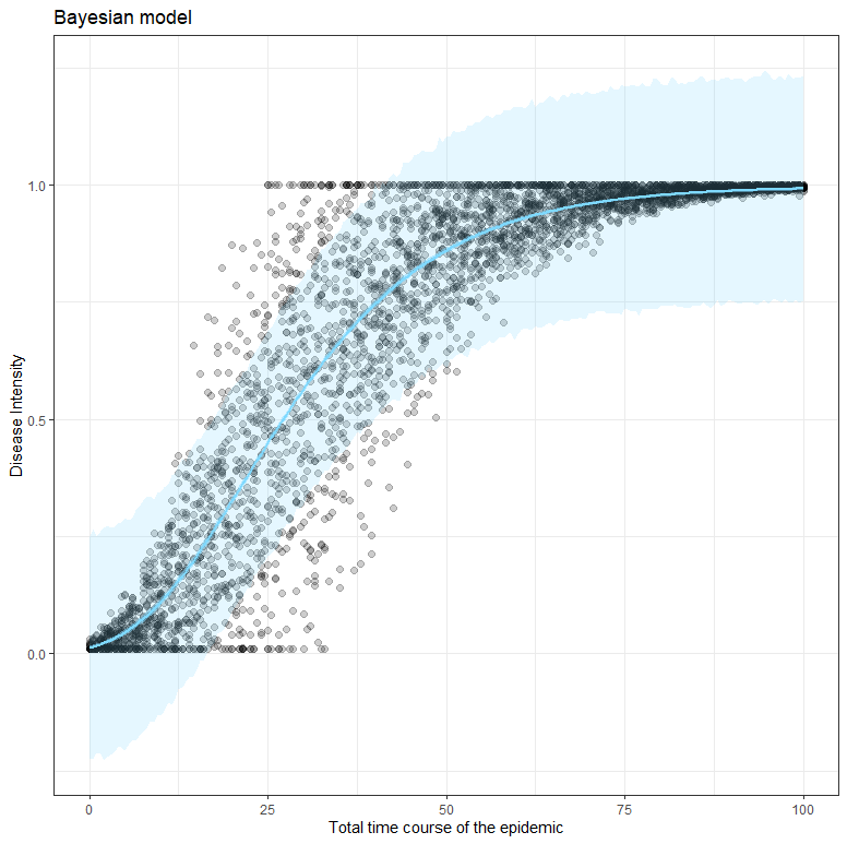
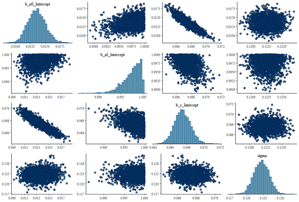
What’s good to see in the figure above here is that the blue model-line involves quite a bit of uncertainty. This is also reflected in the estimates of the individual parameters below, and in the correlation between the parameters. It is important to remember that model prediction is strongly dependent on model coefficients, and that those coefficients in turn depend on data and mutual relationships. Assumptions drive a model with few data. Once again, in Bayesian analysis, we accept such a situation.
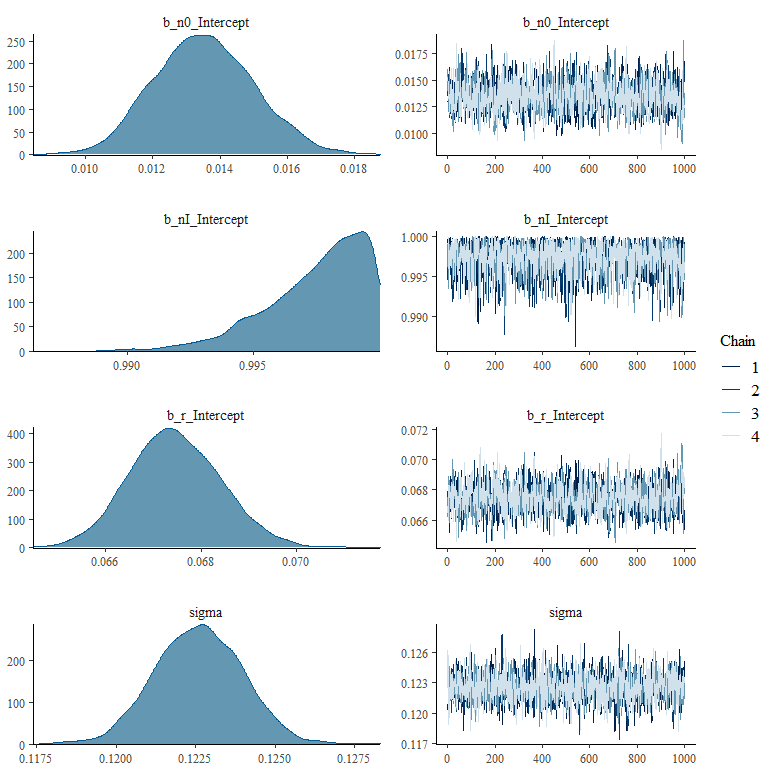
What happens if we remove some of that data, as we did before? What does it look like then? What I ask below is to strongly limit the number of days and to show a Gompertz curve with that data. I already know the parameters of that curve, so I am interested in the change of the lower and upper limit and the reproduction rate.
set.seed(1123
dat<-sim_gompertz(N = 100,
dt = 0.5,
y0 = 0.01,
r = 0.07,
K = 1,
n = 20,
alpha = 1)
dat<-as.data.frame(dat);dat$x<-dat$time
dat_new<-groupedData(random_y~time|replicates,
data=dat,
FUN=mean,
labels=list(x="Time", y="Disease Intensity"))
dat_new_1<-dat_new%>%filter(x<10)%>%mutate(random_y=replace(random_y,0,0.001))
plot(dat_new_1$x,dat_new_1$random_y)
fit<-nlme(random_y~n0*exp(log(nI/n0)*(1-exp(-r*time))),
data=dat_new_1,
fixed=n0+nI+r~1,
start=c(0.01,1,0.07),
method="ML",
control=nlmeControl(maxIter=100000, msMaxIter = 100)))
The model will not run, nor will I will be able to plot a hypothetical Gompertz curve on top of the data.
ggplot(dat_new_1, aes(x=time, y=random_y)
  geom_point(color="grey", alpha=0.2)+
  stat_summary(fun.data = "mean_cl_boot", colour = "black", size = 0.2)+
  stat_smooth(method = 'nls', formula = 'y ~ n0*exp(log(nI/n0)*(1-exp(-r*x)))',
              method.args = list(start=c(n0=0.01,nI=1,r=0.07)), se=TRUE)+
  geom_smooth(color="red",fill="red", alpha=0.2)+
  labs(title="GAM model",
       x="Total time course of the epidemic",
       y="Disease Intensity")+
  theme_bw())
Now let’s look at what happens when I try to infer the future from the model as I have it now. Make no mistake, the above red line is a model that has been trained to be placed on top of the data as neatly as possible. That’s not what nonlinear functions are normally for. Their function is to link the beginning to the end, biologically and logically. However, they need enough data to find suitable coefficients. So that’s what I want to do now, find coefficients.
set_prior("beta(1, 20)", nlpar = "n0", lb=0, ub=1),
set_prior("gamma(1, 1)", nlpar = "nI", lb=0, ub=1),
set_prior("normal(0, 1)", nlpar = "r", lb=0),
set_prior("normal(0.05, 0.2)", class="sigma"))
gomp_bayes <- bf(random_y ~ n0*exp(log(nI/n0)*(1-exp(-r*time))),
n0 + nI + r ~ 1,
nl = TRUE)
options(mc.cores=parallel::detectCores())
gomp_bayes_fit <- brm(
gomp_bayes,
family=gaussian(),
data = dat_new_1,
prior = gompprior )
summary(gomp_bayes_fit)
plot(gomp_bayes_fit)
plot(conditional_effects(gomp_bayes_fit),
points = TRUE,
rug=TRUE,
theme=theme_bw())
dat_new_1 %>%
add_fitted_draws(gomp_bayes_fit, n = 150) %>%
ggplot(aes(x = x, y = y)) +
geom_line(aes(y = .value, group = .draw), alpha = 0.05) +
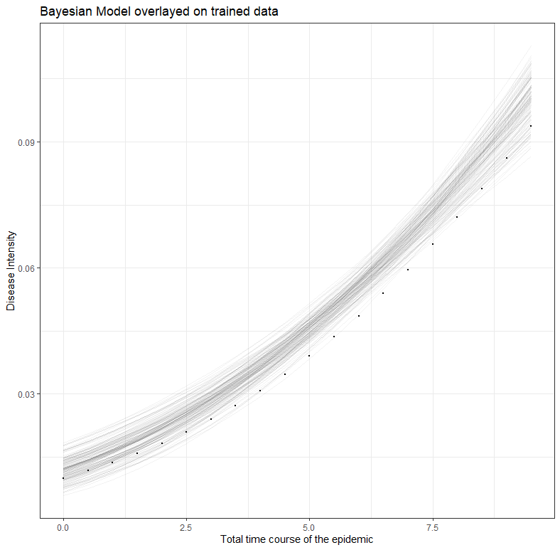
geom_point(data = dat_new_1, size = 0.05)+theme_bw()+
labs(title="Bayesian Model overlayed on trained data",
x="Total time course of the epidemic",
y="Disease Intensity")
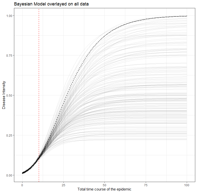
dat_new %>%
add_fitted_draws(gomp_bayes_fit, n = 150) %>%
ggplot(aes(x = x, y = y)) +
geom_vline(xintercept = 10, color="red", linetype=2)+
geom_line(aes(y = .value, group = .draw), alpha = 0.1) +
geom_point(data = dat_new, size = 0.05)+theme_bw()+
labs(title="Bayesian Model overlayed on all data",
x="Total time course of the epidemic",
y="Disease Intensity")
What is immediately noticeable is that the result provides different parameters. The reproduction value has gone from 0.07 to 0.09, and the estimated top of the line is 0.58 instead of 1.
Family: gaussian
  Links: mu = identity; sigma = identity
Formula: random_y ~ n0 * exp(log(nI/n0) * (1 - exp(-r * time)))
         n0 ~ 1
         nI ~ 1
         r ~ 1
   Data: dat_new_1 (Number of observations: 400)
  Draws: 4 chains, each with iter = 2000; warmup = 1000; thin = 1;
         total post-warmup draws = 4000


Population-Level Effects:
             Estimate Est.Error l-95% CI u-95% CI Rhat Bulk_ESS Tail_ESS
n0_Intercept     0.01      0.00     0.01     0.02 1.01      833      662
nI_Intercept     0.58      0.23     0.21     0.98 1.01      527      190
r_Intercept      0.09      0.02     0.06     0.15 1.01      496      162


Family Specific Parameters:
      Estimate Est.Error l-95% CI u-95% CI Rhat Bulk_ESS Tail_ESS
sigma     0.04      0.00     0.04     0.04 1.00     2006     1936


Draws were sampled using sampling(NUTS). For each parameter, Bulk_ESS and Tail_ESS are effective sample size measures, and Rhat is the potential scale reduction factor on split chains (at convergence, Rhat = 1).
What the table actually shows can best be explained through three visuals. First, the conditional model based on the data.
Secondly, the spectrum of possibilities based on the data.
Third, the extrapolation of the model op top of the entire data, but based on incomplete data. The red line shows where the model becomes an extrapolation. It shows how difficult it is to fit a curve based on starting points. This is only possible, via Bayes, if you are very sure about the course of the disease intensity. That’s quite some assumptions. For comparison, the figure of the Dutch National Institute for Public Health and the Environment has been added again. See the difference.
Comments (feedback) and pointing out errors are more than welcome. So is the discussion, of course!
In modelling, the first steps are the hardest was originally published in Towards Data Science on Medium, where people are continuing the conversation by highlighting and responding to this story.
from Towards Data Science - Medium https://ift.tt/34wOYNK
via RiYo Analytics


No comments