https://ift.tt/34PD8OU How to search numeric features for poor accuracy Model explainability is an area of machine learning that has incre...
How to search numeric features for poor accuracy
Model explainability is an area of machine learning that has increased in popularity over the last several years. Greater understanding leads to greater trust by stakeholders and improved generalizability. But how can you peek into the black box?
In a prior post, we covered IBM’s solution called FreaAI. In one technical sentence, FreaAI uses highest prior density methods as well as decision trees to identify areas of our data where model performance is low. After filtering for statistical significance and a few other criteria, interpretable data slices are surfaced to the engineer.
FreaAI is not open source, so in this post we will be doing a code walkthrough of highest prior density methods.
Without further ado, let’s dive in!
1 — A Dummy Example
We are looking to develop code that efficiently searches through our features and looks for areas of low accuracy. For univariate numeric data, we use Highest Prior Density (HPD).
HPD regions are dense areas of our data. According to the researchers at IBM who worked on FreaAI, high density areas are more likely to have interpretable and correctable inaccuracies. To determine these areas we…
- Approximate the probability density function (PDF).
- Find the y-value of a horizontal line that divides our PDF into α and 1-α.
Let’s slow down and take this step by step. First, we need to create some dummy data…
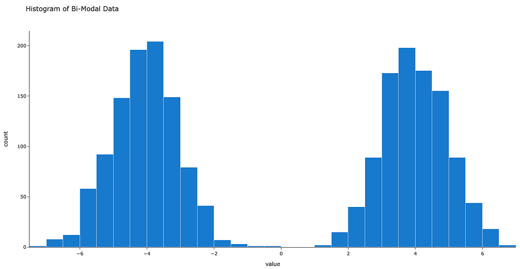
samples = np.random.normal(loc=[-4,4], size=(1000, 2)).flatten()
Now the current data are just a vector. Instead, we’d like to approximate a smooth curve that represents the density of our data at any given location. In other words, we’re looking to approximate the probability density function (PDF).
One method way estimate a probability density function is called kernel density estimation. We don’t have time to get into the details, but if you’re curious here’s an in-depth walkthrough.
In the below code we leverage a gaussian kernel to develop a smooth approximation of the above data.
import plotly.express as px
import scipy.stats.kde as kde
# 1. get upper and lower bounds on space
l = np.min(sample)
u = np.max(sample)
# 2. get x-axis values
x = np.linspace(l, u, 2000)
# 3. get kernel density estimate
density = kde.gaussian_kde(sample)
y = density.evaluate(x)
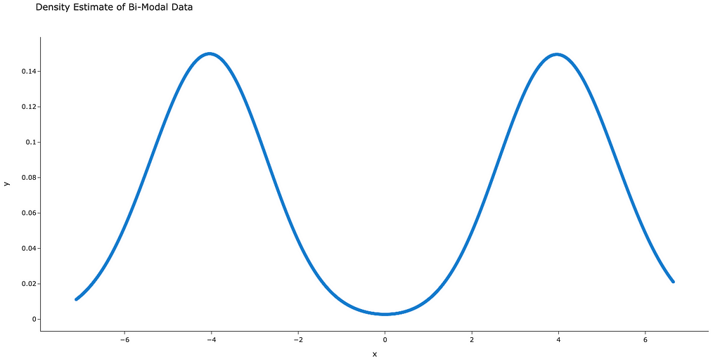
Now that we have a smooth curve that approximates the PDF (figure 3), we’re ready for step 2.
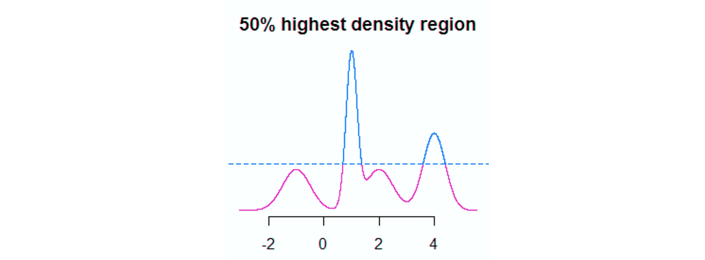
Here, we’re looking to find region of our PDF that holds p percent of our data. For example, with a p of 0.05, we would expect 5% of our data to be included in our region. The code to do this a bit verbose, so we not going to show it, but in figure 4 we can see a chart that ties all our work together.
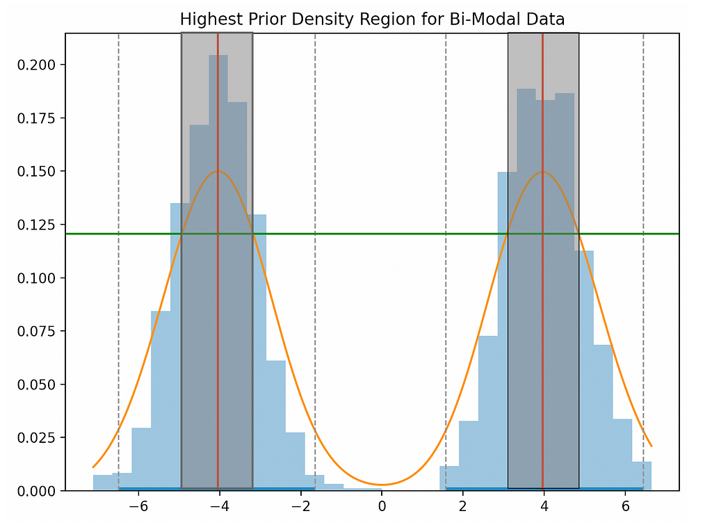
Breaking down figure 4…
- The blue boxes are a histogram of our raw data.
- The orange curve is our kernel density estimate of the PDF.
- The red vertical line is the highest density point(s) in our PDF.
- The grey boxes correspond to the x-axis region that holds 50% of our data.
- The green horizontal line is used to determine the width of the grey box — the intersection between the green and orange line is the width corresponding to 50%.
The chart looks pretty complex, but what we want to focus on is the green line and it’s relationship with the grey box. If we shift the green line down, the grey box becomes wider and thereby holds more data. Conversely, if we shift the line up, the grey region gets narrower and thereby holds less data.
FreaAI iteratively moves the green line up until there is a sufficient change in model accuracy. Each time this happens, the region (values on the x-axis) is returned to the engineer.
By doing so, we receive interpretable data slices in a very efficient manner, which scales to large dataset.
2 — Train Our Model
Now that we have an understanding of HPD methods, let’s test it out on a real model.
2.1 — Get the Data
All models need data, so let’s start there.
In this post we’ll be using a diabetes dataset which can be downloaded here. The rows correspond to people and the columns correspond to traits about those people, such as age and BMI.
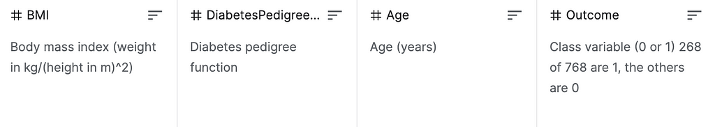
As shown in figure 5, our outcome is a binary label corresponding to whether the given individual has diabetes.
Luckily, the data are already cleaned so we simply need to read the data frame into pandas to get started…
import pandas as pd
df = pd.read_csv('DiabetesData/pima-indians-diabetes.data.csv', header=None)
2.2— Train a Model
Armed with a pandas dataframe, let’s train our black box model. The specific model we selected to fit doesn’t matter, but we’re going to use XGBoost because of its speed, out-of-the-box accuracy, and popularity.
Here’s the model training in one code block…
# split data into X and y
mask = np.array(list(df)) == 'outcome'
X = df.loc[:,~mask]
Y = df.loc[:,mask]
# split data into train and test sets
seed = 7
test_size = 0.33
X_train, X_test, y_train, y_test = train_test_split(
                                     X, Y,
                                     test_size=test_size,
                                     random_state=seed)
# fit model no training data
model = XGBClassifier()
model.fit(X_train, y_train)
# make predictions for test data
y_pred = model.predict(X_test)
predictions = [round(value) for value in y_pred]
# evaluate predictions
accuracy = accuracy_score(y_test, predictions)
print("Accuracy: %.2f%%" % (accuracy * 100.0))
# add accuracy and return
out = pd.concat([X_test, y_test], axis=1, ignore_index=True)
out.columns = list(df)
accuracy_bool = (np.array(y_test).flatten() ==
                 np.array(predictions))
out['accuracy_bool'] = accuracy_bool
out
All the steps should be pretty self-explanatory except the last one; after training the model, we return the testing data frame with an accuracy_bool column that corresponds to whether we correctly predicted the label. This is used to determine the accuracy of different data splits.
Before we move on, let’s return to our high-level goal. The XGBoost model above exhibits 71% out-of-sample accuracy, but wouldn’t it make sense that certain parts of the data show very different levels of accuracy?
Well, that’s the assumption we make — there is (probably) a systematic nature to our misclassifications.
Let’s see if we can identify any of these systematic areas.
3 — The Real Thing
As noted above, the way we leverage HPD methods is we will iteratively shift the percent of our data that we’re looking at look for “dramatic” decreases in accuracy.
For conciseness, we unfortunately can’t be super scientific and we’ll have to leave out helpers. However, the code was adapted from here.
import numpy as np
# 1. Get percents to iterate over
start, end, increment = 0.5, 0.95, 0.05
percents = np.arange(start, end, increment)[::-1]
# 2. Create prior vars
prior_indices = {}
prior_acc = None
prior_p = None
for p in percents:
  # 3. run HDP and get indices of data in percent
  *_, indices = hpd_grid(col, percent=p)
  # 4. Calculate accuracy
  acc = get_accuracy(indices)
  # 5. Save if accuracy increases by > 0.01
  if prior_acc is not None and acc - prior_acc > 0.01:
    out[f'{p}-{prior_p}'] = (prior_indices - set(indices), acc - prior_acc)
  # 6. Reset
  prior_indices = set(indices)
  prior_acc = acc
  prior_p = p
And does it work? Well, the code is pretty janky (which is why it’s not linked), but we did see that 5 of our 8 predictor columns had low-accuracy areas. Some quick hitters…
- The columns without inaccuracies were skin_thickness, bmi, diabetes_pedigree
- Accuracy drops ranged from 1.00–3.18%
- As many as 4 percent shifts showed decreased accuracy
To give a little more context, here’s the output for the column insulin.
60-65%
> indices: {65, 129, 131, 226, 137, 170, 46, 81, 52, 26, 155}
> accuracy drop: 0.017309115
65-70%
> indices: {33, 67, 134, 8, 76, 143, 175}
> accuracy drop: 0.015932642
80-85%
> indices: {193, 98, 35, 196, 109, 142, 176, 210, 21, 86}
> accuracy drop: 0.010059552
Now that we know what indices returned dramatic changes in accuracy, we can do some exploratory analysis and try and diagnose the problem.
Finally, if you want to explore the raw highest prior density function, it is shown below. Note that it was quickly adapted from this repo and needs more work before it can be productionized.
Next week I plan to publish the full code with decision tree logic. Stay tuned!
Thanks for reading! I’ll be writing 20 more posts that bring academic research to the DS industry. Check out my comment for links to the main source for this post and some useful resources.
Highest Prior Density Estimation for Diagnosing Black Box Performance — Part 1 was originally published in Towards Data Science on Medium, where people are continuing the conversation by highlighting and responding to this story.
from Towards Data Science - Medium https://ift.tt/3nqX9BU
via RiYo Analytics


No comments