https://ift.tt/3FIuiQg Here’s my story about using Data Analysis & Visualization to prove my husband wrong My husband and I have had a...
Here’s my story about using Data Analysis & Visualization to prove my husband wrong
My husband and I have had an on-going debate on his expenditures at Philz Coffee ever since we got married. Don’t get me wrong, Philz Coffee is pretty awesome, but our on-going debates needed to be resolved. To settle this debate, I turned to the data.
First I had to obtain my husband’s Philz Coffee App usage data through the Philz Coffee App (with his permission of course!). Under the California Consumer Privacy Act, Californians can request the data that is being collected when using mobile applications. After the data was requested, it took about 30 days to return the request with the dataset. The dataset that was returned had user data from May 2018 to October 2021.
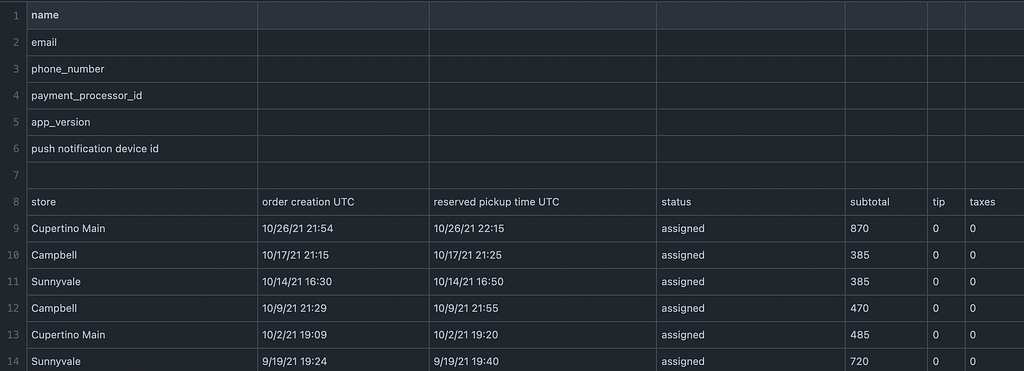
I then loaded the dataset into R-studio to see what kind of information the app collects when a user places a coffee order via the app. The types of information collected through the application include Store Location, Order Time/Date, Pickup Time/Date, and Total Transaction Amount. The dataset also included two separate columns for Tax and Tip, but these columns returned 0’s and the tax and tip value was already included in the Total Transaction Amount.
I also thought to analyze the average amount of time my husband waited for his coffee by store location using the Order Time/Date and the Pick Up Time/Date columns. However, this proved to be difficult as the app allows for a pick up time to be set for a much later time in the future. For example, an order can be placed at 8:00am for pick up at 10:00am. This will show as a two hour “wait time” between the order time and the pick up time, which does not necessarily reflect an accurate “wait time” for an order. So, I decided to exclude these columns from this analysis.
I first started by installing several packages to perform data cleaning, including ‘tidyr’, ‘dyplr’ and ‘tidyverse’.
### INSTALL PACKAGES AND LOAD LIBRARIES
install.packages("readr")
library(readr)
install.packages("tidyverse")
library(tidyverse)
install.packages("dplyr")
library(dplyr)
install.packages("tidyr")
library(tidyr)
I dropped rows that were not pertinent to the analysis plan or were empty, renamed column headers to be more descriptive of the content in the column, and removed any rows that contained missing values. I also reformatted character columns that had numeric values into a numeric column.
# Drop row 1 through 6 and 116
df <- (df %>% slice(-c(0:6,121)))
# Rename column headers
colnames(df) <- (c("Store", "OrderCreationDate", "ReservedPickUpTime","Status","Subtotal", "Tip", "Taxes"))
# Drop first row with column names and relabel column headers with column names
df <- (df %>% slice(-c(1)))
# Remove rows with missing values
df <- na.omit(df)
# Change variable from character to numeric
df$Subtotal <- as.numeric(df$Subtotal)
For the purposes of this project, I relied heavily on the Store Location column, the Total Expenditure Column, and the Order Date column. In the raw dataset, the date and time information were stored in one cell. I split this data into two separate columns, one with the date and another with the time stamp. I did this because I would not be relying on the time information for the purposes of this analysis for the reasons stated earlier.
# Split date and time into two columns
df$OrderCreationDate <- data.frame(do.call("rbind", strsplit(as.character(df$OrderCreationDate),' ', 2)))
I also created a new column to associate each store location with its respective zip code. This additional column will contribute to mapping the store locations geographically to visualize the data on a map.
Lastly, I pulled the cleaned dataset into Google Data Studio to create a dashboard to visualize the data. The dashboard features drill down capabilities that allow users to slice and dice the data by location or date. The full interactive dashboard can be found here.
One of the key findings that came out of this project was that from January 1, 2021- October 26, 2021, my husband spent $523.95 at Philz Coffee. The data confirmed that Philz Cupertino Main Street is the preferred location to chill with Philz.
This started out as a debate around my husband’s Philz expenditures and my motivation to prove him wrong. But turned into a fun data analysis and visualization project. Since he is going to continue to be a Philz regular, I hope to gather enough data points to build prediction models on his future behavior. That piece is to be continued…
To see my raw dataset, Rstudio code, and cleaned dataset, see my Philz Coffee Data repo on GitHub.
How Much Do You Really Spend On Coffee? was originally published in Towards Data Science on Medium, where people are continuing the conversation by highlighting and responding to this story.
from Towards Data Science - Medium https://ift.tt/30SF8DQ
via RiYo Analytics


ليست هناك تعليقات