https://ift.tt/3288oY5 Performing a predictive maintenance task only using interactive visualization techniques Photo by Jonathan Borba ...
Performing a predictive maintenance task only using interactive visualization techniques

Working as Data scientists, we all know that we spend most of our time in exploratory data analysis, data cleaning, and preprocessing. Often, developing Machine Learning, doing all the training, validation, and testing stuff are less of the work. Some ML-Models perform better than others, you play around with some parameters and you end up with better or worse results. But usually, you will end up quite fast in finding a model that works well on the data.
Therefore, the question is how to speed up the initial exploratory data analysis step. Since this step involves lots of interactive work one possible solution is to work with so-called no-code or low-code libraries. Using these libraries allows you to quickly check your data set with strongly reduced or even without the need to code. In other words, you can completely concentrate on the creative work for analyzing the data set.
Within Python, several low-code/no-code libraries have already come to the market, while in this article, we will focus on Lux.
Lux promotes itself as being a Python library, that automates the visualization and data analysis process while working on Pandas DataFrames. Therefore, Lux automatically proposes to highlight interesting trends and patterns in the underlying dataset.
The use case
There are already several tutorials available on the net that use Lux for data analysis. Still, most of the tutorials work on smaller data sets with the focus to give a general introduction to Lux. Therefore, in this article, we will try to get some insights into larger data coming from the production area.
The dataset has been introduced in 2020 at the AI4I conference within this paper and afterwards has been uploaded to the UCI Machine Learning Repository. It is freely available and can be downloaded following this link.
In summary, the data set describes a simulation of a production plant consisting of 10 000 data points and 14 features. For our task the following columns are of interest:
- type: This column consists of the letters L, M and H. L stands for low (50% of all products), M for medium (30%) and H for a high (20%) product quality variant.
- air temperature [K]: Generated from a random walk and around 300 Kelvin
- process temperature [K]: Generated through a random walk and added to the air temperature plus 10 Kelvin
- rotational speed [rpm]: Calculated using a power of 2860 W and overlaid with a normally distributed noise
- torque [Nm]: Normally distributed values around 40 Nm
- tool wear [min]: For the quality variants, H/M/L 5/3/2 minutes are added of tool wear to the used tool in the process.
- machine failure: Label that indicates, whether the machine has failed or not.
The dataset consists of even more information, e.g. giving details on why the machine failed. But since we don’t want to figure that out, the other columns will be neglected. In summary, the goal for the use case can be summarized as follows
Find some possible reason why the machine failed by using interactive visualizations from the Lux library
A quick survey on other libraries
As mentioned in the introduction, there are several low-code/no-code libraries available in Python. Here is just a quick review of some others:
- Bamboolib: Is a GUI that works on pandas DataFrames and can be easily integrated into Jupyter notebooks. It is quite interactive to visualize and analyze data sets. Unfortunately, it is not open source and the free version only gives you access to a limited number of features.
- Mito: Adds some sort of an Excel Spreadsheet to your Jupyter notebook. The changes you make in the spreadsheet are translated into python code. This is especially interesting for Citizen Data Scientists since they can perform their data analysis in a familiar environment
- PyCaret: This is less about exploratory data analysis, but provides a low-code ML-library. It is especially suited for people new to data science, as you can solve complete ML tasks with very few lines of code
Setting up Lux
Let’s get started. First of all, we need to install the needed libraries Lux and Pandas. To install both libraries, simply use PyPI and the following commands in the command prompt and type
pip install lux-api
pip install pandas
Furthermore, to activate LUX as a Jupyter notebook extension, type the following two commands in the command prompt. Note, maybe you need to restart the Jupyter kernel
jupyter nbextension install --py luxwidget
jupyter nbextension enable --py luxwidget
Next, within your Jupyter notebook import the two libraries and load the original dataset from the UCI repository. After loading the .csv file, you should see a button writing “Toggle Pandas/LUX” on it. And of course an excerpt of your dataframe.
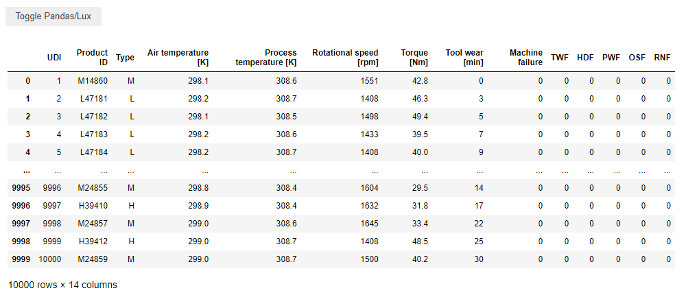
First of all, we drop the columns not needed to fulfil the task. Additionally, we need to rename the remaining columns. Lux shows difficulties for distribution plots if square brackets are included in column names. Hence, they need to be replaced with round brackets. Note the article was written with Lux version 0.4.0. Maybe this problem won’t persist in a future version.
Finally, check the results with Lux (within the Jupyter notebook, just click the toggle button). The plot should look like this:
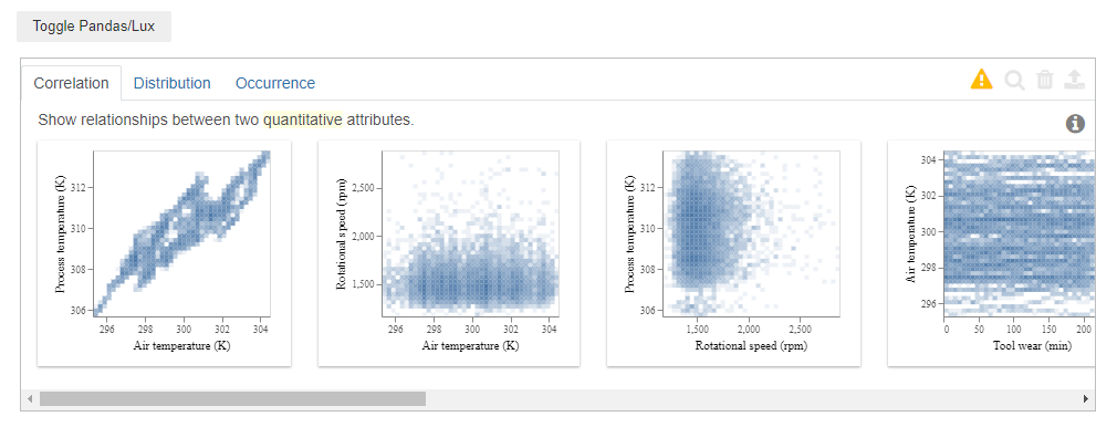
Let’s see what we have behind the tabs:
- Correlation: There are 10 scatter plots showing the behaviour of the different process values. Air temperature and process temperature show a more or less linear behaviour. The last plot shows that there is a nonlinear behaviour between torque and rational speed.
- Distribution: This shows for each of the process variables the distribution in form of a histogram.
- Occurrence: Flux automatically separates quantitative and categorical variables from each other. In the dataframe there are two categorical attributes, namely the machine failure and the type. Furthermore, we moving over the bars, you can get the information that 9661 times the production ran normally and 339 times there was a machine failure
One great feature: The Attribute of intent
Until now, this was not that impressive, but the library provides a nice feature called the attribute of intent. It is possible to select one (or even several) columns that will be highlighted in the plots.
In our case, with just one line of code, it is possible to check how the machine behaved for the different quality types. Therefore, simply type
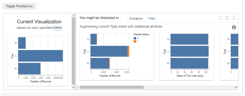
That’s quite interesting. Especially the second plot. Within the three types with “H” high, “L” low and “M” medium quality, now Lux also marks if there was a machine failure or not. By clicking the “Filter” tab, there is even a more detailed view of it. By hovering over the bar chart (to do this, download the jupyter notebook) , Lux only gives us the number of records, but it is quite straightforward to calculate the failure rate. The result is:
- M: 83/2914 = 0,028
- L: 235/5765 = 0,04
- H: 21/982 = 0,021
Hence: Products with low-quality yield the highest machine failure rate. Finally, let’s check if it is possible to figure out a reason that leads to machine failures. Keep in mind, that that’s the actual goal we wanted to achieve in the beginning. Let’s set the attribute of intent to “Machine Failure” and check the results.
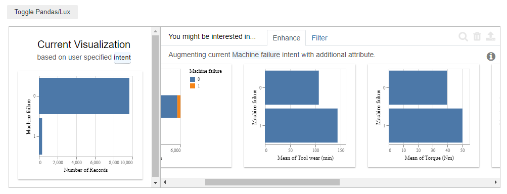
Lux tells us how the mean values of the process variables behaved if a machine failure existed and if not.
Checking the results, two variables stand out, namely the “Tool wear” and the “Torque”. Both variables have a higher value if there’s a machine failure.
Let’s investigate the Torque further. Therefore, mark the plot and click on the magnifying glass on the upper right.

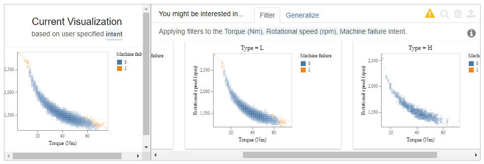
Now, we get the scatter plots of all variables, with an additional mark if there was a machine failure or not. Scrolling to “Torque” against “Rotational speed”, gives us a clear picture. There is a machine failure if the machine is running with low torque and a high rotational speed, or when having a high torque and low rotational speed.
Finally, select this scatter plot and click on the magnifying glass. Again, the results are quite interesting. As additional information, the data is separated into the three product qualities. By comparing the plots we see that products with high quality were rarely produced with a rotational speed larger than 2.500 and a torque larger than 60 NM. Hence, high-quality products do rarely lead to machine failures.
Conclusion
This article should give an introduction to the Lux library and evaluate if it is possible to analyze production data. Keep in mind, that this article only scratched the surface of the possibilities the library is offering.
For me, several things were interesting:
- It is impressive how few lines of code are needed. Furthermore, it is not complicated to understand them
- It is impressive that almost no statistical knowledge is required. You need to have a basic understanding of scatter plots and histograms, but that’s it.
- No ML/AI was needed to find one of the reasons for machine failures. Keep in mind, that this is a common result when analyzing production data. A sharp look at the production data with some domain knowledge is often enough to get new insights into the data.
- Finally, the most impressive thing was how quickly and intuitive it was to navigate through the dataset. By not having to write code, it is possible to focus on the main task, analyze the process data and gain new insights.
If you are interested, you can download the Jupyter notebook with the used data set by following this link
Analyzing Production Data with Python’s LUX library was originally published in Towards Data Science on Medium, where people are continuing the conversation by highlighting and responding to this story.
from Towards Data Science - Medium https://ift.tt/3kKXqhs
via RiYo Analytics


No comments