https://ift.tt/0PiD3RQ What I learned after running AB tests for one year as a data scientist — Part 1/2 Set up your A/B tests like a data...
What I learned after running AB tests for one year as a data scientist — Part 1/2
Set up your A/B tests like a data scientist by following these simple steps

A big part of what data scientists do is measuring differences. More specifically, comparing different versions of a product or service and determining which performs better. This is done through randomized controlled trials (RCT) or its more fancy business name of A/B testing.
The idea is very simple. We want to improve a specific KPI, like the conversion rate on the checkout page. We then assume that a certain change might positively affect our KPI of interest. For example, we might want to test changing the color of the checkout button from grey to green. We then randomly assign half of the visitors in the checkout page to see the current version (grey button) and the other half to see the new version (green button). The proper terminology for the current and new versions are control and treatment, respectively. As data scientists, our job is to measure the difference in conversion rate between the two versions and determine if it is statistically significant or due to luck (random variation).
In this series, I will take you through the entire journey of an A/B test, from designing the experiment to analyzing and presenting the results. The case study is designed to simulate the types of challenges that occur when conducting an A/B test in a real-world environment but also cover the key questions that pop up in data science interviews. The guide will be structured in two parts as follows:
Part 1
- The Idea: Overview of the business case study
- Designing the Test: Selecting the population and KPIs of interest
- Pre-Test Analysis: Estimating sample size using power and simulations
Part 2: AB Test Analysis (coming soon)
- EDA: Sanity checks, time series visualizations
- Analyzing the results of the experiment: P-values, confidence intervals, bootstrapping, etc.
1. The Idea

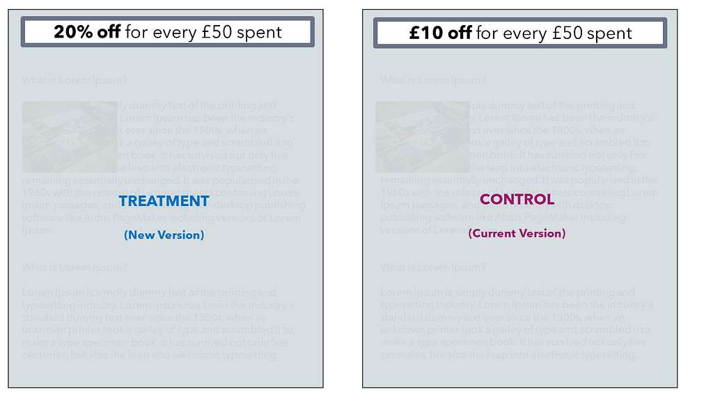
For our case study, let’s imagine an e-commerce retailer selling Brazilian coffee beans in the UK. Every Friday, the company offers £10 off for every £50 spent. One of the product managers has been trying to improve the performance of the promotion and, through research, came up with an idea. If we changed the copy of the offer to be a percentage discount, it would be 20% off for every £50 spent. The train of thought was that 20 is higher than 10, so customers might perceive the same offer as being of higher value (even though 20% and £10 off are the same deal).
This is where our protagonist appears. Being very excited about the idea, the product manager schedules a call with one of the data scientists in the company and walks him through the idea. Our data scientist is no stranger to the idea of A/B testing as he had to help business stakeholders make such decisions numerous times in the past. And so our journey begins.
2. Designing the Test

Population of Interest
Before proceeding any further, it is important to clearly define our experiment’s population of interest. For our example, that would be anyone that will visit the website on a Friday (i.e., when the offer is live). This is an important distinction. If a user visited the site on Monday, for example, there would be no purpose in adding them to the experiment as they would not be affected by the change of the offer.
Following that logic, you might also ask whether it is appropriate to include all visitors on a Friday. The offer may not be present on all pages, so only those that visited a page with the offer displayed should be included. You would be correct. For our case study, we assume that the offer is a banner on top of every page on the website (as shown below) to simplify things.
Selecting KPIs of Interest
Whether the idea for the experiment came from the CEO or a junior analyst, the need for a clear definition of the KPIs of interest is always present. But why is that the case? Why can’t we run the experiment and then look at all possible metrics that could be influenced?
Besides compromising efficiency, there is another reason for defining our KPIs before we start the test. In order to estimate (key word) the needed sample size for making accurate inferences, we must also know the variance of our KPIs. A more volatile metric, like average spent, will likely be skewed and have higher variance and outliers and so would require a much higher sample size compared to a symmetrical normally distributed metric.
Okay, so let’s get down to business. For our experiment, we are interested in two KPIs. Both are at the visitor level and are reasonably linked with the effect we expect from the new version. More visitors redeeming the offer (so higher ATPV) without decreasing their overall spending (higher ARPV or at least no harm to ARPV).
Average Revenue per Visitor (ARPV): Total Revenue / Total No. of Visitors
Average Transactions per Visitor (ATPV): Total Transactions / Total No. of Visitors
Time Windows
You might have noticed that Friday is not in the formula of either metric. This is because we don’t care about increasing visitors’ spending on a Friday if that cannibalizes sales from other days of the week, thus leading to the same weekly or monthly spent. What we really care about is incrementally increasing their overall transactions and spending on a set time window.
Since most companies report their key KPIs monthly, we will also report our two KPIs on a 28-day window (other companies might operate on a weekly or bi-weekly basis and so 7-day or 14-day KPIs might be more appropriate):
- Each visitor enters the experiment on the first Friday they visit the site after the test is live. That would be their day 1
- We then gather data on the next 27 days, and we have our 28-day kpis for each visitor
- So 28-day ARPV would be the total revenue in the 28 days after the visitor entered the test, divided by the number of visitors that entered the test at least 28 days ago (not all visitors, as we want to give everyone the same time window of opportunity for purchasing)
- The 28-day window also ensures there is no novelty effect (visitors being initially hyped with a change, but that quickly fades out after one week or two)
These are all very important points to cover in an interview. Demonstrate your understanding of the population and which part of the funnel users enter the test (is it all pages or specific pages). Finally, always tie it together with the business needs. Explain the importance of clearly communicating with stakeholders the need for defining the KPIs and how you have designed your experiment in a way that primed it to be an asset!
3. Pre-Test Analysis

This is where the exciting part starts. Our main goal in this part of the pipeline is to estimate the needed sample size to accurately make inferences on our two KPIs. This part is known as power analysis. Power analysis allows us to estimate the required sample size, given the following three quantities:
- Effect size
- Significance level = P(Type I error) = probability of finding an effect that is not there
- Power = 1 — P(Type II error) = probability of finding an effect that is there
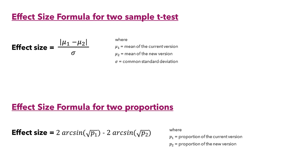
We will set the significance level to 5% and power to 80% (we will cover these concepts in more detail in Part 2). Then we only need to compute the effect size to get our required sample size. Fortunately, Cohen 1988 has equipped us with the formulas to calculate effect size when comparing two means (I have also added the formula for proportions as it is an often selected KPI like payer rate, etc.).
But we are still not out of the woods just yet. We need to figure out the mean for the current and new version and their standard deviation. Since we do not know how our KPIs will perform in the future, we can look at historical data to find these numbers (as our best guess of what we expect them to be when the test goes live). So we will go back two months and pretend we started the experiment then. We will then compute the 28-day ARPV and 28-day ATPV. That yielded data for 20000 visitors (those who have been in the test for at least 28 days).
##########################################
# Load Libraries
##########################################
library("ggplot2")
library("dplyr")
library("scales")
library("patchwork")


#############
# ARPV
#############
# Plot
revenue_plot <-
  dataset %>%
  ggplot(aes(revenue)) +
  geom_histogram(fill ="turquoise3", colour = "white", binwidth = 2, boundary = 0) +
  scale_x_continuous(breaks = seq(0, max(dataset$revenue), 14) ) +
  ylab("No of Visitors") +
  xlab("28-day Revenue (each bar is £2)") +
  ggtitle("Histogram of 28-day Revenue") +
  theme_classic()

# Statistics
dataset %>% select(revenue) %>% summary()
dataset %>% summarise(sqr_rt = sd(revenue))


#############
# ATPV
#############
# Plot
transactions_plot <-
  dataset %>%
  ggplot(aes(x = transactions)) +
  geom_bar(fill ="turquoise3", colour = "white") +
  scale_x_continuous(breaks = seq(0, max(dataset$transactions), 1) ) +
  ylab("No of Visitors") +
  xlab("28-day Transactions") +
  ggtitle("Histogram of 28-day Transactions") +
  theme_classic()

# Statistics
dataset %>% select(transactions) %>% summary()
dataset %>% summarise(sqr_rt = sd(transactions))


#################
# Output plot
#################
revenue_plot + transactions_plot
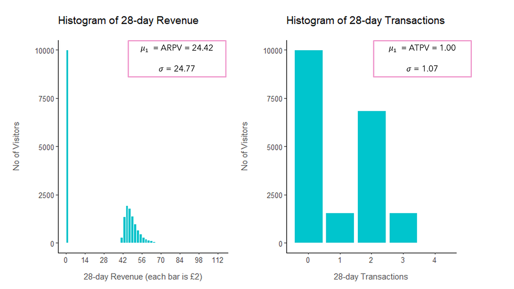
From that data, we can initially get a better idea of the distribution of our two KPIs — as you can see from the plots above, half of the users (10000) did not make any purchases in the 28-day window (0 revenue and transactions). We can also compute the mean for the current version (ARPV and ATPV) and the standard deviation for our effect size formulas. However, we are still missing the value for the mean for the new version. Of course, this is unknown as we do not have any data on how the new version will perform. However, we can declare the minimum detectable effect (MDE) we are interested in measuring, which in our case will be a 5% difference. We can then compute the new version mean as the current version increased by 5%.
##########################################
# Load Libraries
##########################################
library("pwr")


##########################################
# Cohen's power for ARPV
##########################################
std_arpv <- dataset %>% summarise(std = sd(revenue))
arpv_current_vers <- dataset %>% summarise(avg = mean(revenue))
arpv_new_vers <- arpv_current_vers * 1.05
effect_size_arpv <- as.numeric(abs(arpv_current_vers - arpv_new_vers)/std_arpv)

pwr_results_arpv <- pwr.t.test(
  d = effect_size_arpv,
  sig.level = 0.05,
  power = 0.8,
  type = c("two.sample")
  )
plot(pwr_results_arpv)
pwr_results_arpv


##########################################
#Cohen's power for ATPV
##########################################
std_atpv <- dataset %>% summarise(std = sd(transactions))
atpv_current_vers <- dataset %>% summarise(avg = mean(transactions))
atpv_new_vers <- atpv_current_vers * 1.05
effect_size_atpv <- as.numeric(abs(atpv_current_vers - atpv_new_vers)/std_atpv)

pwr_results_atpv <- pwr.t.test(
  d = effect_size_atpv,
  sig.level = 0.05,
  power = 0.8,
  type = c("two.sample")
  )
plot(pwr_results_atpv)
pwr_results_atpv
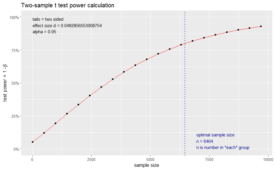
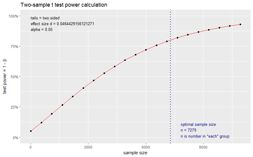
Looking at the above, we have an estimate of 6464 and 7279 as the sample size for ARPV and ATPV. These estimates refer to the sample size for control and treatment separately, so in total, we need approximately a sample of 14000 visitors.
The curious reader might have noticed that power calculations are based on the assumption we will use the two-sample t-test for our analysis and works backward to give us the required sample size for a given effect size, significance level, and power. But that technique has some assumptions. Notably, it assumes that our data loosely follow the Normal distribution (i.e., are approximately symmetrical and centered around the mean). Looking at the histograms, this is clearly different for revenue and transactions. This might still be okay due to the Central Limit Theorem. We will cover the CLT in detail in Part 2, but in general, with adequate sample size, deviations from the normal do not cause issues (the more skewed and non-symmetric the data, the higher the sample size we require). Nonetheless, I would also like to estimate the needed sample size without making assumptions, i.e., using a non-parametric approach.
An alternative way is to use the historical data and generate 2000 samples of a given size. So we can simulate 2000 random samples, each of size 100, from our data of 20000 observations. In each one of these samples, we can then randomly allocate half of the users into control and the other half into treatment and compute the differences between the metrics. Finally, we can visualize the 95% interval (from 0.025 to 0.975 quantile) of the 2000 differences in ARPV and ATPV and understand the variability in our KPIs. By experimenting with different sample sizes, we can then find the needed sample size for our MDE of 5%. So let’s create the function we will use to simulate samples.
##########################################
# Load Libraries
##########################################
library("caret")


##########################################
# Function for Simulation
##########################################
simulating_sample_size <-
  function(dataset, iterations, sample_sizes_vector, kpi) {

    n <- iterations
    output_df <- data.frame(NULL)

    for (j in sample_sizes_vector) {
      # create 2,000 samples for sample size j
      sampling_df <- data.frame(NULL)
      for (i in 1:n) {
        sampling_temporary <-
          data.frame(kpi = sample(dataset[[kpi]], j, replace = TRUE))
        trainIndex <-
          createDataPartition(
            sampling_temporary$kpi,
            p = 0.5,
            list = FALSE,
            times = 1
          )
        ## split into control and treatment
        sampling_df[i, 1] <- mean(sampling_temporary[trainIndex,])
        sampling_df[i, 2] <- mean(sampling_temporary[-trainIndex,])
        }

      # compute aggregates for sample size j
      # and union with old entries
      output_df <- output_df %>%
        union_all(
          .,
          sampling_df %>%
            mutate(diff = round((V2 - V1) / V1, 2)) %>%
            summarize(
              trim_0.05_diff = round(quantile(diff, c(0.025)),2),
              trim_0.95_diff = round(quantile(diff, c(0.975)),2),
              mean_0.05_abs = round(mean(V1),2),
              mean_0.95_abs = round(mean(V2),2)
            ) %>%
            mutate(iter = j)
        )
    }

    return(output_df)
}
We can now use our function to generate samples of a given size from our historical data. We will use sample sizes of 500, 1000, 2000, 3000, 4000, 10000, 15000, and 20000 and generate 20000 samples of each size.
##########################################
# ARPV simulation
##########################################
simulation_arpv <-
  simulating_sample_size (
    dataset = dataset,
    iterations = 2000,
    sample_sizes_vector = c(500,1000,2000,3000,4000, 10000, 15000, 20000),
    kpi = "revenue"
)

##########################################
# ATPV simulation
##########################################
simulation_atpv <-
  simulating_sample_size (
    dataset = dataset,
    iterations = 2000,
    sample_sizes_vector = c(500,1000,2000,3000,4000, 10000, 15000, 20000),
    kpi = "transactions"
)
##########################################
# Plot ARPV from simulations
##########################################
arpv_sim_plot <- simulation_arpv %>%
  ggplot(aes(x = as.factor(iter), y = trim_0.05_diff )) +
  geom_col(aes(y = trim_0.05_diff ), fill="turquoise3", alpha=0.9,width = 0.5) +
  geom_text(aes(label = scales::percent(trim_0.05_diff)), vjust = -0.5, size = 5) +
  geom_col(aes(y = trim_0.95_diff ), fill="turquoise3", alpha=0.9,width = 0.5) +
  geom_text(
    aes(x = as.factor(iter), y = trim_0.95_diff,  label = scales::percent(trim_0.95_diff)),
    vjust = -0.5, size = 5
  ) +
  scale_y_continuous(labels = scales::percent) +
  ylab("% Difference in ARPV") +
  xlab("Sample size") +
  theme_classic() +
  geom_hline(yintercept= 0, linetype="dashed", color = "red")


##########################################
# Plot ATPV from simulations
##########################################
atpv_sim_plot <- simulation_atpv %>%
  ggplot(aes(x = as.factor(iter), y = trim_0.05_diff )) +
  geom_col(aes(y = trim_0.05_diff ), fill="turquoise3", alpha=0.9,width = 0.5) +
  geom_text(aes(label = scales::percent(trim_0.05_diff)), vjust = -0.5, size = 5) +
  geom_col(aes(y = trim_0.95_diff ), fill="turquoise3", alpha=0.9,width = 0.5) +
  geom_text(
    aes(x = as.factor(iter), y = trim_0.95_diff,  label = scales::percent(trim_0.95_diff)),
    vjust = -0.5, size = 5
  ) +
  scale_y_continuous(labels = scales::percent) +
  ylab("% Difference in ATPV") +
  xlab("Sample size") +
  theme_classic() +
  geom_hline(yintercept= 0, linetype="dashed", color = "red")


#################
# Output plot
#################
 (arpv_sim_plot + coord_flip()) + (atpv_sim_plot + coord_flip())
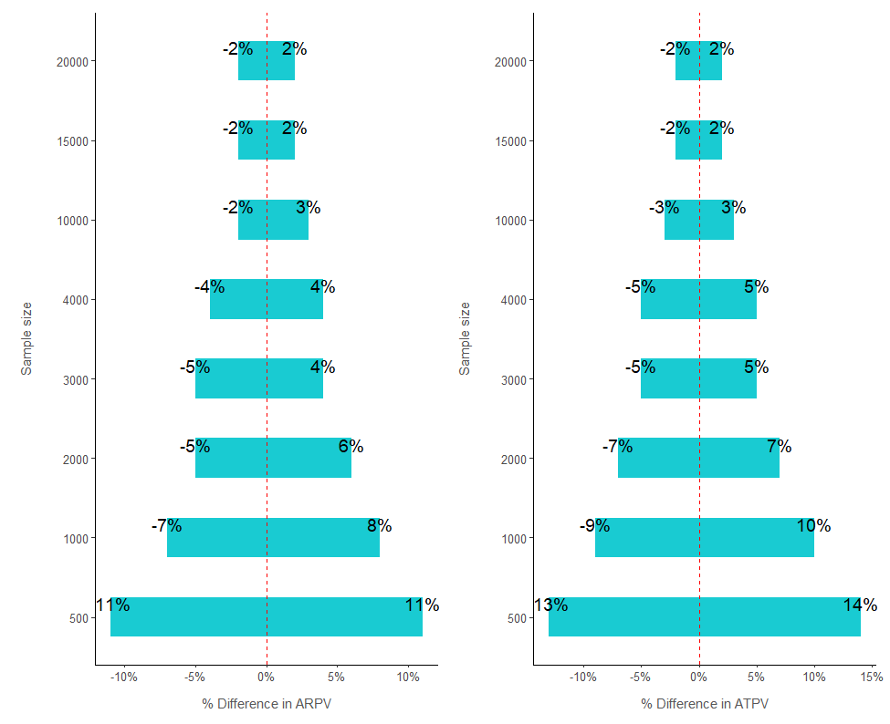
The results from above are in symphony with the results of our power analysis. Looking at a sample size of 15,000, the 95% interval for both KPIs is between a -2% and 2% change. So if we take a sample of 15000 and allocate 7500 to control and treatment, we expect in a scenario of no difference to have a variability of four percentage points (from -2% to 2%). So if the uplift from the new version is 5%, we expect a sample of 15000 to return results between 3% and 7% (5%- 2% = 3% and 5% + 2% = 7%).
Summary
And with that last step, we are ready to launch our RCT experiment! Let’s summarise where we are:
✅ We defined the two versions of the test
✅ We defined the population as all visitors on a Friday
✅ Once visitors enter the test, they will be split randomly into control and treatment (50% — 50%)
✅ We defined our two KPIs of interest: 28-day ARPV and 28-day ATPV
✅ We estimated the sample size for our experiment using both power and simulations at 15000 (7500 for control and treatment, respectively)
In the next article of this series, we will dive in and learn how to analyze the results from our A/B test. If you want to play with the data yourself, you can see below the code I used to generate our dataset of 20000 observations.
set.seed(15)

##########################################
# Create normal skewed ARPV attribute
##########################################
sigma = 0.6
mu = 2
delta = 1
samples = 10000
revenue <- rnorm(samples, rlnorm(samples, mu, sigma) , delta)
revenue <- revenue + 40


##########################################
# Create normal symmetric ATPV attribute
##########################################
transactions <- round(rnorm(10000, 2, 0.5),0)


##########################################
# Create data set with both attributes
##########################################
dataset <-
  data.frame(revenue, transactions) %>%
  # fixing records with 0 or negative atpv but positive arpv
  mutate(transactions = case_when(transactions <= 0 & revenue > 0 ~ 1 , TRUE ~ transactions)) %>%
  # adding non purchasing visitors
  union_all(., data.frame(revenue = rep(0,10000), transactions = rep(0,10000)))

summary(dataset)
Stay in Touch
If you enjoyed reading this article and want to learn more, don’t forget to subscribe to get my stories sent directly to your inbox.
On the link below, you can also find a free PDF Walkthrough on completing a Customer Cluster Analysis in a real-life business scenario using data science techniques and best practices in R.
Data Science Project Checklist - Aspiring Data Scientist
What I learned after running AB tests for one year as a data scientist — Part 1/2 was originally published in Towards Data Science on Medium, where people are continuing the conversation by highlighting and responding to this story.
from Towards Data Science - Medium
https://towardsdatascience.com/what-i-learned-after-running-ab-tests-for-one-year-as-a-data-scientist-part-1-2-5277911e89ec?source=rss----7f60cf5620c9---4
via RiYo Analytics

No comments