https://ift.tt/U5V9MB8 Simplifying data analysis for everyone Photo by William Felker on Unsplash Motivation Pivoting and Grouping o...
Simplifying data analysis for everyone

Motivation
Pivoting and Grouping operations are fundamental to every typical tabular data analysis process. The pivot_table() and groupby() method stands among one of the most commonly used methods in Pandas.
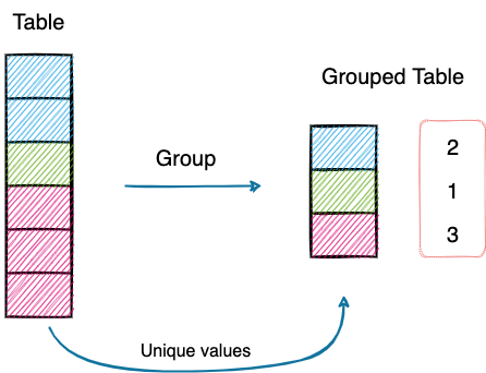
Used primarily for understanding categorical data, Grouping lets you compute statistics for individual groups in the data.
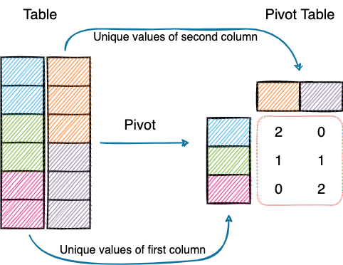
Pivot tables, on the other hand, allow you to cross-tabulate your data for fine-grained analysis.
First and foremost, I do appreciate the importance of pivot tables. However, many a times, I have found pivoting (specifically) in Pandas, a little intimidating. I am sure many of you would resonate with that.
For someone coming from Excel, which provides a sleek and intuitive UI to generate pivot tables, transitioning to Pandas isn’t as smooth as one may expect.
Moreover, in many data analysis tasks, things usually don’t stop at pivoting or grouping the data. Many are often interested in creating plots/graphs to make them more comprehensible, which adds to writing more code.
Wouldn’t it be nice if we had a beginner-friendly and elegant UI to perform these operations on Pandas DataFrames, just as we have in Excel?
Introducing PivotTableJS 🚀!
PivotTableJS
As the name suggests, PivotTableJS is a Javascript library for creating Pivot Tables (and Grouped Tables also).
Its Ultimate Selling Point is that it can be used in a Jupyter Notebook (read more), without writing any code. Thus, you can write your code (wherever needed), modify the data and throw that to PivotTableJS instantly.
What’s more, its drag-n-drop functionality and intuitive layout makes the task of performing aggregations, creating pivot tables, and plotting interactive charts effortless and quick.
Install PivotTableJS
To install PivotTableJS using pip, type the following command in the terminal.
Alternatively, you can also conda:
Getting Started
Load the Dataset
The first step, of course, is to load the dataset using Pandas.
For demonstration purposes, I will use a dummy dataset containing fake employee information, which I created using Faker.
Invoke PivotUI
After loading the dataset as a Pandas DataFrame (df), import the pivot_ui method from the pivottablejs library.
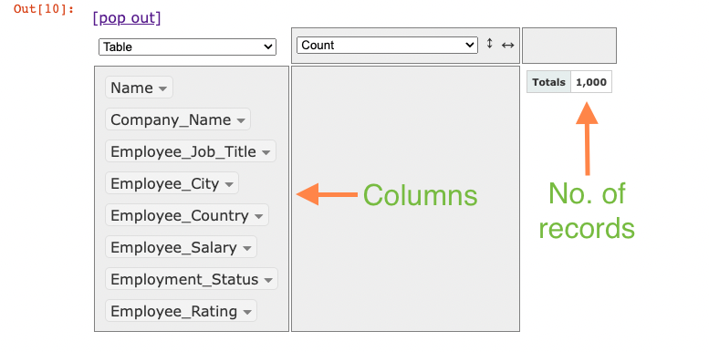
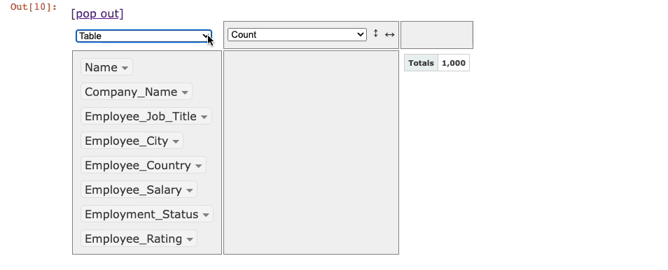
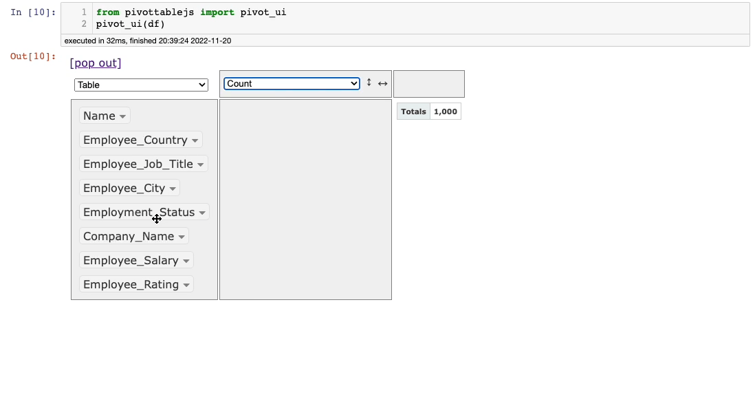
After this, the following window will appear in the output panel of Jupyter.
The columns are shown in the leftmost panel of the interface. By default, it shows the number of records in the calculation area (1,000 here).
You can drag columns to the two empty boxes to perform groupby and pivot operations and select the appropriate aggregation from the aggregations dropdown.
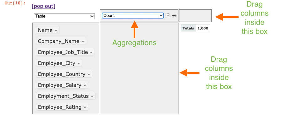
Lastly, besides the aggregations dropdown, you can see another dropdown (currently showing Table). This is used to select the output format:
Next, let’s understand how you can perform groupby and pivot using this tool.
GroupBy Using PivotTableJS
To perform Grouping on single (or multiple) columns, drag them to the empty region below aggregations.
For instance, consider that we want to group on the Employee_Status column. This is demonstrated below:
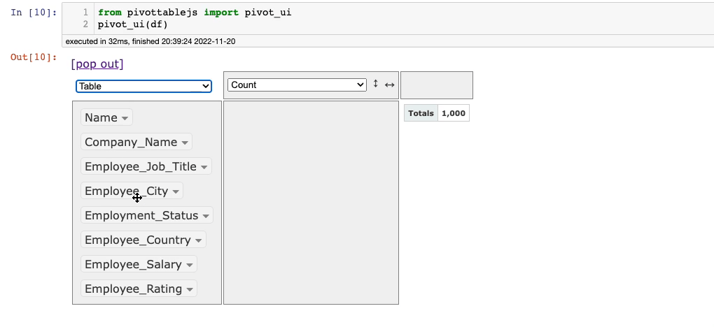
It’s that simple.
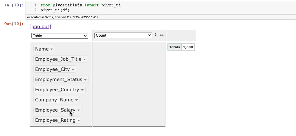
The default aggregation here is the size of the group (Count). You can change this and perform it on any column of your choice with the desired aggregation method.
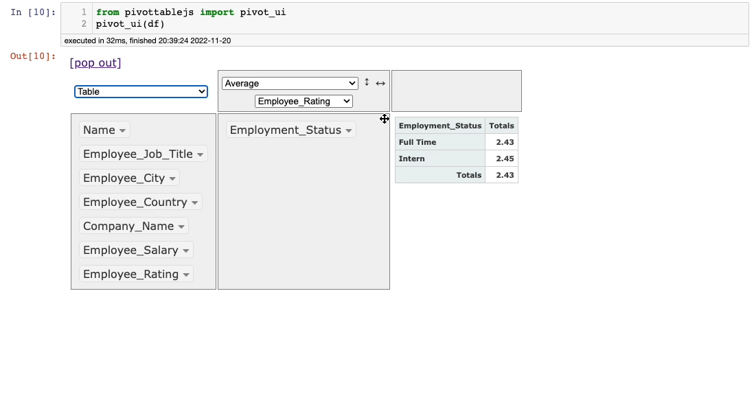
Let’s say we want to find the average Employee_Rating for each value in theEmployee_Status column. This is demonstrated below:
Things don’t stop there. You can also change the output format.
Say in the demonstration above, we want to show the average Employee_Rating grouped on theEmployee_Status column as a bar chart. You can do this as follows:
Pretty cool, isn’t it?
Imagine how much time one would have taken to do the same thing with code. This is quick and effortless.
Pivot Table Using PivotTableJS
Similar to GroupBy, Pivot Tables are also fairly straightforward to generate using PivotTableJS.
There’s just one extra step required. In the groupby examples, we dragged columns only to one of the empty panels.
However, as both the rows and the columns of pivot tables originate from the values in the table, we should drag a header row too.
For instance, say you want to display the pivot table of Employee_Status and Employee_City columns. This can be done as follows:
As you may have noticed, this time, we also dragged a column to the upper panel, which created a pivot table instead of a Grouping.
The rest of the things remain the same as discussed in the section above.
You can change the aggregation from the aggregation dropdown and select another column as well.
Moreover, you can also represent the data as charts for better comprehensibility.
Conclusion
With this, we come to the end of this blog. I hope you learned something new.
I am confident that this incredible tool will save you tons of time while performing some typical data analysis tasks.
Found this tip interesting?
If you want to learn more such elegant tips and tricks about Data Science and Python, I post an informative tip daily on LinkedIn.
You can find all the tips I have posted in My LinkedIn Post Archive. You can follow me on LinkedIn to see all future posts.
Alternatively, you can also receive them via email by subscribing below:
Thanks for reading!
Introducing PivotUI: Never Use Pandas To GroupBy and Pivot Your Data Again was originally published in Towards Data Science on Medium, where people are continuing the conversation by highlighting and responding to this story.
from Towards Data Science - Medium
https://towardsdatascience.com/introducing-pivotui-never-use-pandas-to-groupby-and-pivot-your-data-again-ed0fcf95b6ed?source=rss----7f60cf5620c9---4
via RiYo Analytics


No comments