https://ift.tt/fECJH4U Probabilistic Performance and the Almost-Free Lunch Photo by Warren Wong on Unsplash Principle Researcher: Dav...
Probabilistic Performance and the Almost-Free Lunch

Principle Researcher: Dave Guggenheim, PhD
Introduction
In machine learning, the No Free Lunch Theorem (NFLT) indicates that every learning model performs equally well when their performance is averaged over all possible problems. Because of this equality, the NFLT is unequivocal — there is no single best algorithm for predictive analytics (Machine learning and it’s No Free Lunch Theorem | Brainfuel Blog).
At the same time, there have been dramatic improvements in learning models, especially regarding bagging and boosting ensembles. Random forest models, a version of bagging, were tested against 179 different classifiers and across 121 datasets, and they were found to be more accurate more of the time (Fernández-Delgado, Cernadas, Barro, & Amorim, 2014). But the XGBoost algorithm, a version of boosting, was unleashed in 2015, and it has reigned over other learning models since (Chen et al., 2015). It has earned this title for creating many Kaggle competition winners (What is XGBOOST? | Data Science and Machine Learning | Kaggle). Part of its appeal deals with extensive hyperparameter tuning functions that allow custom fitting to different datasets (XGBoost Parameters — xgboost 1.6.2 documentation).
To that end, we will focus on random forest and xgboost models as the core underlying ensembles to which we will add additional learning models, thus creating ‘extreme ensembles’ to find a model that generalizes well. This research will explore default configurations of extreme ensembles and compare them with highly tuned XGBoost models to determine the efficacy of hypertuning and the limits of practical accuracy. Finally, in a ‘Don Quixote’ moment we will try to discover a universal model from a practical sense that performs at or near the top rank across all datasets.
Research Questions
- What would our models look like if we anticipate multiple futures instead of just one?
2. How does data quality affect multi-future model performance?
3. What does hyperparameter tuning do?
4. Is hyperparameter tuning required or can untuned models achieve the same performance?
5. If there is No Free-Lunch, is there an Almost-Free-Lunch?
Trigger Warning
Please review the following statements:
- Data is just another machine learning resource.
- The random seed value for the train/test split can be any integer you desire, so 1, 42, 137, and 314159 are all good.
- Hyperparameter tuning is one of the most important steps in the data mining process, and a hypertuned XGBoost model is the best all-around machine learning algorithm.
- Kaggle competitions reflect real data science, and the person with the 90.00% accuracy beats everyone who achieved 89.99%.
If you identify with any these statements, then this is your ‘red-pill’ moment — before reading on, perhaps you should retrieve your emotional support animal and brew a nice cup of hot tea.
Because buckle up Buttercup, it’s going to be a bumpy ride.
Models
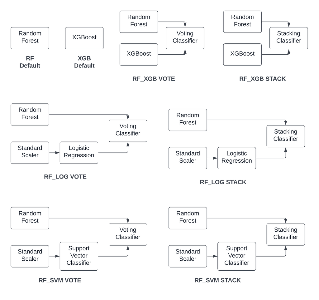
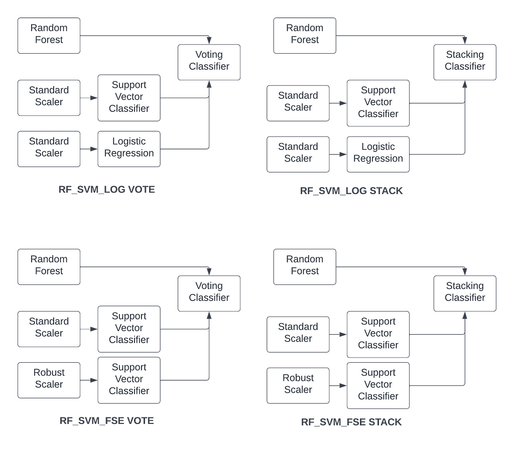
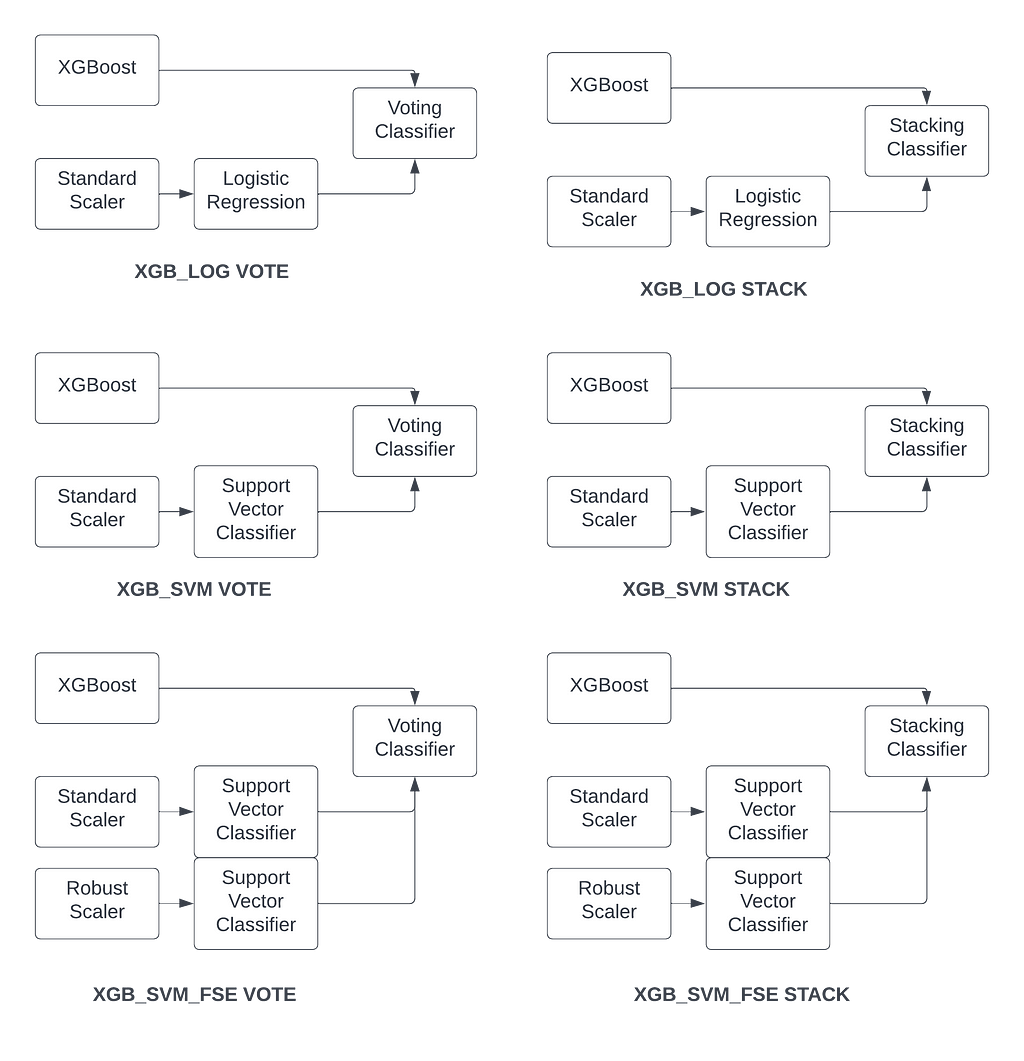
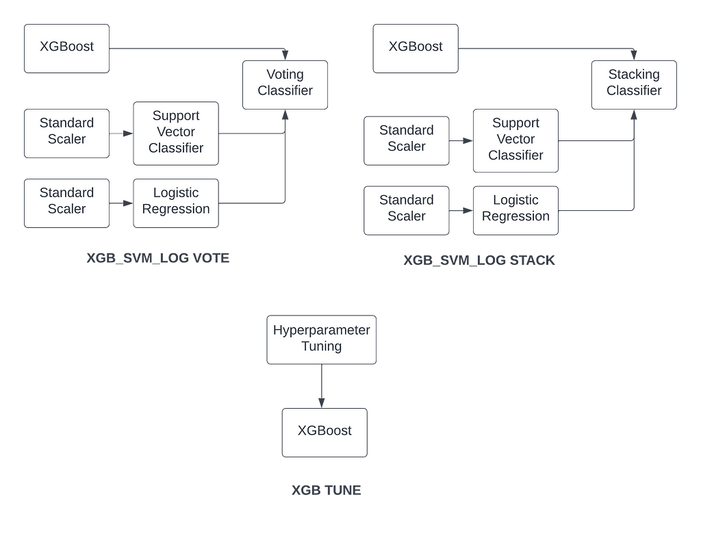
Twenty-one models were created for this research, from default random forest and xgboost to the invention of extreme ensembles, wherein either bagging or boosting is combined with other learning algorithms to capture more information from the data (see Figures 1–4 for more information).
Either random forest or xgboost were combined with logistic regression, for capturing linear information, and/or a support vector classifier with a radial basis kernel for discovering smooth curve relations. In addition, the feature scaling ensemble was added to the support vector classifier as it demonstrated excellent performance in the original feature scaling research (The Mystery of Feature Scaling is Finally Solved | by Dave Guggenheim | Towards Data Science). The feature scaling ensemble was not combined with logistic regression because earlier research has shown improvement with multinominal data only (Logistic Regression and the Feature Scaling Ensemble | by Dave Guggenheim | Towards Data Science) and all of the data here represents binary classification.
For the extreme ensembles, either a voting classifier (sklearn.ensemble.VotingClassifier — scikit-learn 1.1.2 documentation) or stacking classifier (sklearn.ensemble.StackingClassifier — scikit-learn 1.1.2 documentation) were used to combine algorithms in their default configurations.
More details follow these model descriptions:
1) RF: Default RandomForestClassifier with random_state=1
2) XGB: Default XGBoostClassifier with random_state=1
3) RF_XGB VOTE: Default random forest and xgboost combined with a VotingClassifier
4) RF_XGB STACK: Default random forest and xgboost combined with a StackingClassifier
5) RF_LOG VOTE: Default random forest and logistic regression with a VotingClassifier
6) RF_LOG STACK: Default random forest and logistic regression with a StackingClassifier
7) RF_SVM VOTE: Default random forest and support vector classifier with a VotingClassifier
8) RF_SVM STACK: Default random forest and support vector classifier with a StackingClassifier
9) RF_SVM_LOG VOTE: Default random forest, support vector classifier, and logistic regression with a VotingClassifier
10) RF_SVM_LOG STACK: Default random forest, support vector classifier, and logistic regression with a StackingClassifier
11) RF_SVM_FSE VOTE: Default random forest and support vector classifier with feature scaling ensemble with VotingClassifier
12) RF_SVM_FSE STACK: Default random forest and support vector classifier with feature scaling ensemble with StackingClassifier
13) XGB_LOG VOTE: Default XGBoost and logistic regression with a VotingClassifier
14) XGB_LOG STACK: Default XGBoost and logistic regression with a StackingClassifier
15) XGB_SVM VOTE: Default XGBoost and support vector classifier with a VotingClassifier
16) XGB_SVM STACK: Default XGBoost and support vector classifier with a StackingClassifier
17) XGB_SVM_FSE VOTE: Default XGBoost and support vector classifier with feature scaling ensemble combined with VotingClassifier
18) XGB_SVM_FSE STACK: Default XGBoost and support vector classifier with feature scaling ensemble combined with StackingClassifier
19) XGB_SVM_LOG VOTE: Default XGBoost, support vector classifier, and logistic regression with a VotingClassifier
20) XGB_SVM_LOG STACK: Default XGBoost, support vector classifier, and logistic regression with a StackingClassifier
21) XGB TUNE: Hypertuned XGBoost model using recursive heuristic with multiple tuning cycles.
Logistic Regression Details
Many textbooks will tell you to choose l1 or lasso regularization over l2 because of its additional ability at feature selection. What they don’t tell you is that l1 can take 50–100 times as long to run. One model set ran for over 72 hours using l1 and didn’t finish (power outage during storm); the same model set finished in two hours using l2. And yes, I now have an uninterruptible power system.
Low Train Sample Count (<2000): LogisticRegressionCV(penalty=”l1", Cs=100, solver=’liblinear’, class_weight = None, cv=10, max_iter=20000, scoring=”accuracy”, random_state=1)
High Train Sample Count(>=2000): LogisticRegressionCV(penalty=”l2", Cs=50, solver=’liblinear’, class_weight = None, cv=10, max_iter=20000, scoring=”accuracy”, random_state=1)
make_pipeline(StandardScaler(), log_model)
Support Vector Classifier Details
SVC(kernel = ‘rbf’, gamma = ‘auto’, random_state = 1, probability=True) # True enables 5-fold CV
make_pipeline(StandardScaler(), svm_model)
Support Vector Classifier with Feature Scaling Ensemble
SVC(kernel = ‘rbf’, gamma = ‘auto’, random_state = 1, probability=True)
make_pipeline(StandardScaler(), svm_model)
make_pipeline(RobustScaler(copy=True, quantile_range=(25.0, 75.0), with_centering=True, with_scaling=True), svm_model)
VotingClassifier (RF_SVM_FSE shown)
VotingClassifier(estimators=[(‘RF’, rf_model), (‘SVM_STD’, std_processor), (‘SVM_ROB’, rob_processor)], voting = ‘soft’)
StackingClassifier (RF_SVM_FSE shown)
estimators = [(‘RF’, rf_model), (‘SVM STD’, std_processor), (‘SVM_ROB’, rob_processor)]
StackingClassifier(estimators=estimators, final_estimator=LogisticRegressionCV(random_state = 1, cv=10, max_iter=10000))
On the more mundane front, when an extreme ensemble contained a logistic regression model, then one-hot encoding with ‘drop_first = True’ was coded. If not, then ‘drop_first = False’ was the norm.
Hypertuning the XGBoostClassifier
There are many different hypertuning algorithms that use Bayesian optimization (optuna, Hyperopt, etc.), but this is one that uses an interesting implementation of GridSearchCV, and it recursively iterates over refined hyperparameters. After modifying this auto-tune heuristic to accommodate classification problems, I’ve tested this algorithm and found that it realizes best-in-class performance frequently, despite long run times. Here are the details:
SylwiaOliwia2/xgboost-AutoTune: Wrap-up to automatically tune xgboost in Python. (github.com)
But how do we determine which is the best model?
Introducing the Performance Probability Graph
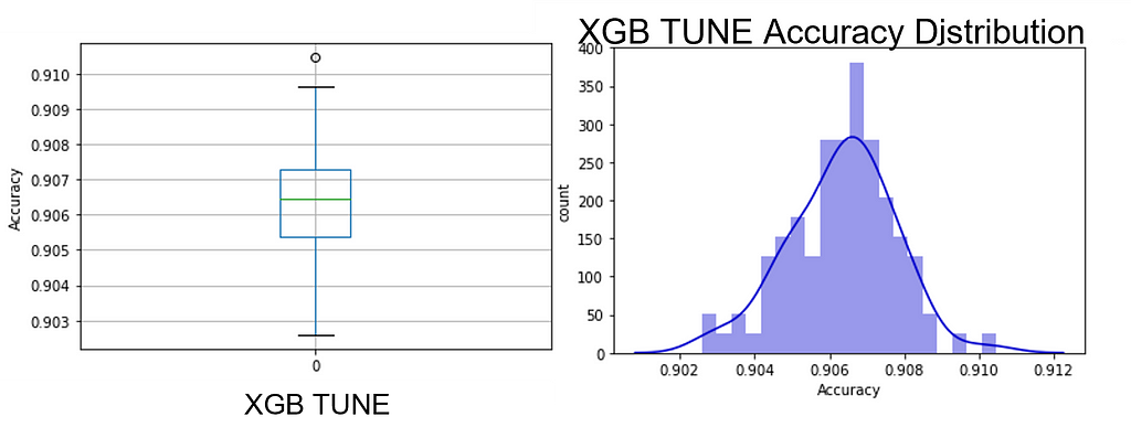
Single-point accuracies are not necessarily dishonest, but they are certainly disingenuous. Data science competitions are to business analytics as Reality TV is to the real world, because a single split of the data using a single random seed value anticipates a pre-defined future, one that is pre-scripted. Some data possesses this foresight. But we know that variance, a random function, has other plans for most — namely, causing chaos.
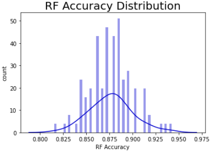
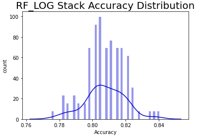
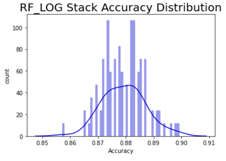
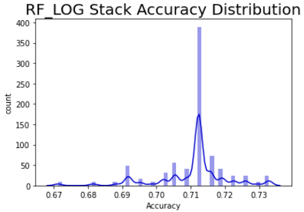
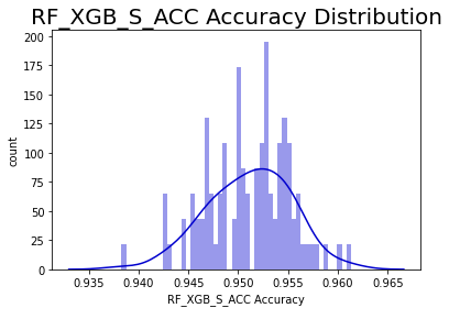
The Performance Probability Graph (PPG) demonstrates a closer approximation to the truth, wherein 100 models are generated using 100 permutations of the train/test data while keeping the same ratios (train/test and class imbalance). The resulting histogram demonstrates not just the potential performance with new data, but the probability of achieving the same (see Figure 5). The kernel density estimator represents the probability density function while the histogram is in correspondence with the probability mass function.
If your business decision requires an accuracy of 87.9% going forward, the median value in Figure 5, then you’ll be right 50% of the time (a condition confused with ‘being half right’). If your decision requires 94%, this model will achieve it, if only briefly. All the remaining models represent analytic failures. Conversely, if you set your decision threshold at 81%, your model will be successful most of the time. And the PPG is conservative in that it does not contemplate data drift, or how new data could be outside the bounds of our current population. One way to think about this phenomenon is that for each permutation of the train/test split, we are presenting identical predictor qualities but differing sample qualities to the model, and each model converts those attributes to the probability of achieving an accuracy.
As an initial investigation using PPGs, we will be comparing boxplots and histograms in search of those models where the entire range is moved to a higher accuracy, not just a single new outlier result. But more work is required to effectively compare these usually nonnormal graphs.
Twelve open-source datasets were used in this study, representing a mix of datatypes and complexity. There are all-floating-point and all-integer data here along with a fusion of numeric and categorical types. One critical metric presented is the ratio of samples to predictors, or the Sample Ratio, which was included because of the relationship between generalized error, predictors, and training sample count with this equation using the Vapnik-Chervonenkis dimensional bounds:
You can learn more about this technique here: SlidesLect07.dvi (rpi.edu). This lecture series is based on Learning from Data (Abu-Mostafa, Magdon-Ismail, & Lin, 2012). Datasets in this study accommodate from ~12 samples/predictor, the bare minimum, to over 440 samples/predictor.
Think of the sampling error as a physical constant as it determines the upper bound of accuracy for all models. And the sample ratio will show us something very important about XGB model tuning (aka hypertuning).
Because N, the desired number of samples appears on both sides of the equation, if you code this in Excel, then you’ll need to enable ‘iterative calculation’ in the Options menu and then set a seed value for N to prime the solution. I recommend using 10 * the number of predictors as a good starting point, which is also the required minimum number of samples recommended by Caltech. Oh, and if you have a large sample ratio and predictor count, you’ll need to perform the calculation in Wolfram Alpha (Wolfram|Alpha: Computational Intelligence (wolframalpha.com) because Excel can’t handle extremely large numbers.
All missing values were imputed with MissForest (MissForest · PyPI) except for Telco Churn; its 11 missing values were dropped from the 7000+ samples. All no-information predictors were dropped (IDs, etc.). And, of course, all data treatments were performed using ‘fit_transform’ on the training data and ‘transform’ on the test data — data partition integrity has been preserved for each permutation and for each model. And test sizes consisted of three set points: 25%, 30%, and 50% in order to manage sample ratios but still maintain generalizability.
And, as always, all performance results, all 25,200+ predictions, are on the test data, those samples that the model had not yet seen.
The Datasets and Their Predictive Performance
Dataset #1
Australian Credit Source: UCI Machine Learning Repository: Statlog (Australian Credit Approval) Data Set
Sample Ratio: 12.32 samples per predictor
Predictors presented to the models: float64(3), int64(3), uint8(36)
Expected sampling error: 7.36% with a 90% confidence interval
The train/test split of this dataset was set to realize the minimum number of samples required for binary classification problems, which is 12 according to Delmaster and Hancock (2001, pg. 68).
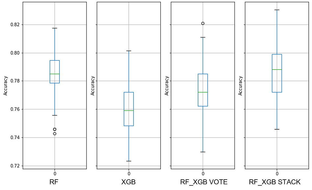
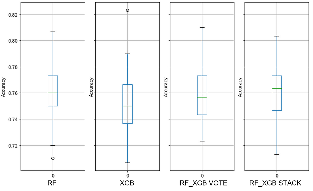
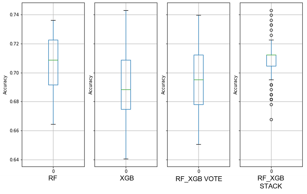
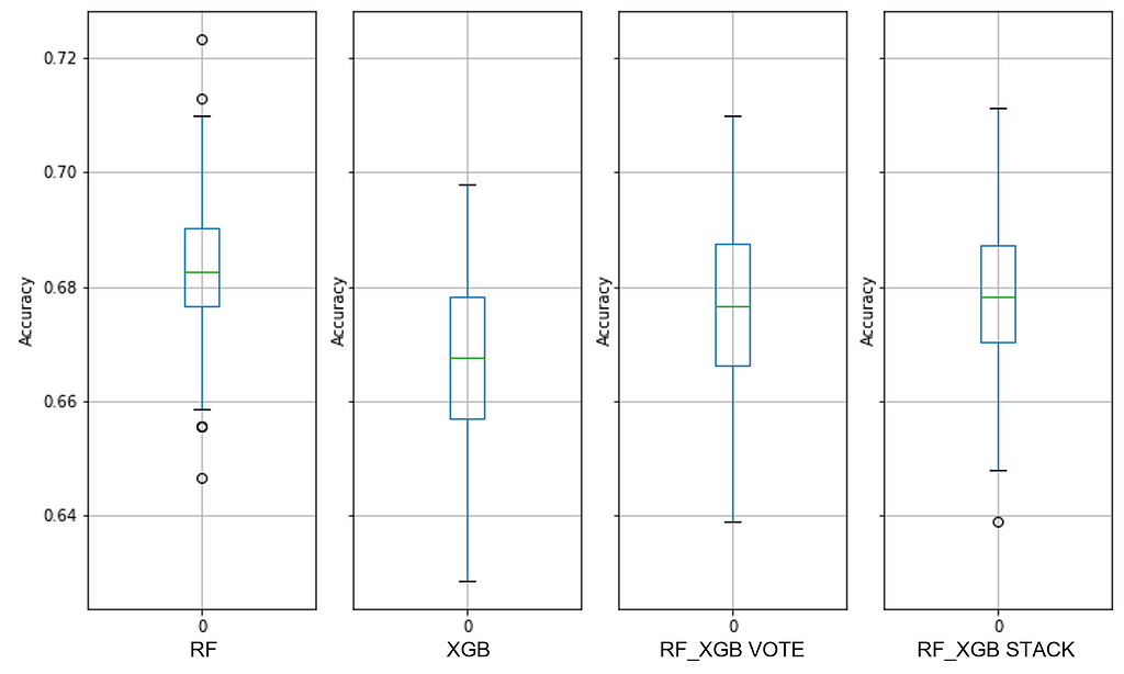
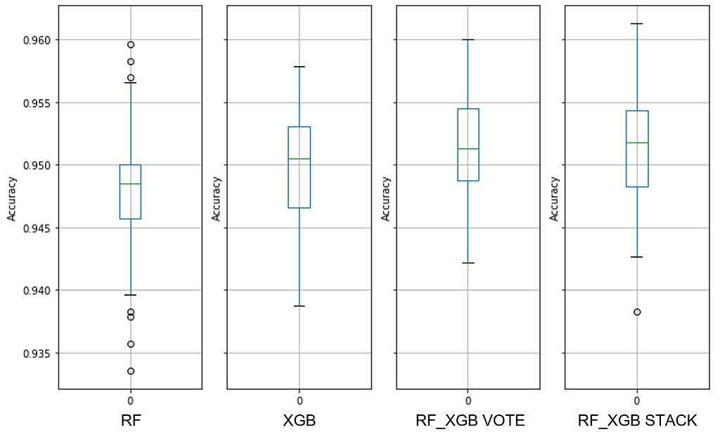
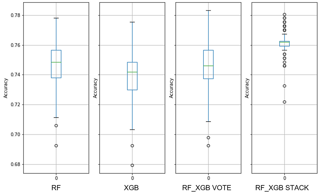
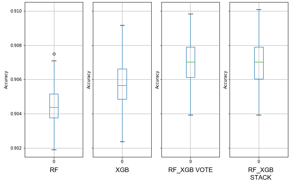
See Figure 7 for details about the baseline default random forest, default extreme gradient boost, and default extreme ensembles with those two:
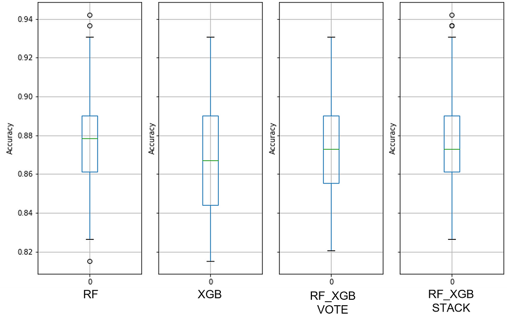
Note the overlap between the RF and XGB ranges — these are performance quanta for which the models are identical. And we can see that combining these two ensembles did not improve performance.
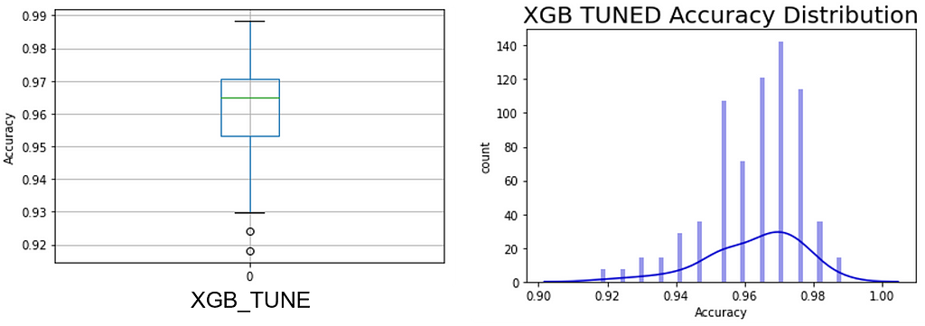
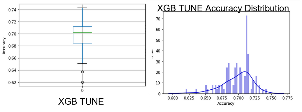
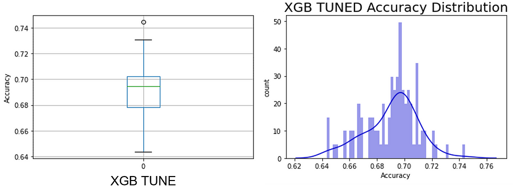
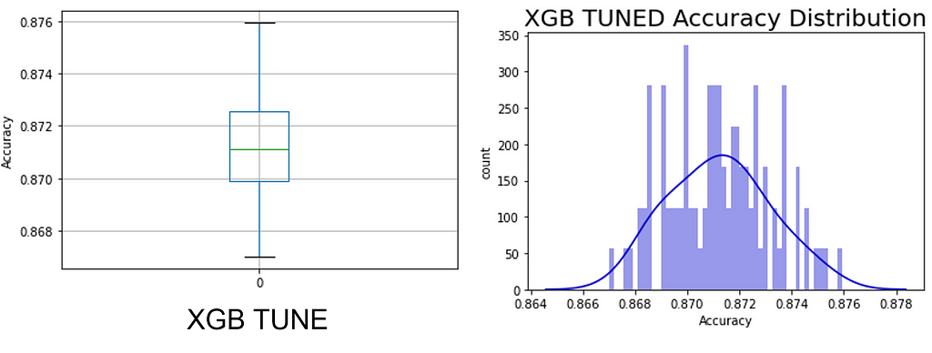
The maximum PPG range for the default XGB model is from 81.5% to 93%, indicating that there are data quality issues. You can think of the median accuracy as a proxy for predictor quality and the PPG dispersion as sample quality (i.e., consistency across all observations). A median accuracy of ~88% might work well for many decisions, so predictors may be good.
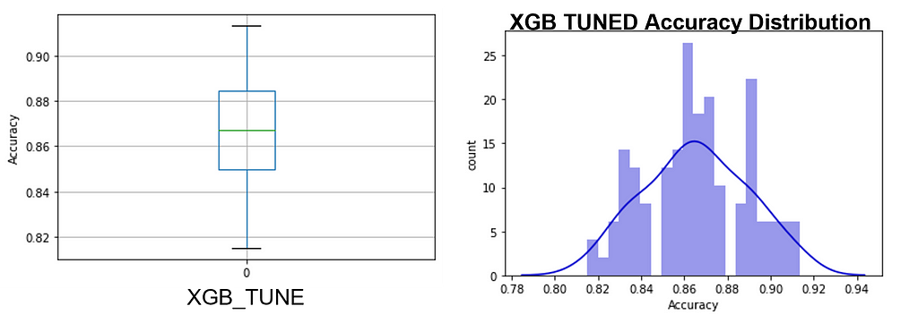
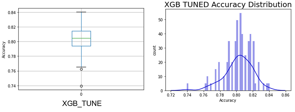
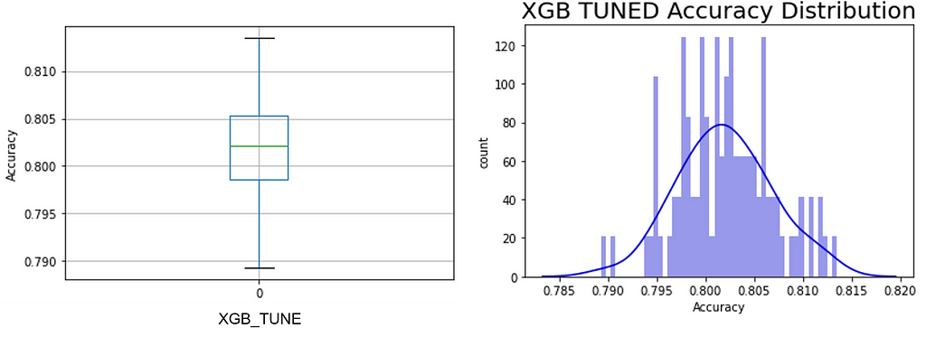
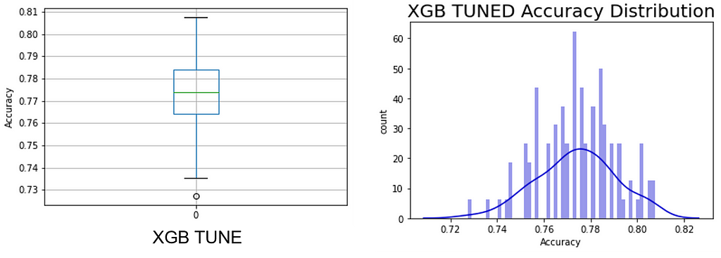
One can readily see that the hypertuning process on each of the 100 permutations did not collapse the PPG into a narrow range or move it toward more accuracy (see Figure 8); in fact, this is very similar to the un-tuned XGB model but with the interquartile Range (IQR) shrunk to that of the random forest model. This shows the limits of hypertuning — poor data quality cannot be ‘tuned’ out of the model as improvements are slight. Yet another indication of the importance of data over models.
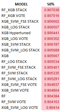
Descriptive statistics were captured from all models, from which we will attempt to find the ‘best’ model without using a single-point performance value. See Table 1 for more information.
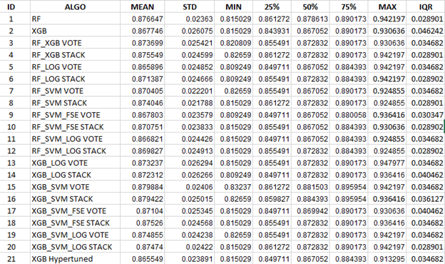
Filtering the 2100 results from each of the datasets required devising sorting algorithms to discover the ‘best’ model(s). Two different sorting methods were utilized, and any models that appeared on either list and within 0.3% accuracy (three tenths of one percent) of the top model were selected as the top rank of models. The tight accuracy thresholds were chosen as a compromise between practical needs and adaptability to new data, but this will be revisited in upcoming work.
Sort #1 The Median Sort
a. 50% from largest to smallest
1. IQR from smallest to largest
i. 75% from largest to smallest
Sort #2 The 75% Percentile Sort
a. 75% from largest to smallest
1. IQR from smallest to largest
i. 50% from largest to smallest
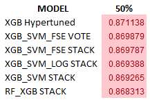
Mean sorting isn’t a good metric for algorithm selection as the PPG is rarely a normal distribution but rather has spikes, which makes modal quanta a more interesting measure. Refer back to Figure 8 for details.
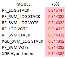
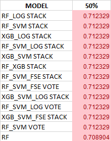
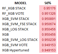
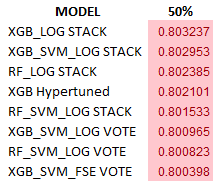
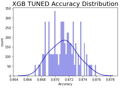
Because of a wide range of median values due to a very low sample count and poor data quality, only two models passed the stringent 0.3% test (the top two in Table 2), but many more were grouped at the next quantum using the 75th percentile sort:
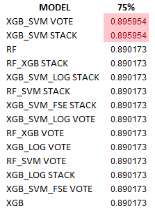
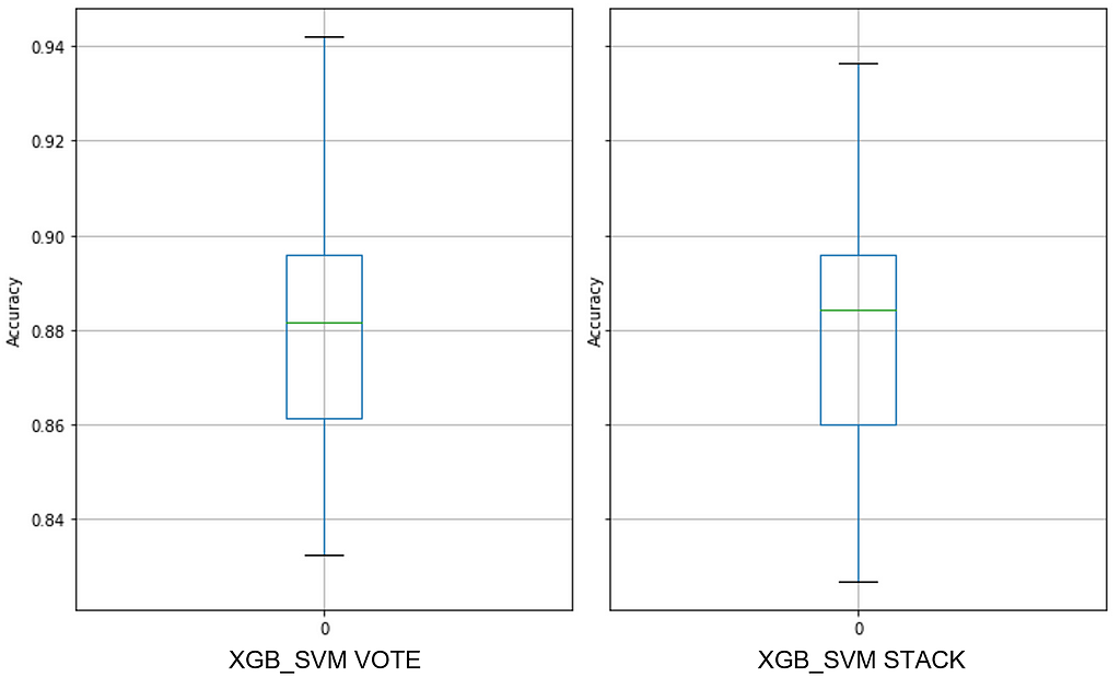
The overall best extreme ensembles, both XGB_SVM VOTE and XGB_SVM STACK, are interesting in that VOTE has a narrower IQR but STACK has a higher median value:

To parse the separation between data quality error and sampling error, like that which we saw in Australian Credit, Dataset #2 will confirm the outsize contribution from data quality.
Dataset #2
Wisc Diag Source: UCI Machine Learning Repository: Breast Cancer Wisconsin (Diagnostic) Data Set
Sample Ratio: 13.28
Predictors presented to the models: float64(30)
Expected sampling error: 6.97% with a 90% confidence interval
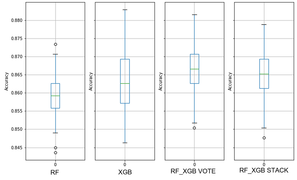
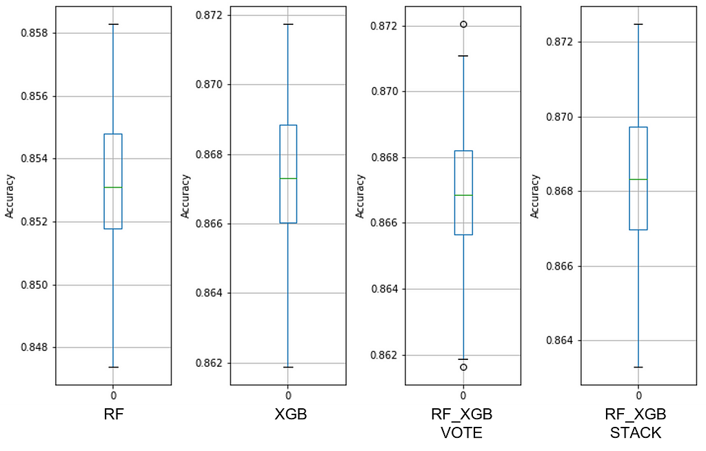
With a sample ratio of only ~13, the median values are all near or above 96%, indicating that perhaps the only error has come from the sample ratio. The sample quality is improved over Dataset #1, with the boxplot ranges spanning ~6.5%, presumably due to the consistency contained within those 30 floating-point biologic measures and their relative similarities. See Figure 10 for details about a dataset with both a low sample ratio and good predictive performance.

Again, the hypertuned XGBoost model shrank the IQR but lowered the 75th percentile when compared with the untuned version. See Figure 11 for more information.
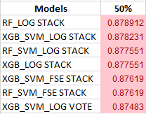
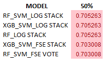
Using the two sorting mechanisms prescribed and with the 0.3% accuracy threshold, these are the top ranked models for this dataset as determined by the Median Sort:
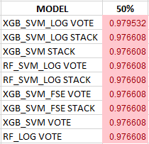
Note that there was a singular top-ranked model, and the next eight are grouped into a lower quantum level with a shared median value to six decimal places. The overall best extreme ensemble, the XGB_SVM_LOG VOTE looks like this:

For this dataset, despite the low sample count, L2 regularization was employed for the logistic regression models as the complexity of the predictors caused long 100-model run times (> 3 days with an Intel 12700K, 32MB DDR4 3200 RAM, and 2TB PCIe4 SSDs).
This is how datasets were analyzed, and all remaining datasets will be discussed in Appendix A to expedite our search for the perfect model.
Finding the Perfect Model
All of the results were gathered and analyzed, but before we start our search, we need to interpret the information in Figures 40–42, to wit:
Sample Ratio: The ratio of samples per predictor.
Penalty: The regularization penalty that was used for the logistic regression models.
Worst Model: This is the model that offered the lowest performance of all 21 models for that dataset according to the sorting mechanism.
PPG Max Range: Using the Worst Model, this is the maximum accuracy range of all 100 models, which indicates data quality as seen by consistency. Remember — a higher median accuracy = better predictors, and a narrower PPG range = greater homogeneity between samples.
BEAT HYPE: This shows whether the extreme ensemble, our Universal Model, bested the hypertuned XGB model.
With the exception of Australian Credit and Transfusion, each model in the Model Rank was within 0.3% of the top performing model, which is in the first position. Not every model appears in these lists, so the worst performing model may not be visible here.
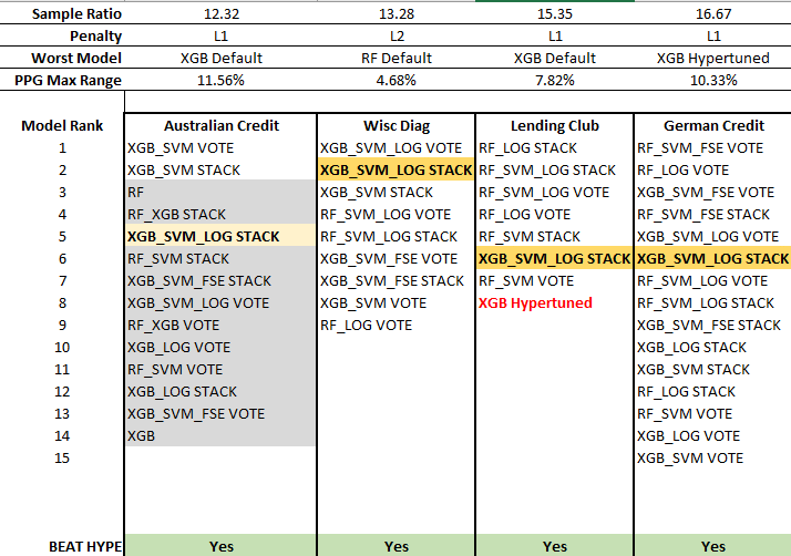
A quick glance at this table in Figure 40, and one can see that there is no single best performing model at the top rank across these datasets. From the strictest perspective, the No-Free-Lunch Theorem holds. However, using our tight 0.3% threshold (again, three tenths of one percent), there is a universal model that appeared out of the ‘noise’ — the XGB_SVM_LOG STACK extreme ensemble (see Figures 42–44). True, Australian Credit and Transfusion are exceptions, but it was an important lesson in data quality over sampling error and the extreme ensemble still bested the hypertuned XGB model in both cases.
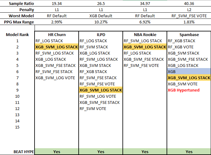
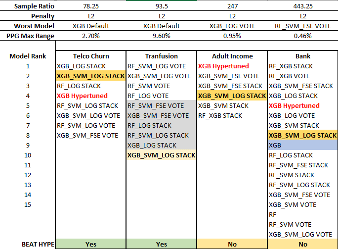
When the Sample Ratio reached 40.36 (the Spambase dataset), the hypertuned XGB model has finally appeared on the top list, but it lags the extreme ensemble. This positioning repeated for Telco Churn, but both the hypertuned XGB model and the extreme ensemble dropped off the list for Transfusion, a dataset with both poor predictors (low median) and high sample heterogeneity (wide PPG). Despite missing the 0.3% threshold and being one quantum from the top, the XGB_SVM_LOG STACK model still beat the hypertuned XGB at a sample ratio of 93.5 as the hypertuned model was two quanta below.
The hypertuned XGB performance bested the extreme ensemble through the last two datasets though, so this model seems to prefer very large sample ratios. Basically, at some point over 100+ samples per predictor, the hypertuned XGB model is better than most extreme ensembles. But until then, it had poor performance in general, only making the top-rank list for 42% of the datasets in this study. The XGB_SVM_LOG STACK extreme ensemble, on the other hand, reached the top-rank 85% of the time. Tuning an XGB model requires many more samples that those needed for modeling, and the extreme ensemble requires no tuning.
There is no perfect model, but here are two that might work across all datasets in a consecutive series — the Almost-Free Lunch is here. From a minimal sample ratio of 12 up to roughly 100+, use the extreme ensemble, the Universal Model. Above 100+, switch to the hypertuned XGB model. From a practical sense, these two models in sequence should work just about everywhere on tabular data. And not just with a single predestined future, but with many possible futures.
Special Bonus Dataset
Just as an additional check and to test the upper bounds of sample ratio, another 2100-model run was executed on the MAGIC Gamma Telescope data, which has a sample ratio of 951: UCI Machine Learning Repository: MAGIC Gamma Telescope Data Set. See Figure 43 for the outcome:
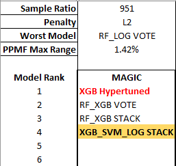
Once again, with a very high sample ratio, the hypertuned XGB model was the best model, but the Universal Model, the XGB_SVM_LOG STACK, still made the short list using the Median Sort mechanism with the 0.3% threshold.
There is a computational cost to the extreme ensemble, and it needs to be recoded in a lower-level language for speed improvements in much the same way that XGB was built.
Conclusions
This research has opened the door to extreme ensembles, and much more work is required to explore these algorithmic combinations. In addition, more research is required to develop comparative analyses between Performance Probability Graphs, perhaps based on their unique ability to separate error components from the modeling process.
To wit, assuming the sampling error to be ‘constant,’ the PPG allows us to disambiguate model error into two distinct groups:
1) Predictor quality measured as the median accuracy.
2) Sample quality (consistency) measured through the PPG range itself.
A higher median accuracy is determined by the individual models, and these are affected by sampling error and predictor quality. While data quality is present, it is ‘averaged out’ by the median computation.
Conversely, a wider PPG range is determined by sample consistency, a form of data quality, as the difference between model accuracies is foreseen by differences in the data partition (i.e., the birth of variance). This separation of error sources can guide future behaviors. For example, the Bank Marketing dataset has a PPG maximum range of 0.46%, so the train/test split is inconsequential as this data is highly similar. Knowing this will help us focus on improving predictor quality as this is the error preventing better performance.
With an acceptably narrow range of the PPG, we can return to single-point accuracies for decision thresholds as a large number of possible futures have collapsed into just those closely related.
Here are some other important take-aways:
1. Data quality is the Prime Directive, the Moral Imperative. Spend your time getting better data instead of exploring yet another algorithm because with poor quality data, all algorithms will have a learning disability.
2. Hypertuning an XGB model only delivers high performance with a large sample ratio as tuning requires far more samples than modeling; until then, it is an under-performing model. But if you have that large sample ratio, then this is the model to use.
3. There is an extreme ensemble, XGB_SVM_LOG STACK that performed in the top rank of 10 of 12 datasets in this study — the Almost-Free Lunch. Plus, it landed on the short list of the Magic Gamma dataset — yet another confirmation, which makes it 11 out of 13 winners.
Planned research will explore the sample ratio at which the hypertuned XGB model lands in the top rank consistently. Other work is being designed to investigate the sample-quality source of the PPG max range, given that two of the three models in the extreme ensemble are robust to outliers.
The Take-Away: If you don’t know the width of your PPG, then entering a single random seed value for data partitioning is a roll of the dice, pure chance that your model will be positioned appropriately for the future.
References
Abu-Mostafa, Y. S., Magdon-Ismail, M., & Lin, H.-T. (2012). Learning from data (Vol. 4). AMLBook New York, NY, USA:
Chen, T., He, T., Benesty, M., Khotilovich, V., Tang, Y., Cho, H., … others. (2015). Xgboost: extreme gradient boosting. R Package Version 0.4–2, 1(4), 1–4.
Delmaster, R., and Hancock, M. (2001). Data Mining Explained. Boston, MA: Digital Press
Fernández-Delgado, M., Cernadas, E., Barro, S., & Amorim, D. (2014). Do we need hundreds of classifiers to solve real world classification problems? The Journal of Machine Learning Research, 15(1), 3133–3181.
APPENDIX A
Dataset #3
Lending Club Source: All Lending Club loan data | Kaggle
Sample Ratio: 15.35
Predictors presented to the models: float64(4), int64(1), uint8(15)
Expected Sampling Error: 6.38% at 90% confidence interval
Missing value imputation: MissForest
Finally, the hypertuned XGB model has moved the entire PPG range to higher ground. See Figure 14 for details. This was sufficient to transport the hypertuned XGB model onto the top performing list within the 0.3% threshold, albeit in last place (see Table 4).
Despite the improvement in the hypertuned model, it was an extreme ensemble that was the top performing model. See Figure 15 to see the RF_LOG STACK Performance Probability Mass Function.
Dataset #4
German Credit Source: UCI Machine Learning Repository: Statlog (German Credit Data) Data Set
Sample Ratio: 16.67
Predictors presented to the models: int64(30)
Expected Sampling Error: 6.31% at 90% confidence interval
All-integer predictors show a decided advantage of the random forest model over XGBoost (see Figure 16). Hypertuning the XGB model did not improve the range of outcomes other than a slight narrowing of the Inter Quartile Range (see Figure 17).

Dataset #5
HR Churn Source: IBM Attrition Dataset | Kaggle
Sample Ratio: 19.34
Predictors presented to the models: int64(19), uint8(19)
Expected sampling error: 5.99% with a 90% confidence interval
The sample ratio has increased again, and the datatypes are now an even mix of integer and binary predictors. Of the baseline boxplots, the extreme ensembles show the best performance, with the voting classifier edging out the stacking classifier; voting runs much faster than stacking, so when you can choose a voting extreme ensemble, it is recommended. See Figure 18 for details.
The hypertuned XGB model did constrain the min-max distance and it compressed the IQR into a narrower range as compared with the default model, all signs of improved accuracy and stability (see Figure 19). Even so, the hypertuned model did not make the top rank for this dataset with a 0.3% threshold (see Table 6).

Dataset #6
ILPD: UCI Machine Learning Repository: ILPD (Indian Liver Patient Dataset) Data Set
Sample Ratio: 26.5
Predictors presented to the models: float64(5), int64(4), uint8(2)
Expected sampling error: 4.84% with a 90% confidence interval
Regardless of the model, this dataset showed very strong modes and yet weak predictors and a wide PPG range (see Figures 22 and 23 for more details). Note that the default random forest model bested the default XGB model with this data.
The remaining datasets will be presented as results only to limit text.
Dataset #7
NBA Rookie: NBA Rookies | Kaggle
Sample Ratio: 34.97
Predictors presented to the models: float64(18), int64(1)
Expected sampling error: 4.43% with a 90% confidence interval

Dataset #8
Spambase: UCI Machine Learning Repository: Spambase Data Set
Sample Ratio: 40.36
Predictors presented to the models: float64(55), int64(2)
Expected sampling error: 4.41% with a 90% confidence interval

Dataset #9
Telco Churn: Telco Customer Churn | Kaggle
Sample Ratio: 78.25
Predictors presented to the models: float64(2), int64(2), uint8(41)
Expected sampling error: 3.24% with a 90% confidence interval


Dataset #10
Transfusion: UCI Machine Learning Repository: Blood Transfusion Service Center Data Set
Sample Ratio: 93.5
Predictors presented to the models: int64(4)
Expected sampling error: 2.62% with a 90% confidence interval

Dataset #11
Adult Income: UCI Machine Learning Repository: Adult Data Set
Sample Ratio: 246.67
Predictors presented to the models: int64(6), uint8(60)
Expected sampling error: 1.18% with a 90% confidence interval
NOTE: The predictor ‘Country’ was dropped because many had too few samples.
Dataset #12
Bank Marketing: UCI Machine Learning Repository: Bank Marketing Data Set
Sample Ratio: 443.25
Predictors presented to the models: int64(7), uint8(44)
Expected sampling error: 1.10% with a 90% confidence interval
In Search of the Perfect Machine Learning Model was originally published in Towards Data Science on Medium, where people are continuing the conversation by highlighting and responding to this story.
from Towards Data Science - Medium https://ift.tt/sU1dXAB
via RiYo Analytics


No comments