https://ift.tt/Z5LEBl3 Effective Data Visualizations Consider Color Blindness Image by the author. Has this happened to you before? You...
Effective Data Visualizations Consider Color Blindness
Has this happened to you before? You thought your data analysis report was convincing. The data supported your arguments and you polished your data visualizations. But the person you needed to convince to achieve your goal was just like “meh”.
Was your argument not strong enough? Or was your data visualization not as effective as you thought? An uninclusive color palette makes data visualizations difficult to understand for colorblind people. E.g., the combination of red and green colors renders data visualizations ineffective for people with that color blindness.
Color blindness is a genetic condition that makes it difficult to distinguish between specific colors, most commonly red and green. Color blindness affects approximately 1 in 12 (8%) men and 1 in 200 (0.5%) women [2]. Globally, around 300 million people are affected by color blindness to some degree — that is roughly equivalent to the population of the United States of America [2].
Color blindness affects approximately 1 in 12 men and 1 in 200 women.
This means that there is a good chance there is someone in your audience that is experiencing your data visualizations much differently than you’d expect — especially if your audience is mainly male. E.g. if you were trying to convince Mark Zuckerberg of something, you’d be better off not using a red and green color combination since it is reportedly difficult for him to distinguish between those colors [4]. In the worst case, your choice of colors could even render your data visualizations incomprehensible for some of your audience and therefore, prevent you from making a convincing argument.
Even if your audience has no visual deficiency, black-and-white printing can have a similar effect on your data visualization as someone with complete color blindness (yes, people are still printing).
In this article, you will learn how to make your data visualizations accessible to ensure everyone in your audience can fully comprehend the message you are trying to convey to achieve your goals. We begin with a quick overview of the different types of color blindness and see how a poor choice of colors can render your data visualization ineffective for convincing someone with color blindness. Then we will discuss two strategies to create more accessible data visualizations by leveraging the right color palettes and other visual aids.
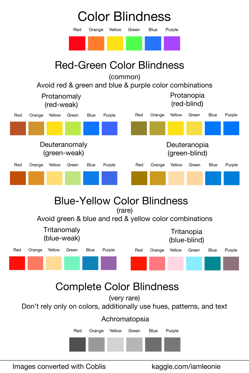
What is Color Blindness?
Color blindness is a genetic condition that makes it difficult to distinguish red, green, or blue light. However, a small percentage of colorblind people can’t see any color at all.
The three main categories of color blindness are red-green, blue-yellow, and complete color blindness [2, 3]. For red-green and blue-yellow color blindness, the types of color blindness can be addressed to an affected color (red, green, blue) and also to a severity (anomalia: irregularity or anopia: blindness).
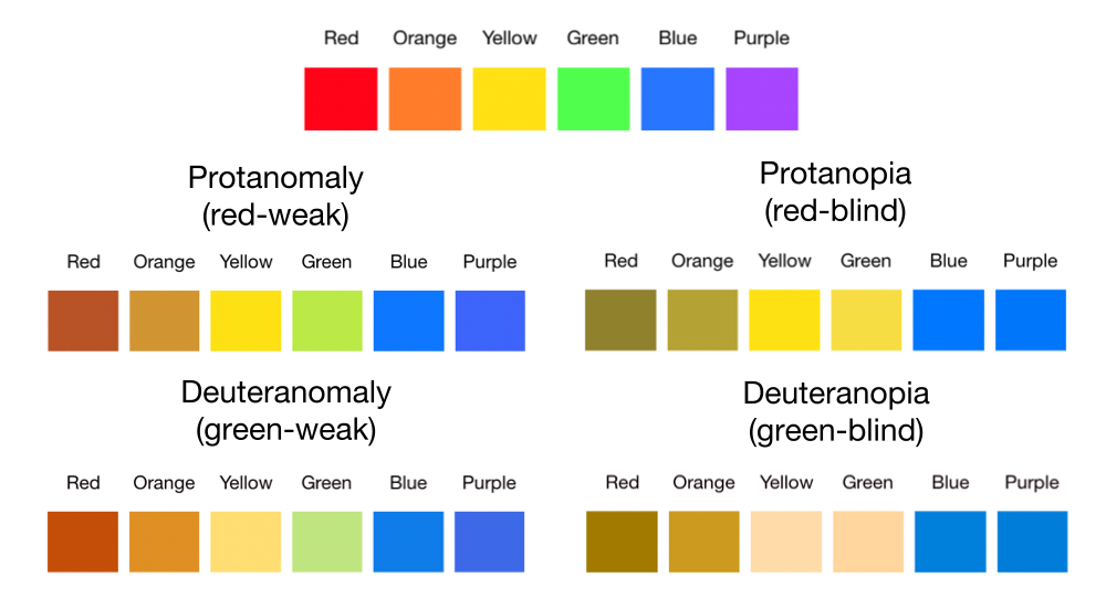
Red-Green Color Blindness
The most common category is red-green color blindness. While protanomaly (red-weak), is a reduced sensitivity to red light, deuteranomaly (green-weak) is a reduced sensitivity to green light. Both protanopia (red-blind) and deuteranopia (green-blind) make you unable to tell the difference between red and green at all. Therefore, color combinations of red and green and blue and purple are problematic for people with one of these conditions [2, 3].
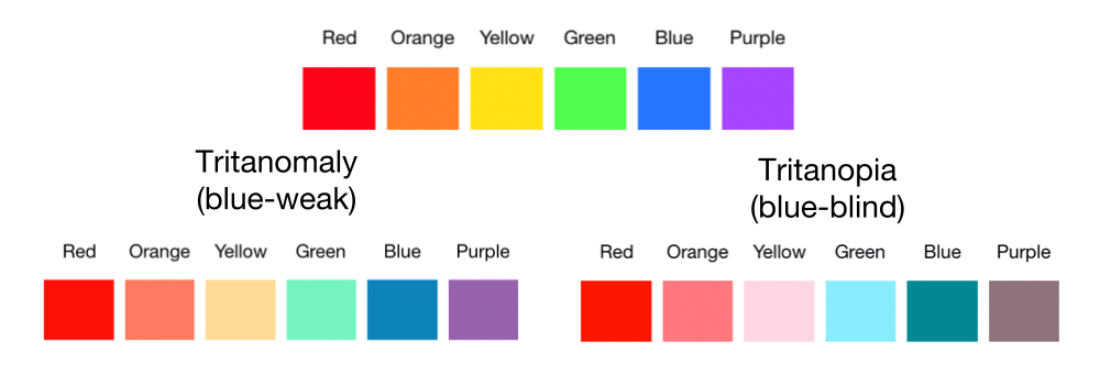
Blue-Yellow Color Blindness
Blue-yellow color blindness is less common than red-green color blindness. While tritanomaly (blue-weak) is a reduced sensitivity to blue light, tritanopia (blue-blind) makes you unable to tell the difference between blue and green, purple and red, and yellow and pink [2, 3].
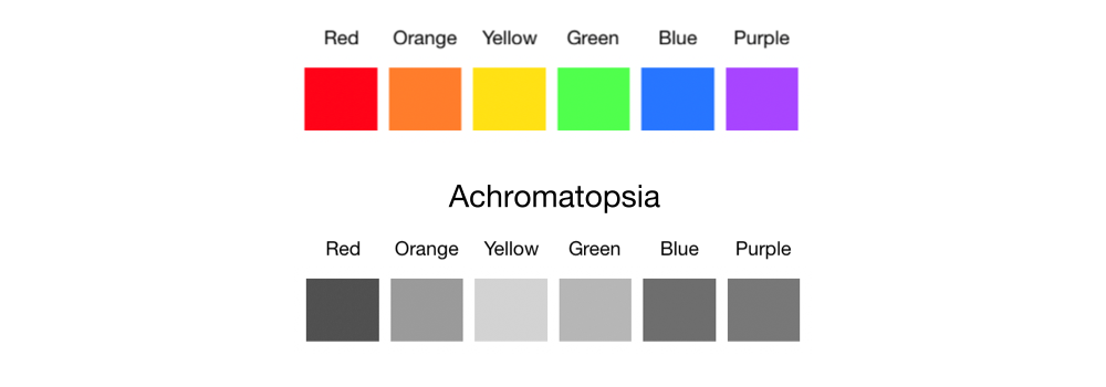
Complete Color Blindness
Complete color blindness is very rare [2, 3]. People with complete color blindness or achromatopsia can’t see any color.
Choosing an Accessible Color Palette
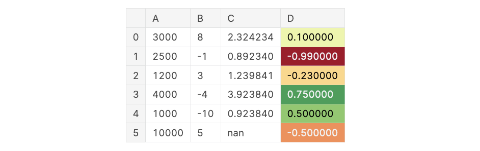
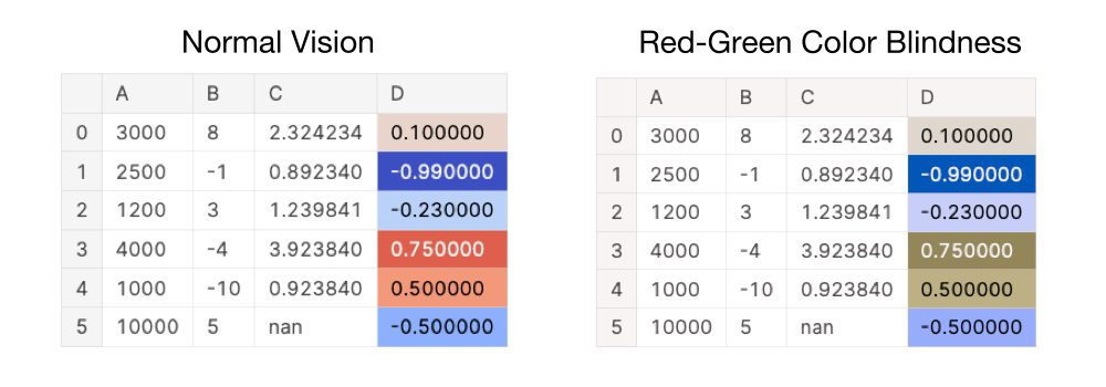
Let’s have a look at an example of an ineffective data visualization due to its color palette. On the first look, the below data visualization looks effective for showcasing how positive or negative a value in column D is. This is a popular method to indicate positive vs. negative or even good vs. bad since we often associate the color green with “good” and the color red with “danger”. For people with an unimpaired vision, it is clear that row 1 has the largest negative value with -0.99 and that row 3 has the largest positive value with 0.75.
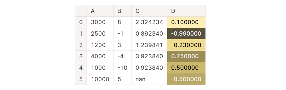
However, the above data visualization is difficult to read for someone with red-green color blindness. Below you can see the previous data visualization simulated with red-green color blindness. The last three rows have similar shades of brownish-yellow. In comparison to what a person with an unimpaired vision would see, it is difficult to recognize that the last row is a negative value while the two values above it are positive values.
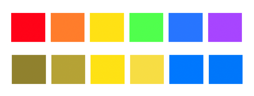
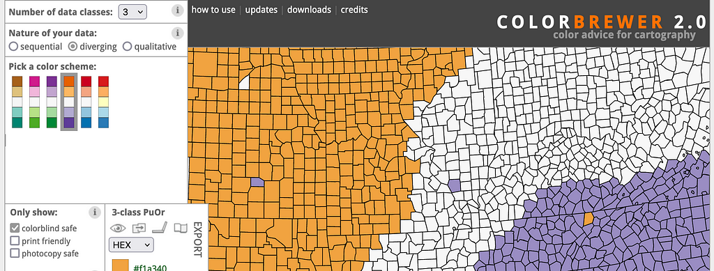
Although, there are different types of color blindness, it is not difficult to choose an accessible color palette. First, make sure to avoid problematic color combinations like red and green, blue and purple, blue and green, or red and yellow. Additionally, online resources like ColorBrewer and Coolors help you pick a colorblind-friendly color palette.
In ColorBrewer, you can set the option to only show colorblind-friendly palettes in the toolbar on the left.
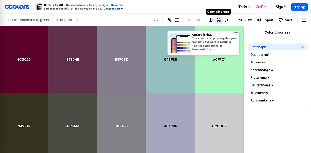
In Coolors, you can enable a colorblindness simulator by clicking on the glasses symbol in the toolbar.
If you don’t have time to create a custom color palette, the Seaborn visualization library provides a colorblind-friendly color palette out of the box [5]. You can set your color palette with the following code snippet:
sns.color_palette("colorblind")
Below you can see the improved data visualization with a colorblind-friendly color palette (we are using “coolwarm” in this example). Not only are the positive and negative values easy to distinguish for people with unimpaired vision but also people with red-green or blue-yellow color blindness.
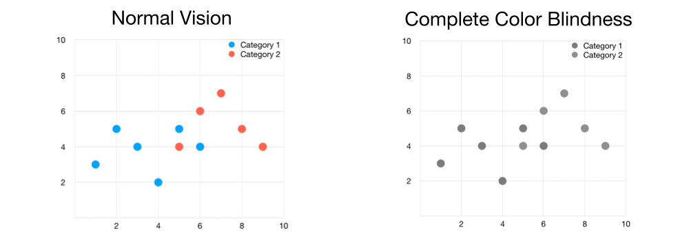
However, even with the colorblind-friendly color palette, the above example is difficult to comprehend for people with complete color blindness.
Don’t Rely Only on Colors
Although you can make your data visualizations more accessible by choosing better color combinations, you cannot rely solely on colors. Black-and-white printing has the same effect on your data visualization as a person with complete color blindness would experience it. Although the data visualization on the left has a colorblind-friendly color palette, it is unsuitable for someone with complete color blindness or black-and-white printing.
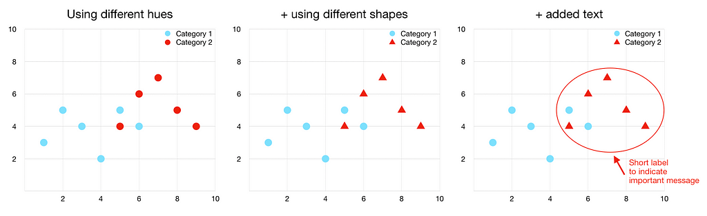
To ensure your audience will be able to fully comprehend your data visualization you can use the following strategies in addition to using a colorblind-friendly palette.
- Using different hues of color
- Using different marker shapes, line styles and widths, and fill patterns
- Adding text
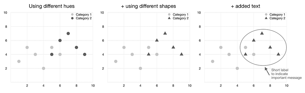
Below you can see that combining these strategies increases the readability not only for people with complete color blindness but also for people with unimpaired vision.
With these three strategies, the readability of the data visualization increases for people with color blindness and black-and-white printing.
Conclusion
This article explained why an inaccessible color palette renders data visualizations ineffective for colorblind people. As color blindness affects 8% of men and 0.5% of women, there is a good chance that someone in your audience is color blind. Thus, considering color blindness for your color palette helps your data effectively tell a story.
Online resources like ColorBrewer and Coolors can help create an accessible color palette. You can also simulate your data visualization’s effectiveness for all types of color blindnesses with Coblis [1].
Considering complete color blindness or black-and-white printing, you can’t rely on colors alone. Thus, supporting your colorblind-friendly color palette with varying hues, marker shapes, line styles, fill patterns, and text enhances the effectiveness of your data visualization.
The following figure summarizes the main points of this article:
References
[1] Coblis, “Color Blindness Simulator.” color-blindness.com. http://www.color-blindness.com/coblis-color-blindness-simulator/ (accessed July 8, 2022)
[2] Colour Blind Awareness, “Types of Colour Blindness.” colourblindawareness.org. https://www.colourblindawareness.org/colour-blindness/types-of-colour-blindness/ (accessed July 8, 2022)
[3] National Eye Institute, “Types of Color Blindness.” nei.nih.gov. https://www.nei.nih.gov/learn-about-eye-health/eye-conditions-and-diseases/color-blindness/types-color-blindness (accessed July 8, 2022)
[4] J. A. Vargas, “The Face of Facebook.” newyorker.com. https://www.newyorker.com/magazine/2010/09/20/the-face-of-facebook (accessed July 8, 2022)
[5] M. Waskom, “Choosing color palettes.” pydata.org. https://seaborn.pydata.org/tutorial/color_palettes.html (accessed July 8, 2022)
Is Your Color Palette Stopping You From Reaching Your Goals? was originally published in Towards Data Science on Medium, where people are continuing the conversation by highlighting and responding to this story.
from Towards Data Science - Medium https://ift.tt/CIgKMRc
via RiYo Analytics


No comments