https://ift.tt/yAcBOLH Making an animation to find the best balance between x and y coordinates on a curve I was recently asked to help wi...
Making an animation to find the best balance between x and y coordinates on a curve
I was recently asked to help with a project that involved finding the x and y values on a curve that had the largest area underneath them. To accomplish this, decided to make this animation:
Aside from looking pretty cool, such a task can have utility in research or industry. As one variable increases, the other decreases, and so you want to find the values of x and y that provide the maximum area under the curve that maps their relationship (I call this the best x/y trade-off).
The example in the initial problem I helped with was in the context of growing fruits in a greenhouse with heat capacity on the x-axis and frequency/year on the y-axis. Another example could be between heat and pressure in a bioreactor or food processing system— maximising one or both of them would be too costly, so finding the best trade-off between the two would be desirable.
Since the problem was fun and not too difficult, I thought I’d make an article out of it for others to learn from. When I started Python, something that frustrated me sometimes was the assumed knowledge of much of the code I found online. To avoid this, I’m going to try to be as comprehensive as possible when explaining my code and show multiple ways of achieving the same goal.
I recommend reading the contents below and skipping over bits you’re more familiar with to get to the bits you will benefit from. I will import libraries as we use them so you get a better sense of how and when they’re used. With that, let’s begin!
Contents:
- Making a dataframe
- Removing outliers
- Dealing with not available (NA) values
- Make a spline curve
- Find best x/y trade-off
- Plotting
- Animating
Making a dataframe
The data used in the original project is private, so instead, I made some data of a very similar nature for this article. It also means you can copy and paste it easily and follow along.
Now, let’s put the data into a dataframe since it will make future steps a little easier for us and because dataframes are one of the most common data types you’ll come across in Python.
We can do this by specifying a dictionary (using the curly brackets {}) with the desired column names before the colon and the data we are using after:
This throws an error that tells us that we can’t do this because of the dimensions of the data.
They’re both arrays, but x is a 1D array whereas y is a 2D array in which each of the 17 elements is also an array. We can see this using .shape :
and also by printing a given value of x compared to y:
This makes y a little bit more awkward to deal with. To fix this, let’s quickly loop through y and add all the values to an empty list, new_y, so we have the data in a more usable form.
Here, so loop through each value of y and from each array take the first (and only) value by using [0]. Then we append this to the new empty list we just made.
Now, we can make a dataframe from the data:
Removing outliers
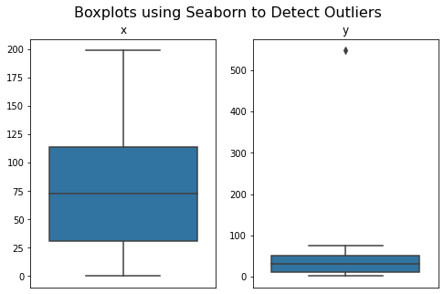
The presence of outliers in data is all too common and should always be investigated. This can be done with visual inspection if the data is small, as in our case.
Another option us using approaches like boxplots. I like the seaborn package for this purpose:
Another way to check for outliers is to use an outlier function. Previously, the ones I found online didn’t satisfy my needs, so I decided to make my own.
It takes a dataframe as the first argument and a z value as the second argument, loops through the columns, and columns with outliers, their values, and their location in the dataframe to you.
For conciseness, I leave out the code for defining the outlier function, but you can copy it from this link.
As we saw with the boxplots, we see that y has an outlier at index position 0 of value 548.
What I like about this outlier function compared to others is it doesn’t just remove them but presents them to you and lets you decide what to do with them. This is convenient in my work because often I have outliers in my data that should not be removed, such as high body-mass index values that, although outliers, reflect genuine readings and shouldn’t be excluded without good reason.
In this case, though, it’s possible that the first value represents something like energy required to start up the system and this energy could not be sustained throughout the whole process, therefore representing a true outlier. This is supported by the fact that it occurs within the first millisecond of recording.
Having the data in dataframe form now makes removing this datapoint easier since, instead of having to remove both x and y values, we can just remove the whole row. This makes things convenient on larger datasets and prevents the risk of removing datapoints in different positions, causing a data shift.
There are various ways to do this.
We can copy the index value from the outlier report and drop that index value like this:
Another situation would be to remove any row with a certain reading.
I encountered this recently with continuous blood glucose monitoring data where regular calibrations provided unrealistic readings of a fixed amount. If this, in our case, was 548, we could use this code to get rid of all instances where the y value is equal to 548:
And it may also be that 548 represents a cut off of some kind, the values above which are not realistic and therefore can be discarded as outliers. The following code can do this:
A final option in this case though, since our outlier is the first value in the dataframe, is just to using indexing to remove the first value:
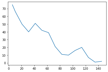
Now, the data looks more reasonable:
Dealing with not available (NA) values
Another important part of data cleaning is checking for NA values. We might be deceived that our data does not contain NA values since we were able to plot it using matplotlib above.
Certain functions just ignore NA values and still work (like matplotlib and seaborn above), but others like the function we will use below will not work with NA values.
We should always check. Since our data is in a dataframe form, pandas’ isna() is the best way to do that. The function isna() returns each item of the dataframe as a Boolean (True or False) as to whether it is or is not an NA value.
This is not particularly helpful in most cases, but by combining this with sum() to see the NA values per column and sum().sum() to see the number of NA values in total in the dataframe, it becomes a lot more useful.
Before just dealing with NA values, we might want to investigate them a little first. The first, second, and third lines of code
respectively.
This NA value could be something like a value so low that it is no longer detected, something I come across very often in data I’m working with. It could be appropriate to swap this to 0, however because we are uncertain, we will drop the data instead.
Make a spline curve
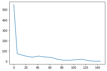
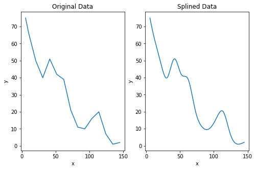
When we plot our data we see that it is jagged and not smooth. There are various ways for curve smoothing but I have good experience with scipy’s make_interp_spline.
The x and y data are given as inputs to estimate coefficients for a curve. We then split the x data up into many individual and evenly spaced points using numpy’s linspace function and use this to estimate the values for y.
Now, if we plot this data, we see it is smooth whilst still representing the approximate shape of the data.
It’s worth noting that issues can arise when we modify the data in this way. For example, let’s say we placed our NA value with a 0 as we considered, the data would look like this instead:
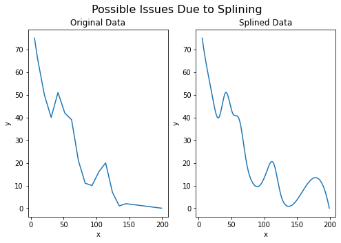
In our case, this issue arises because the y value at x=145 is slightly higher than the data point before it, although since both the values are small this could simply due to measurement differences rather than anything meaninful. Aside from this, the data is well represented, though this serves as a reminder to always check that splined data represents the observed data.
Find best x/y trade-off
In this case, the splined data is not only helpful for us for plotting but it also helps us with our next step: finding the values of x and y that will give us the largest area under the curve (AUC). Now, instead of having 14 data points as in the original dataset, we have 500 (or however many we decided to specify in the third argument of the np.linspace function.
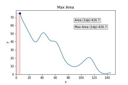
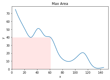
By rephrasing this question as finding out an area, and by realizing that the bottom left corner of the rectangle is fixed at 0,0, the top left is fixed at 0,y, the bottom right is fixed at x,0, and the top right is every point on the line, the question becomes a simple multiplication.
First, we can calculate the area for all the points that compose the curve by making a dataframe with the splined data and then adding a new column to represent area:
Then we find the max row in the dataframe:
We can then save these coordinates to two new variables with the following code:
and now we are ready to visually represent this on our new smoothed curve.
Plotting
There might be various ways to add a rectangle to a graph as we want to do in matplotlib but the way I found most straightforward was with a package called mpatches.
We create 2 new variables which represent the coordinates of the bottom left corner of the rectangle, and then 2 which represent the height and width. Since our rectangle will start at 0,0 (the origin), then the first 2 variables are 0 and 0. The height and width are then simply the values we obtained for x and y, i.e., bestx and besty.
We then use the mpatches package to create a rectangle of the proportions we just specified and the design we desire.
I included various arguments that can be used here to alter the appearance of the rectangle and put some explanations for what they do afterwards, but there are also other arguments that allow manipulation of the rectangle appearance that you can explore.
It looks pretty cool (this is what classifies as cool for nerds), but we can easily make it a little bit cooler.
We can add the point on the graph which corresponds to best x and best y to emphasise this a little more. We could also consider adding some lines going down from the point to the x and the y to emphasise each of these values a little more, too. We can achieve this easily with the following code:
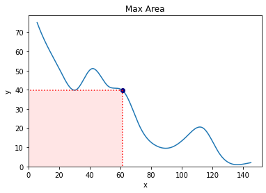
We could also add some text if we so wished. A logical entry here would be the area of the rectangle:
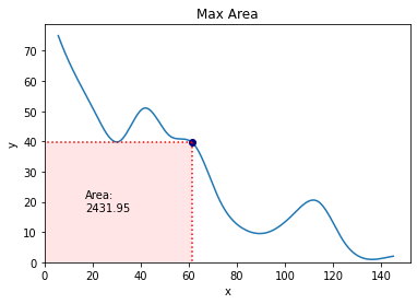
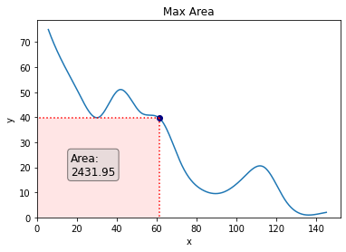
To make the text stand out a bit more, we will add a box around it. We will also make the font a little bigger.
Animating
Adding the finishing touches to all of this is now to animate our plot in a way that shows the area of each point on the curve starting from the first point to the last.
There are multiple ways and packages to animate plots in Python but I found this from Christopher Tao the most straightforward way to do it.
It involves making separate plots for each point on the curve and then merging them into a GIF using a package called Imageio. It’s probably not the most efficient way to do this but it’s pretty straightforward and not technical.
I will build the code bit-by-bit and explain each chunk as we go, then put it all together so you can copy and paste it and use it easily. (I don’t recommend running each code bit by bit because you’ll end up with a lot of images in your directory).
The first thing we will do is loop through the splined_df and make a new plot for ever single data point. The main changes we need to make to do this is 1) change the width and height for the box from bestx and besty to the x and y values of the current data point, and 2) do the same for the point and the vlines and hlines. This is easy:
Next, we’re going to update the text box to show the area of the current datapoint. It doesn’t make sense to keep the text box showing the area of the box in the same position as in the previous figures since the box will be changing in shape and size. Instead, let’s put it out of the way in the top right corner:
Additionally, what would be cool is to show how the maximum area changes along the curve. For this, we will create another textbox just underneath that shows the current best area up until now.
To do this, we need to create a variable outside of the for loop at the beginning of this section and set it to a number lower than our lowest value. In our case, this could be 0, but it’s good practice to set this number to be negative infinity just in case we’re ever working with data with very low or very low (and unknown) data points.
Next, we then make an if/else clause within our for loop to say: if the area of the current data point is largest than the previous one, then the current data point now becomes current_max and we print this in the textbox. Else — if the current data point is not larger than the value for current_max — then we just print current_max in the textbox (i.e., it is unchanged from the last picture). We’ll also round the area to 1 decimal place to maintain readability.
This looks like this:
Finally, we save each individual figure and close the plot to stop it each one from popping up in whichever environment you’re running Python.
All the figures will exist in your directory with the name “max_area” followed by the number of the row in the splined_df dataframe.
The final step is to use the library imageio to make all our images into a GIF. The following code does this by looping through all the images we just saved and writing them into one GIF.
After a couple of minutes, you’ll have your animation.
The final step is to delete all the files we just made, leaving only the GIF. This can be done with the following code:
Below, the full code for making the anaimation so that you can copy and paste it all at once to use in your own data.
I hope you found this helpful and are able to apply or adapt the code to produce something relevant to what you need to do!
Finding the Maximum Area Under Points on a Curve in Python was originally published in Towards Data Science on Medium, where people are continuing the conversation by highlighting and responding to this story.
from Towards Data Science - Medium https://ift.tt/2aoW7Dk
via RiYo Analytics


ليست هناك تعليقات