https://ift.tt/VIpNZ7y Plotting the movement of SO2 after a volcanic eruption. The first picture: Screenshot of a satellite animation of...
Plotting the movement of SO2 after a volcanic eruption.
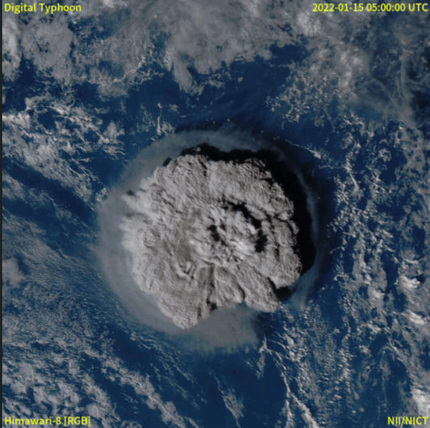
In mid-January 2022, there was a volcanic eruption on Hunga Tonga– Hunga Haʻapai, a volcanic island of the Tongan archipelago. A satellite animation showed a massive explosion with a ton of smoke. The smoke we saw naturally consists of water vapor, carbon dioxide (CO2), sulfur dioxide (SO2), and ash.
Let’s talk about SO2. After being released, SO2 is converted to sulfate aerosols at a high altitude. The aerosols are able to reflect sunlight and cool the Earth’s climate, and they are also a cause of ozone depletion. With massive eruptions, SO2 can be injected more than 10 km into the atmosphere.
However, the released SO2 is hard to observe due to its invisibility.
This article will show how to visualize SO2 movement after the eruption with a scatter plot and heat map.
Get Data
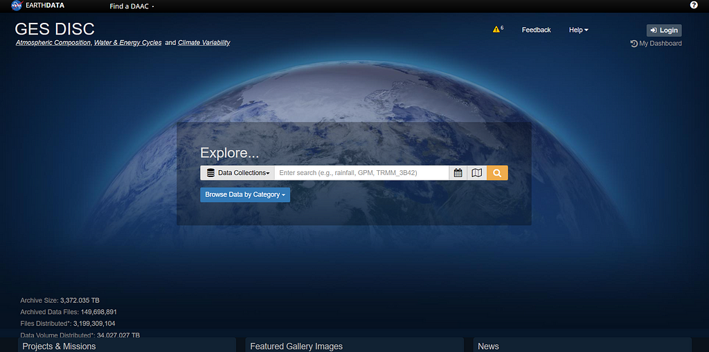
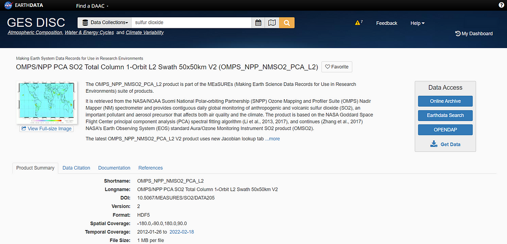
Atmospheric composition data, including SO2, can be downloaded from NASA’s Goddard Earth Sciences Data and Information Services Center (GES DISC). The data is open to access after signing up.
SO2 data can be accessed from the OMPS_NPP_NMSO2_PCA_L2 data product, which is a Level 2, orbital-track volcanic and anthropogenic sulfur dioxide product for the Ozone Mapping and Profiler Suite (OMPS) Nadir Mapper (NM) onboard the NASA/NOAA Suomi National Polar-orbiting Partnership (SNPP) satellite.
Please take into account that this is not raw data. Level 2 data product is defined as derived geophysical variables at the same resolution and location as Level 1 source data. For more information about the levels, you can check them here.
To access SO2 data from the website, I followed the useful steps from Getting NASA data for your next geo-project, an insightful article about getting GES DISC data files.
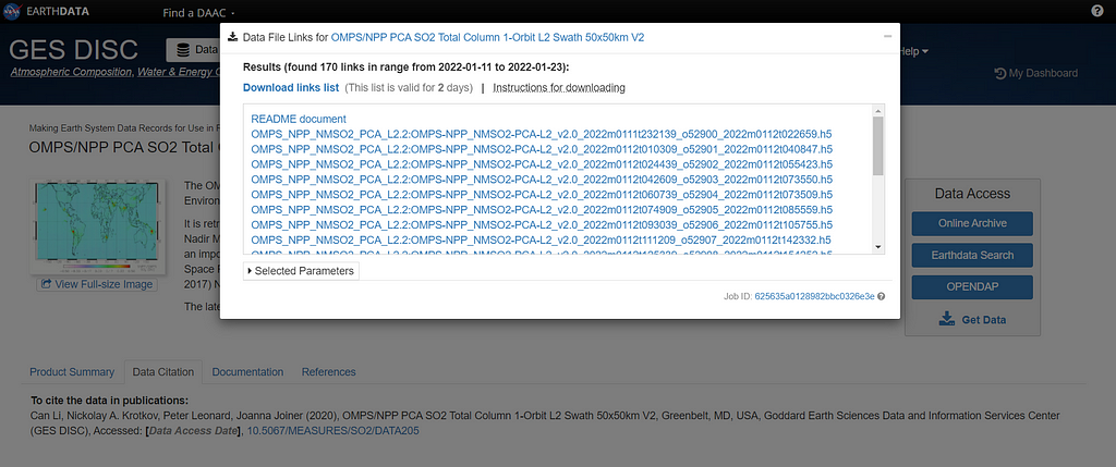
The date range is refined from January 12 to 23 since the eruption of Hunga Tonga–Hunga Haʻapai reached its climax on January 15, 2022.
Besides getting data, download a text file (.txt) from the website by clicking on the Download links list. This text file will help us get file names in the next step.
Import Data
Starting with libraries, besides NumPy and Pandas, the H5py library is for reading the downloaded HDF5 files.
Read the obtained text file (.txt) in the previous step to get file names.
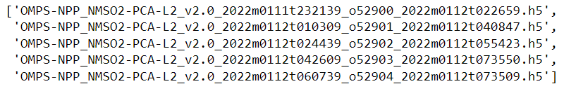
The code below shows how to read files with H5py from file names. After reading, the data will be kept in a list.
Select Keys
The HDF5 format contains many keys inside. We need to explore the data to select what key we are going to work with. The main two keys used in this article are GEOLOCATION_DATA and SCIENCE_DATA.
list(dataset[0].keys())
### Output:
# ['ANCILLARY_DATA',
# 'GEOLOCATION_DATA',
# 'SCIENCE_DATA',
# ...
GEOLOCATION_DATA: Latitude, Longitude, and UTC_CCSDS_A.
list(dataset[0]['GEOLOCATION_DATA'].keys())
### Output:
#['Latitude',
# 'LatitudeCorner',
# 'Longitude',
# ...
# 'UTC_CCSDS_A',
# ...
SCIENCE_DATA: ColumnAmountSO2 which is the total vertical column amount SO2 in Dobson units.
list(dataset[0]['SCIENCE_DATA'].keys())
### Output:
# ...
# 'ColumnAmountSO2',
# ...
The dataset also contains other interesting keys inside. For more information, the official website provides a PDF file explaining the other keys here.
Create DataFrame
Now that we have already selected the keys, let’s define a function to extract data.
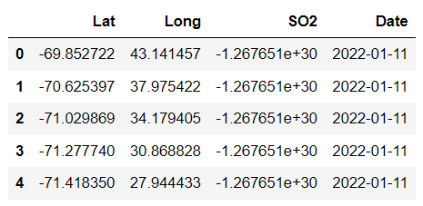
Create lists of latitude, longitude, amount of SO2, and date.
Before doing the scatter plot, we have to convert the longitude range. This is because the longitude range of a typical map, including the data from GES DISC, is between -180 and 180.
If we directly plot the location of Hunga Tonga–Hunga Haʻapai, which is located at longitude -175.4, the movement of SO2 will be cut due to locating close to the range’s limit (-180). The code below is for modifying the longitude rage.
Create a Panda DataFrame from the lists.
Descriptive Analysis
An important step to start with is doing the descriptive analysis. This is a useful step in helping us understand the data.
To see the daily amount of SO2 surrounding the volcano, we will create a filtered DataFrame selecting only the amount of SO2 within a square area of 15 degrees of latitude and longitude from the eruption point. We will also select only rows with positive SO2 values.
Group the filtered DataFrame by Date and sum the daily amount of SO2.
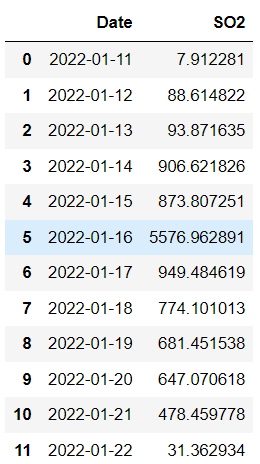
The table above shows that the daily amount of SO2 reached the maximum point on January 16.
Plott a time-series line graph from the DataFrame to see the progress in a timeline.
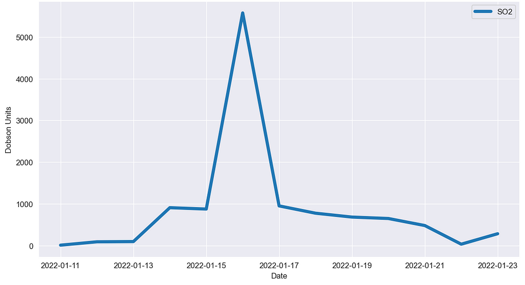
The graph shows that SO2 surrounding the island had increased drastically from 15 to January 16, when the explosion occurred.
Visualization
1. Scatter plot
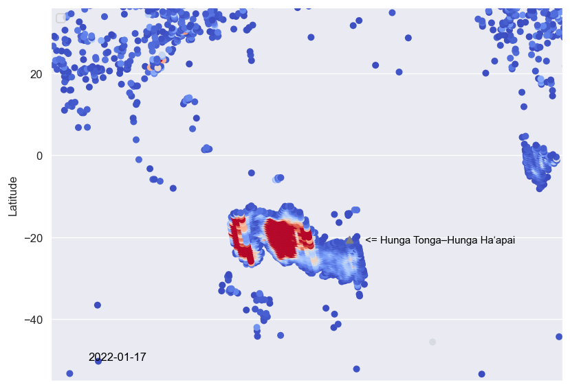
With latitude and longitude, the position of SO2 is plotted as dots with colors in accordance with location and density, respectively.
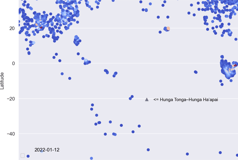
Start with creating a list of dates to filter the DataFrame. Only rows with SO2 more than 0.5 DU are selected to avoid the excessiveness of data when we plot them.
Now that we have everything done, as an example, I will show a scatter plot of the amount of SO2 on January 17, a few days after the eruption.
Making an animation is an idea to make the visualization looks interesting. We can combine these daily plots into a GIF file to see the progress. To do that, we are going to plot every daily scatter plot and store them in a list.
Combine the plots and turn them into a GIF file.
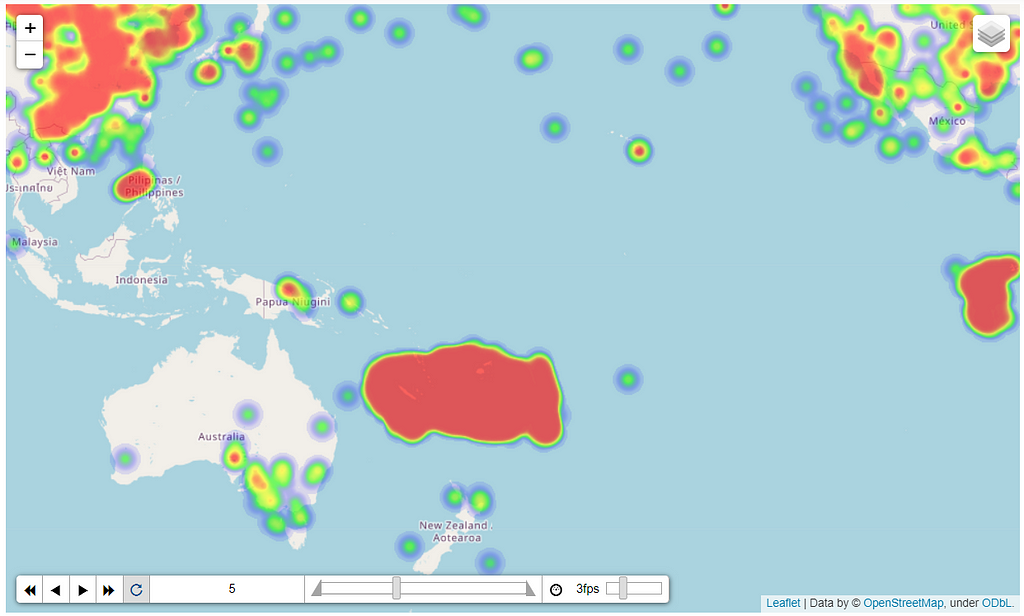
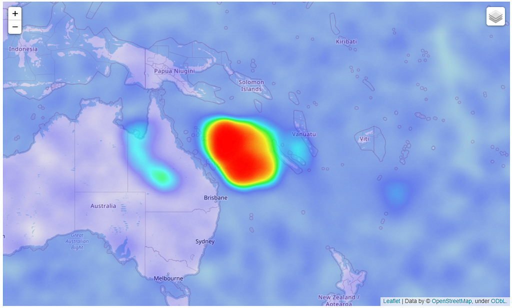
2. Heat Map
Folium is a Python library that is easy to use and powerful for working with geospatial data. Start with importing libraries.
For example, I will show how to plot a Heat map of SO2 on January 17.
To work with Folium, we need to create a list of list of latitude, longitude, and the amount of SO2 from the DataFrame. Then, use the Heatmap function to create a Heat map.
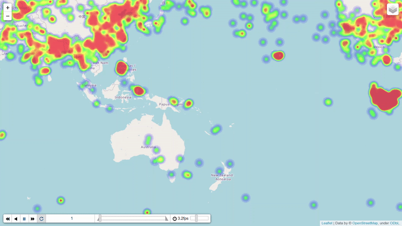
Heat Map with Time
Folium has a function called HeatMapWithTime for making a time-series Heat map. This is very useful to create an animation of the SO2 movement.
Voila !!…
Discussion
According to the news, the eruption reached its climax on January 15, 2022, and calmed down after that. However, visualization with the OMPS_NPP_NMSO2_PCA_L2 data, which is a level 2 product, shows that the released SO2 still remained in the air for more than a week.
The result is in accordance with the information from the Agency for Toxic Substances and Disease Registry (ATSDR) that the atmospheric lifetime of SO2 is approximately 10 days.
Summary
Even though SO2 is hard to observe with bare eyes, we can use Python with data from NASA to plot the movement of SO2 after being released. This article has shown the source of data and how to download and visualize them.
As I mentioned in the explore data step, there are also other keys inside the HDF5 files. You can go back and play with the others. If anyone has a question or suggestion, please feel free to leave a comment.
Reference
- Can Li, Nickolay A. Krotkov, Peter Leonard, Joanna Joiner (2020), OMPS/NPP PCA SO2 Total Column 1-Orbit L2 Swath 50x50km V2, Greenbelt, MD, USA, Goddard Earth Sciences Data and Information Services Center (GES DISC), Accessed: Mar 19, 2022, 10.5067/MEASURES/SO2/DATA205
- Bhanot, K. (2020, August 12). Getting NASA data for your next geo-project. Medium. Retrieved April 12, 2022, from https://towardsdatascience.com/getting-nasa-data-for-your-next-geo-project-9d621243b8f3
- Python-visualization. (2020). Folium. Retrieved from https://python-visualization.github.io/folium
- Agency for Toxic Substances and Disease Registry (ATSDR). 1998. Toxicological profile for Sulfur Dioxide. Atlanta, GA: U.S. Department of Health and Human Services, Public Health Service.
Visualize The Invisible SO2 with NASA Data and Python was originally published in Towards Data Science on Medium, where people are continuing the conversation by highlighting and responding to this story.
from Towards Data Science - Medium https://ift.tt/pbU8Id3
via RiYo Analytics


ليست هناك تعليقات