https://ift.tt/EubgDAR Understanding the Fourier transform through a visualization of oscillators in the complex plane Image by author. S...
Understanding the Fourier transform through a visualization of oscillators in the complex plane
Introduction
In other articles, I’ve written about the application of the Fourier transform to determine the frequency components of real or complex signals.
To build our intuitions even further, let’s learn to draw with the Fourier transform!
Defining an oscillator
We’ve discussed frequency, phase, and magnitude in other contexts, but it is worth a quick refresher!
- https://towardsdatascience.com/the-fourier-transform-1-ca31adbfb9ef
- https://towardsdatascience.com/the-fourier-transform-2-understanding-phase-angle-a85ad40a194e
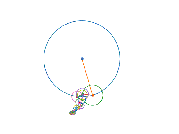
Frequency is the rate of rotation, i.e., the speed at which a given oscillator spins. Phase indicates the rotation’s starting position, i.e., the point on the circle where it begins rotating. Magnitude is the amount of a given frequency present in a signal, i.e., the size of an oscillator.
In the visualization above, each of the spinning circles is an oscillator. Each oscillator spins at a fixed speed: its frequency. Each oscillator starts at a given point in its rotation: its phase. Each oscillator has a specific radius: its magnitude.
We can get all this information from the Fourier transform. The absolute value (np.abs) of the Fourier transform gives us magnitude. The phase (np.angle) of the Fourier transform gives us phase. This gives us all the information we need to set up some oscillators to draw an outline!
Sketching with the Fourier transform
1. Convert outline to a complex signal
First, we need to get an outline from an image. I decided to use Canny edge detection to extract the edges from an image (in the example above, a drawing of Sherlock Holmes).
This will give us a 2D binary array indicating the edges of the image. Now, we need to represent these points as complex coordinates oriented about the origin. The x-axis will represent the real component, and the y-axis will represent the imaginary component.
2. Reorder to minimize distance between sequential points
Now, we need to order the points to make the progression as smooth as possible. In practice, I’ve found ordering to minimize the difference from one point to the next is a good approach!
3. Call the Fourier transform
We’ll now apply the Fourier transform to extract the magnitude and phase information associated with each frequency. As visualizing all the oscillators is slow, we’ll filter out all the frequency components above self._n_oscillators.
5. Sketch!
All we have left to do is combine the pieces and plot…
… to create a gif!
Conclusion
The Fourier transform is a critical building block in data science, but it isn’t easy to learn! Piecing together a 2D animation using just an FFT is a great method to build an understanding.
What’s next?
Next, I’d like to walk through the mathematics that make the Fourier transform possible. Reply in the comments if there are other topics you’d like to see explained!
Acknowledgements
The visualization ideas presented are shamelessly stolen from creators like…
- 3b1b: https://www.youtube.com/watch?v=-qgreAUpPwM
- Smarter Every Day: https://www.youtube.com/watch?v=ds0cmAV-Yek
Thank you for taking the time to read! If you’re interested in the full source, check it out!
GitHub - peterbbryan/fourier-sketcher: Fourier based drawing script
Teach (and learn) the Fourier transform geometrically! was originally published in Towards Data Science on Medium, where people are continuing the conversation by highlighting and responding to this story.
from Towards Data Science - Medium https://ift.tt/1s3NJkL
via RiYo Analytics


No comments