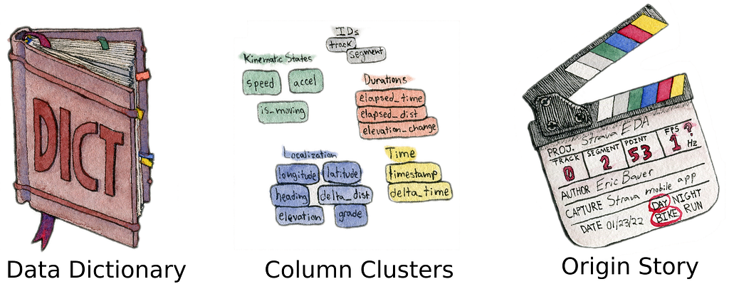
https://ift.tt/S6aiuNY How to go beyond just data dictionaries It’s a jungle out there. Image by Author. When encountering a new datase...
How to go beyond just data dictionaries

When encountering a new dataset, a data dictionary is helpful for understanding and exploring it. Data dictionaries are typically the first tool for EDA, but they still lack or even obscure context. Understanding the data is required before any models or analyses can be built. For datasets with 50 or more columns, constantly looking up information in the dictionary is a mental tax that slows down the understanding process. To extract insights quicker, you need a quicker way to build intuition about your datasets.
Data on its own is just noise. It is only useful with the right context. After all, the integer 3 could be anything–a count of some quantity, a category, or an ID. It isn’t any surprise that column names or data headers are usually included in datasets. Ideally, the data provider describes the meaning of each column in a “data dictionary”. Take the “Housing Prices Prediction” challenge on Kaggle. Without its data dictionary, it would be near impossible to reason that the Condition1 and Condition2 columns indicate a house’s proximity to a noisy road or railroad. Other columns like RoofMatl (roof material) are less cryptic, but still not immediately obvious without a data dictionary.
To quickly build intuition about your data, you need to go beyond the data dictionary and by building a data field guide. The field guide is made up of 3 components:
The most important thing to remember is that data field guide must be made by you. Simply receiving a data dictionary is not enough. That is too passive to quickly build intuition. You must take an active part in understanding what you might see in your explorations. Creating the Column Clusters (also called a “visual data dictionary”) is an exercise in chunking the available information into fewer pieces. Telling your data’s origin story is another strategy to contextualize columns into when they are relevant. Both will give you a new appreciation for your data.
Working with Raw Fitness Data
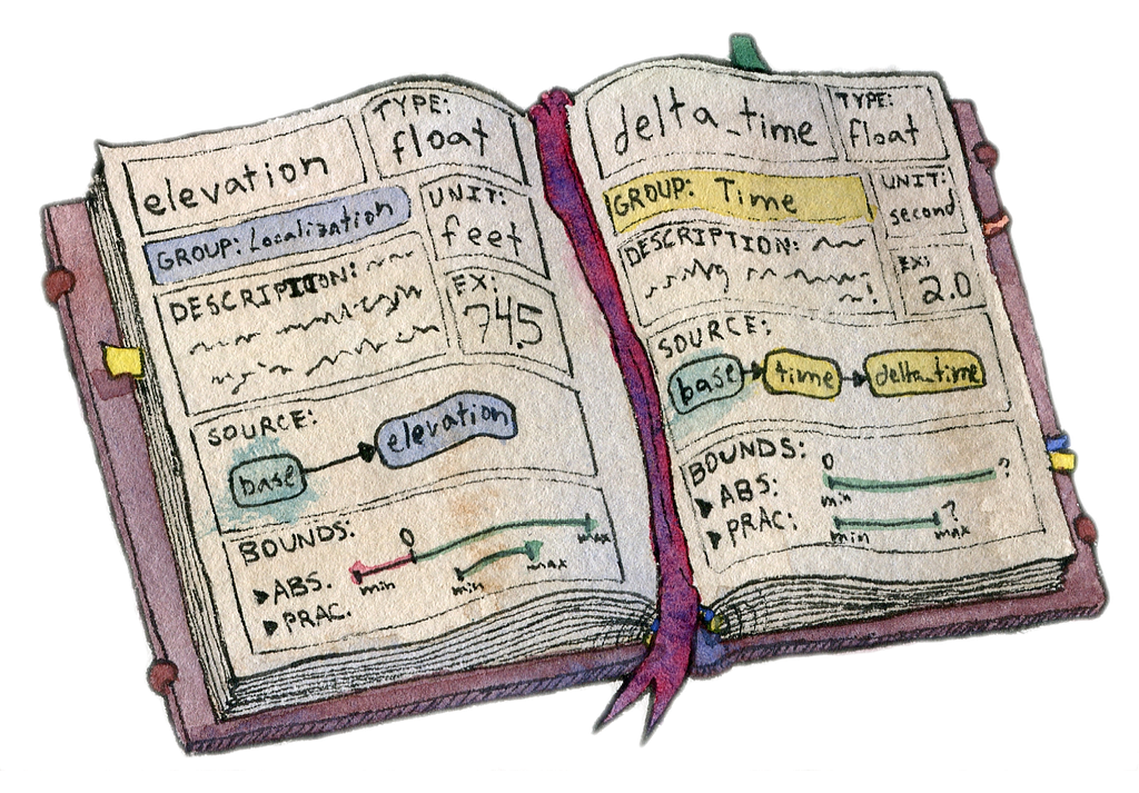
To provide concrete examples, let’s use a real dataset. In another post, I talked about exploring your fitness with activity data downloaded from the Strava app. It is easy to do and making your own dataset through exercise is a productive adventure. Following on from the file format conversion process, here is what a sample bike ride looks like:
This is a Pandas dataframe created with Python, but do not worry–these methods are language agnostic. This dataset only has 6 columns to start. It might not seem like a lot to work with, however, explaining the methodology on a smaller dataset will help show each step without getting lost in combinatorial messes. I have applied this process to datasets at work that have hundreds of columns and obscure origins.
1. The Data Dictionary
The first component of your field guide is the data dictionary. If you are given a dictionary, then some of your work is already done for you. However, you still need to maintain a healthy suspicion of its validity and identify where it is incomplete or confusing.
What if you have column names, but no dictionary? The best recourse would be to ask the dataset provider for that information. If that isn’t possible (or would take too long), it is up to you to construct your own data dictionary. In the example Strava fitness data, 2 of the columns are created by my data read process, but the other 4 lack any explanation besides their names. The first draft of my data dictionary is the following:
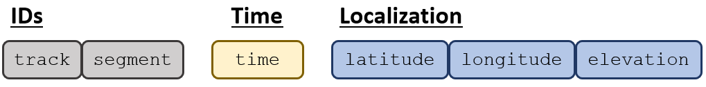
- track (int) = a unique ID for a GPX track within a ride’s data. Derived column
- segment (int) = a unique ID for a GPX segment within a GPX track. Derived column
- time (datetime) = the naive¹ timestamp that states when the row was recorded.
- elevation (float) = the elevation of the user in feet.
- longitude (float) = the longitude of the user in degrees.
- latitude (float) = the latitude of the user in degrees.
¹ the timestamp is not recorded with time zone information. Thus it is naively in local time. (I know it is the Eastern time zone, though)
At a minimum, a data dictionary will catalog each column’s name, data type, description as well as numerical column units or category enumerations (example: 0=Female, 1=Male). This basic data dictionary will get updated as the dataset is explored. The EDA process may enrich the dataset with new columns. Tracking the origin of each column will help document the pedigree of the dataset for machine learning.
What’s in a name?
Names and naming conventions can be very personal matters. It is common sense that a column name should be succinct yet descriptive, but how that manifests in column names is subjective. If you don’t like a name, your choices depend on who you are working with. I am the only stakeholder in my Strava data exploration, so I can and will change names to suit my needs. If you are on a team, changing the names in production datasets might not be possible or practical. Aliasing the names during experiments is fine as long as they are still understandable by the team. Integrating your changes may require undoing those column aliases though.
Completing the Dictionary
A good data dictionary will provide data examples as well as lower and upper bounds for numerical columns. Examples of each column are shown in the previous section’s dataframe image. For the raw columns, the bounds are:
For each column, the absolute bounds represent the physical or designed limits of a column. The technical limits of a float versus an integer or string are not typically useful. The land elevation ranges from 1,358 feet below sea level at the Dead Sea to the top of Mount Everest. I have biked in neither Jordan nor Nepal, so the absolute bounds would not help spot outliers. That is where “practical bounds” come in. Most of my rides are in Ohio where the elevation ranges between 455 and 1550 feet. Similar logic can be applied to the latitude and longitude values to form a rough geofence.
Altogether, the data dictionary part of the field guide will look something like:
Despite their usefulness, data dictionaries are dense. For datasets with hundreds of columns and many attributes noted for each, it can be hard to parse–especially when new to the dataset. If you know the column you want to search, then the dictionary is perfect for finding that information. In terms of knowledge management, the dictionary has good “findability”. Discovering which columns are related can be a harder task in a tabular dictionary format. The next two components of the data field guide will create assets with better “discoverability” [4].
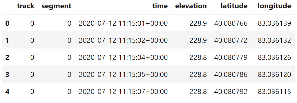
2. Column Clusters
It is time to chunk that information into a curated, visual reference. After all, a picture is worth 1,000 words! For our dataset with 6 columns, this process is relatively simple. The goal is to group related columns into clusters and to label each cluster. This method is sometimes referred to as Affinity Mapping or the KJ Method [5]. I recommend doing this exercise in Powerpoint, Google Slides or a digital whiteboard like Mural. You can do it with sticky notes, but these clusters may change as you explore the data.
In your digital tool of choice, type out the name of each column in the dataset like so:

Next, drag around logically similar columns to sit next to each other in a cluster. Give each cluster some space from the others for visual separation. Once you’re confident in your clusters, add a textbox to label each of them. Fill each column-box in a cluster with the same color to reinforce the visual separation. Naming a cluster can seem tricky, but once you find the “right” one, you will know. It will be much easier to remember those columns by that cluster name, and it will be easier to explain them to colleagues. As for colors, I generally pick colors based on feel. Columns for IDs are boring (yet useful) so they get gray. Warnings or alerts might get orange or red.
More complex datasets will have many related columns and establishing good clusters will require critical analysis of the data dictionary. Placing a column into one cluster versus another might come down to an assumption you have to make. As you form assumptions or questions about the data, keep track of them. I’ll show you what to do with them in a future blog post.
If you’ve completed this step with your own dataset, then you now have a valuable asset for EDA. Beyond the typical column-to-column interactions, you can discover new insights by exploring the interactions between clusters. You may uncover new enrichments or perhaps inconsistencies that affect overall data quality. In addition to improving “discoverability”, creating the clusters is actually a “chunking” exercise. Chunking is the process of organizing information into smaller units (chunks) that are easier to work with and memorize [6]. I am a visual learner, so having a visual guide to these chunks is even better. Building data intuition relies on recognizing patterns. So far, I have shown how to cluster columns based on their semantic relationships. Next, I’ll cluster columns based on their temporal relationships.
3. The Data Origin Story
A data field guide must also contain notes on the data creation timeline. A dictionary is just a reference for columns as nouns. Think about your dataset as a verb–or better yet, a movie! It is fun to think of your data as a superhero (or supervillain) with its own origin story. Data changes as events occur and samples capture important occurrences. Certain columns are only relevant at certain points in this data creation process. Thinking about the data as a movie helps break complex, many-columned datasets into stories which are easier to remember and share with others.
Recall from the previous article that the example fitness data is generated as a GPS Exchange Format (GPX) file. The GPS coordinates, elevation and time data are all generated as the ride occurs. Overall, this data story is relatively easy to understand, but there is still nuance lurking there.
There are many ways to capture the data journey. An actual movie would be too much effort, but other techniques like storyboarding can help. The storyboard walks through the user journey at key moments in which data is created. The goal for the storyboard is to tell enough of the user journey to see changes in as many relevant columns as possible. For more complex interactions there could be multiple user journeys that capture different chunks of information. Try to highlight the common components across user journeys so that the variations can be handled in different “episode” storyboards.
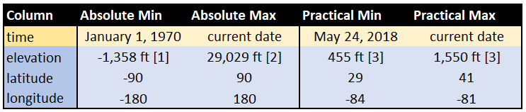
I can summarize the Strava storyboard into a single image (and handy reference) below:
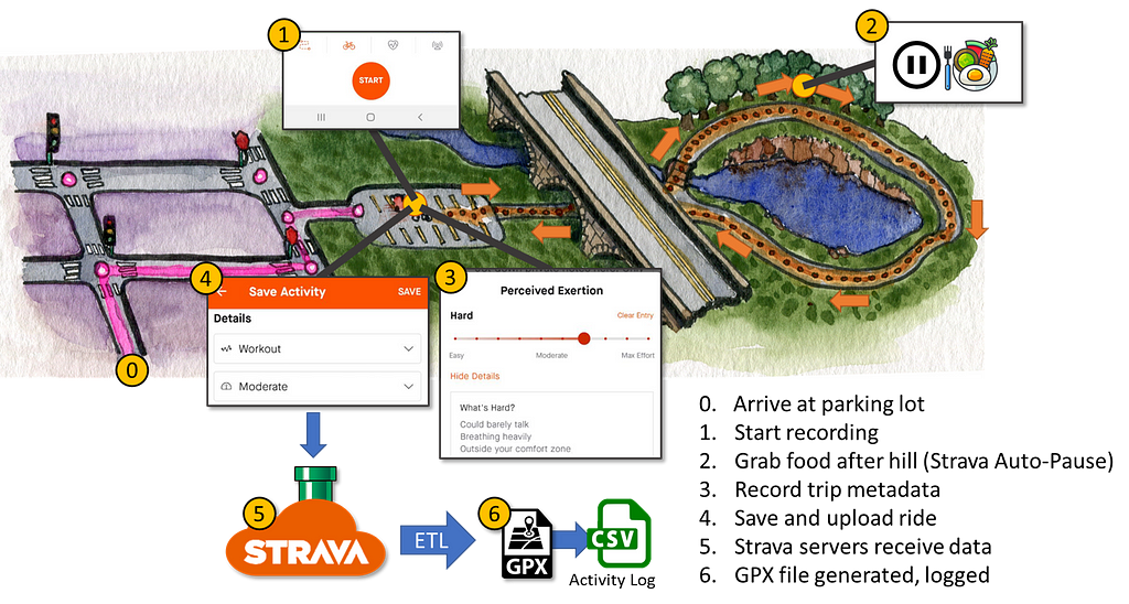
After arriving at the parking lot, the user and data journey is as follows:
- I open the Strava app and start recording a new activity.
- I pedal under a bridge and up a hill, creating track points with timing and localization data. At the top of the hill, I stop to grab some water and a snack. Strava’s Auto-pause feature kicks in to temporarily pause data collection.
- I pedal back down the hill, around the lake and back to the starting point. I end the tracked ride. I record metadata about the trip like a title, any pictures and my perceived exertion on a scale from 1 to 10.
- I save the ride and upload it to Strava
- Strava servers receive my ride data and process it so that it shows up on my account’s feed
- A GPX file is generated for my ride if I want to download it later. Additionally, the summary of the ride is added to an Activity Log file — also available for download.
The 4 core columns (timing and localization) are relevant for steps 1 through 3. The ID columns are relevant at the start as well as in step 2 when the discontinuous recording of GPS data should generate a new segment ID for the last half of the ride.
Defining a “Ride”
Strava tracks runs, hikes, swims as well as bike rides. Strava calls each upload an “activity”. This works well because it makes no assumptions about the activity type. Within the bike ride type, it also doesn’t assume what a “ride” is.
Imagine the user journey where I stop at the top of the hill for lunch. I would likely end the current activity and upload it. After lunch, I would start a new activity. Does each upload count as a separate ride, or does the entire out-and-back trip around the lake? Choosing a definition depends on the purpose of your analysis.
Instead of biking data, consider a car telematics dataset with driving data. From the driver’s perspective, a “trip” to the grocery store could informally mean the drive to and from the store. That data would show up as two distinct ignition ON and OFF cycles, however.
The conundrum applies to e-commerce too. What if in a single login, a customer adds a product to their shopping cart only to purchase it a few hours later when they login again. Do you consider this user journey as one “session” or split it up based on logins?
Whether its biking, driving or online shopping, the labels we assign to our user journeys are packed with assumptions. These assumptions will affect the metrics and analyses we are trying to evaluate. Hence, calling them out in the Data Origin Story can keep you aware of them.
Data “Plot holes”
Data quality issues can cause plenty of headaches, but the Data Origin Story is useful for spotting some quality concerns. For example, Strava seems to rely on the already installed Google Maps for localization data with my phone. What happens if Google Maps is having issues and needs updating? Well…
There are also more human-driven issues:
- Forgetting to record a ride
- Battery dies during a ride
- Manually pausing an activity, but forgetting to unpause later
- Forgetting to stop a recording…and driving home
It can be helpful to capture the ideal or typical user journey before trying to call out sources of data quality issues. Regardless, putting data quality into a story can help understand downstream quality issues.
Conclusions
In this article, I have covered the 3 components of a data field guide. Creating the guide is an active process between you and your dataset. It includes and enhances the value of the data dictionary by creating more discoverable knowledge assets–Column Clusters and the Data Origin Story. The last two assets of the field guide are critical for reducing data vertigo and quickly building intuition.
If you have followed along and created your own data field guide, then questions and assumptions have no doubt arisen. These form the starting points in your data exploration. In my next post, I will detail how to utilize your questions, assumptions and new data field guide to plan your EDA.
References:
[1] Statista, The Lowest Places on Earth (2016), Statista.com
[2] NOAA, What is the highest point on Earth as measured from Earth’s center? (2022), Oceanservice.NOAA.gov
[3] Teacher Friendly Guide to Earth Science, Highest and Lowest Elevations (by state)
[4] Fire Oak Strategies, Knowledge Management: Findability vs. Discoverability (2019), Fireoakstrategies.com
[5] ASQ, What is an Affinity Diagram (2022), Asq.org
[6] Forbes, What Makes Chunking Such An Effective Way To Learn? (2017), Forbes.com
Building Your Data Field Guide was originally published in Towards Data Science on Medium, where people are continuing the conversation by highlighting and responding to this story.
from Towards Data Science - Medium https://ift.tt/mEsAyd1
via RiYo Analytics


No comments