https://ift.tt/Ykbnx46 Visualizing NYC’s Subway Traffic & Census Data Using Python’s Geopandas and Leafmap packages to visualize open ...
Visualizing NYC’s Subway Traffic & Census Data
Using Python’s Geopandas and Leafmap packages to visualize open city data.

The first module of Metis’ Data Science and Machine Learning Bootcamp is in the books & it’s been a whirlwind couple of weeks!
Module #1 covered Exploratory Data Analysis, and for the associated project we were tasked with formulating a use case for turnstile data taken from the New York City MTA, and conducting an analysis to generate insights from the data.
For my project, I chose to analyze the turnstile data from the entire year of 2021 because I felt the insights would be more reliable when taken from the whole year, and also because 2021 has just ended so this data is from a freshly completed calendar year!
Scoping
To determine the scope of my analysis for this proposal, I started with a basic question: What are the broad trends of subway traffic system-wide, and what does traffic at individual stations look like?
I wanted to identify trends on a system-wide level such as the following: What times of the day had the highest traffic? What days of the week? Months? For station metrics, I wanted to know which stations had the highest traffic by borough.
As a further goal, I wanted to look at the demographics of each neighborhood in NYC to see if there were any correlations between traffic and demographics, such as more subway traffic in lower-income areas or less traffic in older neighborhoods.
So, the next question I asked myself was this: How could this information be useful in a professional context?
Well, there could be many applications for this data!
- Targeted outreach for use cases such as non-profits, advertising, political mobilization, and public health.
- Comparative analysis with pre-pandemic traffic numbers. (NY Times)
- Public safety analysis when used with crime data
- Optimized subway maintenance schedules.
Given the number of potential use cases (and the two week turnaround time for the project), I chose to keep my deliverables to the following:
- System-wide traffic trends by time of day, day of week, week of year, month of year.
- Top stations by traffic in each borough
- Visualization providing demographic information alongside station traffic data
Tactics, Tools, and Data
High-level, the ‘relational framework’ I was working with in my mind was as follows:
Subway Station Turnstile Data — Location Data for the Stations — NYC Neighborhood Geographic Data — Demographic Information for NYC Neighborhoods
So the last question I asked myself before diving into the work was this: How would be the best way to convey these insights to a potential client?
The answer was with maps!
I found a second dataset from the NYC MTA which contains longitude and latitude coordinates for the subway stations. I was able to join this onto the turnstile dataset once I aggregated by station.
From there, I took NTA (Neighborhood Tabulation Area) shapefiles published by the NYC Department of Planning, combined them with the most recent data (2019) from the American Community Survey taken at the NTA level, and plotted the subway stations with calculated traffic data over the neighborhoods with demographic information.
All data used in this project is licensed for free use by agencies of the City of New York. You can find specific terms of use for each dataset at the following locations:
- MTA Turnstile and Location Data
- NTA 2020 Shapefiles from NYC Dept. of Planning
- ACS 5 Year Estimates at the NTA Level from NYC Dept. of Planning
To accomplish my goals for this project, I needed a few different Python packages:
- SQLAlchemy: for working with the local database containing our turnstile data
- Pandas, Numpy, Matplotlib, Seaborn and/or Plotly: for manipulating and visualizing tabular data.
- FuzzyWuzzy: for joining station turnstile data with station geographic information (the nomenclature for stations in the two datasets was different, thanks MTA!).
- Geopandas, Leafmap: for plotting static and interactive maps.
Methodology and Code
You can find the full code in the GitHub repo. I’ll provide the highlights below!
Ingestion
Once I’d gotten the packages imported, and set formatting and style options, the first step was to connect to the database holding the turnstile data using SQLAlchemy:
engine = create_engine("sqlite:////Users/USER/Documents/GitHub/NYC_MTA_EDA_Project/mta_data.db")
Next, I read this database into a pandas dataframe like so:
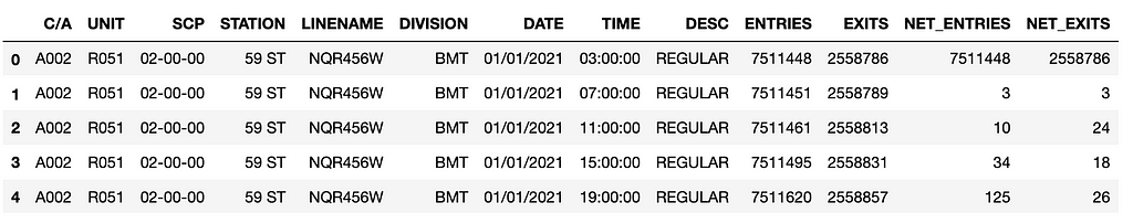
df = pd.read_sql('SELECT * FROM mta_data;', engine)
We can do whatever we like with the SQL query here, but I prefer pandas for my EDA.
select *, ENTRIES - coalesce(lag(ENTRIES) over (ORDER BY "C/A", UNIT, SCP, STATION, DATE, TIME), 0) AS NET_ENTRIES, EXITS - coalesce(lag(EXITS) over (ORDER BY "C/A", UNIT, SCP, STATION, DATE, TIME), 0) AS NET_EXITS from mta_data order by "C/A", UNIT, SCP, STATION, DATE, TIME LIMIT 100;
Will give you:
Cleaning
Once I had the data (in its original format) read in as a pandas dataframe, I did a couple of things:
- Renamed columns for easier manipulation.
- Created a datetime column from the DATE & TIME columns
- Got rid of any values where the DESC was “AUD RECOVR”(more on this)
- Calculated the aggregated column net_traffic, which is the basis for much of our analysis further along.
Outliers
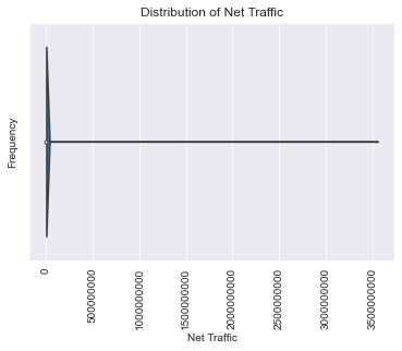
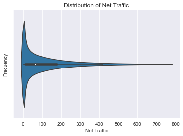
After running a pandas-profiling report, I saw that our net_traffic field was all over the place. Some negative values, some in the billions. I made some executive decisions at this point:
df['net_traffic'] = abs(df.net_traffic)
q = np.quantile(df['net_traffic'], .99)
df=df[df['net_traffic'] < q]
This casts all the values of our net_traffic column as positive, and gets rid of any values beyond the 99th percentile. This should get rid of the most egregious outliers, while preserving the dataset as much as possible. It’s an approach that lacks nuance, and definitely an area for improvement!
Visualizing
Since the goal was to provide a series system-wide insights over given timeframes, I needed to add those timeframes as columns using the date_time column:
df['date'] = df.date_time.dt.date
df['day_of_week'] = df.date_time.dt.dayofweek
df['month'] = df.date_time.dt.month
df['week'] = df.date_time.dt.isocalendar().week
df['hour'] = df.date_time.dt.hour
Then I started visualizing system-wide traffic over given timeframes:
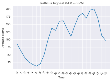
hourly_df = df.groupby(['hour'])[['net_traffic']].mean().reset_index()
plt.plot(hourly_df.hour,hourly_df.net_traffic);
plt.xlabel('Time')
plt.ylabel('Average Traffic')
plt.title('Traffic is highest 8AM - 8 PM')
plt.xticks(np.arange(24), rotation=45);
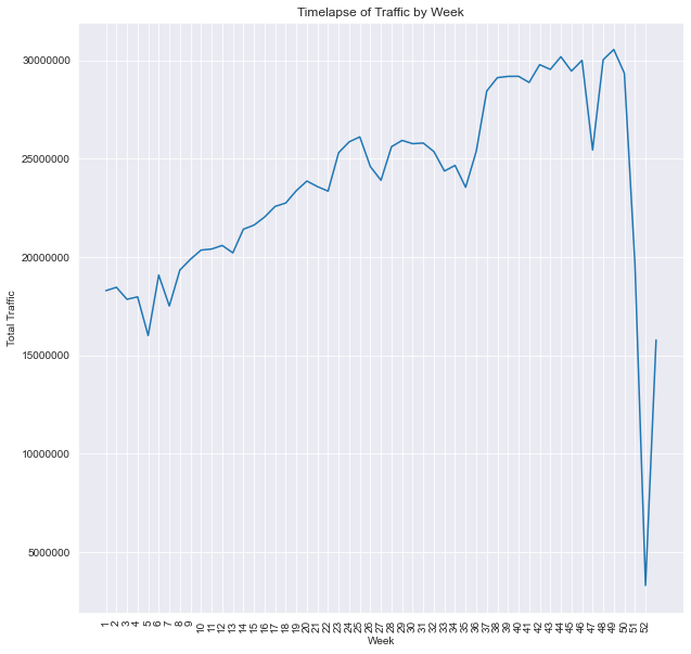
weekly_timelapse_df = df.groupby(['week'])[['net_traffic']].sum().reset_index().copy()
weekly_timelapse_df['pct_change'] = weekly_timelapse_df.net_traffic.pct_change()
weekly_timelapse_df['pct_change'].iloc[0] = 0
weekly_timelapse_df['pct_total'] = weekly_timelapse_df['net_traffic'].apply(lambda x: x / weekly_timelapse_df.net_traffic.sum())
plt.figure(figsize=(10,10))
sns.lineplot(data=weekly_timelapse_df, x='week', y='net_traffic');
plt.title('Timelapse of Traffic by Week');
plt.xlabel('Week');
plt.ylabel('Total Traffic');
plt.ticklabel_format(axis='y', style='plain');
plt.xticks(np.linspace(1,52,52), rotation=90, fontsize=10);
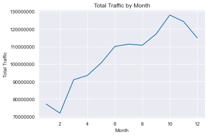
monthly_df = df.groupby(df.month)[['net_traffic']].sum().reset_index().copy()
plt.plot(monthly_df.month, monthly_df.net_traffic);
plt.ticklabel_format(axis='y', style='plain');
plt.xlabel('Month');
plt.ylabel('Total Traffic');
plt.title('Total Traffic by Month');
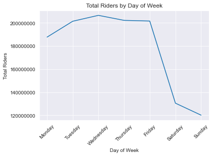
dayofweek_df = df.groupby(df.day_of_week)[['net_traffic']].sum()
dayofweek_df['pct_change'] = dayofweek_df.net_traffic.pct_change()
dayofweek_df['pct_change'].iloc[0] = ((dayofweek_df.net_traffic.iloc[0] - dayofweek_df.net_traffic.iloc[6]) / dayofweek_df.net_traffic.iloc[6])
dayofweek_df['pct_total'] = dayofweek_df['net_traffic'].apply(lambda x: x / dayofweek_df.net_traffic.sum())
plt.plot(dayofweek_df.index, dayofweek_df.net_traffic);
plt.xticks(np.arange(7), ['Monday', 'Tuesday', 'Wednesday', 'Thursday', 'Friday', 'Saturday', 'Sunday'], rotation=45);
plt.ticklabel_format(axis='y', style='plain')
plt.xlabel('Day of Week')
plt.ylabel('Total Riders')
plt.title('Total Riders by Day of Week')
Great! These are pretty useful insights for our client to know. But what they really want to know is what stations they should be installing stations in before they worry about traffic! Let’s get to it:
Top Stations
top_stations = df.groupby('station')[['net_traffic']].sum().sort_values(by='net_traffic', ascending=False).reset_index().copy()
top_stations['pct_total'] = top_stations['net_traffic'].apply(lambda x: x / top_stations.net_traffic.sum())
This created a dataframe of all stations sorted by their traffic values in descending order, regardless of borough. Check out the notebook to see a (very large) plot of it!
The next step toward getting top stations by borough was to bring in the second dataset from the MTA, which handily contains borough information in addition to long/lat info:
station_data = pd.read_csv(http://web.mta.info/developers/data/nyct/subway/Stations.csv)
Next, I used FuzzyWuzzy to do a fuzzy join on the top_stations data frame and the station_data dataframe. The reason being is that the nomenclature of the stations between the two datasets was very similar, but different in a lot of little, idiosyncratic ways. FuzzyWuzzy got a majority of the matches correct, and saved me time in the process. Definitely not perfect, and an area for improvement!
I followed this guide to accomplish a fuzzy join, but here’s the code:
station_data.stop_name = station_data.stop_name.str.replace(" - ","_")
station_data.stop_name = station_data.stop_name.str.replace(" ","_")
station_data.stop_name = station_data.stop_name.str.replace("(","")
station_data.stop_name = station_data.stop_name.str.replace(")","")
station_data.stop_name = station_data.stop_name.str.replace("/","_")
station_data.stop_name = station_data.stop_name.str.replace(".","")
station_data.stop_name = station_data.stop_name.str.replace("-","_")
station_data.stop_name = station_data.stop_name.str.lower()
mat1 = []
mat2 = []
p= []
list1 = top_stations.station.tolist()
list2 = station_data.stop_name.tolist()
threshold = 50 ## Needs to be at 50 or there are some values without matches.
for i in list1:
    mat1.append(process.extractOne(i, list2, scorer=fuzz.ratio))
top_stations['matches'] = mat1
for j in top_stations['matches']:
    if j[1] >= threshold:
        p.append(j[0])

    mat2.append(','.join(p))
    p= []

top_stations['matches'] = mat2
top_station_df = pd.merge(top_stations, right=station_data, left_on='matches', right_on='stop_name', how='left')
top_station_df = top_station_df.groupby(['station'])[['net_traffic', 'pct_total', 'borough', 'gtfs_longitude', 'gtfs_latitude', 'avg_daily']].first().sort_values(by='net_traffic', ascending=False).reset_index()
Mapping Top Stations
So now I had the top stations, with long/lat info, borough, and calculated traffic numbers. I can start mapping them!
Before I got to the interactive bit, I wanted to plot the top stations in each borough statically using Geopandas.
Geopandas, as the name suggests, is a package for working with geographic data in Python. Of note for us, it introduces a special data type called Points:
top_station_df['geometry'] = [Point(xy) for xy in zip(top_station_df['gtfs_longitude'],top_station_df['gtfs_latitude']]
Once I had the geometry column created, I could plot the points. But! They will be meaningless without a backdrop map of NYC to give context. Enter our NTA shapefiles!
nta_map = gpd.read_file('/Users/USER/Documents/GitHub/NYC_MTA_EDA_Project/nynta2020.shp')
nta_map.to_crs(4326, inplace=True)
What is to_crs? A Coordinate Reference System is basically a framework through which the computer interprets scale. to_crs is a geopandas function for changing the crs of a geodataframe. Notice we read in our .shp file using gpd.read_file — it’s not a dataframe, it’s a geodataframe!
Having the NTA map and the points data on the same CRS is important if I wanted them to make sense. First, I had to convert our top_station_df to a geodataframe as well:
top_station_geo_df = gpd.GeoDataFrame(top_station_df, crs=4326, geometry = top_station_df.geometry)
# Just to be extra sure
top_station_geo_df.to_crs(4326, inplace=True)
Now, I could plot them!
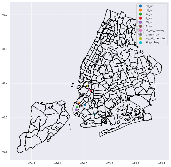
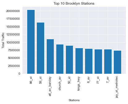
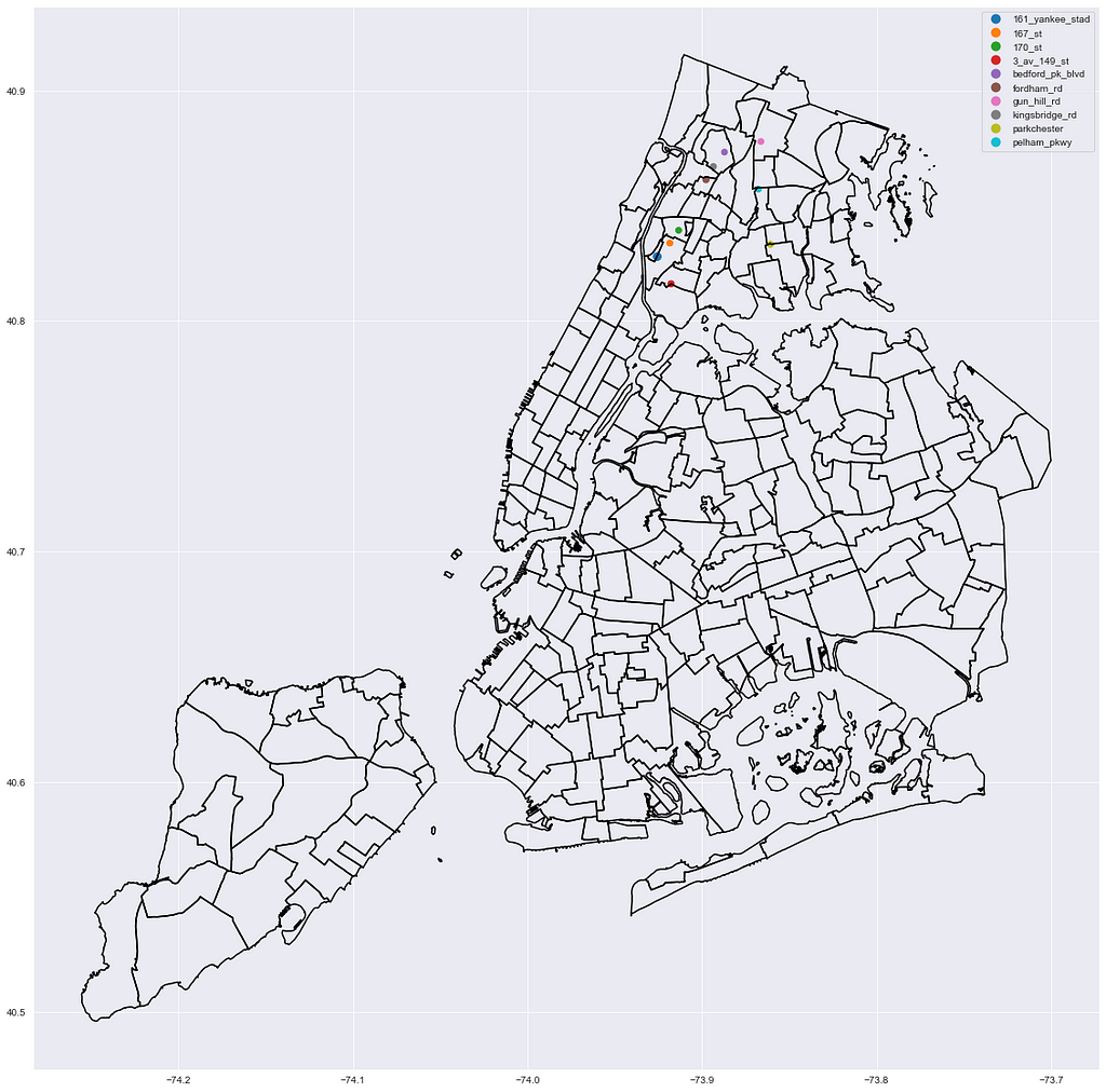
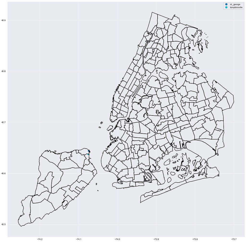
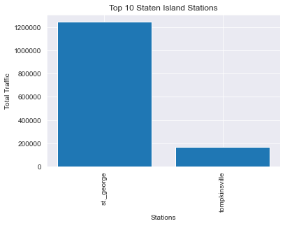
Brooklyn
fig,ax = plt.subplots(figsize=(10,10))
nta_map.boundary.plot(ax=ax, edgecolor='k');
top_station_geo_df[top_station_geo_df.borough == 'Bk'].head(10).plot(column='station', ax=ax, legend=True, marker='.', markersize=top_station_geo_df.pct_total.astype('float') * 10000);
bk_df = top_station_df[top_station_df.borough == 'Bk'].copy()
bk_df.reset_index()
bk_df = bk_df.head(10)
plt.bar(bk_df.station, bk_df.net_traffic);
plt.title('Top 10 Brooklyn Stations')
plt.xlabel('Stations');
plt.ylabel('Total Traffic');
plt.xticks(rotation=90);
plt.ticklabel_format(axis='y', style='plain');
This code is repeatable for all boroughs, so I’ll spare us all the repetition:
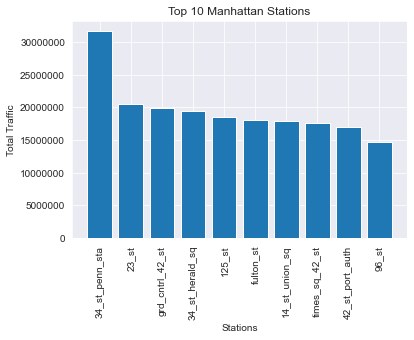
Manhattan

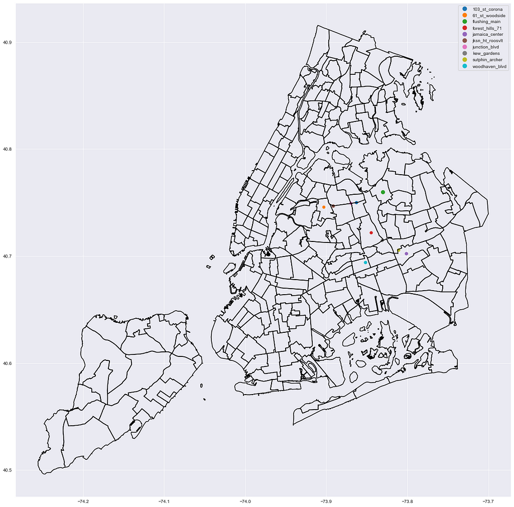
Queens
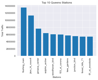
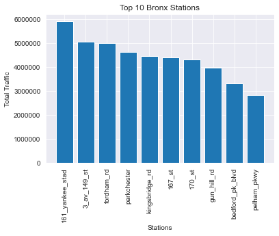
Bronx
Staten Island
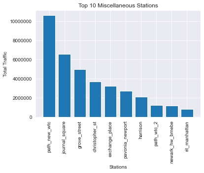
(Bonus) non-MTA stations:
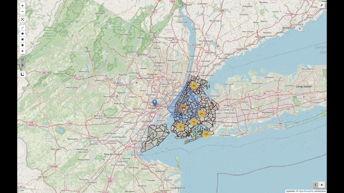
Interactive Mapping using Leafmap
I was put on to Leafmap fairly late in the game by our instructor. It’s an amazingly powerful and easy to use tool for making interactive maps right in the notebook.
But before I started making the interactive map, I needed to bring in some demographic data.
nta_demos =
pd.read_excel('https://www1.nyc.gov/assets/planning/download/office/planning-level/nyc-population/acs/demo_2019_acs5yr_nta.xlsx')
Simple as that- right from the web.
Now the merge (not fuzzy):
nta_df = nta_map.merge(nta_demos, how='left', left_on='NTA2020', right_on='GeoID')
Leafmap
Now for the interactive map!
I actually ended up needing to re-save my top_station_geo_df with calculated traffic columns as a GeoJSON for this to work:
top_station_geo_df.to_file("top_station.json", driver="GeoJSON")
Once I had that in the repo, all the code needed to create the interactive map was as follows:
m = leafmap.Map(center=(40,-100),zoom=4)
m.add_gdf(nta_df, layer_name='2020 NTA Demographic Information', info_mode='on_click')
m.add_point_layer(filename='/Users/USER/Documents/GitHub/NYC_MTA_EDA_Project/top_station.json', popup=['station', 'net_traffic', 'pct_total', 'avg_daily'], layer_name="Stations")
m
Insights and Conclusions
When everything is said and done, I will be able to provide the following to a client:
- System-level metrics such as peak traffic times, days of the week, week and month in the year.
- Top 10 stations by borough, or all stations sorted by traffic regardless of borough.
- An interactive map showing traffic data for each station, alongside demographic data for the surrounding neighborhoods.
With these insights, our client should be able to make an informed, data-driven decision about their business problem. Whether that is how to best reach certain audiences, or the best schedule for track maintenance.
Areas for Improvement
I took this in a lot of different directions, and as a showcase project, that’s great! For a client deliverable not so much. In a real-world setting, I’d have been better served with fewer fun packages, and a more concise line of analysis and presentation.
Building on that, formatting is definitely an area for improvement too. The skeleton is in place, and it’s functional, but the whole thing needs a fresh coat of paint. All the graphs and maps, interactive included, could be presented in a clearer format. With the previous point about time management in mind, I may have been better served paring down the number of visualizations produced and focused on making a few of them really high-quality.
Areas for Further Analysis
There’s a lot of detail presented in this project. But three areas for further analysis that could really increase its utility would be the following:
- Insights similar to those we produced at the system-level, but produced for the top 10 stations in each borough.
- Additional data beyond demographic being added to the NTA’s — It would be impactful to have information such as gender and income alongside the ethnicity data we have right now. Also, cleaning the NTA data so there are less columns and they are more descriptive.
- Subway ridership is a fraction of what it was in 2019, pre-pandemic. A YoY analysis between 2019, 2020, and 2021 would contextualize this traffic information and help advertisers understand trends.

Visualizing NYC’s Subway Traffic & Census Data using Leafmap was originally published in Towards Data Science on Medium, where people are continuing the conversation by highlighting and responding to this story.
from Towards Data Science - Medium https://ift.tt/F0XS5mR
via RiYo Analytics


No comments