https://ift.tt/2tc1UE6 Recreating a 538 Election Plot: Making Custom Matplotlib Visualizations There are instances when you want your data...
Recreating a 538 Election Plot: Making Custom Matplotlib Visualizations
There are instances when you want your data visualization to be very sophisticated

I have recently been interested in making detailed and highly customizable visualizations. While in many cases using basic commands to produce a standard plot is sufficient, there are instances when you want your data visualization to be very sophisticated. This leads to turning to low-level functions to adjust every element in a plot. As practice, in this story I wanted to recreate this visualization from 538. In essence, it is plotting the urbanization index versus political preference of the US’s 50 continental states.
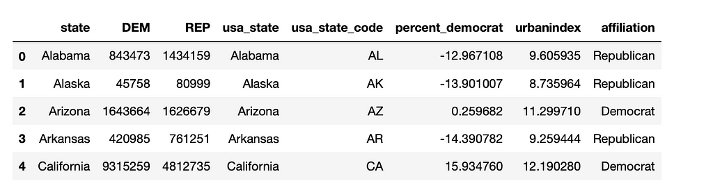
First, some setup and importing the data. The two main libraries I will be using is Pandas for data cleaning and matplotlib to recreate the visualization. The datasets will be taken from here (this is 538’s GitHub repo, and the data is licensed with a CC BY 4.0 license). From there, we can join the data on the “state” column. Let’s take a look at the result:
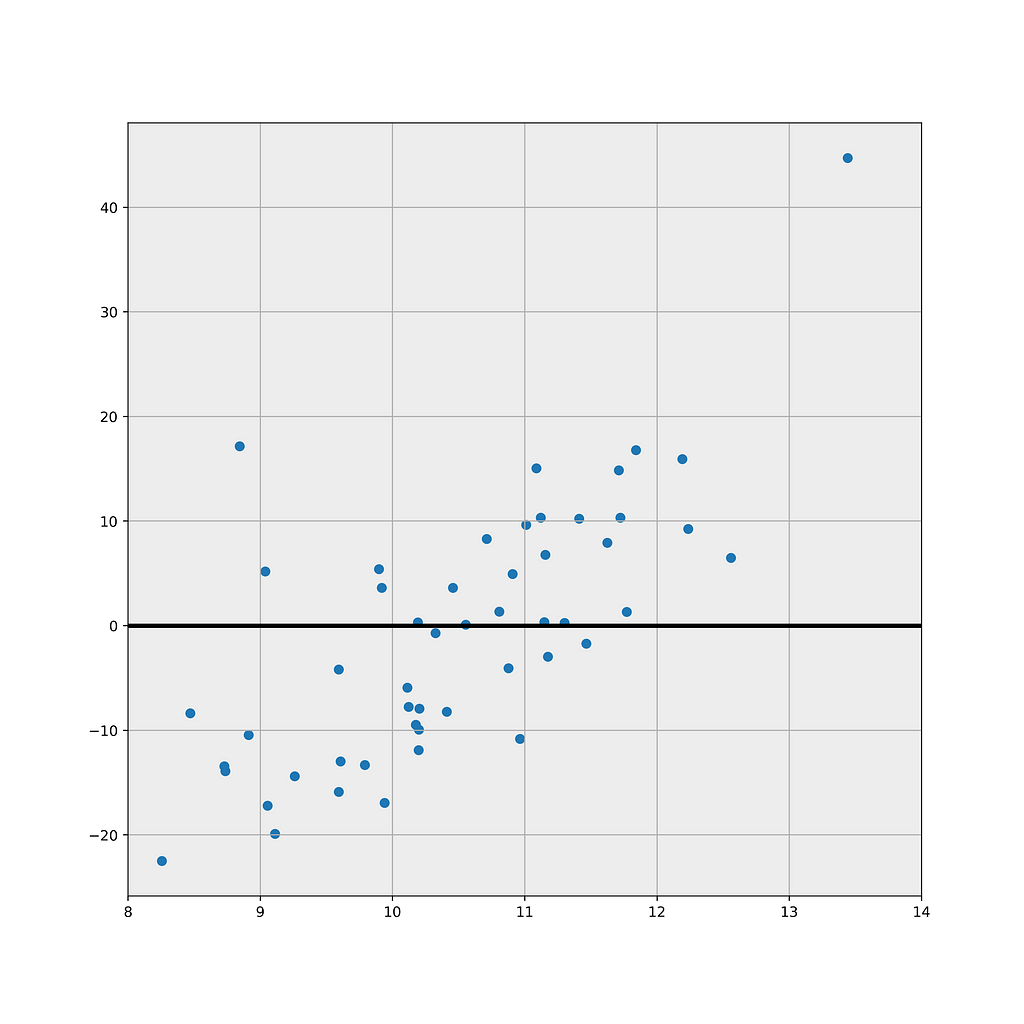
Since the original plot has calculated a “lean” with the Democratic states above the y-axis, and the Republican ones below, I am going to add an “affiliation” variable calculated as a state’s democratic percentage minus 50% (which would be the case where both parties are favored equally).
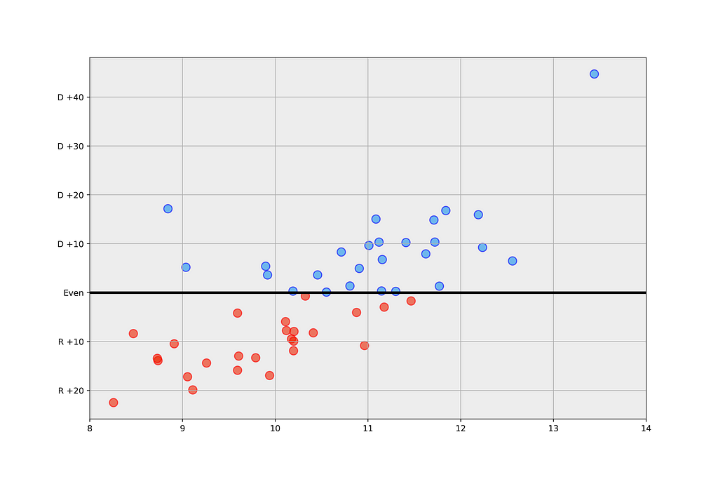
In the original plot, we can see a grey background, as well as an x-axis representing the urbanization index, and a y-axis with the respective partisan leaning. t. In addition, I have changed the y-axis ticks to reflect “Party” + the value of the how much that party is favored. Let’s add those to the plot first, including the thicker line we see drawn across y=0:
Now, let’s customize the scatter points a bit more: here we are adding a light blue and light red to the points, depending on their y-value, as well as an edge color with a darker version of the filler colors, to create more contrast:
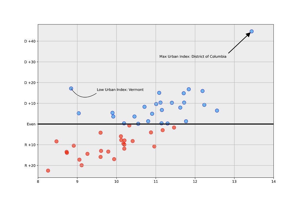
Now, we can add the curved arrows as we see in the original graph. This is done using matplotlib.patch’s FancyArrowPatch, with the first set of coordinates setting the location of the head of the arrow, and the second that of the tail. The “connectionstyle” attribute sets the shape of the arrow, like so:
Conclusion
So there it is! My attempt at recreating 538’s plot, with some commentary. The main functions we used were “annotate”, “FancyArrowPatch”, and well as “scatter”, with customizable attributes. I hope you enjoyed this short story and thanks for reading!
Recreating a 538 election’s plot: making custom matplotlib visualizations was originally published in Towards Data Science on Medium, where people are continuing the conversation by highlighting and responding to this story.
from Towards Data Science - Medium https://ift.tt/NhKxRIu
via RiYo Analytics


No comments