https://ift.tt/7GeqLfY Image by Ylanite Koppens as free stock on Pexels. Source: https://www.pexels.com/photo/beige-analog-compass-697662/...
Inspired by Encarta, built in Python, accessible at worldatlas.org
There is no catch, no advertising, no paywall, or hidden agenda. This is a self-funded thought experiment, 18 months in the making, with the goal of asserting one thing: “we can do better at making important data accessible to everyone”. I sincerely hope this generates some thought from you as the reader, and I hope you approve of my flawed attempt to demonstrate this idea.
Give it to me straight: go to worldatlas.org and hit the user guide button for a quick video flyover.
Pitch
Have you ever wondered why we don’t have a World Atlas as a replacement for the paper Atlas, in the same way Wikipedia has replaced the paper Encyclopaedia?
Do you ever wonder how the country you live in compares to others across a range of areas spanning education, literacy, health, crime, biodiversity, gender equality, life expectancy, economy etc? Perhaps how these factors are measured and how they have changed over time? Do you lie awake at night missing Microsoft Encarta from the 1990’s?
If your answer to any of the above questions is ‘Holy crap, YES!’ or ‘what the hell is Encarta?’ then you have come to the right place. There’s also a good chance you need therapy. Get ready to bear witness to one of the clunkiest websites you have ever seen. If you can see past the problems, I hope this manic creation ignites a spark of interest for how we might make important facts and statistics about the world more (intellectually) accessible, for everyone.
I’ve built a World Atlas as a website, incorporating over 2,500 datasets for you to explore. With over 12 million data points spanning 100 categories, find a dataset that interests you and analyse it using a suite of interactive charts. All data is fully sourced and available for download. It’s designed to be easy to use and fun to learn. Let me show you what I mean.
What might a modern World Atlas look like?
If we were to re-imagine the World Atlas as a website it should probably still have a map as the centrepiece. Map=good. But wait… couldn’t we do a lot more to visualise data with pretty colours and interactive charts? You bet your ass we can. We can bring the data to life with modern tools in data science. For example, wouldn’t it be interesting to look at:
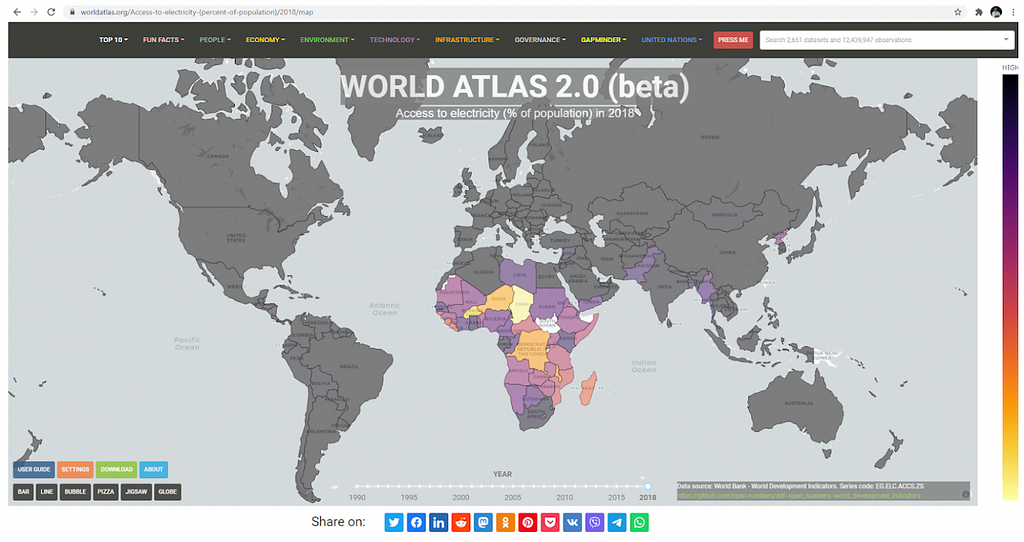
- A map indicating access to electricity across the world in 2018
- All countries ranked by their access to the internet in 2017
- How access to clean water and sanitation has changed over the last 20 years
- An interactive 3d globe of the world showing which side of the road each country drives on
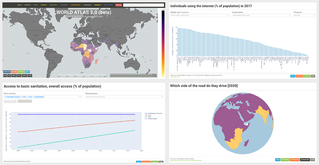
My god…think of the possibilities
And that’s just for starters. Choose from over 2,500 open datasets across 100 categories spanning economy, finance, health, education, environment and technology. All data can be downloaded directly to your local machine. All data can be analysed in real-time with interactive charts. All datasets are fully sourced so you can trace their origin and the authority that published them, along with caveats. Any visualisation (chart or map view) is reproducible via a full URL path, so you can share a specific insight with anyone, anywhere, anytime.
For example, a map of sugar consumption per person in 2013 and accompanying chart of each country ranked in order. Or a map of cell phone use per country in 2018 (phones per 100 people) and a chart showing how it has changed over the last 40 years.
Whether you are a school student, boomer or grandparent I think every person in the world should have access to these kinds of datasets in a way that is simple and intuitive enough for them to understand. The problem right now is I don’t believe this data is accessible to the general public at all. And by inaccessible I don’t mean datasets can’t be found, it’s just when they are located they are not in a format that is intellectually consumable to the average person. They must be downloaded as a .csv file, cleaned, then plotted manually (requiring technical skills) or they are buried in a report somewhere for a specific purpose. Alone and naked, these valuable datasets are meaningless to the person on the street.
Organisations like GapMinder, United Nations Data, Worldbank, and OpenNumbers (along with many others) have done the heroic work of producing, cataloguing and maintaining many great datasets. A global community of contributors have helped build the open-source charting libraries and other amazing web tools that allow a modern web application to do things we thought were impossible only five years ago. The data is here. The tools are here. The final piece of the puzzle (I believe) is to bring it all together in some kind of centralised platform to visualise these data in a way that is meaningful for as many people as possible.
“What we need is a product to iterate and evolve; a stage to bring important datasets to life.”
This is what I’ve set out to prove with this prototype. This essay is the white paper for my proposal for an open-source open-data community funded World Atlas for the general public. A modern and free replacement for Encarta’s World Atlas using the latest tools in data science, and a very different landscape to the flooded ‘textlands’ of Wikipedia.
What are the problems we are addressing? (Why build this?)
Key problem 1: Wikipedia is not built to visualise statistical data
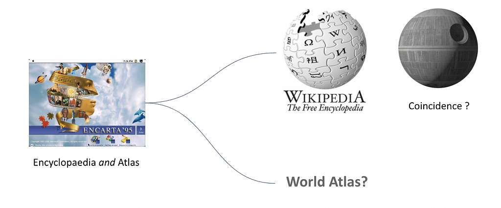
With the loss of Encarta in 2009 we lost two things: an Encyclopaedia and a World Atlas. Wikipedia has firmly taken the mantle of the de facto standard for a World Encyclopaedia and it is one of the few remaining wonders of the internet. I’ll continue to donate to it for the rest of my life. What Wikipedia IS NOT, is a suitable platform for visualising and understanding statistical data; it’s not an Atlas.
Sure you can find tables and data on things like world population and that kind of thing but, fundamentally, Wikipedia (more correctly the underlying ‘wiki’ engine upon which it is built) is structured around displaying interlinked pages of text. This is what it does and it does it incredibly well. Almost too well.
Wikipedia, at over 6 million articles in English, is now a flooded textland. Users are buffeted by waves of text at every turn, with images and tables thrown in awkwardly, almost as an afterthought. There are no real-time charts or analytical tools. The Wiki engine is just not designed for this purpose; it’s dated technology, largely unchanged for 20 years. That’s not a criticism, it’s just a fact. New tools have arrived, and they are good. I also think Wikipedia is a barrier for less literate members of the general public (who exist in all age groups). We all know data insights are more powerful as visual representations because we can use our most powerful primary sense: spatial reasoning, to interpret what we see. I think there is a missed opportunity here because we don’t have a mainstream, visual-first resource as a sister site to Wikipedia; we don’t have a World Atlas to complement our World Encyclopaedia.
Key problem 2: Data Inaccessibility (Data Literacy)
If we can agree that it’s good thing for the public to understand (or at least have easy access to) facts about the world like carbon emissions, deforestation, economic wealth, health and education factors etc, then I would assert the problem is much of this type of data is not as accessible as it could be, and we can do better. Way better. And by better I mean providing opportunities to find this information in one place, for visual learning, and for interactive exploration of data in a way that is much more powerful than looking at numbers in a table.
Most of this data is scattered all over the place, hosted on a myriad of different websites by the differing authorities and institutions that publish them, written up in separate reports and peppered across web pages. It’s a literal nightmare. And in many cases when you do finally find good data it’s usually targeted at professionals in the surrounding industries, and is not in a format that can be digested easily by school age students etc. This makes me sad. Right now, you basically need to be a data engineer, technical professional or academic to know where to find good global statistical data, to say nothing of how you would begin to clean, analyse and visualise it to discover an insight.
Whilst it’s great that we have access to curated open datasets such as those from UN Data, Worldbank, and Gapminder — it’s not enough. I think the absence of a well-known intuitive educational tool to visualise the data and draw insight means that this data is largely lost on the general public. A school age student does not know where to find, nor how to interpret or analyse, a .csv file. This is the core problem I’ve set out to solve. I want to make important data super-accessible to everyone. I also want to enable users to form an insight on their own, rather than spoon feed it to them.
In summary, the central problem I am asserting is: “many great geo-statistical datasets exist but they are not presently accessible to the general public in a format that is meaningful”. Put more bluntly: “We can do better at making important data accessible to everyone”.
Design principles
If the mission is to “make country-scale statistical data super-accessible to everyone” what then might our core principles for design be? Here are my thoughts for how we might combine the spirit of the paper Atlas with the charm of Encarta, and perhaps a splash of magical Gummy berry juice.
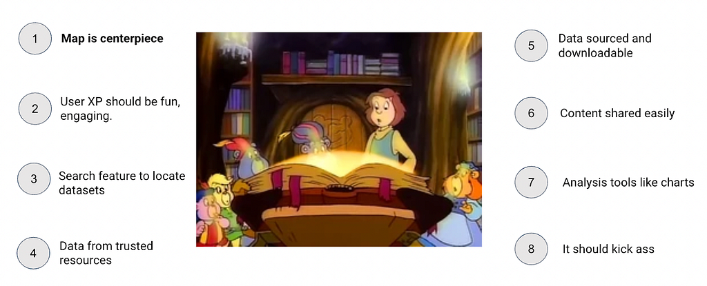
I’ve distilled it down to the eight principles you see here. The map has to be the centrepiece of this creation, but of course as we escape the confines of paper and embrace the power of the modern web browser we can enrich the Atlas experience immensely. We can add buttons, dials, sliders, colour schemes, analytical tools and charts, and other interactive widgets. If done tastefully, this could make for a superb user experience.
It also needs to be generic enough so we can keep adding datasets and extend functionality with new tools as they become available. (i.e a shift away from single-use websites to a truly reusable model). Finally, people need to like it and enjoy using it. It needs to be fun and have some style. (Help definitely needed here but I’ve tried).
What I have built so far
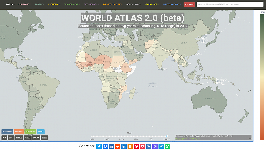
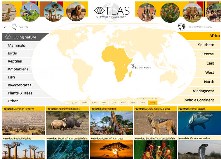
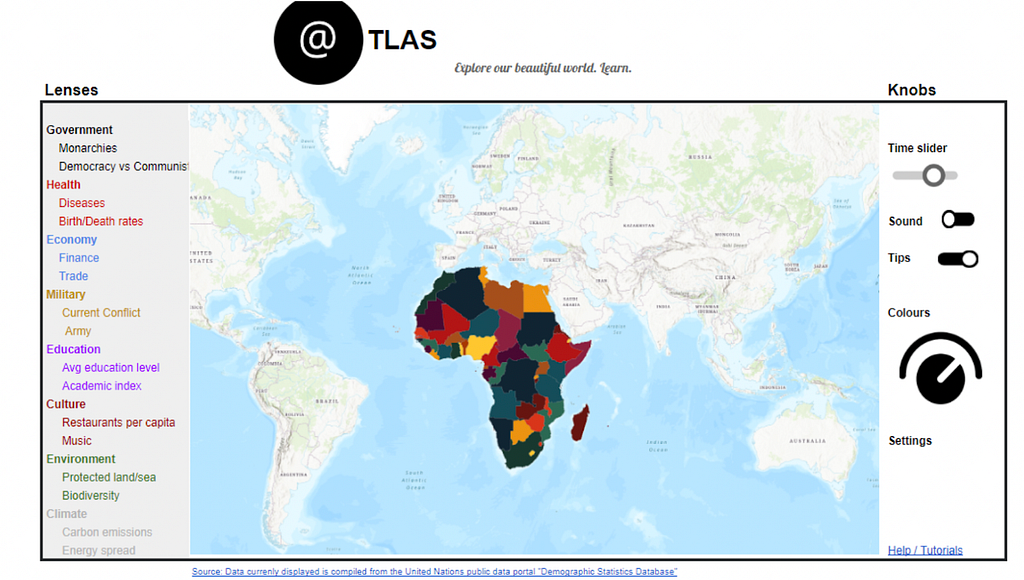
With the above principles in mind, I have made an attempt. It’s a website. It acts as a front-end for the user to visually access thousands of datasets.
It provides a fully interactive map that can be zoomed and panned, a navigation menu to select datasets, a time slider to flick between different years, and buttons to bring up real-time charts for analysis. All data is downloadable and fully sourced.
Is it riddled with bugs, server-side slowness, trade offs, and incorrectly used visualisations? Absolutely yes, it is. Does it have any social utility whatsoever as an idea? I hope so, but you tell me. I’ve fallen into the designer trap of “I like it so others might”.
How it works (nerd section)
For the nerdy people like me who want nothing but detail: the prototype is a web application written in Python that aims to be a generalised platform for ingesting country-scale datasets and displaying them visually in a variety of ways.
The front-end is a typical website comprised of the navigation menu along the top, main map, and various components. This is all built in Plotly Dash open-source, allowing the entire website to be written in Python, while gaining access to awesome Javascript charts out of the box. To make the magic happen in the back-end I’ve taken country/region borders from Natural Earth Data (geojson polygons), which allows us to draw borders around each region, and colour them uniquely. I’ve located, downloaded, cleaned, and formatted thousands of open datasets to standardise them for use in this generalised platform. I’ve curated the current list of ~2,500 datasets, re-labelling many series names to be more consistent and intelligible with consistent units of measurement. I’ve also tagged each series according to its data type (e.g. Categorical, Continuous, Ratio, Quantitative) in order to determine which charts should be available and how they behave. Finally, I’ve categorised and sub-categorised each series so they can be searched and easily built into a nested navigation menu with categories like ‘people > education’, ‘environment > climate’ etc.
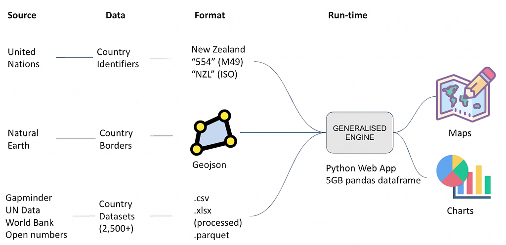
Once processed, I store and compress all the .csv data to the .parquet binary format. This is an awesome format for storing big tabular data as it uses columnar compression (especially good if you have many rows of repeated data). To give you an idea of just how insane it is, I’ve condensed 5GB of .csv files (5 columns x 12 million rows) to a single 100MB parquet file, that’s a 98% compression ratio. The parquet file is read in at run-time by the Python app and loaded into memory as a pandas Dataframe in 4 seconds flat, giving instant access to 12 million unique records. Because all the data is in memory at run-time, this allows the charts and maps to rapidly re-query the data and serve different data series to the client browser in seconds. There are probably better methods, but this is the fastest way I’ve found to access such a large dataset at speed. Keep it simple: pandas dataframes and a shit tonne of ram.
For web developers, the web application itself is a stand-alone Flask app encasing a Plotly Dash Python app, providing the full power of the Flask framework with the power of Plotly’s open-source charts. Full write-up on how to do this courtesy of Hackers and Slackers here. Finally, to get it deployed I’ve containerised the app via Docker along with an NGINX load balancer container and a certbot container to manage TLS (HTTPS) certificates, and brought it all up on dedicated virtual machines on Azure infrastructure. I’m sure there are better ways but (1) I don’t know what they are; and (2) I prefer having full hardware control via a VM rather than relying on app services like Heroku. I’ve tried these but owing to high ram requirements of the app, going for dedicated virtual machines has ended up being cheaper and more versatile. End nerd section.
Why I have done this
I miss Encarta. I was there.
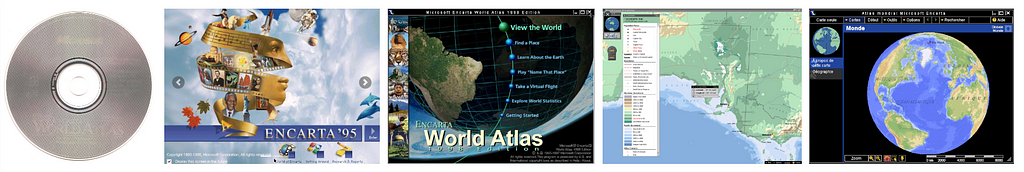
Microsoft made an impression when they first released Encarta in 1993. In the golden era of squawking dial-up modems, ‘Ace of Bass’ on the radio, and wall-length encyclopaedias, Microsoft released a shiny compact disc containing what seemed like the sum of all human knowledge. It was a breathtaking showcase of how we could represent information using tools of the emerging digital technology space. With the explosion of high speed internet into millions of homes throughout the late nineties, new website based knowledge platforms (such as Wikipedia) were able to scale at incredible speed. This eventually led to the demise of Encarta in 2009.
I think the world is still missing a quality the Encarta creators just nailed: they delivered curated, accessible information in a format that could be digested by those of all ages. And they did it with style: colours, sound, images, video, interactive maps, it was a triumph. Entire families from kids to grandparents would be fighting over the compact disc.
Somewhere along the path we’ve taken from the sunlit days of Encarta to the dystopian smartphone nightmare of today, something has gone horribly wrong. Maybe I’m mistaken and everyone loves 2,000 notifications per day from 20+ messaging services across 7 devices, but this new age of digital noise has stolen the pleasure we all used to take in seeking out information and learning. Most of us are so overloaded with information we are actively trying to shut it out.
Data is so plentiful and cheap to produce that it spews from every orifice of the connected world; we’ve got it flowing out of wearables, furniture, finger tips, and twitter bots. Completely devoid of authority, the modern piece of data is ready to be manipulated and repurposed for any actor and any purpose. No one really trusts the written word anymore and who can blame them when it’s so easy to publish and fake content? There doesn’t seem to be any reliable authorities and if they are out there in the screaming noise, somewhere someone has questioned their credibility and cast doubt on whether you can trust them anyway. But don’t take my word for it, I’m sure there are YouTube influencers who can tell you who and what to trust.
Before this got dark, I had a point. The point I was building to is that when it comes to education and learning, structure is important. Right now, I think information is coming to us from the internet in a very unstructured way. This is because of its self service nature and the fact we just blind search for things these days. Dictionaries, encyclopaedias, essays and novels are all ordered with purpose; meticulously curated by their authors and fact checked by peers, editors and publishers.
When it comes to comparing important statistical information between regions and countries, data authority and trust level becomes super important. Quality and standardisation of data also becomes harder to manage. This is why it’s a big task left to funded bodies like UN Data and World Bank with teams of analysts to do the work of collecting and collating datasets. When you want to start making general comparisons over a range of metrics for regions and countries in the world, things get messy and difficult fast, which is why the problem of making this kind of data accessible visually in a general way may not have been adequately solved yet, and may never be.
As hard as I have looked, I haven’t found any free public resource that meets the standard set by Encarta for information accessibility and provides a World Atlas-esque experience that I love. After I couldn’t find satisfaction, I began building it with the naivety of an idiot. How hard could it be?
Product Evolution
The following is a comical collection of early designs ideas that take us to the present version of the site.
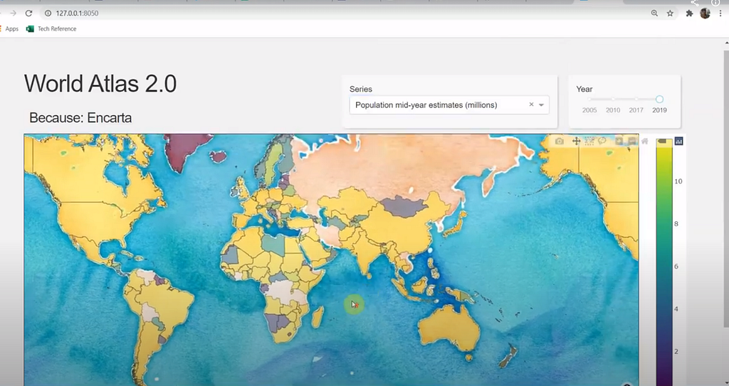
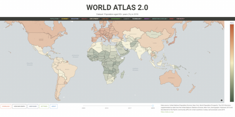
The present state of the site is as far as I’d really want to go as a demo or prototype. The project is now at the point where I want to validate it against strangers (not friends and family) and see if it has any value. If not, well it’s been fun.
A look at the competitors
In my search for the Holy Grail of World Atlas-y type experiences, I’ve found some truly great resources and some disappointing ones. I’ll lay these out below along with an uninvited and stinging critique for why I’m still not satisfied with what’s out there.
The criteria for which I make this entirely opinionated assessment of the competitors is based loosely on user experience, ability to appeal to all ages, apparent quality of data and ability to verify it, ability to analyse or interrogate the data, ownership and mission. But mostly I’m assessing based on whether I think the resource meets the Encarta standard for delivering great learning experiences for all-ages. (I fully acknowledge many of the competitors are targeting more selected audiences, and this is fine). Before we embark on this voyage of discovery, let us begin with the Gold Standard: Microsoft’s Encarta.
The Standard: Microsoft Encarta World Atlas
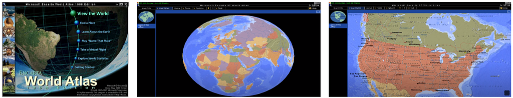
It’s hard to overstate the significance of what Microsoft achieved almost thirty years ago with this product. You have to remember this was a time of dial up modems and Pentium computers, it was before high speed internet, before MP3s and many of the breakthrough audio and video compression technologies existed, before GIS software was mainstream, before Google existed as a company, 10 years before YouTube, 5 years before Mozilla Firefox browser, and almost before the USB standard was released (1996). It was a time when owning a 8x (8-speed) cd-rom made you popular with friends.
Microsoft built the map software application ground up (their MapPoint software) and put it on a compact disc. The World Atlas came shipped with Microsoft Encarta from around 1997 and was targeted for family homes and all-ages education. At an exciting time when home computers were advancing dramatically, it was fun to use and navigate, providing an interactive globe and map experience where users could zoom and pan intuitively. It also displayed data in an unpatronising way. Users could choose to display interesting geographical data spanning physical, land and climate, human, political categories. Learning was genuinely a pleasure and you could spend hours just browsing what it had to offer. I think it’s still impressive today and I am not aware of a modernised, freely available version or similar product currently available.
Score: 10/10 Encarta Love Meter
Competitor 1: Worldatlas.com
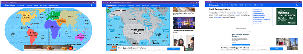
By its name alone, I want to like this resource. I really do. It’s got a good domain and an interactive map as the centrepiece, with some great ideas and articles about interesting pieces of history from parts of the world, along with nice country summary tables. It also appears to be targeted at all ages. If I am brutally honest though, I find the experience dated and disappointing. The main map is clunky and not very interactive by today’s standards, which I could forgive if the site wasn’t riddled with advertising. Even with an ad blocker it’s a frustrating user experience and I think if the site owners really cared about education, as they claim, they would find a way to do it without blatant, distracting advertising that ruins the educational experience entirely.
It’s also impossible to verify any of the data in the tables and content in the articles, because there is no source information, just a loose claim that they fact check everything. Guess we’ll just have to take their word it’s all accurate. I’m not sure how they are funded but appears to be supported by a private company. In shifting the medium for a World Atlas from paper to a website, I feel this site has managed to take some of the worst aspects of the web experience (e.g. flashing ads) and failed to capitalise on the best aspects of web (the possibility for a truly immersive experience). I’d much prefer to use a paper Atlas.
Score: 1/10 Encarta Love Meter.
Competitor 2: CIA World Factbook
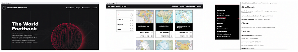
In my Atlas pilgrimage many I have spoken to recommended I check out CIA World Factbook. I’ve checked it out and indeed it does represent information in a nicely structured way for basically 266 countries/regions of the world, with static maps, tables of statistics, nice categories and surprisingly good explanatory content. It certainly provides some of the components of a good Atlas. You can download the maps and I really like that you can download the various data tables as a .csv file (big tick here). The whole experience, and the layout, has polish.
However, there are a number of major causes for concern. Obviously there is the issue of the entire resource being hosted by a sovereign nation (USA) so it’s not as globally independent as the UN Data services, for example. I’m also disappointed to find that none of the map or statistical data (and I mean none of it) is sourced. Most of the data tables just say ‘est 2021’ or something. This means there is no possible way to verify anything on this site as being true and accurate. People could just be making up numbers and chucking them in the tables, and no one would know. It’s this lack of integrity that allows users to check the origin of data that I see time and time again, and I think it’s a major problem for many of these ‘trusted’ public resources. Any published statistics anywhere without a reference to a source are 100% useless and 100% unverified as far as I’m concerned. Maybe that’s too harsh, but I just think the standard we must put on published statistics has to be better than this. For a resource that calls itself a Factbook it’s ironic that there is no way to verify the facts.
Score: 3/10 Encarta Love meter.
Competitor 3: Google Earth
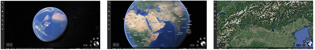
If we’re thinking about a digital Atlas, we can’t go past without looking at Google Earth. From an interface and user experience point of view, I don’t think anything can touch it; it’s a superb product with the ability to zoom almost to infinity from space to street level. It has made the giant leap from the imperfect projections of the earth on a flat surface (e.g. Mercator) to the only true and correct way to visualise the Earth without projection distortion trade-offs: a spherical globe.
The clincher is it’s really only built for displaying the physical landmarks, it doesn’t (to my knowledge) have a comprehensive geographical-information-systems (GIS) component that would allow you to visualise region specific statistical data, such as population density. I know you can add geo points and series, with a bit of metadata etc but this is more for cartographic applications. Nor can it be used to plot data in real time with charts etc. It’s just not really designed for the purpose of displaying geostats, it’s more for displaying high resolution photographic imagery of the Earth.
In summary I think Google Earth captures the Encarta-esque magic from an interface and user experience perspective (++points), but fails to deliver on how to display the geostats (data) itself. I.e. the interface is insane, it just doesn’t have the stats I want. It’s also a private company owned asset so there is no community control of the content.
Score 4/10 Encarta Love meter
Competitor 4: United Nations Data Portal (UN Data)
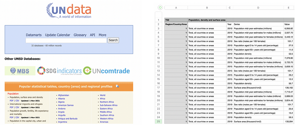
I’ve chosen UN Data as a representative competitor to some of the other publishers of geostatistical datasets (others include Worldbank and OpenNumbers). These resources collect, curate, and lovingly maintain some of the most important global statistics about the world that I know of. All the data is freely downloadable and many of them have APIs (application programming interfaces) that allow a direct machine to machine connection to access their data, which is awesome. If you’re not familiar with APIs, in this context it means you can connect to their systems and download their data directly from your code (running app), rather than manually downloading a .csv file from the browser as a user. It’s like a back door to the data. In any case, what they don’t do is provide a visual interface to any of the data; it’s raw access only.
Really, these sites are a shopping trolley for you to download specific datasets from their shelves. Getting good data is a critical piece of the Atlas puzzle, and these organisations provide this service. But of course getting from raw data to an insight moment requires additional effort and technical prowess to visualise the data in a meaningful way.
I’d like to single out UN Data because they are funded, unlike OpenNumbers which is all volunteers. I must say that I’m disappointed that a funded organisation such as the UN has not risen to the occasion to breathe a bit of life into the wonderful datasets they hold. I’d argue that hosting the data for download is the bare minimum effort. Part of their purpose and intent surely is to get this data into the hands of those that could benefit from it, particularly the general public. To quote their website directly:
“UNdata was launched as part of a project in 2005, called “Statistics as a Public Good”, whose objectives was to provide free access to global statistics, to educate users about the importance of statistics for evidence-based policy and decision-making and to assist National Statistical Offices of Member Countries to strengthen their data dissemination capabilities.”
I love the intent and am eternally grateful for the hosting of these open datasets. However, I’d say this resource is spectacularly underknown and underutilised by the general public due to the impassable technical bridge required to convert the raw data they supply into a meaningful insight such as a map or a chart. It’s useless to the average school student or non technical person. If I was assessing them on their core objective (above) I’d call it a complete fail because they have failed to really deliver on a ‘public good’ outcome to make this data intellectually accessible to the general public. It doesn’t matter if it’s available for download if no one can understand it.
For example, how does a 5,000 row .csv file containing multiple series, with no explanatory guidance, help educate a school student (who just downloaded it) on the importance of statistics? As a first time user it took me 2 hours just to work out that they use the M49 country identifier standard to uniquely identify each country or region with a special 3 digit, zero padded integer (e.g Brazil = 076). This was because they didn’t reference the M49 standard anywhere in the column headings of any of their datasets, or provide any notes, and I’d never used it before. Do you know the M49 standard? What about the ISO A3 standard?
I know they have a big job, but they’ve had 17 years to work on this project. I’m disappointed with the UN on their lack of progress on basic improvements to make their data more accessible. There are no data dictionaries, they don’t explain country identifiers like M49, there are no supporting notes for first timers using their service, and there is a lacklustre visualisation page that has 2 images and it hasn’t changed in 2 years. I’d suggest an additional page on the main home screen for ‘Guide for new users’ or something, and have a few simplified representative datasets to download, along with a full explanatory overview of the typical ways they identify countries/regions. Then a worked tutorial showing how to translate the data into a chart or something in excel, R, or Python.
Score: Not applicable as they are a data service provider only.
Competitor 5: ArcGIS Living Atlas Map Viewer
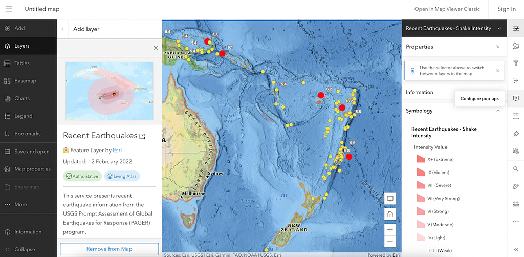
I’ll admit, initially I was annoyed with ArcGIS because they are heavily geared toward paid subscriptions and I didn’t realise you could access a bunch of stuff for free. This is a great resource to explore. I haven’t been able to find any basic statistics like world population and GDP and that kind of thing. But I’m guessing it’s because this data is generally more for statistical analysis. We are obviously in hardcore GIS space here and I’m not qualified to comment on how you are (correctly) supposed to represent much of the statistical information.
There looks to be some great datasets here for learning in specific areas. This is a professional level tool. I’d say it’s a little too technical for the average middle school student or member of the general public, but this is the nature of a tool as sophisticated as this. It’s also a bit hard to actually find this map viewer tool. I spent 20 minutes navigating the ArcGIS website and avoiding all the paid subscription hard sells, before I actually found the free access part (massive barrier). Finally, it doesn’t appear to be a way to generate a hyperlink to share a specific map view, such as the one I used above of the volcanic activity. This is a lost opportunity for sharing knowledge and insight with others.
Score: 6/10 Encarta Love Meter.
Competitor 6: GapMinder
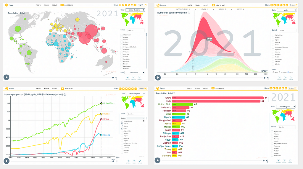
Gapminder is a (Swedish) not for profit. Their origin story, mission and intent is noble and aligned with my Atlas mission:
“Our mission is to fight devastating ignorance with a fact-based worldview everyone can understand. Gapminder identifies systematic misconceptions about important global trends and proportions and uses reliable data to develop easy to understand teaching materials to rid people of their misconceptions. Gapminder is an independent Swedish foundation with no political, religious, or economic affiliations.”
They are the driving force behind many amazing datasets used by websites and educators worldwide, they produce teaching materials and they have built a suite of awesome interactive and responsive visualisation tools (pictured above). They have even pioneered some new visualisation techniques that have landed their founder on famous TED talks (15M views). They provide links to access the raw data and good explanatory content around how it is standardised etc. Amazing stuff and a must see if you haven’t heard of them.
The one point I will make for why I didn’t stop work on my project when I discovered GapMinder is that they are not quite an Atlas. Their interactive charts and visualisation tools are fabulous and I feel that each of them are more like components of something bigger that could exist to bring it all together. Most of these great tools are also buried quite deep in their educational website on a subdomain as they are only a small part of the mission. So, for example, to get to the charts and maps displayed above, you need to actually click through three (1-click-2-click-3-click) separate web pages from the homepage! So you really have to know where to look to access these great tools, and I think this immediately adds a major barrier to getting to the data. Of course, this is my problem not Gapminder’s and they have a much broader educational mission than building an Atlas. If any organisation was to have a proper go at building the modern World Atlas, I would trust Gapminder to do it in a way that is super accessible for a broad audience. Lots of love.
Score: 9/10 Encarta Love Meter.
Competitor 7: Visual Capitalist
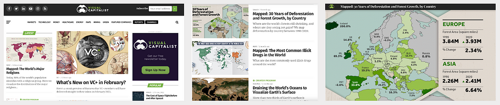
Visual Capitalist is a publisher that builds artistically gorgeous infographics across a range of educational areas. Their mission is super on point:
“Making the world’s information more accessible. Every day a staggering 2.5 exabytes of data is generated making our world increasingly difficult to understand. By highlighting the bigger picture through data-driven visuals, we stay true to our mission to help cut through the clutter and simplify a complex world.”
This really strikes a chord with my Atlas dream. Visual Capitalist is an amazing resource and a must-see. The stuff they produce is artistically and professionally presented, whilst at the same time being authoritative and accurate, based on open public data like Census data, Worldbank etc. They also provide great explanatory content to contextualise the visualisations, and they source everything to a high standard. Their work has broad appeal and is unpatronising, making it highly accessible for all ages from school students and up. They have full path URL linking, so you can share a direct insight or visualisation, such as corruption mapped across the world. They are independently owned and draw revenue from ads and licensing.
I can’t fault this great work and this fills the artistic void for bringing data to life, the very thing I think we need to do so much more of. They employ a different approach (polished infographics) to achieve that similar punchy insight and instant appeal through visually representing data. Visual Capitalist use high quality design to produce pieces of infographic art, whereas a digital World Atlas is simply another way to access the data that may arguably be less effective. In any case, this is not a competitor but a kindred spirit. I’m so glad I found it during this project.
Score: 8/10 Encarta Love Meter
Competitor 8: Our World in Data
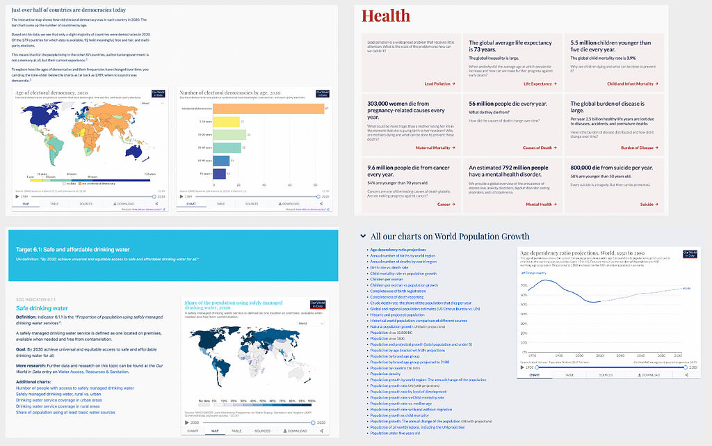
Our World in Data is a mission centred on information accessibility to the public to convey and help articulate the World’s biggest challenges. They boast over 3000+ interactive charts across 297 topics. As a collaboration between researchers at the University of Oxford and a not for profit organisation Global Change Data Lab they are funded by sponsors, philanthropists and grants including the Bill and Melinda Gates Foundation (that’s a big deal).
“The goal of our work is to make the knowledge on the big problems accessible and understandable. As we say on our homepage, Our World in Data is about Research and data to make progress against the world’s largest problems. We believe that a key reason why we fail to achieve the progress we are capable of is that we do not make enough use of this existing research and data: the important knowledge is often stored in inaccessible databases, locked away behind paywalls and buried under jargon in academic papers.“
Simply superb. Not only do they tackle the World’s most important issues, they do it with style: beautifully structured information, well written and accessible explanatory content, supported by interactive visualisations most relevant to the issue. They provide categorised ways to access different areas of interest, and data is fully sourced and available for download. They also host a stand-alone website to track global progress toward the United Nations Sustainable Development Goals (UN SDG), which are arguably the most important goals we have for a future most people want to live in. This is a must see also.
The one and only criticism I can make here (which is more of an unavoidable fact) is that I feel ‘Our World in Data’ is a resource best suited to university level educated people and above. It’s academic grade work and it’s rich and detailed. I wonder if there is a way to open some of it up to broader audiences such as middle-school students, in the way Gapminder does so admirably? Unfortunately this is not an easy task given the enormity of the problems they are trying to address. It’s not a user experience like an interactive Atlas, it’s a high quality visual-rich publication (as it was designed to be). This is a must see resource for anyone interested in data that matters, and it is absolutely authoritative.
Score: 9.5/10 Encarta Love Meter
Do we really need a World Atlas in light of the existing great resources?
Maybe we don’t, I accept, but I will say this. Over the last 18 months I have traversed much of this rugged landscape in my quest to access and unlock important insights and rekindle the magic of the Encarta experience. I’ve hiked up snow capped mountains to gaze upon some of the best vistas we have to offer (Our World in Data) and I’ve had to cut the rope and let some baggage go along the journey. I’ve also had a go at creating something myself, exposing me directly to many thousands of raw datasets currently available.
As I reflect on this journey, what I think is still missing in the best of our public resources (Our World in Data, Gapminder, Visual Capitalist) is they are each a collection of great tools and resources. None of them is an actual complete product that delivers a consistent user experience, like Encarta’s World Atlas. Of the more product-type resources (such as ArcGIS mapviewer and Google Earth) these also don’t cut the mustard in my view because they don’t provide the interesting statistics that matter for broad appeal (biodiversity, literacy rates, GDP etc). So I think we’re still left with an incomplete and haphazard way for the public to discover this important data. And that’s a problem.
I would bet that less than 1% of those reading this article have ever heard of Our World In Data, or Visual Capitalist. Have you? I hadn’t, nor did I even know about Gapminder when I started. Conversely, I would bet that 100% of you have heard of Wikipedia and use it regularly. And this is the very essence of the problem: most great resources are simply lost in the noise of an ever expanding internet.
As the internet expands, the signal to noise ratio of quality to crap is going in the wrong direction, leaving the highest quality parts of the internet more and more obscured by the tidal waves of shit. Every day, it’s getting worse. The only way I can think of to combat this is to improve the ratio of quality material (good luck), or have a household name that everyone knows and trusts. Wikipedia is that for the encyclopaedia. I’d like to think we can also have a household name for an Atlas type experience, one day too.
Also, isn’t it a bit of a shame that none of these great resources reference each other, despite sharing a common vision? I stumbled on every single one independently and haphazardly. There is no resource (I’ve yet found) that gives a nice overview of what is out there, and none of the sites hyperlink to one another. Are they all competitors or should they be partners?
Why compete with one another when we can embrace the aspects of a shared vision? In fact, who are we to claim these noble mission statements if we don’t promote other similar resources? There is a theme here and it is public education, access to truth and high quality information. And there appears to be a strong community that shares this vision. Wouldn’t it be great if we had a home base that embraced the central philosophy and shared vision from these resources, that celebrates them all and acts as an index? A public mainstream World Atlas could be this landing page. It could provide an interface to simple datasets, and act as a conduit to ensure related resources are discovered by the users that would adore them.
After weighing up my arguments, does this whole concept of a modern World Atlas have social utility? Is this kind of information, presented in this kind of way, useful to you? Do you think it would be useful to others? Would it be useful in education? If the answer is yes, then my flawed experiment might have legs. If the answer is no, I’ve missed the mark and it’s time for me to let it go.
Who should pay for something like this?
If, for the sake of argument, we decided a community World Atlas would be something we wanted, this brings us to the question of funding. We would need to ensure it’s done in the most independent manner, so as to never corrupt the intent of the mission. I would opt for the Wikipedia foundation model of zero advertising, community and volunteer sponsored and curated as the only way to fund a tool like this without being influenced by companies, sovereign nations or capitalism. Our World in Data has a grant based model that I think would also work well. To stay true to the public education intent, it would need to be zero advertising and free for all, forever. With no exceptions.
The many flaws and caveats of my prototype
Please remember worldatlas.org is a working prototype made with love, red wine and zero seed funding, so it’s slow and it’s riddled with bugs and things that could be better. I’m a hacky data scientist, UX designer and software developer so most of this project has been minimum effort to get running, and done around full-time work.
Problem 1: User experience
Most of the site is rendered server side, so buttons and many core user experience things have a bit of clunky input delay. The navigation menu is fairly horrific, as are my CSS styling skills and general web talent. This is all easily solvable with a proper rebuild.
Problem 2: Data Integrity (some modification has occurred)
Whilst the site is live and data can be downloaded directly from it, it is far from production ready and no guarantee can be made on the quality of data. I manually engineered many of the datasets to reduce size and unneeded content, stripping out rows etc. I haven’t changed any numbers or anything, but I’m sure I’ve made a few mistakes. If you are using data for professional purposes, I’d recommend getting it at the original source (bottom right of main map has a link). That being said, I think it’s useful to search and find datasets you may not have known about and for educational purposes I’d say 95% of the data is good enough. Also note many datasets may only have limited data in a given year. This is a product of 2–4 year reporting cycles typical for many of these data points. I’ve opted to leave all datasets in rather than filter out those that only have data for a few countries in a given year. If this hurts the experience, I can easily strip out the more empty datasets.
Problem 3: Map Projections
Yes I know, Mercator projection is not accurate and there are better alternatives. I hear and agree completely. In a perfect world the main map centrepiece would be a 3d globe and we could do away with projections altogether. To get a nice interactive choropleth map full screen, the easiest way to do it is using free mapbox tile based maps, which are only available in the Mercator projection (to my knowledge). So the current centrepiece map was the quickest and dirtiest way to get the site running and displaying real data while retaining cool zoom, pan, mouse hover interactivity out of the box :)
Problem 4: Dodgy and oversimplified use of Choropleth maps
I fully appreciate that a Choropleth map as the default map view is not a universally perfect (or appropriate) way to display much of this data. I’m not a statistician or visualisation expert. I’ve removed the scale on the scale bar deliberately, so it just indicates broad differences via colour. I’ve logarithmically normalised the colour scale to get better contrast between countries, and I’ve naughtily cut many other corners that will draw wrath from the professionals and purists. I’ve done this deliberately for a reason; I want to show how we might begin to expose these visual tools to the general public in a far more simplified format to how they might typically be used (in serious articles, technical journals and reports).
Problem 5: Responsive layout and browser support
The modern user is looking at websites on their handheld device, so having a responsive layout that works well on mobiles and tablets is critical. As it’s an information rich web experience, this is a big challenge for a site like this. I’ve added a bit of responsiveness so it is kind of usable on a phone, but the experience is far better on a laptop, tablet or desktop at present. Presently the site works best on Chrome and Firefox, there are some issues with Safari on MacOs. All easily solvable with proper web development.
Problem 6: Running cost and performance
Running a data rich Python web application like this is way more intensive on compute and memory resources than serving a set of static web pages (like Wikipedia) so there are definitely some performance hurdles to overcome. That being said, it can be rate limited and throttled within clear boundaries. Most of the site is server-side processed at present, so it can be laggy and not very responsive when pushing buttons and waiting for charts to load etc. Really it would need a full overhaul and to be built in something like React (Javascript) to give a super slick feel to the user. The site is also generally slow for many regions as it’s hosted from a single data center in the UK (no mirroring or CDNs) so there is latency just based on your geographical distance from the UK. Presently it’s running on a 4 cpu core virtual machine with 16GB or ram that is about as much as I can afford to run out of my own pocket. It can definitely be scaled up if needed.
Why is the site code not open-source?
The reason I haven’t open sourced it (yet) is: (1) I’m embarrassed and trying to clean it up into a format that can be easily extended and managed by other collaborators, (2) I’m just a bit scared to put a year of solo work straight out there without a structure in place and plan to develop it, such as a not for profit organisation or something.
Finale
If I asked you, right now, to compare literacy standards in your country with that of another, where would you start?
A resourceful person would get there through Google searching, Wikipedia, and perhaps digging up a single-use website, or an old report from somewhere. You’d get an answer eventually but it would be an erratic one-off work around, and the data you find would probably be restricted to a single year and limited list of countries. Others might take a different path to you and end up with different and conflicting data. If you wanted to compare any other statistics, you would start the whole process again. I think we can do sooooo much better than that.
That same problem took 5 seconds using my site. I rapidly located literacy rates for adults in 2018 via the search, and I can display it on a map or rank each country in order. I can also chart how this measure has changed over time in a line graph, and tag in any available countries I want to see. I can download the raw data in .csv or .xlsx format, view it’s source information, and look at related data (literacy rates for different age groups and sex, for example, or the AVG years spent in school for different age groups) which are grouped together in the navigation and search results. I can also export any of the charts I looked at as PDF, SVG, or JPG files in full form (e.g. all available countries ranked in order).
To me, this is immensely powerful for learning.
The level of functionality outlined above would have taken teams of developers to build a few years ago, but the latest tools in data science (such as Plotly Dash) have massively reduced the effort to bring data to life. I am convinced it’s this new generation of visualisation tools in data science that can punch a hole through the wall of apathy and bring quality data insights to the mainstream public; literally slap them in the face with it. We need to show the public what a ‘front-end’ to the World’s best data could look like.
Closing comment (the dream)
I’d love there to be a public resource that was free and as fun to use as Encarta that allowed for the visual exploration of important data in an Atlas style way. A family household name and trusted place to visit if you are interested in things like population data, carbon emissions, deforestation, fish stocks, biodiversity, health, economy etc. A learning and education hub, free from advertising, and equally valuable to all ages from children to data professionals. Ever evolving it would be bolstered with new and interesting datasets, and cutting-edge ways of representing the data. There would be something for everyone here.
This is the dream I have tried to capture with my World Atlas prototype. I can’t see why something like it couldn’t be built properly on the cheap with the open-data and open-source tools we have today. We just need a coordinated effort from a group of talented volunteers, a plan to do it, and $12M USD (jokes).
As a tech nerd who now works in product, I can categorically say the best product I’ve ever used in my life is Microsoft Encarta. I experienced this product when I was 12 years old and I’ll never forget it. I’ve yet to use anything since that has taken my breath away in the way Encarta did, and I doubt anything ever will. I challenge us all to do better.
Let’s build products that should exist for the good of all, not just those that make money.
I’ve Built a Public World Atlas with 2,500 Datasets to Explore was originally published in Towards Data Science on Medium, where people are continuing the conversation by highlighting and responding to this story.
from Towards Data Science - Medium https://ift.tt/mIfQWVM
via RiYo Analytics

No comments