https://ift.tt/H3OSLZg Visualizing news sentiment, most common words, and approval ratings for Bush, Obama, Trump, and Biden Tableau Dash...
Visualizing news sentiment, most common words, and approval ratings for Bush, Obama, Trump, and Biden
In part one of this project, I created a model for sentiment analysis with tensorflow. I used this model to perform sentiment analysis on news article abstracts from the past four U.S. presidents’ first years in office. Article calcabstracts were obtained via The New York Times’s API. In part two, I visualize the results of this analysis in Tableau. I also include the ten most commonly used words each month, for each president. Finally, I include presidential approval ratings from Gallup*, to see how news sentiment correlates with (or diverges from) public approval.
The end result is this Tableau Dashboard.
You can check out this jupyter notebook to see exactly how I used the python library nltk to extract the ten most common words for each president/month combo, ignoring stop words like ‘the’, ‘and’, ‘he’, etc. Note, you first need to load president_df_final.json, which is one of the output files from part 1 of this project.
Overall Sentiment/Approval
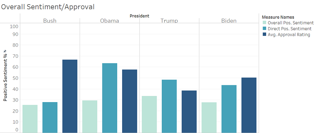
In the chart above, a few things stand out. Firstly, all news is bad news (kind of). For all presidents, the average overall news sentiment is only between 25–35% positive. Talk about a glass half empty! Second observation, news abstracts containing Obama’s name (direct mentions) were EXTREMELY positive — around 65%! Final observation — Bush’s average approval rating was very high. It will become clear later on that this is largely due to the massive bump in approval he saw following the 9/11 attacks.
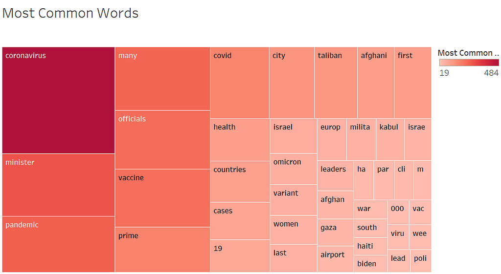
Most Common Words
All Presidents
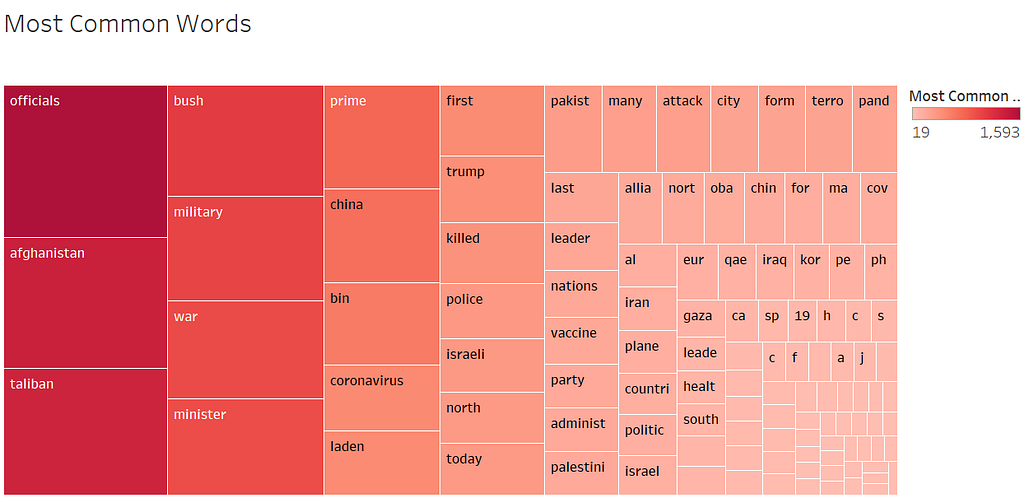
Across all presidents’ first years, some words stood out. Afghanistan, Taliban, military, war, China, coronavirus, Bin Laden, etc. were all featured in a ton of abstracts. Bush is the fourth most mentioned word overall, meaning his name was directly mentioned a LOT during his first year. This chart becomes even more interesting when we filter by president. For example, let’s compare Trump and Biden’s first years.
Trump
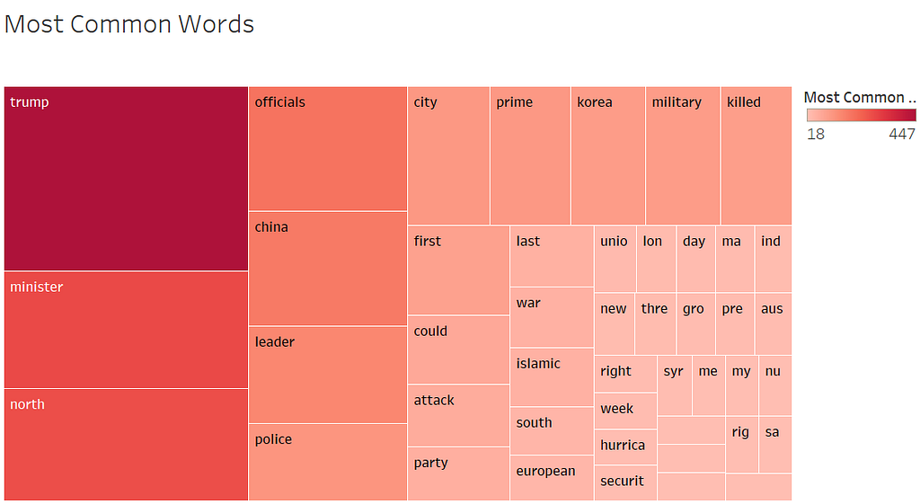
When filtered for Trump, we see that clearly the biggest news in Trump’s first year was, well, Trump. However, when we filter for Biden his name just barely makes it into view (bottom right, below). His first year was completely dominated by COVID-19.
Biden
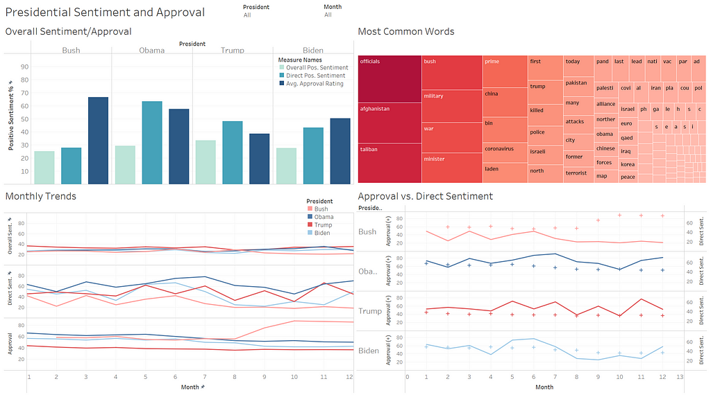
Monthly Trends
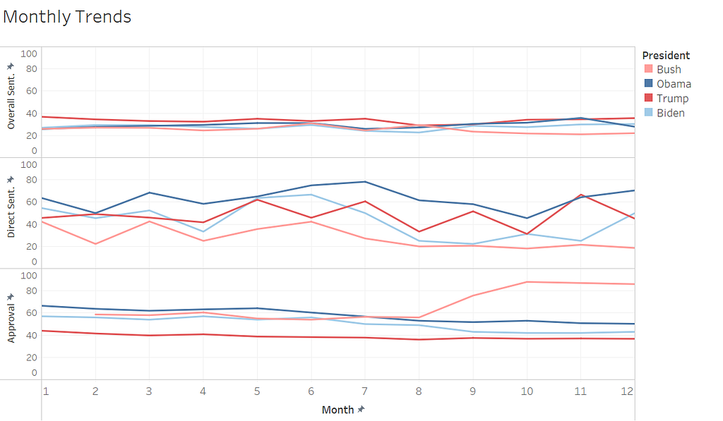
In the chart above, we can see the following monthly trends for each president: overall news sentiment, direct mention news sentiment, and approval rating. Once again, we see that overall news sentiment is similarly negative for all presidents. Direct mentions were very positive for Obama throughout the year. They were also surprisingly high for Trump, given the NYT’s leftward lean. Finally, we can see the jump in Bush’s approval rating beginning in September, which explains the very high average approval rating we saw earlier.
Looking at the discrepancy between direct news sentiment for Bush vs. approval rating from September-December demonstrates how direct mentions of presidents might be very negative because of events taking place in the world, not necessarily because of a news outlet’s political leaning. The New York Times was likely not trash-talking President Bush in the days following 9/11, but the content of the news was extremely negative, and his name happened to be involved. The opposite can also be true, and this could explain why direct mentions of Trump are pretty positive. It’s not that the NYT was singing his praises, but perhaps the world was just in pretty decent shape in 2017. Given that 2001 saw 9/11, 2009 saw the Great Recession, and 2021 saw a global pandemic, maybe 2017 just wasn’t too bad.
Approval Rating vs. Direct News Sentiment
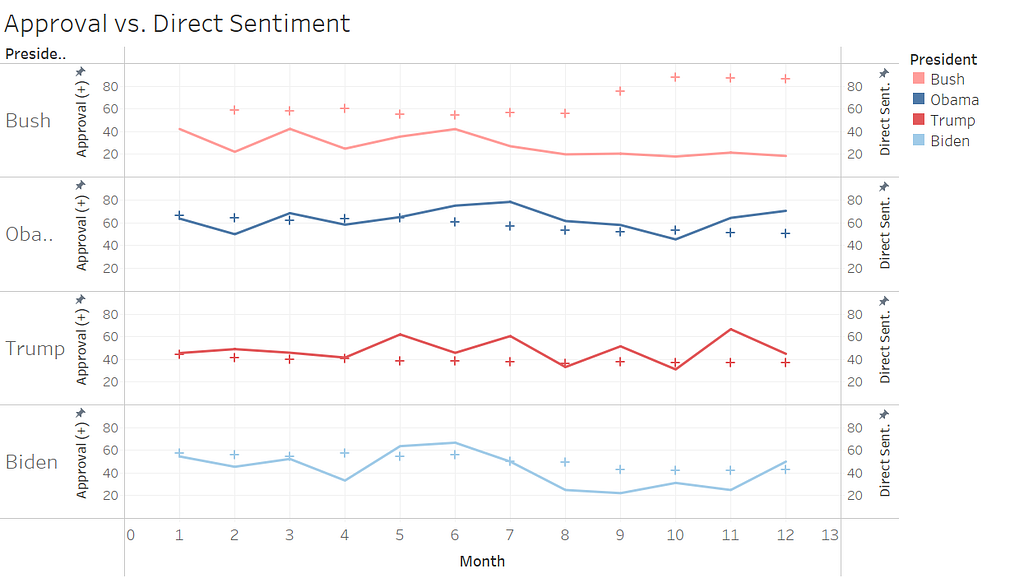
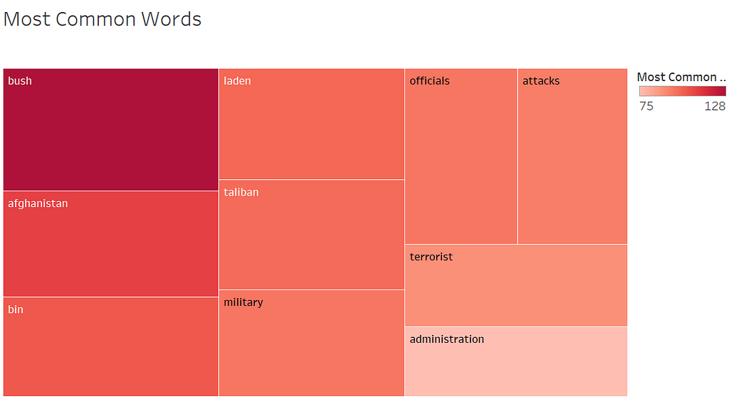
Above, we have a direct comparison of monthly approval rating and direct news sentiment for each president. A couple of things stand out, here. First, sometimes bad news is good for presidential approval. This was clearly the case for Bush following the 9/11 attacks, when the country rallied together and patriotism soared. Although the news was very obviously negative (news abstracts containing Bush’s name were only about 20% positive Sept-Dec), his approval rating skyrocketed. If we filter for Bush and for September, we see the top 10 words, below, which all deal with the attacks.
Bush, September
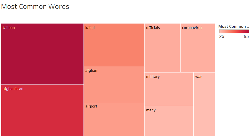
Somewhat ironically, we can see the complete opposite occurs in August of Biden’s first year. While the most common words are very similar, they have the opposite effect on his approval rating. The US’s messy exit from Afghanistan 20 years after 9/11 contributed to negative direct news sentiment (around 20% positive in August and September), but Biden is given the blame. His approval rating drops from 49 in August to 43 in September, where it stabilizes for the rest of the year. In this case, bad news sentiment is bad news for presidential approval.
Biden, August
Conclusion
The most satisfying part of a project, for the person working on it, is often getting the code to run properly, building a model that works as expected, etc. However, there’s no point in the code running properly or the model working as expected if you have no results to show for it. That’s why I pushed myself to build off of the first part of my project and visualize the results (with some additional, easy-to-pull data) in Tableau.
Exploring the data in a dashboard format was really interesting. It allowed me to drill down further into dips and spikes in the data. The most common words let me gain a better understanding of which topics were driving the national narrative at a given time. Visualizing the data made certain trends clear in ways that a pandas dataframe never could.
In summary, my project would not have been complete if I had not visualized my results. I am glad that I forced myself to write this up and publish it! I hope you are glad that you read it :)
*References
Gallup, Inc. “Presidential Approval Ratings — Joe Biden.” Gallup.com, 5 Feb. 2021, news.gallup.com/poll/329384/presidential-approval-ratings-joe-biden.aspx.
Gallup, Inc. “Presidential Approval Ratings — Donald Trump.” Gallup.com, 16 Nov. 2016, news.gallup.com/poll/203198/presidential-approval-ratings-donald-trump.aspx.
Gallup, Inc. “Presidential Approval Ratings — Barack Obama.” Gallup.com, 21 Apr. 2016, news.gallup.com/poll/116479/barack-obama-presidential-job-approval.aspx.
Gallup, Inc. “Presidential Approval Ratings — George W. Bush.” Gallup.com, 11 June 2013, news.gallup.com/poll/116500/presidential-approval-ratings-george-bush.aspx.
Comparing U.S. Presidents’ First Years was originally published in Towards Data Science on Medium, where people are continuing the conversation by highlighting and responding to this story.
from Towards Data Science - Medium https://ift.tt/qCr9ldD
via RiYo Analytics


ليست هناك تعليقات