https://ift.tt/3zziNIM Predicting full time employment outcomes at the County of Santa Clara using logistic regression Photo by Priscilla...
Predicting full time employment outcomes at the County of Santa Clara using logistic regression

As many employers begin to reevaluate the demographic makeup of their workforce, I thought to dig through my own employer’s publicly available workforce data to determine what demographic equity looks like at my place of employment. Through this project, I applied Exploratory Data Analysis (EDA) and data visualization methods, and fit a logistic regression model to predict full time employment status by various demographic characteristics. For the purposes of this analysis, full time employees were defined as those who were classified (either permanent or in probationary status) or executive management. All others were considered non-full time employees.
Contents
1. Exploratory Data Analysis & Data Visualization
2. Data Cleaning and Regression Modeling
3. Interpreting the Results
4. Strengths & Limitations
Exploratory Data Analysis & Data Visualization
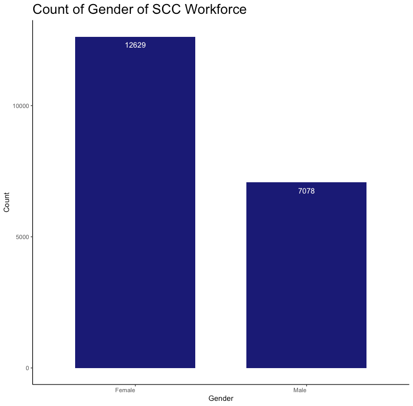
First, I downloaded the Equal Opportunity Employment dataset (n=19707) from the County of Santa Clara Open Data Portal and imported it into R. I started with some EDA and visualizations of the data to scan for anomalies, outliers, or any other interesting trends in the data.
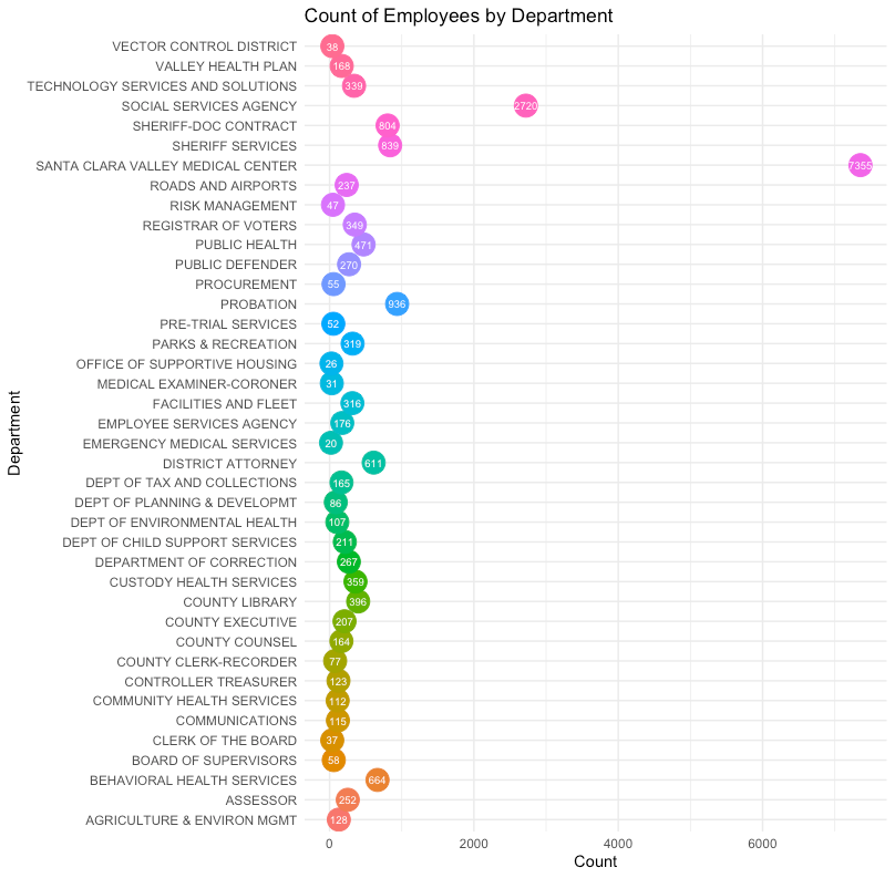
Using Rstudio, I built bar charts and a dot plot to visualize key variables in the dataset. Here is sample code I used to build a bar chart:
ggplot(df, aes(Gender))+
geom_bar(stat="count", width=0.7, fill="#1A1A75")+
geom_text(aes(label = ..count..), stat = "count", vjust = 2, colour = "white")+
labs(title = "Count of Gender of SCC Workforce", x= "Gender", y= "Count")+
theme_bw()+
theme(plot.title= element_text(size= 20), axis.text.x = element_text(hjust = 1),
      panel.grid.major = element_blank(),
      panel.grid.minor = element_blank(),
      panel.border = element_blank(),
      panel.background = element_blank(),
      axis.line = element_line(color = 'black'))

In order to create a dot plot, I developed a separate view by creating a new data frame using only the ‘Department’ variable. This allowed the count of the ‘Department’ variable to be easily passed into ggplot (Rstudio data visualization library). Here is the code I used to build a dot plot by ‘Department’:
dept_count <- table(df$Department)
dept_count <- as.data.frame(dept_count)
ggplot(dept_count, aes(x=Freq, y= Var1, label= Freq)) +
  geom_point(aes(col=Var1), size=7, show.legend = F)+
  geom_text(color="white", size=2.5, parse = T)+
  xlab("Count")+
  ylab("Department")+
  labs(title="Count of Employees by Department")+
  theme_minimal()
Here is the resulting output:

Data Cleaning and Regression Modeling
From there, I worked on cleaning and formatting the data to pass into a logistic regression model. This required encoding the data into a quantitative format (numbering variables from 0 for the reference group, increasing by 1 for each category in the variable). This data dictionary provides documentation as to how the variables I used in the model were encoded. Here is a sample of my code used to encode the ‘Ethnicity’ variable and convert the variable into a numeric variable from a character variable:
df$Ethnicity[df$Ethnicity == "American Indian/Alaska Native"] <- 1
df$Ethnicity[df$Ethnicity == "Black/African American"] <- 2
df$Ethnicity[df$Ethnicity == "Native Hawaiian/Oth Pac Island"] <- 3
df$Ethnicity[df$Ethnicity == "Asian"] <- 4
df$Ethnicity[df$Ethnicity == "Hispanic/Latino"] <- 5
df$Ethnicity[df$Ethnicity == "Two or More Races"] <- 6
df$Ethnicity[df$Ethnicity == "Not Applicable"] <- 7
df$Ethnicity[df$Ethnicity == "Not Identified"] <- 8
df$Ethnicity[df$Ethnicity == "White"] <- 0 #comparison group
df$Ethnicity <- as.numeric(df$Ethnicity) #convert from chr to numeric
I then fit the selected demographic variables into a regression model and summarized the results of the model:
m <- glm(as.factor(Employment.Status) ~ as.factor(Age) + as.factor(Gender) + as.factor(Ethnicity), family = "binomial", df)
summary(m)
Interpreting the Results
The output below shows the results of the logistic regression model. The ‘*’ indicate significance and you can see that not all variables included in the model remain significant after adjusting for other variables included in the model.
Call:
glm(formula = as.factor(Employment.Status) ~ as.factor(Age) +
    as.factor(Gender) + as.factor(Ethnicity), family = "binomial",
    data = df)
Deviance Residuals:
    Min       1Q   Median       3Q      Max
-2.6159  -0.6046  -0.5015  -0.3303   2.4451
Coefficients:
                        Estimate Std. Error z value Pr(>|z|)
(Intercept)            -2.066504   0.062371 -33.133  < 2e-16 ***
as.factor(Age)1         4.871116   0.735350   6.624 3.49e-11 ***
as.factor(Age)2         1.404890   0.065853  21.334  < 2e-16 ***
as.factor(Age)3         0.375222   0.059230   6.335 2.37e-10 ***
as.factor(Age)4         0.001325   0.065042   0.020   0.9837
as.factor(Age)5         0.572097   0.073372   7.797 6.33e-15 ***
as.factor(Age)6         1.811770   0.140881  12.860  < 2e-16 ***
as.factor(Gender)1      0.055374   0.042902   1.291   0.1968
as.factor(Ethnicity)1  -0.859101   0.431944  -1.989   0.0467 *
as.factor(Ethnicity)2  -0.181556   0.101585  -1.787   0.0739 .
as.factor(Ethnicity)3  -0.577770   0.297139  -1.944   0.0518 .
as.factor(Ethnicity)4   0.084497   0.054369   1.554   0.1202
as.factor(Ethnicity)5  -0.871253   0.069348 -12.563  < 2e-16 ***
as.factor(Ethnicity)6  -0.063882   0.113879  -0.561   0.5748
as.factor(Ethnicity)7   0.528137   0.065507   8.062 7.49e-16 ***
as.factor(Ethnicity)8 -10.607403 122.517633  -0.087   0.9310
---
Signif. codes:  0 ‘***’ 0.001 ‘**’ 0.01 ‘*’ 0.05 ‘.’ 0.1 ‘ ’ 1
(Dispersion parameter for binomial family taken to be 1)
Null deviance: 16956  on 19706  degrees of freedom
Residual deviance: 15713  on 19691  degrees of freedom
AIC: 15745
Number of Fisher Scoring iterations: 11
To obtain the odds ratios and p-values from the model, the output needed to be exponentiated. This can be done simply by executing the following code on the model:
exp(coefficients(m))
exp(confint(m))
Here is the output from the above code:
#Odds Ratios:
                      exp.coefficients.m..
(Intercept)                  0.12662764672
as.factor(Age)1            130.46646380157
as.factor(Age)2              4.07508039371
as.factor(Age)3              1.45531434372
as.factor(Age)4              1.00132609820
as.factor(Age)5              1.77197884694
as.factor(Age)6              6.12127428713
as.factor(Gender)1           1.05693574512
as.factor(Ethnicity)1        0.42354252826
as.factor(Ethnicity)2        0.83397119030
as.factor(Ethnicity)3        0.56114822112
as.factor(Ethnicity)4        1.08816930350
as.factor(Ethnicity)5        0.41842702920
as.factor(Ethnicity)6        0.93811576448
as.factor(Ethnicity)7        1.69577024472
as.factor(Ethnicity)8        0.00002473223
#Confidence Intervals:
                          2.5 %      97.5 %
(Intercept)            0.1119507   0.1429609
as.factor(Age)1       38.9341090 811.6890375
as.factor(Age)2        3.5822371   4.6374648
as.factor(Age)3        1.2960778   1.6348703
as.factor(Age)4        0.8813076   1.1373159
as.factor(Age)5        1.5337998   2.0450854
as.factor(Age)6        4.6385626   8.0627385
as.factor(Gender)1     0.9718973   1.1499075
as.factor(Ethnicity)1  0.1624569   0.9095877
as.factor(Ethnicity)2  0.6811999   1.0146872
as.factor(Ethnicity)3  0.2988317   0.9668308
as.factor(Ethnicity)4  0.9783697   1.2108047
as.factor(Ethnicity)5  0.3649682   0.4790100
as.factor(Ethnicity)6  0.7478204   1.1689730
as.factor(Ethnicity)7  1.4911884   1.9278357
as.factor(Ethnicity)8         NA   1.4707108
I immediately noticed an unusually large odds ratio for Age1 category, which is ‘Age 20 or below’. Looking back at the EDA, we see that this category only had 35 observations. Due to the limited sample size in the category, (and the large confidence interval) this estimate is likely not reliable.
Hint: if the confidence interval crosses 1 (ex. .08–1.3), there is no statistical difference between the study group and the comparison group.
Findings from this analysis include that Hispanics were 58% less likely (CI: 0.36–0.47) to be full time employees at the County of Santa Clara compared to their White counterparts. No statistical difference between ‘Males’ and ‘Females’ holding full time positions at the County of Santa Clara was found. Those aged 30–39 were 45% more likely (CI: 1.30–1.63) to be full time employees at the County compared to those aged 40–49 years old.
Strengths & Limitations
As with any type of modeling, there are pros and cons for employing certain techniques over others. Logistic Regression is no different. Although it is one of the simpler models to build and interpret, it relies heavily on well formatted data with sufficient sample sizes.
Some limitations of this dataset include how these variables were measured. For example, the ‘Gender’ variable only collected ‘male’ and ‘female’ and no SOGI (sexual orientation gender identity) information. Also, the ‘Ethnicity’ variable was aggregated so identifying patterns or trends by various ethnicity subgroups was not possible.
The data used in this analysis is outdated and not well balanced across all categories within a variable. To address this concern, the data could be manipulated to create larger categories (for example, wider age ranges). This would, however, dilute the granularity of the interpretation of the results. More robust data collection would allow for more accurate analyses making it easier to identify areas for improvement for a more equitable workforce.
My full code, data dictionary, raw and analytic dataset, and data visualizations can be found on my Github page here.
Workforce Equity at the County of Santa Clara was originally published in Towards Data Science on Medium, where people are continuing the conversation by highlighting and responding to this story.
from Towards Data Science - Medium https://ift.tt/3JQEPLN
via RiYo Analytics

No comments