https://ift.tt/3tnFBub An overview of different components of LIME for explaining an image classification model Photo by Rinke Dohmen on...
An overview of different components of LIME for explaining an image classification model
With the continuous upsurge of COVID-19 and in the presence of emerging variants different regulatory authorities have stated the importance of wearing mask especially in public areas. Already different face mask detection machines are developed and are being used by some organizations. All these machines have some kind of image classification and detection algorithms working in the backend. But, the sad part is most of these algorithms are “black-box”. That means the model is doing something in the background for behaving the way it is doing which is shadowy to us. So, in these highly sensitive scenarios it is a point of concern whether to trust the model.
For this purpose LIME (Local Interpretable Model Agnostic Explanations) can be used to interpret the way the image classification model is behaving. It can provide a clear idea about the superpixels (or features) which are responsible for making certain prediction. In this article, I will share how lime can be used to interpret the predictions done by an image classification model in a step-by-step manner. To know the mechanism of how different interpretability tools work read this article
Explainable AI: An illuminator in the field of black-box machine learning
Description of the data
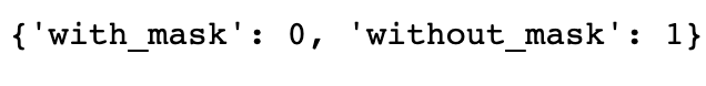
The data is collected from Prasoon Kottarathil’s “Face Mask Lite Dataset” that can be found here[4]. Here to conduct the analysis I have randomly selected around 10,000 images from the dataset source. The data is for distinguishing whether the person in the image is wearing mask (class 0) or not (class 1). The purpose of the image classification model is to detect those images where the person is without the face mask so the class ‘without_mask’ is considered as positive class.
The main purpose of this article is to interpret the predictions done by the image classification model. So, I am not going into much details of the architecture of the CNN model that I have used for the classification.
Building the CNN model
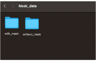
The data is stored in a directory which contains two folders: one containing images with mask and another one contains images without face mask.
The data is generated from the path by using ImageDataGenerator() .It takes the path of the directory and generates batches of augmented data. As the images used for analysis are 3-D images so they contain 3 channels (color_mode = ‘rgb'). The images are resized to (height,width) : target_size = (256,256). class_mode = ‘categorical' is selected which determines the class label arrays will be returned as 2-D one hot encoded labels. The images are flowed from these two folders with the class label as per the folder name they are from in a batch_size of 32.
Now let’s create the CNN model!!
The model that is used is a vanilla CNN model which takes 3-D input images and passes them to the first Conv2D layer with 16 filters each of size 3x3 and activation function ReLU. It returns the feature maps which are then passed to a MaxPooling2D layer with maximum filer size 2x2 which reduces the dimensionality of the feature vector. It then moves to the second Conv2D layer(32 filters) , MaxPooling2D layer , third Conv2D layer(64 filters) and the last MaxPooling2D layer.
Finally, the output passes to a Flatten layer (which flattens the output), a dense hidden layer with 512 units and a fully connected layer which outputs a vector of size 2 (which is the vector of probabilities of two classes).
Adam optimizer is used for optimizing the binary_crossentropy loss function.
Checking the prediction done by the CNN model
Now, let’s see how the model is working on an unseen data. For that I have used my own photo to see whether the model is properly able to classify the image or not.
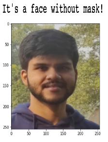
That’s amazing!! The model has predicted the proper class for this image.
But can we trust our model? Which features are affecting my model to predict in this way??
Judging the model based on its accuracy is not enough. Understanding the behaviour of the “black-box” model is very much important. For that purpose, we can use LIME.
Interpretation using LIME
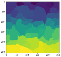
Before everything first we will have to know what are the features of an image that are used. The pixel values can be used as features for an image but in LIME superpixels are used as features. Superpixels are the group of pixels that have some common characteristics(for example pixel intensity). They contain more useful information than the pixels. There are several ways to do segmentation of the pixels of an image like SLIC (Simple Linear Iterative Clustering), Quickshift etc.
By using Quickshift algorithm we got a number of 46 superpixels which work as features of the image and the output looks like this:
Creation of perturbed sample
First, some perturbed samples are created around the neighbourhood of the original data instance by randomly switching on an off some of the superpixels. Here in this example we have generated 1000 perturbed samples in the neighbourhood and classes have been predicted for those perturbed samples by using the already fitted CNN model. One example of such perturbed sample is shown in the below image. Note that each perturbed sample is of length of number of superpixels(or features) in the original image.

1 means that superpixel is on and 0means superpixel of that position is off in the perturbed sample.
So now we have seen which superpixels (or features ) are present in the perturbed samples, but we are curious to know how these perturbed images will look like. Aren’t we??
Let’s see that.
For all the turned off superpixels or features , the pixels of the original image are replaced by the pixels of an image called fudged_image. A fudged_image is created by either taking mean pixel values or by taking superpixels of a particular colour(hide_color). Here in this example, the fudged_image is created by taking the superpixel of colour 0 ( hide_color=0 ).

Calculation of distance between original image and perturbed image
Cosine distances are calculated between the original and perturbed images and top 3 closest perturbed images are shown in the above image.
Calculation of weightage to the perturbed samples
After creating the perturbed samples in the neighbourhood weights(values in between 0 and 1) are given to those samples. Samples that are near from the original image are given higher weightage than the samples far from the original instance. Exponential kernel with kernel width 25 is used to give those weightage. Based on kernel width we can define the “locality” around the original instance.
Selection of important features or superpixels
Important features are selected by learning a local linear model. The weighted linear model is fitted on the data that we got from the previous steps (perturbed samples, their predictions from CNN model and the weights) . As we want to explain the class ‘without_mask’, so from the prediction vector the column corresponding to ‘without_mask’ is used in the local linear model. There are several ways to select the top features like forward selection, backward elimination, even we can use regularized linear models like Lasso and Ridge regression. Here in this example I have fitted a Ridge regression model on the data.
The top 10 features or superpixels that I got are shown below

Prediction done by local linear model
After selecting the top 10 features a weighted local linear model is fitted to explain the prediction done by the ‘black-box’ model in the local neighbourhood of the original image.
Now we have seen how LIME works step by step and locally explain a prediction done by a black-box model. So, let’s see how the final output of LIME looks like and how to interpret that.
Final output of LIME interpretation
The final output of LIME for the image used in this example is shown below. Here we want to see the top 10 most important superpixels in the image. The superpixels marked with green are the features that positively contribute to the prediction of the label ‘without_mask’ and the superpixels marked with red are the features that negatively contribute to the prediction of the label.

From the above interpretation we can see that the superpixels near the nose and mouth are contributing positively for predicting the class ‘without_mask’. As the superpixels near nose and mouth do not contain mask in this image so they are positively contributing for the prediction of ‘without_mask’.This is making sense. Similarly, some superpixels near ear are contributing negatively towards the prediction of the class ‘without_mask’(some patches of beard the model is considering as mask may be , if that is the reason we need to add some more variations in the train data to train the model properly). So, this is one benefit of LIME for optimizing the behaviour of the fitted model.
That brings us to an end.
To get the full Jupyter notebook used for this article please visit my GitHub repository. For my future blogs please follow me on LinkedIn and Medium.
Conclusion
In this article, I tried to explain the final outcome of LIME for image data and how the whole explanation process happens for image in a step by step manner. Similar explanations can be done for tabular and text data.
References
- GitHub repository for LIME : https://github.com/marcotcr/lime
- Superpixels and SLIC: https://darshita1405.medium.com/superpixels-and-slic-6b2d8a6e4f08
- Scikit-image image segmentation: https://scikit-image.org/docs/dev/api/skimage.segmentation.html#skimage.segmentation.quickshift
- Dataset source : https://www.kaggle.com/prasoonkottarathil/face-mask-lite-dataset (License : CC BY-SA 4.0)
- Dataset License Link (CC BY-SA 4.0): https://creativecommons.org/licenses/by-sa/4.0
Thanks for reading and happy learning!
Explaining Face Mask Image Classification Model Using LIME was originally published in Towards Data Science on Medium, where people are continuing the conversation by highlighting and responding to this story.
from Towards Data Science - Medium https://ift.tt/3fompEd
via RiYo Analytics


ليست هناك تعليقات