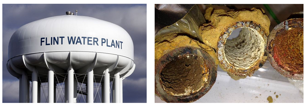
https://ift.tt/3Edng4O Water tower in Flint (left) and corroded lead pipes (right). Images courtesy of BlueConduit . How road distances ...
How road distances and graphs can help machine learning models find lead pipes in Flint and other cities
A collaboration between BlueConduit and Harvard’s Data Science Program. Authors: Javiera Astudillo, Max Cembalest, Kevin Hare, & Dashiell Young-Saver. Project advisors: Jared Webb, Isaac Slavitt, & Chris Tanner.
For centuries, cities in the United States used an inexpensive, malleable, and leak-resistant material for constructing their water pipes: lead. Today, the health risks posed by lead pipes are well-known. Drinking lead-contaminated water can stunt children’s development and cause heart and kidney problems among adults.¹ The Environmental Protection Agency (EPA) banned the use of lead pipes for new construction in 1986. Yet, today, lead services lines (the pipes that take water from city lines into individual homes) are still prevalent across the country.
Lead pipes are notoriously difficult to identify and replace. The only reliable way to identify a lead pipe is to dig it out of the ground. However, digging is expensive, so false positives (mistakenly digging up safe pipes — such as copper) are quite costly. Compounding the issue, city records of pipe materials are often inaccurate and incomplete.
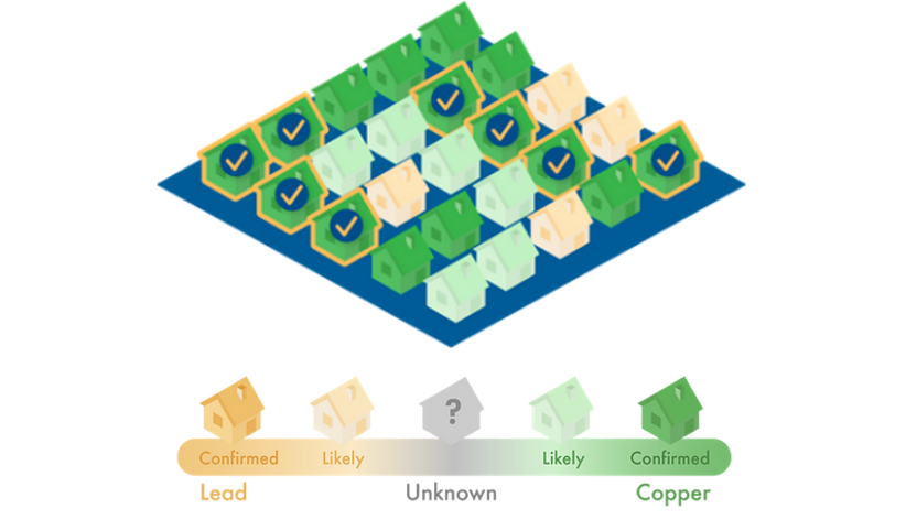
BlueConduit was founded to address the above problem. The company uses machine learning to predict whether homes have lead service lines based on their features (year built, lot size, type of fire hydrant, etc.). The company was started by two professors at the University of Michigan, who constructed lead identification models during the Flint Water Crisis. When the city of Flint began using the professors’ model, their lead pipe hit rate (percent of dug up homes that, in fact, had lead service lines) rose from 15% to 81%.²
As BlueConduit expands their work to more cities across the United States, they are actively researching ways to further improve their models. To help in this effort, we explored a new area of interest for the company: spatial modeling. Currently, BlueConduit’s models do not use spatial information (e.g. homes’ latitudes and longitudes) to make predictions. However, because cities are built out street-by-street, BlueConduit has long hypothesized that sharing information between proximate neighbors could improve their lead pipe predictions. Our project investigates this hypothesis.
To test the efficacy of incorporating spatial information, we built a diffusion model that uses home locations to adjust the predictions from BlueConduit’s standard model. When evaluated on a dataset of homes in Flint, our model showed improvement over BlueConduit’s standard model (in terms of hit rate and city savings). In this blog post, we detail our dataset and evaluation setting, modeling process, and results. Then, we discuss implications for future work.

Dataset & Evaluation
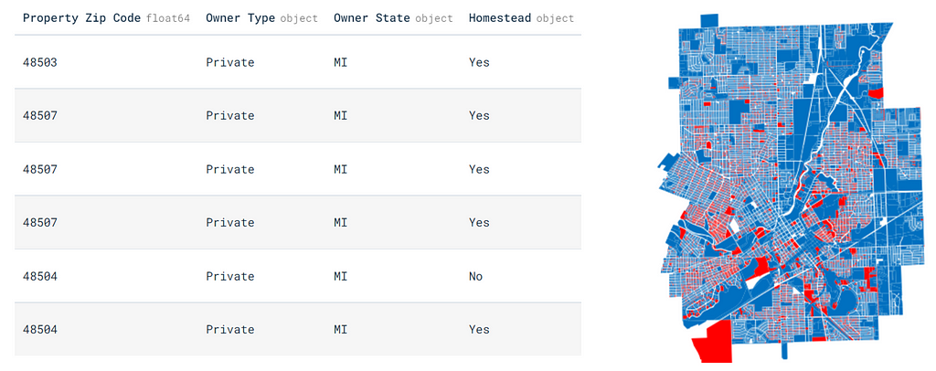
We used BlueConduit’s dataset on lead pipes in Flint to build and evaluate our models. Because of the large-scale digging effort that followed the Flint Water Crisis, the municipality now has one of the most complete lead pipe datasets in the country. The dataset contains 26,863 rows, each representing a parcel (home or commercial property) in Flint. Each parcel has 74 described features, such as the market value, size, location (latitude/longitude), year built, and voting precinct. The target is a binary indicator of whether the parcel had a lead service line.³ In total, 38% of all homes in the city had lead service lines.
In Flint, BlueConduit used an XGBoost model, trained on all home features except for latitude and longitude. We refer to this as the “BlueConduit Baseline” model. We attempted to improve on the BlueConduit Baseline test-set performance by incorporating spatial information.
To evaluate our performance relative to the BlueConduit Baseline, we used two metrics developed by BlueConduit:
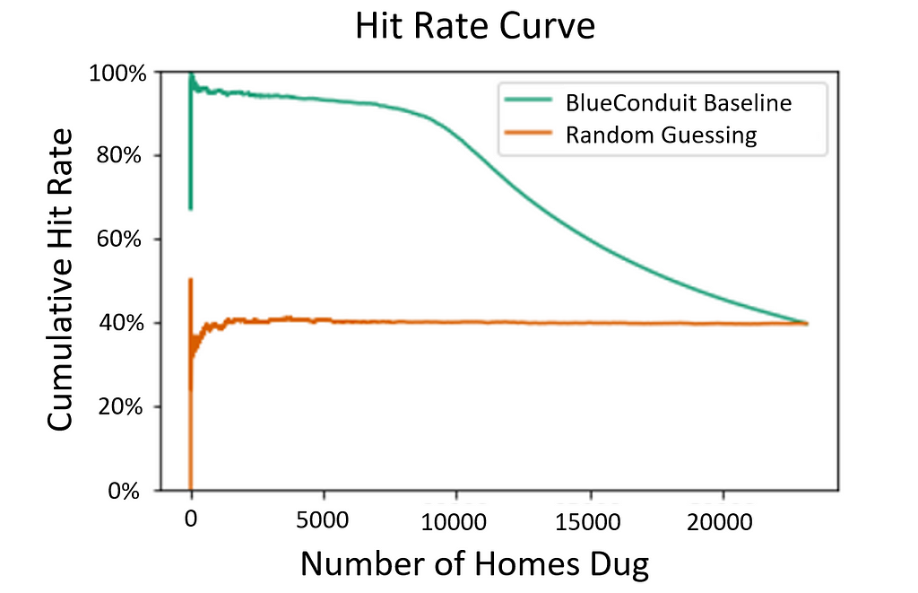
1. Hit Rate Curve: Imagine you dig up a bunch of homes, searching for lead pipes. The hit rate is the percent of those dug homes that actually had lead pipes. A high hit rate means you have been efficient: Of the homes you decided to dig up, a high proportion had lead. The hit rate metric can be extended to a hit rate curve. Imagine that you manage a dig crew tasked with digging up lead pipes. You are given a print out of home addresses and their predicted probability of having lead. Given limited resources and time, a natural way to proceed is to dig up the homes in the order of their predicted probabilities — higher probability homes first, and lower probability homes later. The hit rate curve (visualized above) graphs the cumulative hit rate (y-axis) as you progress through digs ordered by prediction probabilities (x-axis). The ideal hit rate curve is as high as possible (high hit rate) for as long as possible (over many dug homes), which signals you tend to dig up lead homes before non-lead homes. The figure above shows the BlueConduit Baseline’s hit rate curve improvement over random digging in the city of Flint. It’s clear that the BlueConduit baseline tends to produce a higher hit rate than randomly digging, which provides a hit rate centered around the true incidence of lead in the city (38% of homes). Both converge to the true rate of lead in the city once all homes have been dug.
2. Average Cost of Replacement: BlueConduit estimates that the raw cost to dig up a copper (safe) pipe is $3,000. The estimated cost to dig up and replace a lead pipe is $5,000.⁴ However, the former cost is more concerning, as it represents “wasted” city dollars (digging up already safe pipes). To gauge wasted funds, we calculate the average cost of replacement:

L represents the number of lead pipes dug and C represents the number of copper (or other safe material) pipes dug. Imagine that the city would like to determine the expected cost of replacing its first 100 lead pipes. If a digging algorithm leads the city to excavate many copper pipes (high C value) before it reaches 100 lead pipes (L = 100), then its average cost for replacing each lead pipe will be quite high. In effect, this metric summarizes how much more than $5,000 the city will have to spend per lead pipe, due to wasteful digs of copper homes.
If we could show that our models raised the hit rate curve and lowered the average cost of replacement, we’d show that spatial information can be used to improve on the BlueConduit Baseline.
Our Spatial Model: Diffusion
In our experiments, the most promising spatial modeling strategy we explored was diffusion.⁵ Let’s walk through an example to motivate diffusion and demonstrate how we used it.
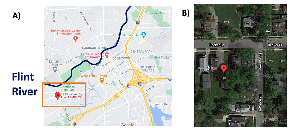
Panel A in the above figure is a map of Flint. In 2014, the city switched its water source to the Flint River, highlighted in dark blue. This decision marked the beginning of the Flint Water Crisis, as the Flint River water contained chemicals that corroded lead pipes in the city. Close to the Flint River is a residential neighborhood on the west side of the city, marked by the orange box. This neighborhood had a high density of lead service lines. A particular home — 1925 Becker St. — is located within this neighborhood.
Panel B zooms in on 1925 Becker St. (marked by the red indicator) and its immediate neighbors. Because the pipes in Flint were all dug up in the years following the Water Crisis, we know the ground truth: every home in the picture had lead pipes (including 1925 Becker). So, if this neighborhood was in a test set (i.e. not yet dug), an ideal model would give high probabilities of lead to every home. The figure below shows the lead prediction probabilities given to each home by the BlueConduit Baseline model.
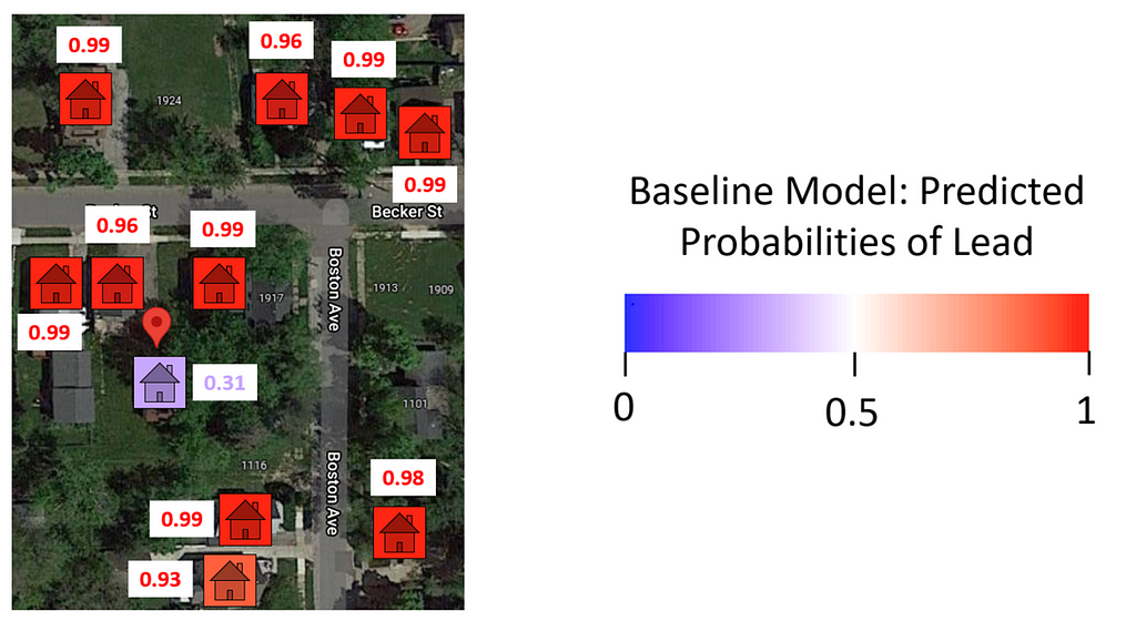
The BlueConduit Baseline gave each home a high probability of lead (>90%), except for one: 1925 Becker St (31%). Upon inspection, it appears that this home had a peculiar feature: its city record indicated that it had copper (safe) pipes. Flint’s pipe records are often unreliable. However, records that explicitly indicate copper pipes are usually accurate. The BlueConduit Baseline model keyed in on this feature and was “fooled.” The model gave 1925 Becker (which did, in fact, have lead pipes) a lower probability of lead, placing it at position 9,136 in the queue of homes to dig. If digging resources were limited, teams may have never reached this home. Instead, they may have dug homes higher in the queue that didn’t, in fact, have lead pipes. How could we prevent this result?
As we mentioned above, because cities are built out block-by-block, we believe that close neighbors should have similar lead probabilities. Because the BlueConduit Baseline doesn’t use spatial features, it cannot directly share information between proximate neighbors. However, this type of information sharing can be achieved through diffusion.
To set up diffusion, we first had to model and build a graph of the distances between homes. Our graph-building process is demonstrated by the figure below. First, we used Open Street Maps to find the street distances (Manhattan distances) between homes. We opted to use street distances instead of Haversine distances (“as the crow flies” distances) because streets encode some of the shared development and infrastructure between homes. Housing developments proceed block-by-block rather than area-by-area. So, two homes with adjacent backyards (small Haversine distance) may have been built by different developers — especially if they aren’t connected by a shared road. In addition, pipes are usually built underneath roadways. So, street distances can also encode shared water mains.
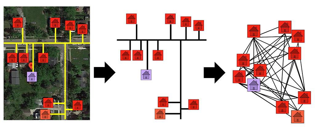
After obtaining the road distances, we created a graph connecting the homes. In our graph, each node was a home. The length/weight of each edge was defined by the street distance between the two homes it connected. In line with our belief that information sharing should only occur between homes in the same immediate neighborhood, we only connected homes that were within 0.5 km of one another.
With the graph fully constructed, we could finally conduct diffusion. The diffusion process is visualized in the figure below. In diffusion, the values in a graph are smoothed between nodes. In our case, the lead probabilities are smoothed between connected homes. For example, a high probability lead home located near many low magnitude probability homes will diffuse its prediction strength to its neighbors — its probability of lead will decrease. In the case of 1925 Becker St. (shown in the figure), we see a low probability lead home located near many high probability lead homes. It borrows prediction strength from its neighbors, and its probability of lead rises. In this way, diffusion allows our model to “correct for” discrepancies between neighbors.
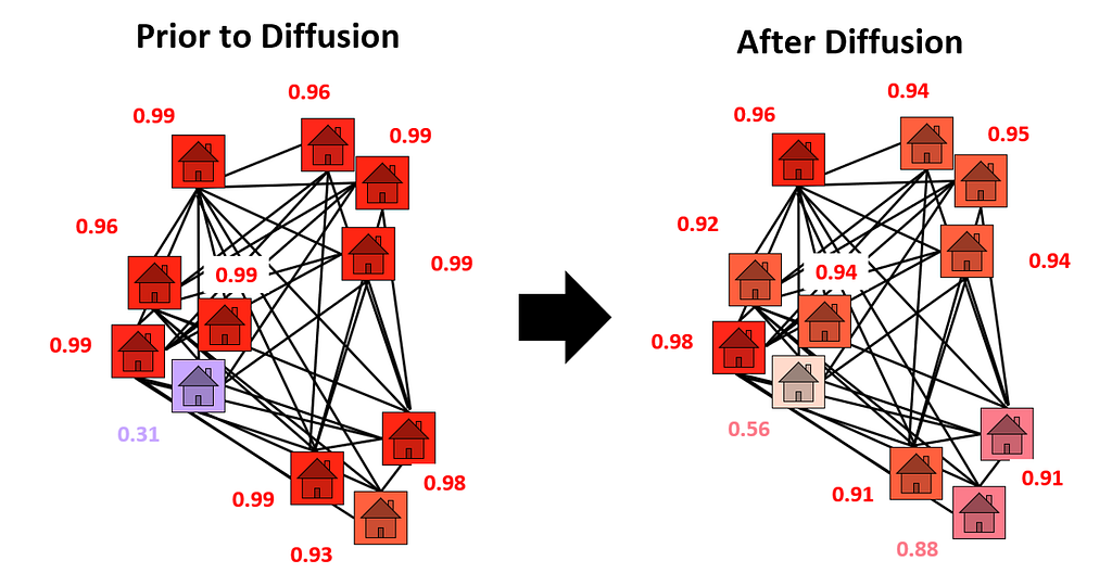
As a result of using diffusion, 1925 Becker St. advanced 502 places in the dig queue. To put this change in perspective, digging 500 homes costs at least $1.5 million. A city with a limited budget may not have the funds to dig an extra 500 homes. So, 1925 Becker St.’s climb in the dig order could represent the difference between replacing and failing to its dangerous pipes.
Yet, 1925 Becker St. is just one home. What results did diffusion bring across the entire city? We answer this question in the next section.
Results in Flint
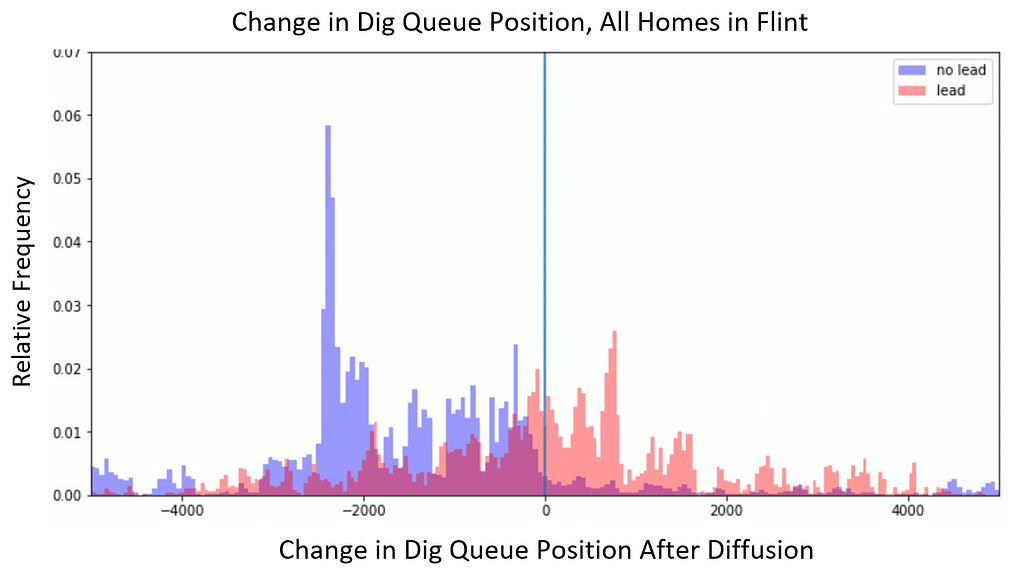
After running diffusion on all the BlueConduit Baseline predictions in Flint, lead homes climbed 327 positions (on average) in the dig queue. Non-lead homes fell 195 positions, on average. The figure below shows the full distribution of dig order changes among lead and non-lead homes. It’s clear that lead homes tended to climb in the dig order (positive values) and non-lead homes tended to fall (negative values).
Exploring further, we found evidence of beneficial information sharing between homes. The figure below visualizes the changes in predicted lead probability (after diffusion) among all homes.
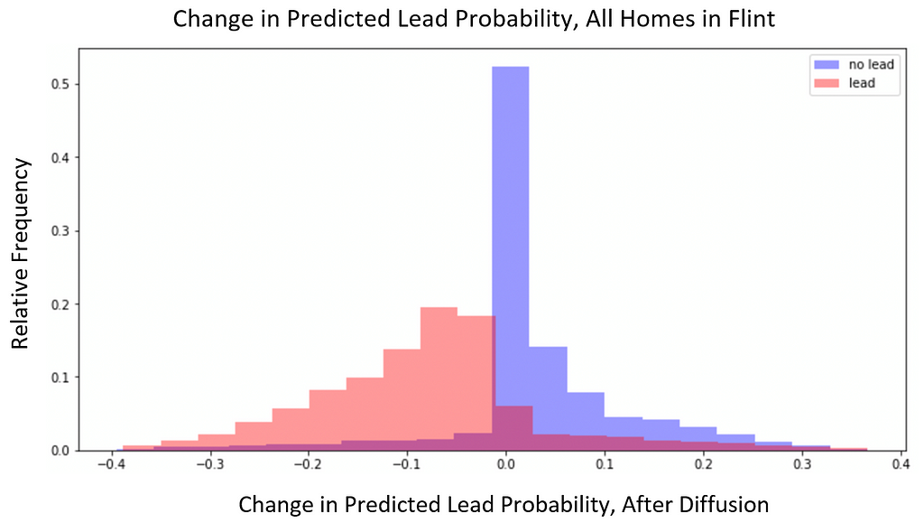
We see a seemingly counterproductive trend: diffusion tends to raise the lead probabilities of non-lead homes and lower the lead probabilities of lead homes. However, it is important to note that the BlueConduit Baseline model gave most homes highly certain and highly accurate lead predictions. In other words, most lead homes were given lead probabilities close to 1, and most non-lead homes were given lead probabilities close to 0. So, we’d expect diffusion to slightly smooth out these probabilities, regressing their extreme values closer to the mean. This means that many lead homes (baseline probabilities close to 1) had slight downwards shifts in lead probability and many non-lead homes (baseline probabilities close to 0) had slight upward shifts in lead probability.
Given this counterproductive trend, how is it possible that lead homes tended to climb in the dig queue and non-lead homes tended to fall? The key is to focus on initially uncertain homes. In the figure below, Panel A visualizes the change in lead probabilities, but only among homes that were given middling lead probability values (30% — 70%) by the BlueConduit Baseline. Here, we see a productive trend: diffusion increased the probabilities of lead homes and decreased the probabilities of non-lead homes.
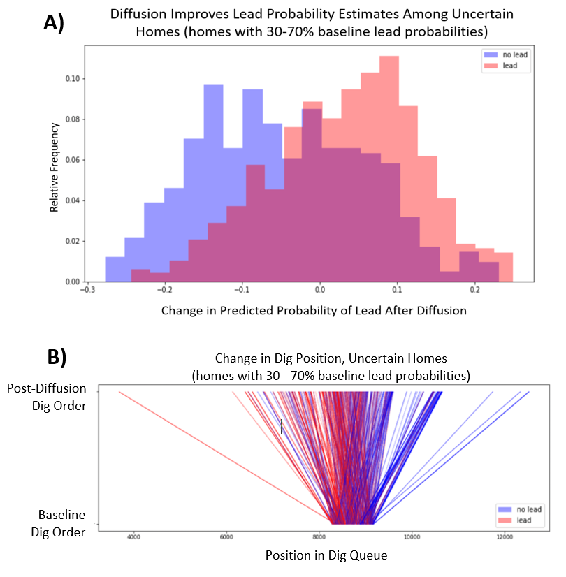
Panel B shows the changes in dig order among a random sample of these same homes. The bottom of the graph represents their place in the BlueConduit Baseline dig queue. The top represents their place in the final diffusion dig queue. Because these homes were given initially uncertain prediction probabilities, they lie in the center of the BlueConduit Baseline dig order. However, we see that diffusion pulls lead homes higher in the dig order, and it pushes non-lead homes lower in the dig order.
These results suggest that information is productively shared from certain homes to uncertain homes. Similar to 1925 Becker St., we see evidence that uncertain lead homes (lead homes with middling probability values) tend to be located near lead homes with higher certainty (lead homes with probabilities close to 1). Diffusion allows these uncertain homes to borrow predictive strength from their neighbors, resulting in higher lead probabilities and a higher place in the dig queue. On the flip side, uncertain non-lead homes (non-lead homes with middling probability values) tend to be located near more certain non-lead homes (non-lead homes with probabilities close to 0). Diffusion allows these homes to borrow predictive strength from their neighbors, resulting in lower lead probabilities and a lower place in the dig queue.
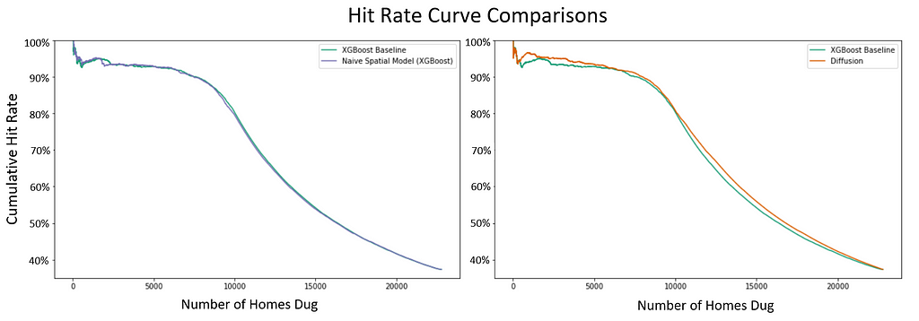
Importantly, the positive effects for uncertain homes outweigh the potential drawbacks for more certain homes (whose extreme probability values are regressed towards the mean). Above, we visualize two sets of hit rate curves. In the left panel, we compare the hit rates of the BlueConduit XGBoost Baseline and the BlueConduit XGBoost Baseline with latitude/longitude included as predictors (labeled: “Naive Spatial Model”). We see that naively including latitude and longitude as predictors produces no noticeable improvement in hit rates. In the right panel, we compare the hit rates of our diffusion model against the same BlueConduit XGBoost Baseline model. Here, we see evidence that the diffusion model has a higher hit rate in both the front half and the back half of the dig queue.
Although the raw differences in hit rates appear small, the estimated differences in savings for the city are quite large. The figure below shows estimates of these savings.
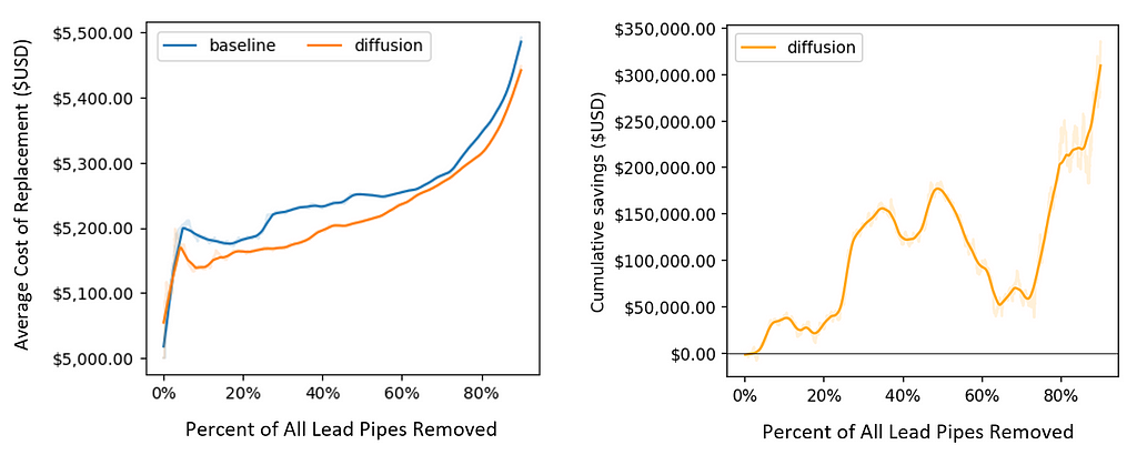
Because diffusion tends to push lead pipes forward in the dig order (and pull non-lead pipes down), it takes fewer total digs to find and replace most of the lead pipes in the city. This translates into monetary savings. As visualized above, diffusion clearly lowers the average cost of replacement throughout the digging process. By the time that 90% of lead pipes are dug, diffusion saves more than $300,000 total for the city (relative to the BlueConduit Baseline model). These savings are primarily driven by preventing wasteful digs of non-lead homes.
Ultimately, beyond monetary value, the most important improvement is for residents. Given time constraints for dig crews, higher hit rates mean that residents will experience less lead exposure (on average) as workers make their way across the city.
Discussion & Future Work
By allowing homes with high lead uncertainty to borrow information from their neighbors, diffusion provided a more efficient ordering of homes in the dig queue. In our experiments with the Flint dataset, this led to large savings for the city and, ultimately, less time of lead exposure for city residents.
More broadly, our results suggest that a home’s location can signal information about its construction, development, and materials. Longitude and latitude may not provide access to this information alone. However, when encoded using the city infrastructure (e.g. street distances), locations can be used as key predictors of lead pipes. In particular, thoughtful modeling of neighborhoods can allow for productive information sharing among neighbors. This can lead to broad improvements for machine learning models.
It is important to note that we only worked with data from one city: Flint. So, we do not strictly know whether our results will generalize to other cities. However, our work utilizes a trend that is likely shared among many municipalities: homes built near one another tend to have similar pipes. As BlueConduit expands its work to more regions across the United States, we are hopeful that spatial information will continue to boost model performance in their future testing. In addition, we are hopeful that BlueConduit will refine our diffusion hyperparameters — or find better spatial models than diffusion altogether — to further improve upon our results.
References & Footnotes
- Environmental Protection Agency, “Basic Information about Lead in Drinking Water.” https://www.epa.gov/ground-water-and-drinking-water/basic-information-about-lead-drinking-water. Accessed December 10, 2021.
- PBS/Nova, “Artificial intelligence is helping get lead pipes out of Flint.” https://youtu.be/anHwjIASyj4
- Technically, service lines have a “public” and “private” component, where the public component is owned by the city or utility and the private by the homeowner. Because both equally contaminate the water supply, we model a home as dangerous if either component is lead. For more information, please see: https://www.nrdc.org/experts/erik-d-olson/how-can-i-find-out-if-i-have-lead-service-line.
- These costs and the average cost of replacement metrics were calculated following Webb et al. (2019) methodology. See Jared Webb, Jacob Abernathy, and Eric Schwartz, “Getting the Lead Out: Data Science and Water Service Lines in Flint,” Bloomberg Data Exchange for Good, 2019. Available at: https://storage.googleapis.com/flint-storage-bucket/d4gx_2019%20(2).pdf
- We also tried using Graph Neural Networks, Gaussian Processes, and a Stacked model. However, these strategies did not improve on the BlueConduit Baseline. Our results and discussion for these models can be viewed in our technical report.
Using Spatial Information to Detect Lead Pipes was originally published in Towards Data Science on Medium, where people are continuing the conversation by highlighting and responding to this story.
from Towards Data Science - Medium https://ift.tt/3e7VCeT
via RiYo Analytics


No comments