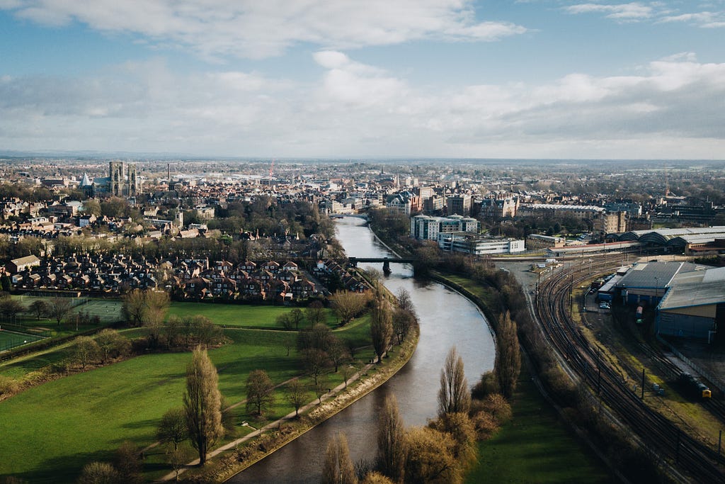
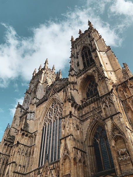
https://ift.tt/3opZf61 (Above) York, UK. Photo by Luke Porter on Unsplash An analysis of data from Strava (via its API) My First Mara...
An analysis of data from Strava (via its API)
My First Marathon
In late 2018, at the age of 38, I realised that the moderate levels of physical exercise that I’d done in my 20s and early 30s had become a distant memory. Life had completely taken over my spare time, and as I ruminated about the not-that-long-away transition into my 40s, I knew it was now or never to get moving again.
I’d never been interested in any form of sport, and pretty much hated PE at school. When I did start to regularly exercise in my mid 20s, I considered a 3 mile run to be more than adequate, and a 10km run an event that was worthy of raising sponsorship money.
The question now was; what challenge could I find that would muster sufficient excitement and focus? What would stir me from my sedentary stupor? The answer presented itself to me when a work colleague mentioned that they’d recently completed the Yorkshire Marathon, and that they’d had a fantastic time.
I entered immediately. After all, it was almost a year away, which was surely plenty of time to get into shape. Upon informing my wife, my initial sense of motivation was hampered somewhat by the immediate response “you’re going to die”, but I pressed on regardless.
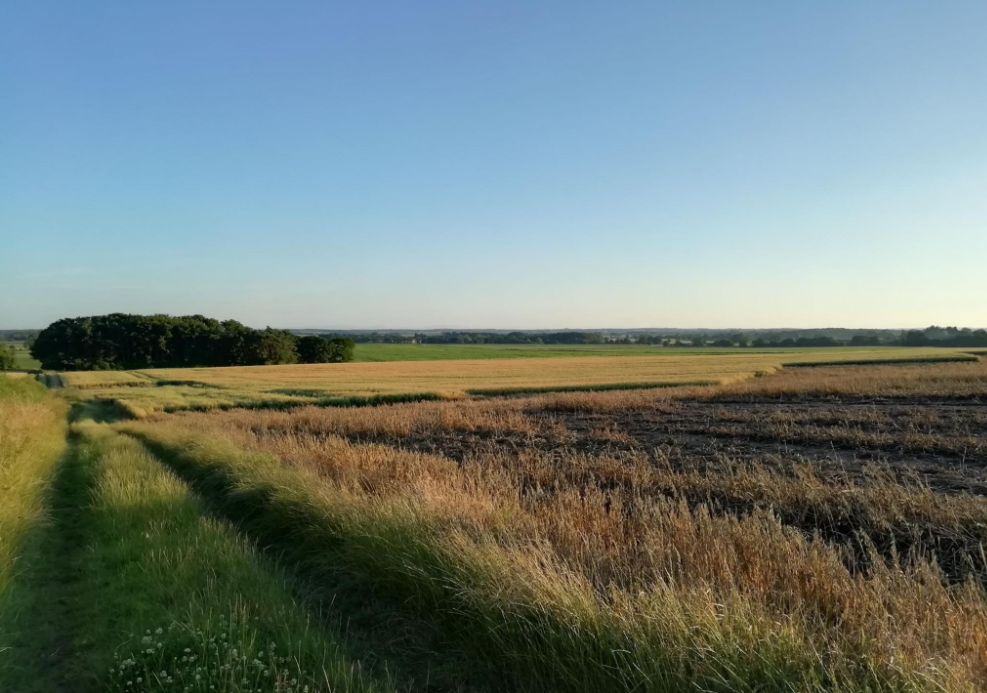
To improve my survival odds I joined a local running club, which, to my shock, treated 10km runs like I treat a casual walk. But this shift in mindset was exactly what I needed, and after a few months, such distances had become routine. Thankfully I live in a small village where the routes around me are pleasant (see figure below) so the training was often quite enjoyable over the summer months.
I spent the 3 months leading up to the marathon preparing and training as best I could. I drew up routes, tried to follow a basic plan, experimented with nutrition, and wore out my shoes. My pace was completely arbitrary and often on the fast side, as in my naïve view, faster equaled fitter!
On the big day I managed to get round the course, but it took me longer than I’d hoped (4 hours, 35 minutes) and I had to slow to a walk 3 times in the last 4 or 5 miles. A few weeks later, determined to do better, I entered again.
Due to Covid-19, the 2020 event became the 2021 event, and 3 months before the big day, my training began again. This time, I decided to read into the science on endurance running, which led me to the concept of heart-rate training.
Heart Rate Zones
The basic gist of what I had read was that there are 5 different heart-rate zones, with exercise in different zones being appropriate for different kinds of training. These are,
- Zone 1: Very light. 50–60% of max. heart-rate
- Zone 2: Light. 60–70% of max. heart-rate
- Zone 3: Moderate. 70–80% of max. heart-rate
- Zone 4: Hard. 80–90% of max. heart-rate
- Zone 5: Maximum. 90–100% of max. heart-rate
All you need to do is determine your maximum heart rate to work out the zones (or an app like Strava will work them out for you). The approximate formula for working this out is,
Max. heart rate = 220 — Age
This gave me a maximum heart rate of 182. I plugged this into Strava and checked my zone percentage breakdowns for my last few runs. The last run I’d done was a fast 10km, and Strava was telling me that I’d spend over 90% in zone 5. This was impossible (zone 5 is your fastest sprint. Think being chased by a pack of rabid dogs!). I’d also ready a few articles that criticised the above formula, so I looked for an alternative technique.
What I did instead was to find a run where I’d sprinted up a steep hill and looked for my peak heart rate, which turned out to be 200. I then plugged that into Strava, and all of my zones suddenly made sense (my fast 10kms were now mostly zone 4). From what I’ve read, this isn’t the most scientific method (especially using a wrist-based heart-rate monitor as opposed to a chest-based one), but it’s the best I could do and it looked more-or-less OK.
For marathon training, the articles I found recommended training mainly in zone 2, with a sprinkling of zone 4 here and there. For me, zone 2 was 120–140 beats per minute. I remember my first run in zone 2. I had to go so slow it felt like I was close to walking. As a consequence, my training runs seemed to take forever, and because I was trying to run 4 times a week compared to the (insufficient) 3 times a week of 2 years before, I quickly started to run out of time.
After a while, I decided that the only way I’d be able to fit my training in was to go a little faster (but still slower than 2 years ago). It would have to do!
Then the big day came around again. The question was, would I get round faster thanks to what I was hoping had been a better approach to training? And would I get around without stopping? Or would the fact that I was now 2 years older hold me back? Let’s look at the data! …
Training Analysis
First, a simple look at the distances over those 3 months leading up to the marathons,
- 2019 Total training distance: 493 km (306 miles)
- 2021 Total training distance: 559 km (347 miles)
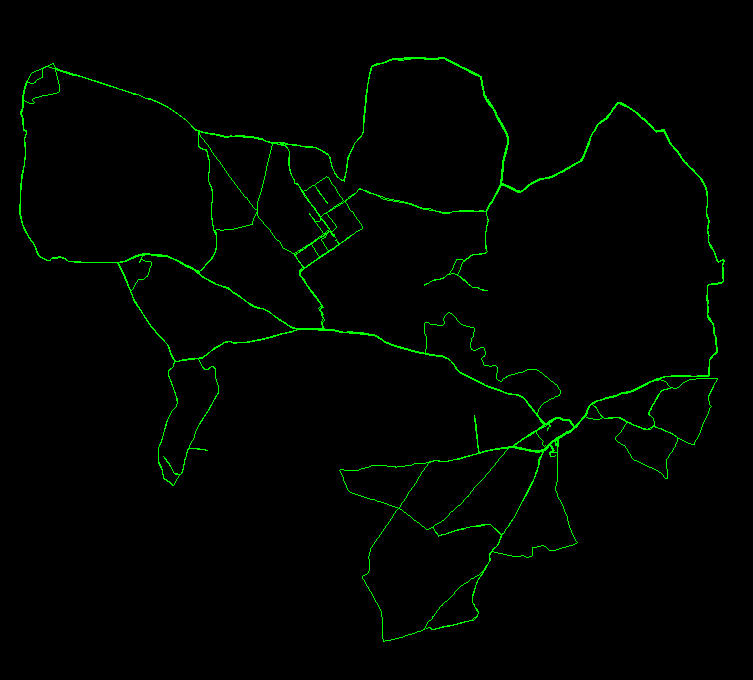
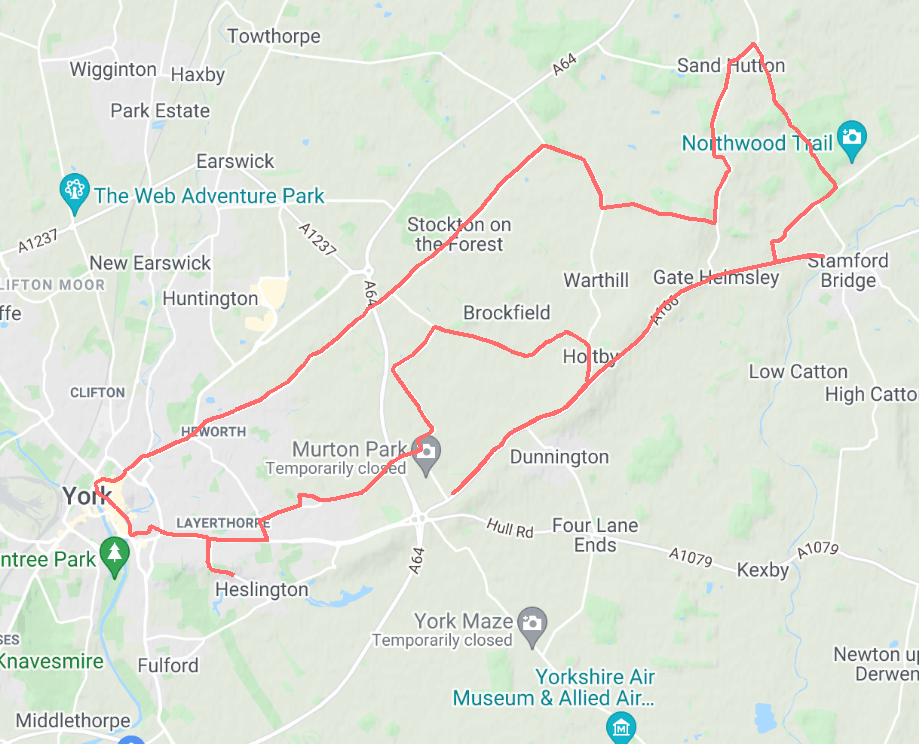
OK, so a bit further in 2021. Out of interest, the image to the left shows a plot of my main routes during my 2021 training.
Now let’s take a bit of a closer look at some of the data, starting with the number of runs by month from the two different years,
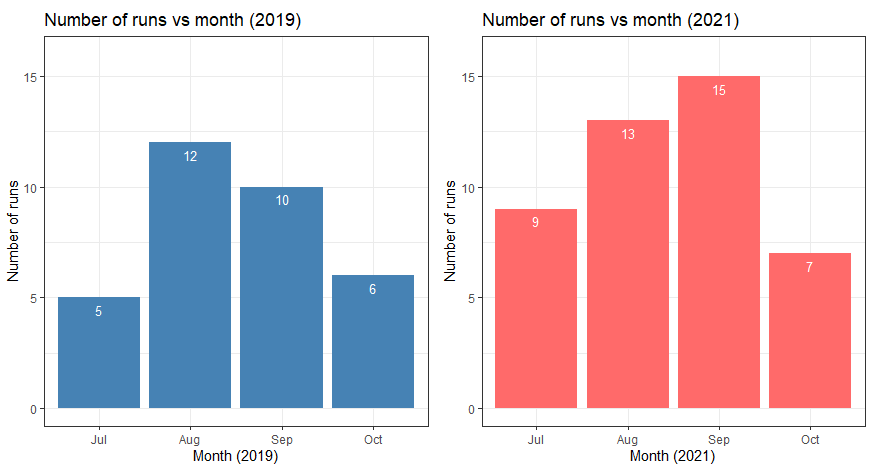
Note that the marathons were held in mid-October each year. Here we can see that in 2019, there was a big jump between July and August, and then I actually did fewer runs in September. In contrast, 2021 shows a gradual increase over the 3 months before October.
What about heart-rate? The following plot shows overlaid histograms of my heart-rate over the training periods, with the mean heart-rates shown,
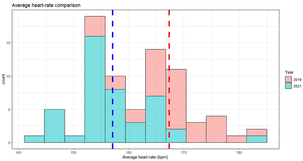
As planned, my average heart-rate in 2021 was less. I had over 30 runs per year (which is the approximate rule-of-thumb minimum for a t-test being valid, thanks to the central limit theorem), so I ran one on the above data (specifically a one-tail test, looking for 2019 being greater than 2021),
Welch Two Sample t-test
data:  marathon_all_training$average_heartrate[marathon_all_training$Year == "2019"] and marathon_all_training$average_heartrate[marathon_all_training$Year == "2021"]
t = 6.0937, df = 68.361, p-value = 2.868e-08
alternative hypothesis: true difference in means is greater than 0
95 percent confidence interval:
 7.420702      Inf
sample estimates:
mean of x mean of y
 167.2844  157.0682
A miniscule p-value!
Here is another way of breaking down the heart-rate data,
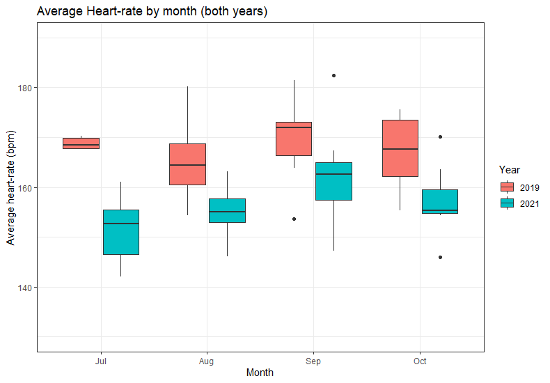
Interestingly, the median heart-rates (the thicker horizontal lines in a box-and-whisker plot) for 2019 have no real pattern across the training period, where-as for 2021 there is a steady increase and then a drop in October as I began to rest. This can also be seen in the average speed breakdown,
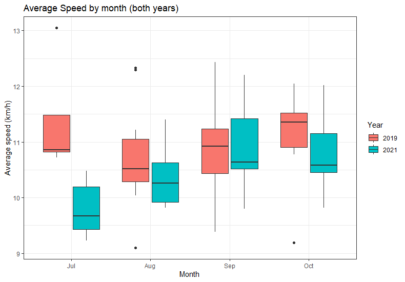
This suggests that my training was more controlled and that I was following a proper plan!
Above I showed that my total distance in 2021 was more than in 2019. I wondered what this translated into in terms of long runs (which I’m defining as anything over 16.1km (10 miles). In the below plot, the coloured bars are those long runs, with the grey bars being the runs that were less than this distance,
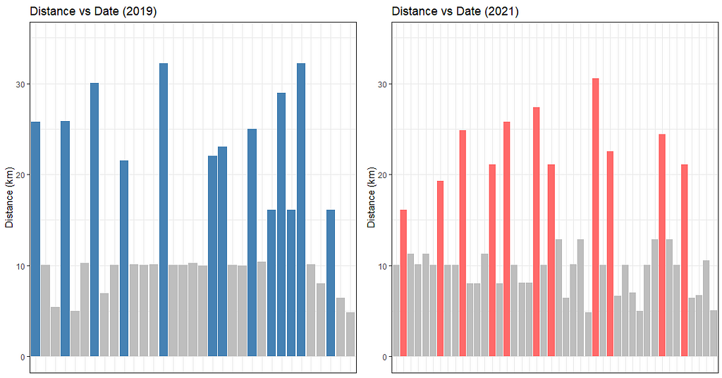
13 in 2019 and 11 in 2021, so actually more the first time around. However, you can see better tapering at the end (i.e. resting before the marathon) in 2021, with 4 shorter runs compared to just 2 in 2019.
The Big Day(s)
My finishing times for both marathons were,
- 2019 finish time: 4 hours, 35 mins
- 2021 finish time: 3 hours, 58 mins
I was really pleased that I’d managed a sub 4-hour time (I hadn’t expected it!). With hindsight, and looking at the data above, I believe a bit more distance, a controlled and steady increase in training distances over time, plus a slower pace (and consequently lower average heart-rate) during training all made the difference.
Here is a plot of my run around the Yorkshire marathon course,
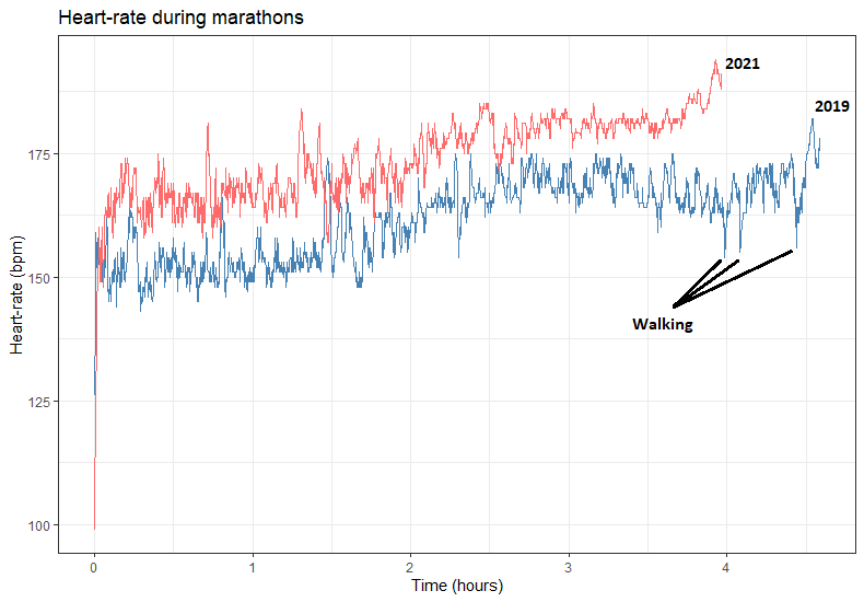
One more plot. This is my heart-rate on the day for each marathon. You can see the 3 points in 2019 where I slowed briefly to a walk. I was absolutely exhausted, despite my heart-rate (and pace) being lower than in 2021. In 2021 in stark contrast you can see a higher heart-rate through-out (as I was comfortably pushing myself more), with no drop-off towards the end,
If this post has inspired anyone to consider a marathon, I can highly recommend the Yorkshire one. It’s relatively flat, well organised, the crowd is great, and you get to run past the second-largest Gothic cathedral in Northern Europe (York Minster). See here for entry details and further information.
Appendix — Key packages and links
The last thing the Internet needs is more code showing you how to create a plot in R, so I’ve left the details out of this blog post. However, see below for some key links to instructions and packages. The main one I used in this analysis was rStrava. Please feel free to message me for any more details.
Marathon Training: A Data Perspective was originally published in Towards Data Science on Medium, where people are continuing the conversation by highlighting and responding to this story.
from Towards Data Science - Medium https://ift.tt/31kEnEl
via RiYo Analytics


No comments