https://ift.tt/3dilSCT Reflections from 6 years of developing human-in-the-loop (HITL) tools For most technical folks, coding things up is...
Reflections from 6 years of developing human-in-the-loop (HITL) tools
For most technical folks, coding things up is easy. If there is a tool you are not happy with, you can hack one up yourself without much of a hassle. If you want to extract data, you can quickly write up some regular expressions. If you want to combine some CSV files together, you can quickly create the Python script for that. If you need to debug a program, you know the tools and the ins and outs of debugging tools to be able to diagnose the fault of your programs.
These technical folks are often the same folks the develop a lot of the software that end-users use. End-users may not necessarily be technically trained to code. But they face the same challenges technical folks face, without the coding expertise. End-users use functions in their spreadsheets but perhaps struggle double-fold to debug them. End-users also need to clean and transform their data but may need to go through the uphill learning curve of learning Python.
In the past 6 years, I have been developing user-friendly tools for data analytics with the end-user at the center of it all. I want to distill the lessons I have learned from developing human-in-the-loop (HITL) tools, in hopes that folks will also use them when designing around the human component of their tools.
Lesson 1: The user’s time and effort to obtain the desired results must be minimized while maintaining the accuracy of the system’s results.
The user’s time and effort are precious. Our designs must reflect these values.
One example of doing this is by integrating well into the workflow of your target user. We noticed users like to highlight data when they want to point out data of interest. The idea of highlighting text to indicate some form of operation onto it is not new, as seen in Microsoft Excel. So, we created this tool called SEER. SEER automatically extracts data from examples of user-highlighted texts.
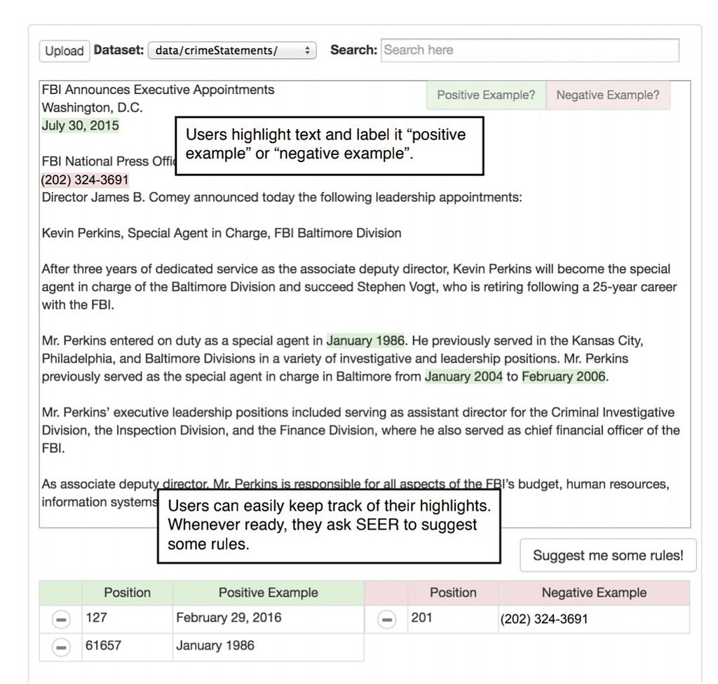
Here the user wants to extract dates from a dataset of news press releases. The user just highlights the text. And bam, SEER suggests extractions rules in a visual manner. These extraction rules basically do the job of extracting the rest of the data the users want to extract.
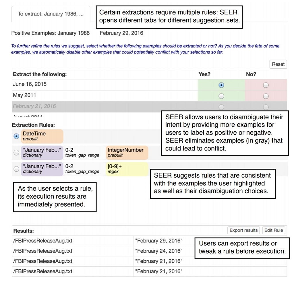
Now, the user may want to extract very specific dates. Or the user may want an extraction script that extracts all dates of varying formats. To accommodate for the varying intent the user may have, SEER displays extraction rules of varying levels of specificity. The user does not waste time programming and building the extraction scripts.
SEER also allows the user to quickly preview the extractions of each extract script in the document directly to quickly assess which script is appropriate. The user can easily update the suggested scripts by highlighting more example texts or even provide examples of texts to not extract. The user sees the scripts in relation to their relevance to the user’s end-goal.
With this design, the user’s time and effort are minimized while maintaining the accuracy of the results. With only a few a highlighted examples of text from the user, SEER quickly performs the target extraction task by automatically generating the extract scripts. Our user studies have proved that users are able to finish the respective tasks quickly and accurately.
Lesson 2: Interactive features and data visualizations are important but should be designed to not distract the end-user from the task at hand and to not overload the end-user with information not needed to complete the task.
While it is tempting to design fancy, nice-looking visualizations in your tools, it is important to assess the visualizations you choose. The visualizations must not only look pretty; they must help the user in his target task. If the user’s task is to debug errors from a large dataset, then the tool that would help the user would have visualizations and features made to help the user quickly identify which data points in the large dataset are contributing to the errors.
One such tool I made to help users debug errors is called WhyFlow. WhyFlow helps the user debug the inputs and outputs of data processing modules. We wanted a user who was not so familiar with the specific details of the code operations to diagnose and explain what might be the cause of those errors by first understanding the operations that occurred between the input and output datapoints.
In an initial version of WhyFlow, a tabular visualization shows the relationship between inputs and output datapoint. Each row is reserved for an output datapoint and towards the right of it shows the input datapoints contributing to it. Red-colored rows are as error outputs that should not be there and the green-colored rows are correct outputs.
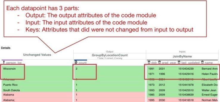
In this image, the outputs of a group-by-and-count operation are shown along with the inputs that contributed to each output. Any value that did not change from input to output, were considered key values and were places on the left-most side of the table.
We asked users to use this visualization to explain what was going on between the inputs and outputs. We also asked users what they think is the cause of the error (the red-colored) outputs to appear.
We learned that this visualization did not really help them explain the errors in the outputs. However, many users did say that it was easy to point out which columns did not change from input to output. The visualizations were not necessarily helping users find columns (the “person_loc” and “count” columns) that were relevant to the errors in the outputs. We saw that users had to scroll horizontally to view other columns they were inspecting. Especially in the case where there were 50+ columns as inputs, the horizontal scrolling became visibly annoying to the users.
So we revamped the visualization and instead ordered the columns according to how relevant a column is to the error outputs.
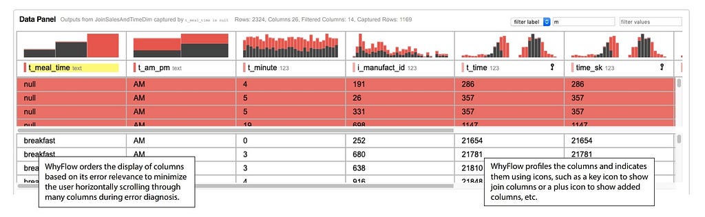
WhyFlow orders columns according to their relevance to the error. The colored histograms help the user understand which particular error values contributed to the outputs. Here, you see that the output datapoints pre-marked by the stakeholders as errors also happen to take on many null values in the t_meal_time column. The colored histograms also make it obvious that a particular value should be further inspected and be a cause of the errors.
When designing visualizations for HITL tools, we have to decide whether it is relevant to the task at hand while not distracting or overloading the user with unnecessary information. While information such as column manipulation is important in verifying the operation of a code module, it was not sufficient in helping users during the task of debugging and analyzing columns relevant to the errors.
Lesson 3: Simple and easy-to-understand models allow end-users to easily interpret the system’s logic while allowing the system to respond interactively.
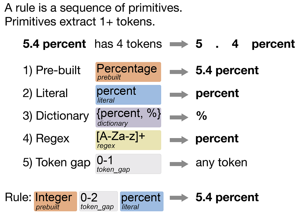
One thing I have used in a lot of my tools is rule-based models. They encode whatever they learned in the form of straightforward rules within some domain-specific language. For example, SEER learns a rule-based model for data extraction, Visual Annotation Query Language (VAQL).
A rule describes the characteristics of the text to capture and is made of primitives. Primitives capture certain tokens. For instance, a pre-built primitive capture entity types, such as percentages, universities, people’s names, company names, etc. A literal primitive captures an exact string. Dictionary primitives capture text that appears in its preset dictionary. See the above image for the rest of the primitives. Combining these primitives into a sequence describes the characteristics of the text that should be captured.
SEER displays these rules in a visual manner. Many users in SEER have said that the visual extraction rules were simple and easy to understand, contributing to the shorter durations in completing the respective tasks.
Lesson 4: Challenging problems can be broken up into smaller problems, allowing one to identify sub-tasks that can be automated by the system or completed by the end-user.

One of the most challenging problems I worked on was extracting texts from PDF documents. PDF documents are tough because they vary in format. Cooking instructions usually have lists of ingredients followed by paragraphs of instructions. Resumes are tougher in that they always have an educational background section but even then the contents might be a list or a set of simple paragraphs or perhaps even a combo. But even then, across resumes, the formats vary heavily, perhaps with some with one column and others with two columns. This makes automating the text extraction over PDFs challenging.
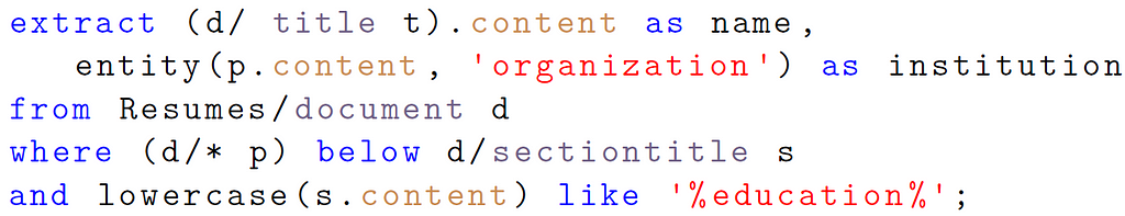
We worked on a tool called Texture, which is a framework for handling extraction over PDF documents. Texture breaks up the PDF extraction problem into two parts:
- Identifying the structures, which are areas of text/figures visually segmented by white space and context, such as lists, figures, paragraphs, titles, footers, and headers, etc.
- Given these structures identified from the previous section, a user can use them to describe where in the PDF the text of interest should be extracted from. Texture comes with a domain-specific language that allows the user to take advantage of the structures when extracting texts.
This two-step framework for data extraction over PDFs allows us to figure out which parts we can automate. We can automate the part where the user writes the extraction rules in Texture as we did in SEER, where we automatically generated the data extraction rules for the user. Read more about extracting texts from PDFs here.
Lesson 5: HITL tools should strike a balance between maintaining the autonomy of the end-user and utilizing automation whenever possible.
Finally, much of the tools I have built integrated the principles of mixed-initiative interfaces. In mixed-initiative interfaces, either the end-user or the system contributes to the task whenever possible. To support automation in these tools, we used techniques in program synthesis which is capable of automatically generating programs from user-specifications of how the program should behave.
SEER, Texture, and WhyFlow employ mixed-initiative interfaces that preserve the autonomy of the end-user: the end-user chooses when the system contributes to the task and when the end-user performs the task. For instance, in SEER, users can choose to update the synthesized rules by updating the examples or by directly editing the rules. SEER’s rule-based models serve as a shared space for the system and the end-user to collaborate without one wholly replacing the other as fully automated methods often seek to do.
Final Thoughts
These 5 lessons cover much of the reflections I had while developing HITL tools in the past 6 years. As we redesign a lot of our current processes to be fully-automated, with efforts in integrating artificial intelligence and machine learning, we also need to keep in mind the human component within the design.
The user needs to understand the system’s logic behind a decision. The user needs to trust the system. The user needs to know that it's not picking up the “biases” of the data that the system is learning from. Users are often not trained to think in the same technical manner an engineer has been. We need to design frameworks with the human in the center. I hope the lessons I have outlined serve as guidelines for that. Let me know what your thoughts are!
Lessons Learned from Integrating the Human for Data Analytics was originally published in Towards Data Science on Medium, where people are continuing the conversation by highlighting and responding to this story.
from Towards Data Science - Medium https://ift.tt/3DowMBD
via RiYo Analytics


ليست هناك تعليقات