https://ift.tt/3FJKNff A Visual Atlas of Popular Culture Atlas of YouTube [By Author] YouTube has always fascinated me with its incredi...
A Visual Atlas of Popular Culture

YouTube has always fascinated me with its incredibly vast library of content. Clicking through thumbnails, discovering monolithic channels, and finding lost relics feels a lot like exploring.
This exploration has inspired me to try to zoom out and visualize the content ecosystem as a whole. What would an atlas of YouTube look like? What insights would this type of visualization hold?
Seeing the broad scope of communities and connections at scale may also be a powerful tool for understanding online behavior. With the rise of dangerous internet bubbles alongside empowered new communities, there will be a need to understand how these groups form, grow, and change.
About a year ago, I created a map of the popular live-streaming website Twitch. This project showed me that visual representations of social media relationships can resonate with platforms, creators, and viewers alike. I wrote an article about my observations here.
Replicating the process for YouTube, a much larger platform, was no easy task. I needed a way to connect channels to each other with publicly accessible data. I found my answer by looking at who leaves comments under each video. By collecting these commenters and comparing them across many channels, I could build a graph of channel relationships. This could then be visualized into an atlas.
After a few months of learning AWS, lots of Python, and balancing a semester of schoolwork, I have arrived at my goal. A searchable, interactive version of the atlas is hosted at https://youtubeatlas.com. Go Explore! Sorry about any usability quirks. I’m not an experienced web developer and most of this implementation uses a library and framework I don't know well. A static image of the map is below for those having issues with the interactive version.
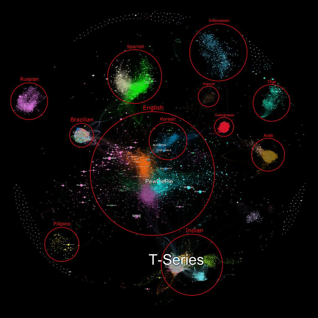
Interactive map available at https://youtubeatlas.com
How To Read The Atlas
- Each bubble is a YouTube channel.
- The size of each bubble is determined by the channel’s subscriber count (in August 2021)
- A line between two bubbles shows that those two channels share at least 350 commenters of the 20,000 collected.
- The color of the bubbles indicate communities of YouTube channels that all share commenters. This was determined by a modularity algorithm that detects graph clusters.
Who is on the Atlas?
The atlas shows the top 5700 YouTube channel’s ranked by subscriber count. SocialBlade was kind enough to provide this list and the project would not have been possible without their help!
The atlas does not include channels targeting children, as those channels do not allow comments (e.g. Cocomelon is the 4th largest channel on YouTube but falls into this category).
If you would like more specifics about my methodology and process all the code for this project is public here.
What Does The Atlas Tell Us?
While it can be a lot to take in at first, a few things might stand out immediately. Here are a few of the insights that can be found from visualizing such a vast content ecosystem.
The Rainbow Clusters
T-Series is the largest channel on YouTube at 200 million subscribers. The Bollywood music conglomerate passed PewDiePie in the race to 100 million in 2019 and has continued to grow at an increasing pace.
The channel is also a member of the brightly multicolored cluster that represents the Indian YouTube community. This cluster, alongside the Brazilian cluster (both pictured below), look quite different than the rest of the map — they are incredibly dense and feature many different colors.
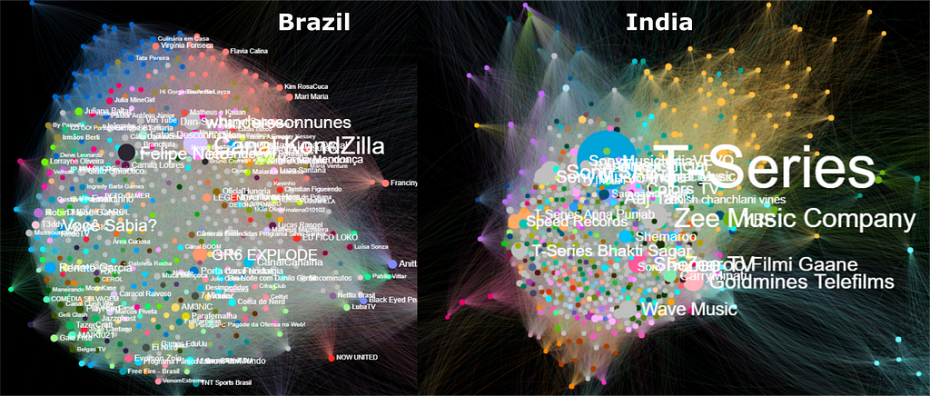
Why do the India and Brazil clusters look so different than other language regions?
Channels like T-Series and Canal KondZilla upload music videos many times a day, most to very low viewership. Because of the massive size of these countries’ populations and the sheer number of videos, most of the commenters only appear once in my data. This is why the computer assigns so many colors within these clusters and reveals that these channels are broadcasting to a huge, diverse audience, across large populations.
The second defining feature of these clusters is how dense they are compared to other regions of the map. This is because the commenters that do link these channels together, generally link all of them together. These rabid fans cause these music/movie channels to cluster very tightly.
Many YouTube users have no idea that these communities have such a huge presence on the platform. Even looking at lists of top YouTube channels and their pages doesn’t clearly show that these channels are behaving differently to most other regions. By visualizing communities and connections like this, this kind of unique audience behavior stands out.
The Fight for the Middle
The sprawling English speaking region of the atlas dominates much of the center of the image. Four communities clash at the center of this region, colored orange, light blue, green, and purple (pictured below). Taken together, these four regions encompass what most consider to be the modern English YouTube landscape. Taken apart, each of these regions has a distinct culture, and in my experience recommendation feeds often stick within these boundaries.
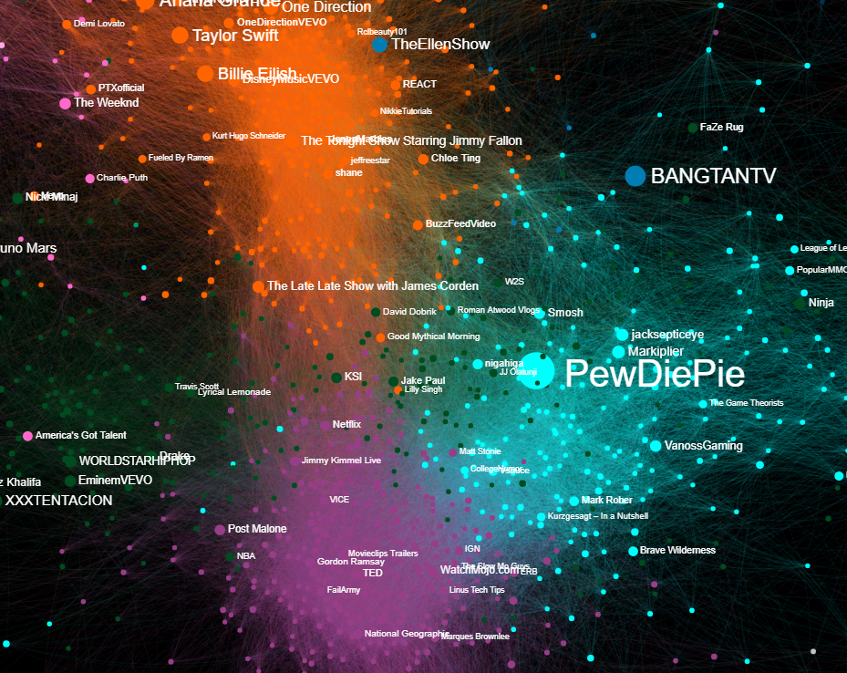
Orange contains Hollywood talk shows and many high budget, family friendly creators. Light blue centers around video games and gaming adjacent content, though has grown to encompass many other forms of internet focused entertainment. Magenta is the broadly educational side of YouTube, a segment that has exploded with the recent boom in “Edutainment” content. I spend most of my time in this section watching channels like 3Blue1Brown, CGPGrey, and Marques Brownlee. Dark Green gives us hip-hop stars and the large sphere of influencers that appeal to that fanbase.
These regions are already relatively distinct and as YouTube grows they are drifting further apart. My life in the purple region virtually never puts me in contact with an orange or green channel, though I do lean toward the light blue border. With this growing polarization in mind, the channels that link these colored communities together are increasingly important.
Take Mark Rober for instance. The former NASA scientist creates wild engineering contraptions for largely entertainment purposes (e.g viral glitter bomb series). The channel is colored light blue though, not purple like most of the other engineering or science focused channels. This is because Mark has a focus on entertainment and very strong ties to popular gaming creators like MrBeast.
Mark, along with a few other entertainment science channels, has captured two audiences through collaboration and thoughtful content creation. I think channels in this position will have a significant influence on how the English cluster as a whole develops and Mark is a good example of a bridge between communities.
Regional Bridges
Many of these links between regions of the atlas can yield an excellent look into how communities interact (or do not interact) with each other.
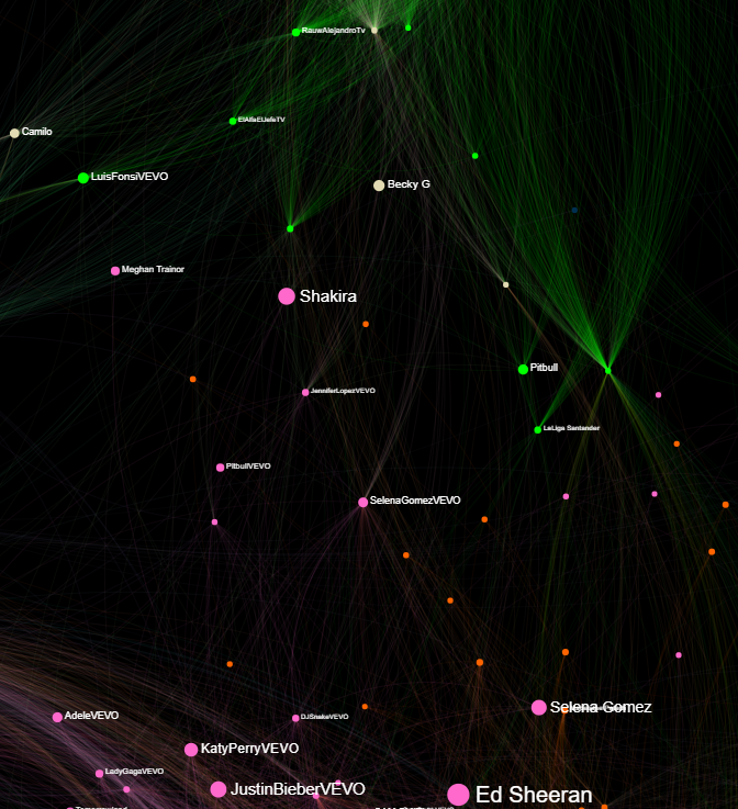
A look at the bridge between the English and Spanish speaking regions of the map shows channels like Shakira, Luis Fonsi, and Pitbull. As expected, these artists are popular with both Latin American and American audiences. In fact, there are easily identifiable channels linking American music with Spanish, Brazilian, Arab, and East Asian music culture. Despite the massive Indian music channels, there seems to be no music links between the Indian and English clusters. Perhaps a niche waiting to be filled.
Music is only one dimension of how these dual culture channels form. I encourage you to find different communities on the map and look for channels that link them together. I think these spaces represent some of the largest opportunities for growth both for YouTube as a platform and content creators.
Open Questions
Exploring the atlas inevitably leads to questions and curiosities. Here are some that I still don’t have answers to:
Why are the Indonesian and Filipino clusters on polar opposites sides of the map despite being geographically close to each other?
Why is the Russian cluster so remarkably isolated compared to other foreign language clusters?
Why are many pink English music artists pushed so far out from the English cluster? Why are their respective VEVO channels generally closer to the center?
Final Thoughts
I believe that being able to visualize internet culture in this way is incredibly valuable for creators, consumers, and platforms.
It can help creators understand their audience not only in terms of one dimensional metrics but also in terms of culture, community, and connections. This understanding can guide new approaches to content, and inspire new niches to form.
It can help consumers make informed choices about the content they consume and better understand the algorithms that captivate our attention. It can also provide an avenue to find new creators in entirely different places on the platform or hidden gems in communities they know well.
It can help YouTube fine tune the algorithmic knobs to augment north star metrics like watch time and engagement. Studying these communities and their connections may also yield insights into online toxicity, positivity, and moderation.
As a 20 year old college kid, I have lived a substantial part of my life in these online communities and I know how important they are to their residents. Understanding how they grow, change, and interact is fascinating and I hope to be a part of that going forward.
If you like the atlas and please share it around!
You can find me on Twitter or on Github.
Thanks for reading!
Insights From Visualizing Communities and Connections on YouTube was originally published in Towards Data Science on Medium, where people are continuing the conversation by highlighting and responding to this story.
from Towards Data Science - Medium https://ift.tt/3JyAZag
via RiYo Analytics


No comments