https://ift.tt/3m1wFpN A journey of a thousand datasets begins with one R script Photo by averie woodard on Unsplash R is a popular p...
A journey of a thousand datasets begins with one R script

R is a popular programming language with particular focus on statistical computing. One of its strongest points is the universe of side-packages that have been contributed by the community over the years. Albeit being an avid Python user myself, I cannot deny that R has an unrivalled arsenal of packages for bioinformatics (Bioconductor), statistical analysis, and publication-quality data visualization.
I often work with mass spectrometry (MS)-based proteomic datasets, frequently using generic Student’s t-test and ANOVA to assess differential abundance of proteins between groups of samples. Progress doesn’t stand still though, and scientists are developing methods that are tailored specifically to biological data. One very popular R package for differential expression analysis is the Linear Models for Microarray Data, or limma [1], which fits gene-wise linear models, but also borrows information between genes to yield more robust estimates of variance and more reliable statistical inference. Limma has been around for a while, and it is now widely used for gene expression data obtained by various methods, not only by microarrays.
Building on top of limma is another R/Bioconductor package called DEqMS [2]. It uses the MS-specific characteristics, such as the number of peptides or peptide-to-spectrum matches (PSMs) per protein in order to build a data-dependent prior estimate of variance. In my own words, DEqMS boosts the significance of quan results for proteins with multiple PSMs, which we do indeed want to see, because multiple quantitation events reinforce the reliability of the observed differential expression.
DEqMS vignettes contain clear explanations and instructive examples on how to use the package. However, I thought it could be useful to step back a little bit and compose an R script with all steps from the protein table to visualization and export of the results, so that a beginner R user could have a template to start with and to build upon.
Prerequisites
The complete script can be found in the Github repo, while the main points of the workflow will be presented below. I used RStudio IDE and R 3.6 on Ubuntu 20.04 to run the script. We start with installing the required packages, most of them you, likely, already have on your system:
Load the packages:
Preparing and Inspecting the Data
The example data was generated in-house from the analysis of the commercially available yeast triple-knockout (TKO) isobaric labeling standard. The LC-MS raw file was processed in Proteome Discoverer 2.4 (PD), the output files were saved as a tab-separated text file and uploaded to the same Github repo.
TKO standard consists of 11 samples: 2 replicates of a wild-type yeast strain and 3 replicates for each of the strains with knocked-out HIS4, MET6 or URA2 gene, respectively. Apart from the obvious absence of the corresponding protein, the knock-outs cause perturbations in the proteome, which we should also be able to detect.
We start by reading it and finding the columns with quantitative values.
## [1] 1904 51
We then filter out the contaminant proteins, add a separate column with gene names, as well as automatically detect and rename the columns with quantitative values, identifying them based on the “Abundance.Ratio” string in the name as follows:
## [1] "BY4741_2" "his4_1" "his4_2" "his4_3" "met6_1" "met6_2" "met6_3" "ura2_1" "ura2_2" "ura2_3"
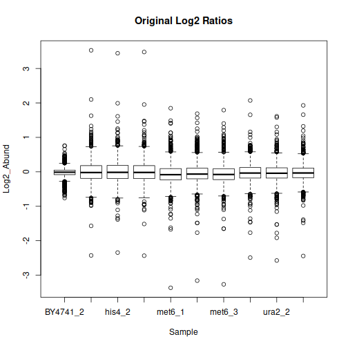
After filtering, formatting and log-transformation, we can look at the distributions of quantitative values in each sample:
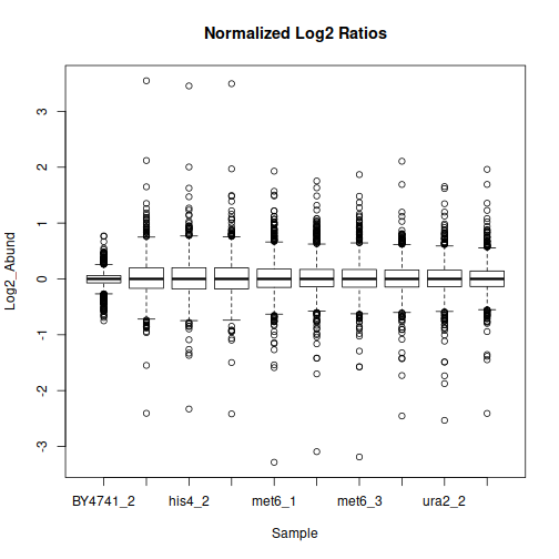
The data may benefit from normalization to compensate for sample-wide shifts due to slight variations in the sample collection and preparation. One way to achieve that is to bring the samples to equal median as follows:
Principal component analysis will show us the general grouping of the samples:
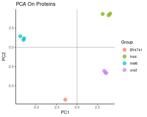
This plot is good news, since well separated groups corresponding to each knock-out strain are exactly what we expect from this dataset.
ANOVA and T-test
One-way ANOVA is a logical way to analyze differential abundances in our case in a dataset-wide fashion, since we have one variable (knock-out gene) and three groups: his4, met6 and ura2.
One of the commonly used thresholds for adjusted p-value is 0.05. From the practical standpoint, we could further prioritize proteins with larger fold changes (FCs) between conditions, as those should be easier to validate by other methods. For a yeast dataset like this one, let’s choose FC ≥ 30%, ( log-FC ≥ log2(1.3) ), and see how many proteins pass these filtering conditions:
## [1] 190 9
The classic way to compare levels in two groups at a time would be the Student’s t-test. Let’s compare the met6 knockouts and his4 knockouts as an example:
How many proteins pass the same filtering criteria (0.05/30%):
## [1] 116 11
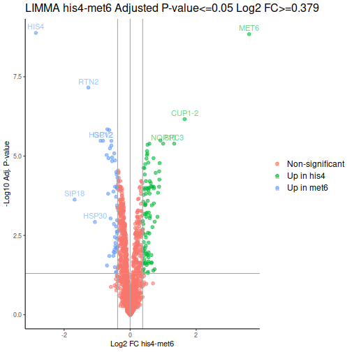
Volcano plot is a common way to represent the differential abundance data. The categorical column will help us to highlight the proteins that pass the set criteria:
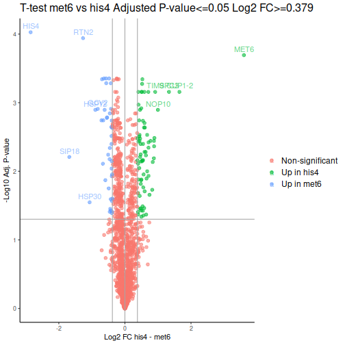
We can see one good thing straight away: our MET6 and HIS4 are the two of the 3 proteins with the lowest adjusted p-values, i.e. the proteins most likely to actually be differentially expressed.
Limma and DEqMS
DEqMS is based on limma, so we will be able to nail two birds with one stone and obtain the results from both algorithms at the same time. We start with selecting the columns for comparison (excluding the wild type as it does not have 3 replicates), defining the design (which column belongs to which group) and indicate which contrasts (comparisons) do we want to observe:
The function spectraCounteBayes is the part that is specific to DEqMS. We extract the information about the number of PSMs per protein that we had in our original data, and spectraCounteBayes uses it to calculate the data-dependent variance in the fit4. Let’s look at the resulting relationship between the number of PSMs and variance:
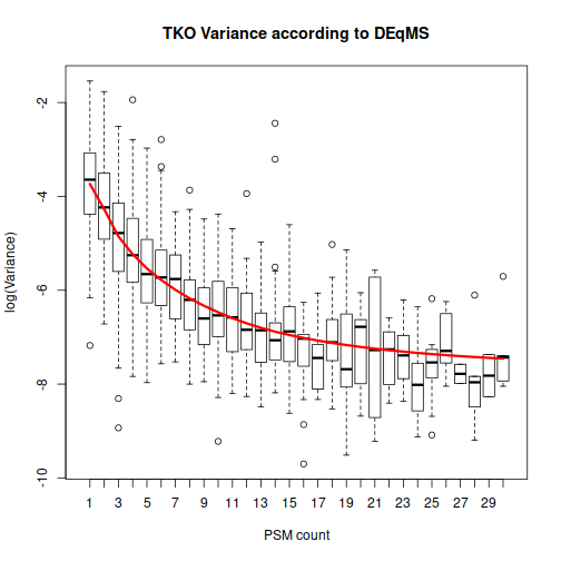
This plot helps to drive home the main message: DEqMS expects proteins with numerous PSMs to have less variability. Because of that, differential expression for such “reliable” proteins should get higher weight than the same difference in abundance for a protein with a single PSM.
Let’s take a look at the tabular result for the same contrast between met6 and his4 groups:
##             logFC     AveExpr         t
## P00815 -2.8532509 -0.54962113 -85.67738
## P05694  3.5999485 -0.85859918  77.41234
## P37291 -0.6922910  0.40048261 -28.07419
## P15992 -0.6353142  0.44930312 -27.22447
## P39954 -0.5661252  0.01364542 -22.95737
## Q12443 -1.2662064  0.60896317 -44.48587
##         P.Value    adj.P.Val        B   gene count      sca.t
## P00815 8.428621e-13 1.318236e-09 18.82971 P00815    20 -108.89141
## P05694 1.846004e-12 1.443575e-09 18.37417 P05694    30   96.37396
## P37291 4.585032e-09 1.434198e-06 11.77468 P37291    36  -42.07175
## P15992 5.803328e-09 1.512734e-06 11.53513 P15992    18  -36.62270
## P39954 2.138660e-08 3.344865e-06 10.18583 P39954    22  -31.96714
## Q12443 1.329146e-10 6.929282e-08 15.15264 Q12443     4  -30.06690
##         sca.P.Value sca.adj.pval
## P00815 8.998668e-18 1.407392e-14
## P05694 3.360470e-17 2.627888e-14
## P37291 2.531791e-13 1.319907e-10
## P15992 1.121588e-12 4.385408e-10
## P39954 4.810014e-12 1.504572e-09
## Q12443 9.260675e-12 2.413949e-09
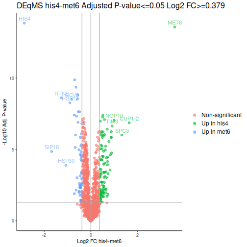
The P.Value and adj.P.Val here are from limma, while the Spectral Count-Adjusted sca.P.Value and sca.adj.pval are the ouptuts of the DEqMS algorithm. How many proteins pass the our filtering criteria for the contrast his4 vs met6 according to limma and DEqMS:
## [1] 148 13
## [1] 154 13
Both methods give noticeable gain in number of proteins that pass the threshold, as compared to the t-test. That’s usually good, more potentially interesting proteins to work with.
After a few additional operations, we can look at the volcano plots. MET6 and HIS4 proteins get sky-high negative Log-p-values by DEqMS, as these proteins have multiple PSMs due to their high abundance in samples other than the respective knock-outs:
Gene Set Enrichment Analysis
Biological interpretation of results will be highly dependent on the experimental system and on the purpose of the study, there is an element of art in it! One widely applicable way to start the functional interpretation would be the Gene Set Enrichment Analysis, or GSEA [3], with R implementation through the package fgsea.
Fgsea requires a ranked gene list to perform the enrichment analysis. To incorporate the statistical results and the fold changes between strains, we will calculate a product of the adjusted p-value from DEqMS and log-FC, and use it for ranking. We could continue with the same his4-met6 contrast and look at 10 genes with the lowest negative ranking values:
##       HIS4       RTN2      SIP18      HSP12       GCV2
## -39.522063 -10.911242  -8.174439  -7.404254  -6.980468
##       SHM2      HSP26       SAM1       SAH1       GPH1
##  -6.839459  -5.945264  -5.255033  -4.994689  -4.869912
Another required input for fgsea is a file which annotates the gene sets (pathways, functional groups) with the corresponding genes. We can download the widely used and comprehensive Gene Ontology annotations [4] for yeast from Uniprot; Gene Ontology Consortium data is available under a Creative Commons license. I have converted the downloaded file into the .gmt format, which is typical for GSEA, using gene symbols as main identifiers, as they are more informative for biologists than Uniprot accessions.
Using the annotation file and our gene ranking, we run the enrichment using default settings:
The pathways in the result file get an Enrichment Score (ES) and Normalized Enrichment Score (NES), those point to the pathways with the most significant over-representation among the differentially abundant genes. Let’s look at 10 pathways with the most significant enrichment in the negative ES zone:
Enrichment p-values and adjusted p-values are not stellar, that can depend on the size of the dataset, type of the annotations and the settings that we have applied. We could further look at one of these pathways with the most significant negative ES:
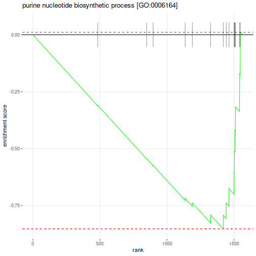
Which genes belong to this pathway:
"ADE1"   "ADE12"  "ADE13"  "ADE16"  "ADE17"  "ADE2"   "ADE3"   "ADE4"   "ADE5,7" "ADE6"   "ADE8"   "MIS1"   "MTD1"
"PRS1"   "PRS2"   "PRS3"   "PRS4"   "PRS5"
GSEA can be a convenient starting point for biological interpretation. As for the end point of it, only the sky is the limit!
Conclusion
I have shown the main highlights of an R script for basic analysis and visualization of isobaric labeling proteomic data, using DEqMS algorithm for differential abundance analysis. The complete script and example data can be found in the Github repository.
References
[1] M.E. Ritchie, B. Phipson, D. Wu, Y. Hu, C.W. Law, W. Shi and G.K. Smyth, limma powers differential expression analyses for RNA-sequencing and microarray studies (2015), Nucleic Acids Research, 43(7), e47 — open access.
[2] Y. Zhu, L.M. Orre, Y.Z. Tran, G. Mermelekas, H.J. Johansson, A. Malyutina, S. Anders and J. Lehtiö, DEqMS: A Method for Accurate Variance Estimation in Differential Protein Expression Analysis (2020), Mol Cell Proteomics,19(6):1047–1057 — open access.
[3] A. Subramanian et al. Gene set enrichment analysis: A knowledge-based approach for interpreting genome-wide expression profiles (2005), PNAS, 102 (43), 15545–15550.
[4] M. Ashburner et al. Gene ontology: tool for the unification of biology(2000), Nat Genet, 25(1), 25–9.
Embrace R to Boost Your Proteomic Analysis was originally published in Towards Data Science on Medium, where people are continuing the conversation by highlighting and responding to this story.
from Towards Data Science - Medium https://ift.tt/3yu9b1x
via RiYo Analytics


ليست هناك تعليقات