https://ift.tt/3Fc1Nu5 “Cat-in-a-Box ” Image by Author A Prototype — Stack Multiple Time Slices in a Single Image and Classify: Normal, ...

A Prototype — Stack Multiple Time Slices in a Single Image and Classify: Normal, Warning or Failure
This is a prototype exploring application of a CNN to predict likelihood of a system failure in a process. The objective is not to classify the failure, but to classify a set of current and past time slices as an indication of a future failure.
Before I begin, note that this is presented as a concept / prototype to test if a CNN model could work reasonably in predicting impending faults in an industrial system. I did apply this to a paper machine failure dataset which I will discuss in a following article. This is not the “be all, end all” or state of the art AI application. I present it here to inspire others, give people new to data science another ‘project’ to tinker with, and maybe spur on some ideas from seasoned practitioners.
I first began thinking of this when discussing a paper (Shaojie Bai, J.Zico Kolter, and Vladlen Koltun, “An Empirical Evaluation of Generic Convolution and Recurrent Networks for Sequence Modelling”, arXiv:1803.01271, 2018) in a meetup (Deep Learning Fellowship) that uses a temporal CNN (TCN) model. That paper evaluated a generic TCN to look to the past and predict future or next state.
My application is simpler. The goal is to arrange data from several time time-slices into an image, a snapshot of past and current state, and assuming that deviations in a process several time periods before a failure will be different from normal operation and thereby give a warning — a yellow light. The purpose isn’t to classify a failure vs. normal condition, but to classify ‘impending failure’. The warning could come in several types. (Referring to the ‘Cat in a Box’ below, a warning could be ears, paws, or a tail poking up before the cat jumps out if the box.)
To do this, each time slice was translated to a line of pixels in a image and multiple times are represented by different rows of pixels. The first image will have time periods 0 to n, and the next image would have time periods 1 to n+1 and so on. If no significant deviation occurs, then each image would be similar with some variation (noise). If the process is successively deviating to a fail-point, the images might change, hence providing a warning of an impending failure. Think of a ‘jack in a box’ or ‘cat in a box’. Can we see the cat’s ears poking out of the box before it leaps out?
Why do this? Industrial systems run on process controls. These keep the system running within parameters. Yet, systems shut down. Excluding other factors such as manual shut down, or equipment failure, upsets still happen. Identifying an impending failure could give the operations staff lead time to prevent an upset. Additionally, analyzing a process in this way may provide insights into why or what combination of events led to an upset.
Synthetic Data Preparation
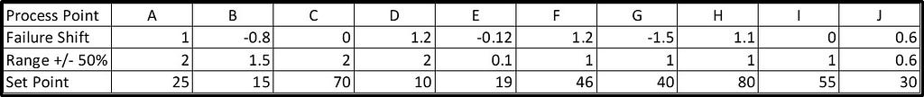
I started with Excel and made 10 process variables. Each variable had a normal set point and a random variance around that. Most variables would deviate prior to and at a failure point. These were scaled depending how far in the future the failure would happen. Remember I was creating this and would simply set a failure flag to 1 at some random time, and back up from there with a value less than 1. Normal operation was 0.
Here are the parameters I used to create the tracks. Each point varies randomly from -0.5 to +0.5 times the Range value plus the Failure Shift multiplied by the Failure Scale leading up to a failure (below). Some tracks do not change with a failure and others change in different percentages. The combined value of the Range Shift and the Failure Shift is not always outside of the normal range prior to a failure since these values can have opposite signs. If they are both positive or both negative it is likely that the process value will be at the edge or outside the normal range.
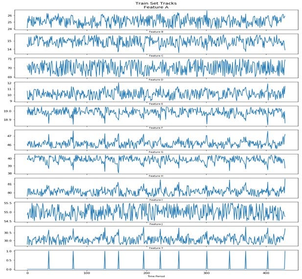
The random generated synthetic data for 400+ discrete times is shown below. It may appear to be high frequency with large swings, but that is the small range on each track chart. The system failure points are the spikes in the bottom track (Feature Y).
The training set track values and the failure points (Feature Y) are shown below. The test set is another random realization of the Excel model with failures at different times. It is different but within the same parameter definition.
Preparing the Data and Images
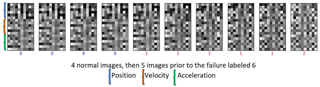
In previous trials I had just used the position data, then added a derivative (rate of change of the values, eg. velocity), and finally incorporated a second derivative so there is equivalent to position, velocity, and acceleration of the track values. Velocity and acceleration tables were created by taking the difference by unit time. I labelled the normal condition as a 0, 5 time slices prior to the failure as a 1 and the failure as a 2.
Image preparation included scaling the data to a 0 to 1 range and assigning the first 6 periods (0–5) of data to one image by moving them into a 3-D Numpy array. The position, velocity and acceleration time slice values were stacked together in each image. Image rows were: 0 to 5 — position, 6 to 11 — velocity, and 12 to 17 — acceleration, for an 18x10 pixel image. Time periods 1–6 filled the second image and so on. Each image is categorized by the label corresponding to the last time slice in that image. Once the failure time slice became the last row in an image, the process repeated by building the next image starting with the next 6 time periods following the failure time slice.
Next, they are reshaped and passed to a CNN model for training. It doesn’t look like a cat, or cat ears to us, but the CNN model can discriminate between these images. Below is an excerpt of these image sequences.
Training
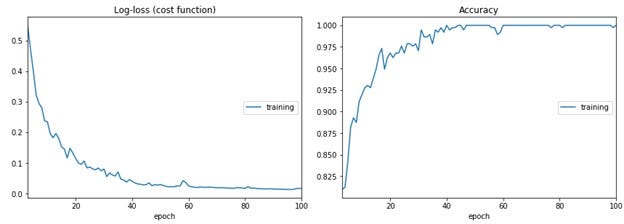
Training is similar to the MNIST handwritten numbers or Fashion MNIST. I used a Sequential CNN model with Conv2D, MaxPooling, and Flatten layers feeding a three-layer 128–64–3 network with one Dropout layer. Details can be found on Github here.
Results
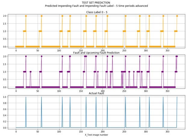
The test results are shown visually below. The actual class labels are shown at the top and the prediction classes are in the middle for easy comparison to the other two.
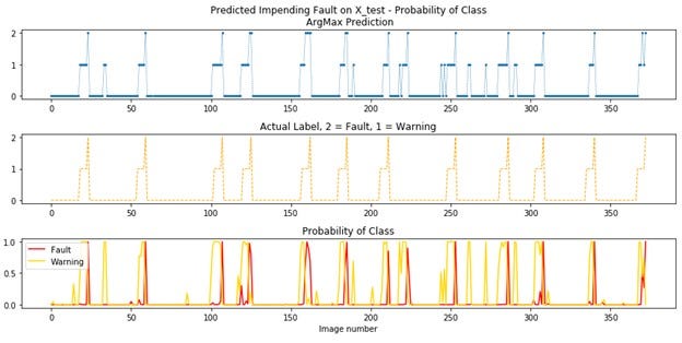
This next chart shows the prediction on the top, the class labels in the middle and the probability of warning or fault classes at the bottom for comparison of the probability to the class labels.
This showed enough promise to move to applying the method to an actual data set for a paper machine, which will be the subject of another post. One change to explore is training on only the normal and warning classes as identifying a failure or stoppage is too late and not needed. Preventing a stoppage is the goal.
Use or application of methods included here are at the sole risk of the reader. The author takes no responsibility for application by the reader.
I welcome your comments.
#DataScience #CNN #MachineLearning #Prediction #Prototype #ProcessFailures
CNN’s to Predict Process Failures was originally published in Towards Data Science on Medium, where people are continuing the conversation by highlighting and responding to this story.
from Towards Data Science - Medium https://ift.tt/3sjxhuJ
via RiYo Analytics


ليست هناك تعليقات