https://ift.tt/3lpXrId A Step-by-Step Guide to Learn the Core Concepts and Create Your First Web App Using Streamlit Image Source: Pixab...
A Step-by-Step Guide to Learn the Core Concepts and Create Your First Web App Using Streamlit

Table of Contents
· Part 1: Streamlit Basics
∘ Introduction
∘ What is Streamlit
∘ Why You Should Add Streamlit To Your Data Scientist’s Toolkit
∘ How to Install Streamlit on Windows
· Part 2: Create Your First Streamlit Web App
∘ Prerequisite
∘ Launch Visual Studio Editor and Streamlit
∘ Data Preparation
∘ Build the Streamlit App
∘ Add the Choropleth Map to the App
Part 1: Streamlit Basics
Introduction
I have long wanted to write a Streamlit tutorial ever since I started to use this fantastic python-based framework to build interactive dashboards and machine learning web apps. In my opinion, Streamlit should be a must-have tool in any data scientist’s toolkit for its simplicity, flexibility, robustness and free of cost.
In this tutorial, I’ll give you a brief introduction about what Streamlit is, why I love it and recommend it to anyone who works in the analytics and data science field, and how to install it on your computer.
After you are all set with the installation, I’ll walk you through, step-by-step, a detailed hands-on example of using Streamlit to create your first interactive dashboard by visualizing the U.S. housing prices across the states. You will go through the complete end-to-end process of creating this web app by coding in python and Streamlit using two open datasets that are available to download for free.
By the end of this tutorial, you should have a solid understanding of the core concepts of Streamlit and its wonderful capabilities. You can save this example as a starter template that you can re-use and expand in your future projects.
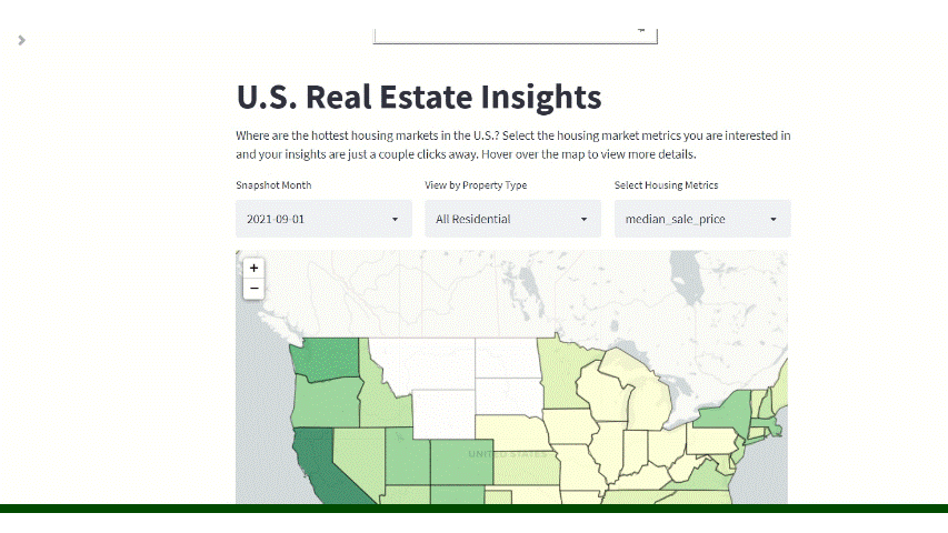
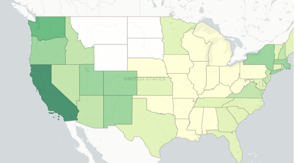
The dashboard/web app we are building will look something like this. Are you ready? Let’s begin!
What is Streamlit
Streamlit is a free, open-source, all-python framework that enables data scientists to quickly build interactive dashboards and machine learning web apps with no front-end web development experience required. If you know python, then you are all equipped to use Streamlit to create and share your web apps, within hours, not weeks.
You can check out Streamlit website’s gallery page for some awesome apps built by its users: https://streamlit.io/gallery if you are interested in learning more.
Why You Should Add Streamlit To Your Data Scientist’s Toolkit
I am a long-time Tableau user and have been using Tableau as my primary tool to create interactive dashboards and data visualizations for all kinds of analytical tasks at work. While I like Tableau for its comprehensive analytics and visualization capabilities, I have been searching for a flexible, free-cost and scalable alternative for my own analytical projects.
When I came across Streamlit, I immediately fell in love with it! It is all python so if you already know python (like many data scientists do) it will be super easy to leverage Streamlit to get your dashboards or data apps up and running with just a few lines of code, without needing to have any front-end web application development knowledge.
And the best part? It’s free! It’s free! It’s free! Important things said three times!😂 So if you are a freelance data scientist or thinking about starting your own analytics consulting business, I strongly recommend that you explore Streamlit and add it to your toolkit for its simplicity, flexibility, scalability and free of cost.
For Tableau users, I would also recommend that you take some time to explore and learn Python and Streamlit. Remember, open source is the trend (like Python replaces SAS’s domination in analytics industry within just a few years) so think forward and prepare yourself ahead of the curve!
How to Install Streamlit on Windows
To install Streamlit on Windows, let’s first install Anaconda (if you haven’t done so) because according to the Streamlit documentation, Streamlit’s officially supported environment manager on Windows is Anaconda Navigator.
Step 1: Install Anaconda (skip this step if you already have Anaconda installed)
Go to Anaconda download page and download Anaconda Individual Edition on Windows. More detailed instructions about how to install and launch Anaconda can be found here.
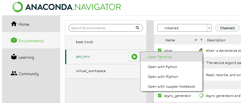
Step 2: Set up your environment using the Anaconda navigator
Follow these detailed instructions provided by Anaconda to create and manage your environment using the Anaconda navigator.
Step 3: Open Terminal in your new environment (I named my environment ‘geo_env’)
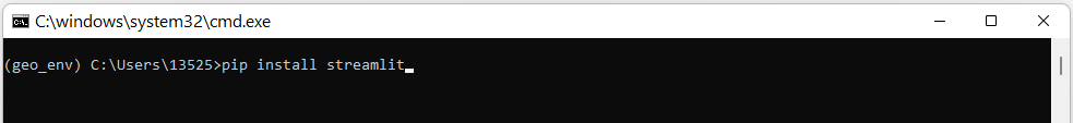
Step 4: Install Streamlit
In the terminal that opens, type the following command:
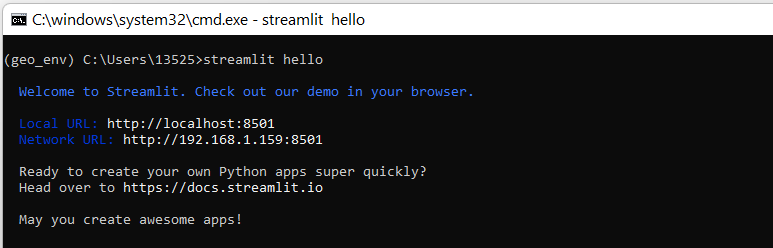
Step 5: Test whether the Streamlit install is successful
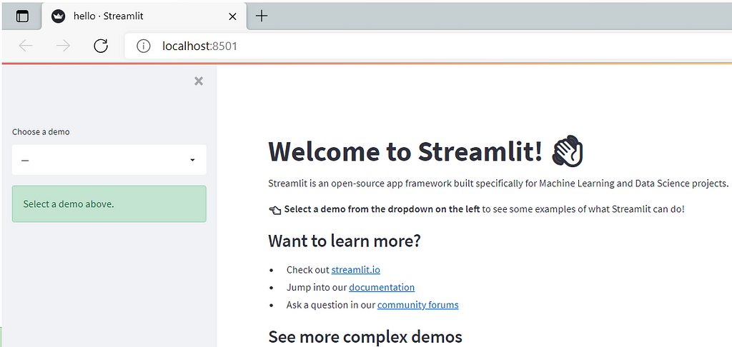
Type ‘Streamlit hello’ in the command line. If the install is successful, you will see the welcome message shown in your terminal and Streamlit’s Hello app appear in your web browser.
Part 2: Create Your First Streamlit Web App
Prerequisite
Before we jump into coding and creating our app, we need to do a bit of preparation first, including downloading the datasets needed for this tutorial and a text editor for coding.
There are two datasets needed for this tutorial and you can follow the links below to download them. They are both open datasets and are free to use for our project demonstration purpose:
(1): Dataset 1 (Redfin U.S. Housing Market Data):
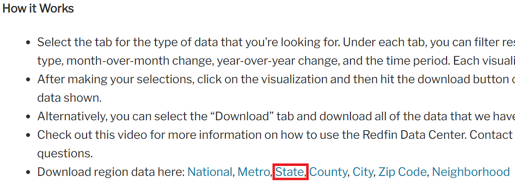
Go to redfin’s data center, scroll down to the ‘How it Works’ section, and download the region data at ‘state’ level. In this tutorial, we are only going to look at housing prices by state for the purpose of simplicity, but you can certainly expand the visualizations to additional region levels such as metro, county, zip code, etc.
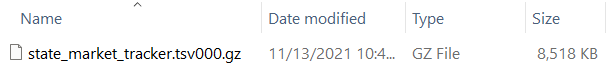
The file is a .gz file and looks like this:
(2): Dataset 2 (U.S. State Boundaries Geojson File):
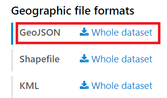
Go to public.opendatasoft.com, scroll down to the ‘Geographic File Formats’ section, and download the geojson file for the U.S. state boundaries. This geojson file defines the geographical boundaries/coordinates of each state which we need to plot our choropleth map.
If you are not familiar with choropleth map or don’t know what a geojson file is and why we need it, please read my previous article How to use python/folium to create a choropleth map for more information.
(3): Text Editor for Coding:
You can use whatever your favorite text editor for this project (just don’t use notepad; it’s not a text editor specifically designed for coding and developers). If you don’t have one, you can go to https://code.visualstudio.com/ and download/install the Microsoft Visual Studio Editor.
Launch Visual Studio Editor and Streamlit
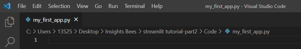
Let’s launch the VS code editor, open a new empty file, name it ‘my_first_app’ and save it as a python file (my_first_app.py) in your project folder.
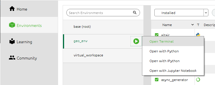
Let’s also launch Streamlit by opening your Anaconda Navigator, click ‘Environments’, then choose the environment you created in the Part 1 section, and click ‘Open Terminal’.
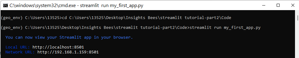
In the terminal, first you need to change your directory to the one where your ‘my_first_app.py’ file was saved. Then type the following command to launch Streamlit. You will see a new web browser open with empty content for now.
streamlit run my_first_app.py
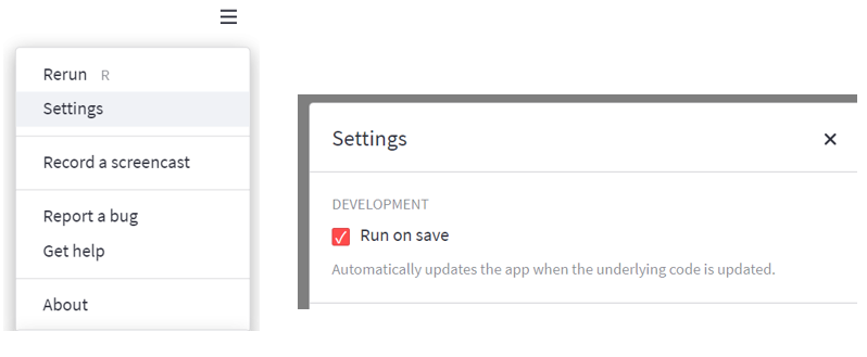
In the web browser, click the menu icon on the upper right corner and click ‘Settings’. Under ‘Settings’, let’s check ‘Run on save’ so that every time we make a code change in the VS code editor and save it , the change will automatically be reflected in the Streamlit web app.
Data Preparation
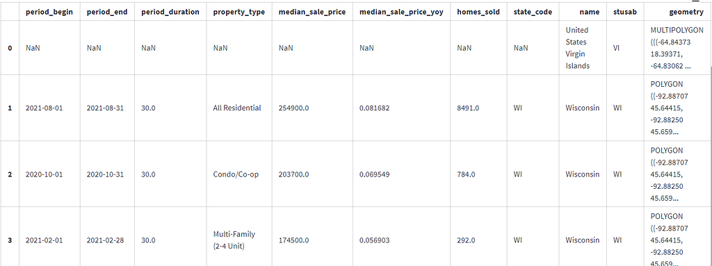
Let’s type the following code in the VS code editor to import all the packages that are needed for this tutorial and prepare our cleaned dataset by only selecting a handful of fields that are of interest. After that, we’ll merge the cleaned housing market dataset with the geojson file.
In the code above, a few import things to notice/remember:
First, streamlit reads and executes your script from top to bottom. Every time if anything is changed in the code or a user interacts with the app (e.g. applying filters), Streamlit reruns your entire Python script from top to bottom.
Second, Streamlit provides a caching mechanism that allows your app to stay performant when loading, reading or manipulating large amount of data that may cause expensive computations. This is done with the @st.cache decorator.
In our example, for example, without caching, every time a user interacts with the app and the app is refreshed, the data is reloaded and re-computed which could make the app run slow and lead to poor user experience. With caching, data is only loaded into the app once. Next time the cached function is called, if nothing is changed from the function input, Streamlit will just skip executing the function altogether and, instead, return the output previously stored in the cache.
Third, you can use st.write() to write arguments to the app. The arguments you want to pass to the app could be many things, such as a data frame, a chart, a string, a function, etc. In the code above we write the df_final data frame to the app in order to see what the final data looks like.
When you save your code and upon saving, a table which represents df_final will appear in your app. After you look at the data and have a good understanding of all the fields (you can refer to Redfin’s data dictionary in this page), you can comment out st.write() command because we don’t plan to display this table in our app.
Build the Streamlit App
Now that we have our data ready, let’s start creating our app using Streamlit. Very exciting!
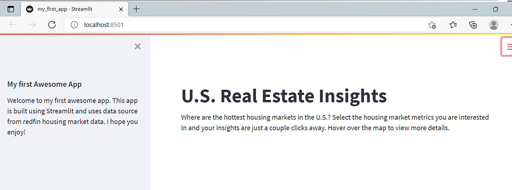
First, let’s add a sidebar in our app to display some introductory information about this app or maybe a disclaimer. We’ll also add a title and a subtitle in the main interface of the app.
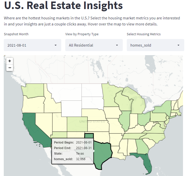
Upon saving the code, you will see that your web app is also re-run/updated automatically and looks like the following:
Second, let’s add a few filters that give users the flexibility to slice and dice the data and generate insights from different angles. We want to place these three filters side by side in the same row, therefore, we create three columns using the following code.
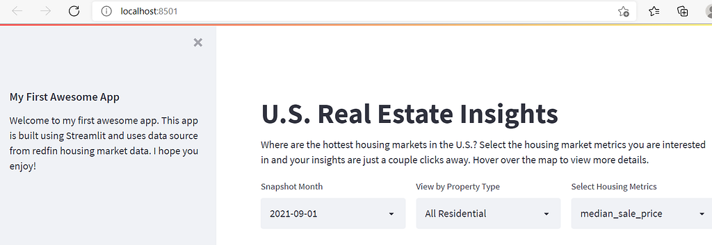
This looks pretty nice so far… but wait! When users select different options in these filters, how does Streamlit take these inputs and filter the data accordingly? For example, if a user wants to look at the median sales price of each state based on the most recent month (2021–09–01) and by single family houses only, how do we pass these filters back to our data frame?
Well, we can update df_final based on user’s selections, using the following code. You can then write the data frame to the app and try changing the filters and check if they work properly (Make sure you comment out st.write after you are done checking).
Add the Choropleth Map to the App
Now that our data is ready, let’s plot the choropleth map in our app. Please refer to my previous article How to use python/folium to create a choropleth map to understand the code and steps in greater detail about creating a choropleth map using python/folium.
Let’s use the following code to create the folium map which visualizes the U.S. housing market data by different period, property type and evaluation metrics, depending on user’s input.
In the code, line 2 and 3 initiate an empty U.S. map and set the default center location of the map to be (40, -100). Line 6 to 18 create the choropleth map based on user’s input on the three filters. Pay attention to line 10 which determines the shading of each state by the ‘metrics’ parameter passed from the third filter.
This looks good! However, it will be nice if we can also show some information about each state when users hover over the map. So let’s add tooltips to the map by inserting the following code before folium_static(m) which is the last line of the code above.
Now you have created your first interactive dashboard/web app using Streamlit. Play with it and think about how you can expand the features or add more bells and whistles to it. Congratulations for completing the project and I hope you enjoyed this tutorial. Happy Learning!
Streamlit Hands-On: From Zero to Your First Awesome Web App was originally published in Towards Data Science on Medium, where people are continuing the conversation by highlighting and responding to this story.
from Towards Data Science - Medium https://ift.tt/3E9LYUx
via RiYo Analytics


ليست هناك تعليقات