https://ift.tt/3kgLcgy In my last article , it was shown how to bin geographical coordinates into square tiles that could be effectively vi...
In my last article, it was shown how to bin geographical coordinates into square tiles that could be effectively visualized on a map. The natural next step would now be to fill this grid with colors to show the spatial change of any metric associated with the coordinates, i.e. a geographic heatmap. Here we will show how this could be done with Google BigQuery and Google Data Studio.

The dataset: New York taxi trips
First of all, we need geo-referenced data and luckily BigQuery comes to our aid with several of its public datasets. Here we will use a dataset containing New York taxi trips that have the exact location of pick-ups and drop-offs. The idea is to show on the map the number of drop-offs in each tile covering New York in a given time range and from a given pick-up zone. We can find the boundaries of such zones in a dedicated table inside this same dataset.
From longitudes and latitudes to tile coordinates
The first step is to map each pick-up and drop-off event to the corresponding tile of the desired size. We follow closely the procedure described here:
DECLARE
  START_DATE DATE;
DECLARE
  END_DATE DATE;
DECLARE
  ZOOM INT64;
SET
  START_DATE='2015-01-01';
SET
  END_DATE='2015-01-01';
SET
  ZOOM=17;
SELECT
  ZOOM || TRUNC((pickup_longitude*ACOS(-1)/180+ACOS(-1))/(2*ACOS(-1))*POW(2,ZOOM))|| -- pick-up x coordinate
  TRUNC((POW(2,ZOOM)/(2*ACOS(-1))*(ACOS(-1)-SAFE.LN(TAN(ACOS(-1)/4+(pickup_latitude/180*ACOS(-1))/2)))))-- pick-up y coordinate
  AS pickup_tile_id,
  ZOOM || TRUNC((dropoff_longitude*ACOS(-1)/180+ACOS(-1))/(2*ACOS(-1))*POW(2,ZOOM)) || -- drop-off x coordinate
  TRUNC((POW(2,ZOOM)/(2*ACOS(-1))*(ACOS(-1)-SAFE.LN(TAN(ACOS(-1)/4+(dropoff_latitude/180*ACOS(-1))/2))))) -- drop-off y coordinate
  AS dropoff_tile_id,
FROM
  `bigquery-public-data.new_york_taxi_trips.tlc_yellow_trips_2015`
WHERE
  DATETIME_TRUNC(pickup_datetime,
    DAY) BETWEEN START_DATE
  AND END_DATE
We introduce some parameters as START_DATE , END_DATE, and ZOOM to give the flexibility to change dynamically the time range and the size of the tiles. With the default values used here, we get the output in just 5.3 seconds, but the “heavy” lifting has still to be done, so avoid using a much larger time range if you want to get the output in a few seconds without saving partial results somewhere 😃.
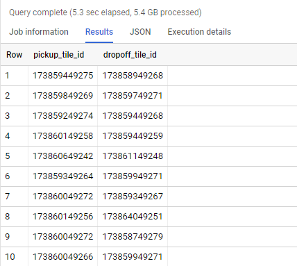
The code above thus gives us the unique IDs of the tiles containing the pick-up and drop-off points for each trip.
Cover the New York taxi zones with tiles
Next, we need to know to which zone belongs each tile just found, thus we proceed as follows:
- Use the table bigquery-public-data.new_york_taxi_trips.taxi_zone_geom to access the boundaries and the name of each taxi zone.
- Find the bounding box enclosing each zone, defined by two couples of coordinates, that is (xmin,ymin) (the bottom-left corner) and (xmax,ymax) (the upper-right corner).
- Determine the tiles containing (xmin,ymin) and (xmax,ymax) of tile coordinates (tile_x_xmin_ymin,tile_y_xmin_y_min) and (tile_x_xmax_ymax,tile_y_xmax_y_max).
- Generate the remaining tiles ranging from the bottom-left to the upper-right corner.
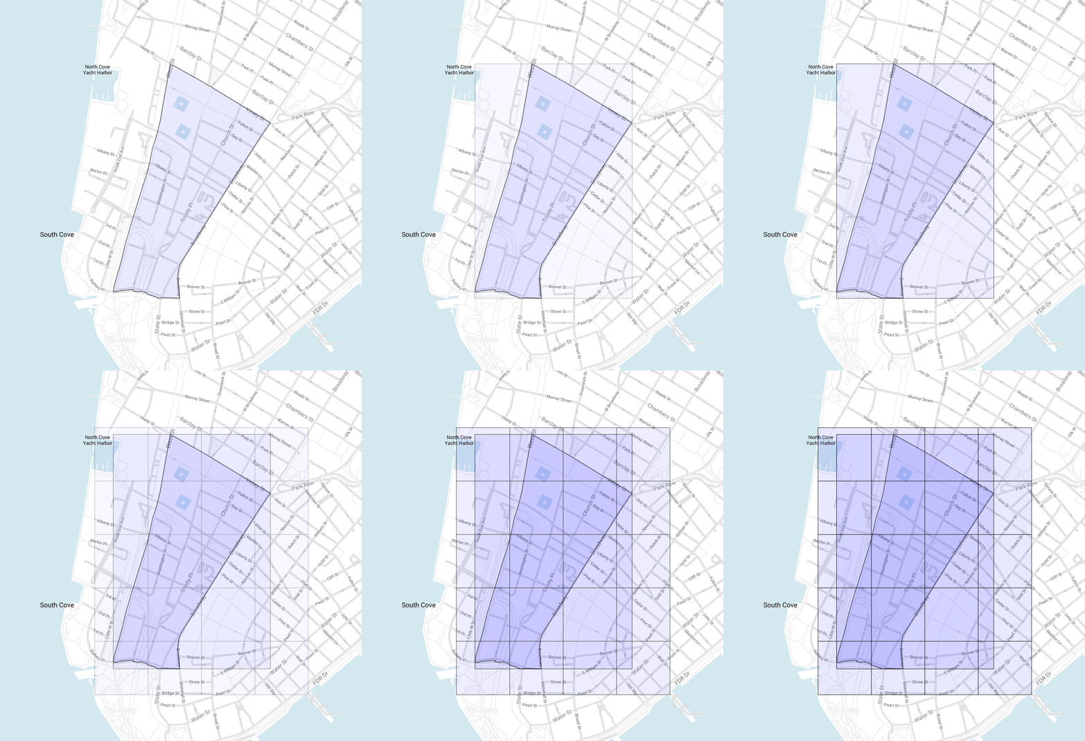
Note that we may have a tile overlapping two or more different zones:
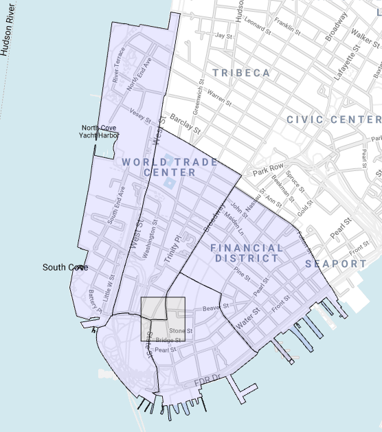
This introduces a degree of ambiguity that must be resolved: each tile has to belong to one and only one zone. We could, for example, associate it to the zone containing its center, but we will follow a different approach, i.e. evaluate the area of the intersection between the tile and each zone and keep only the largest. This may take about a minute to complete so it would be a good idea to save the result in a table and use this output as we need it. Here is the code which accomplishes the procedure just described:
DECLARE
  ZOOM INT64;
SET
  ZOOM=17;
WITH
  bounding_box AS(
  SELECT
    zone_name,
    zone_geom,
    ST_BOUNDINGBOX(zone_geom) BB
  FROM
    `bigquery-public-data.new_york_taxi_trips.taxi_zone_geom` ),
  tiles_at_corners AS(
  SELECT
    zone_name,
    zone_geom,
    TRUNC((BB.xmin*ACOS(-1)/180+ACOS(-1))/(2*ACOS(-1))*POW(2,zoom)) tile_x_xmin_ymin,
    TRUNC((POW(2,ZOOM)/(2*ACOS(-1))*(ACOS(-1)-SAFE.LN(TAN(ACOS(-1)/4+(BB.ymin/180*ACOS(-1))/2))))) tile_y_xmin_ymin,
    TRUNC((BB.xmax*ACOS(-1)/180+ACOS(-1))/(2*ACOS(-1))*POW(2,zoom)) tile_x_xmax_ymax,
    TRUNC((POW(2,ZOOM)/(2*ACOS(-1))*(ACOS(-1)-SAFE.LN(TAN(ACOS(-1)/4+(BB.ymax/180*ACOS(-1))/2))))) tile_y_xmax_ymax,
  FROM
    bounding_box)
SELECT
  zone_name,
  tile_id,
  ST_MAKEPOLYGON( ST_MAKELINE([ ST_GEOGPOINT(NW_LONG,
        NW_LAT),
      ST_GEOGPOINT(NE_LONG,
        NE_LAT),
      ST_GEOGPOINT(SE_LONG,
        SE_LAT),
      ST_GEOGPOINT(SW_LONG,
        SW_LAT),
      ST_GEOGPOINT(NW_LONG,
        NW_LAT) ])) polygon
FROM (
  SELECT
    zone_name,
    zone_geom,
    ZOOM || tile_x || tile_y tile_id,
    180/ACOS(-1)*(2*ACOS(-1)*tile_x/POW(2,ZOOM)-ACOS(-1)) AS NW_LONG,
    360/ACOS(-1)*(ATAN(EXP(ACOS(-1)-2*ACOS(-1)/POW(2,ZOOM)*tile_y))-ACOS(-1)/4) AS NW_LAT,
    180/ACOS(-1)*(2*ACOS(-1)*(tile_x+1)/POW(2,ZOOM)-ACOS(-1)) AS NE_LONG,
    360/ACOS(-1)*(ATAN(EXP(ACOS(-1)-2*ACOS(-1)/POW(2,ZOOM)*tile_y))-ACOS(-1)/4) AS NE_LAT,
    180/ACOS(-1)*(2*ACOS(-1)*(tile_x+1)/POW(2,ZOOM)-ACOS(-1)) AS SE_LONG,
    360/ACOS(-1)*(ATAN(EXP(ACOS(-1)-2*ACOS(-1)/POW(2,ZOOM)*(tile_y+1)))-ACOS(-1)/4) AS SE_LAT,
    180/ACOS(-1)*(2*ACOS(-1)*(tile_x)/POW(2,ZOOM)-ACOS(-1)) AS SW_LONG,
    360/ACOS(-1)*(ATAN(EXP(ACOS(-1)-2*ACOS(-1)/POW(2,ZOOM)*(tile_y+1)))-ACOS(-1)/4) SW_LAT
  FROM (
    SELECT
      zone_name,
      zone_geom,
      (tile_x_xmin_ymin + x) tile_x,
      (tile_y_xmin_ymin + y) tile_y
    FROM
      tiles_at_corners,
      UNNEST(GENERATE_ARRAY(0,tile_x_xmax_ymax-tile_x_xmin_ymin,1)) x,
      UNNEST(GENERATE_ARRAY(tile_y_xmax_ymax-tile_y_xmin_ymin,0,1)) y) )
WHERE
  TRUE QUALIFY ROW_NUMBER() OVER (PARTITION BY tile_id ORDER BY st_area(st_intersection(polygon, zone_geom)) DESC)=1
Make sure to repeat this procedure for each value of ZOOM you think you will need afterward.
Preparing the final query
We now know to which taxi zone each tile belongs to for a given value of ZOOM , so we can move on from where we left:
DECLARE
  START_DATE DATE;
DECLARE
  END_DATE DATE;
DECLARE
  ZOOM INT64;
SET
  START_DATE='2015-01-01';
SET
  END_DATE='2015-01-01';
SET
  ZOOM=17;
SELECT
  trips.*,
  t.polygon
FROM (
  SELECT
    t1.zone_name pickup_zone_name,
    t2.zone_name dropoff_zone_name,
    dropoff_tile_id,
    COUNT(*) trips
  FROM (
    SELECT
      ZOOM || TRUNC((pickup_longitude*ACOS(-1)/180+ACOS(-1))/(2*ACOS(-1))*POW(2,ZOOM)) || TRUNC((POW(2,ZOOM)/(2*ACOS(-1))*(ACOS(-1)-SAFE.LN(TAN(ACOS(-1)/4+(pickup_latitude/180*ACOS(-1))/2))))) AS pickup_tile_id,
      ZOOM || TRUNC((dropoff_longitude*ACOS(-1)/180+ACOS(-1))/(2*ACOS(-1))*POW(2,ZOOM)) || TRUNC((POW(2,ZOOM)/(2*ACOS(-1))*(ACOS(-1)-SAFE.LN(TAN(ACOS(-1)/4+(dropoff_latitude/180*ACOS(-1))/2))))) AS dropoff_tile_id,
    FROM
      `bigquery-public-data.new_york_taxi_trips.tlc_yellow_trips_2015`
    WHERE
      DATETIME_TRUNC(pickup_datetime,
        DAY) BETWEEN START_DATE
      AND END_DATE ) trips
  INNER JOIN
    NY_Taxi_Trips.Tiles t1
  ON
    pickup_tile_id=t1.tile_id
  INNER JOIN
    NY_Taxi_Trips.Tiles t2
  ON
    dropoff_tile_id=t2.tile_id
  GROUP BY
    pickup_zone_name,
    dropoff_zone_name,
    dropoff_tile_id) trips
INNER JOIN
  NY_Taxi_Trips.Tiles t
ON
  dropoff_tile_id=t.tile_id
We use several times the table NY_Taxi_Trips.Tiles that is where we have saved before the polygons of our tiles with the name of the corresponding zone. The output of this query thus gives the number of trips recorded from pickup_zone_name to dropoff_tile_id in dropoff_zone_name between START_DATE and END_DATE. Note that we bring on the GEOGRAPHY field, that ispolygon , only in the last SELECT statement to not burden the previous steps.
Once we have tested this query on BigQuery we are ready to adapt it to be used in Data Studio. We just have to change the way we refer to the declared parameters in the code:
SELECT
  trips.*,
  t.polygon
FROM (
  SELECT
    t1.zone_name pickup_zone_name,
    t2.zone_name dropoff_zone_name,
    dropoff_tile_id,
    COUNT(*) trips
  FROM (
    SELECT
      @ZOOM || TRUNC((pickup_longitude*ACOS(-1)/180+ACOS(-1))/(2*ACOS(-1))*POW(2,@ZOOM)) || TRUNC((POW(2,@ZOOM)/(2*ACOS(-1))*(ACOS(-1)-SAFE.LN(TAN(ACOS(-1)/4+(pickup_latitude/180*ACOS(-1))/2))))) AS pickup_tile_id,
      @ZOOM || TRUNC((dropoff_longitude*ACOS(-1)/180+ACOS(-1))/(2*ACOS(-1))*POW(2,@ZOOM)) || TRUNC((POW(2,@ZOOM)/(2*ACOS(-1))*(ACOS(-1)-SAFE.LN(TAN(ACOS(-1)/4+(dropoff_latitude/180*ACOS(-1))/2))))) AS dropoff_tile_id,
    FROM
      `bigquery-public-data.new_york_taxi_trips.tlc_yellow_trips_2015`
    WHERE
      DATETIME_TRUNC(pickup_datetime,
        DAY) BETWEEN PARSE_DATE('%Y%m%d',
        @DS_START_DATE)
      AND PARSE_DATE('%Y%m%d',
        @DS_END_DATE)) trips
  INNER JOIN
    NY_Taxi_Trips.Tiles t1
  ON
    pickup_tile_id=t1.tile_id
  INNER JOIN
    NY_Taxi_Trips.Tiles t2
  ON
    dropoff_tile_id=t2.tile_id
  GROUP BY
    pickup_zone_name,
    dropoff_zone_name,
    dropoff_tile_id) trips
INNER JOIN
  NY_Taxi_Trips.Tiles t
ON
  dropoff_tile_id=t.tile_id
- ZOOM → @ZOOM
- START_DATE → @DS_START_DATE
- END_DATE → @DS_END_DATE
Visualize the heatmap in Data Studio
Let us create our report in Data Studio, we will keep it simple:
- Go to https://datastudio.google.com/.
- Create > Report.
- Select the BigQuery Connector.
- Select Custom Query and copy our query.
- Tick off Enable date range parameters.
- Click on Add a parameter and define the last parameter, that is ZOOM , using the following configuration:
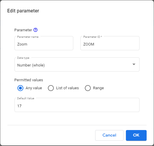
Finally, click on Add and let us create our visualization!
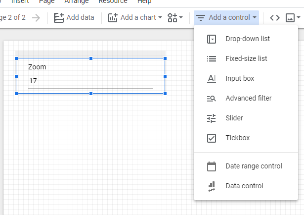
To start we want to be able to change the values of our parameters anytime in View Mode, so we go to Add a control and choose to insert an Input Box to control the zoom level:
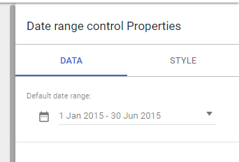
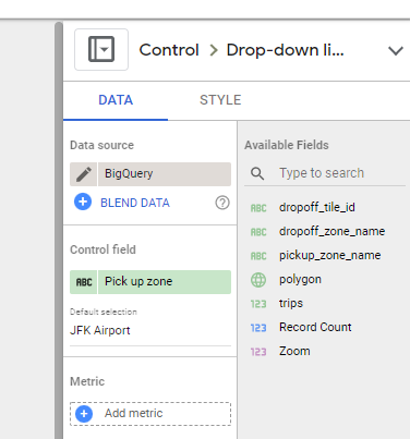
We repeat this procedure to insert also a Date range control and a Drop-down list to have control over the date range and the starting pick-up zone respectively. We also choose a default value for both, that is the first 6 months of 2015 for the first one and “JFK Airport” for the second:
We are now ready to add the map :
- Go to Add a chart > Google Maps > Filled map.
- Insert the map wherever you want inside the report.
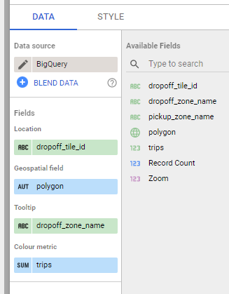
- Use the following Fields configuration to let it works correctly:
We may also customize the map style as follows:
- Use a Dark style
- Use no Border weight
- Choose this palette of colors for the Max, Mid, and Min color: #ffffff, #ffd54f, and #212121
Be aware, the author is colorblind and this may be the worst choice of colors, change them as you like 😃.
At this point we should get something like this:
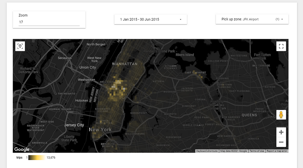
We notice that there is only a small highlighted area, where clearly is gathered the majority of trips from the JFK Airport. If we want our heatmap to appear less flat we can change the scale from a linear to a different one just by changing the Color Metric in the chart configuration:
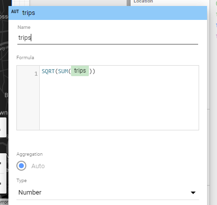
Using, for example, SQRT(SUM(trips)) we get a slightly different visualization:
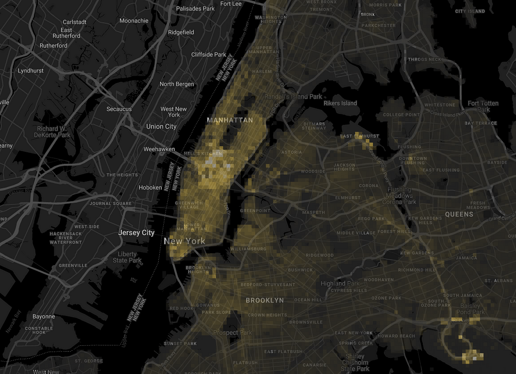
We can now try out different pick-up zones:
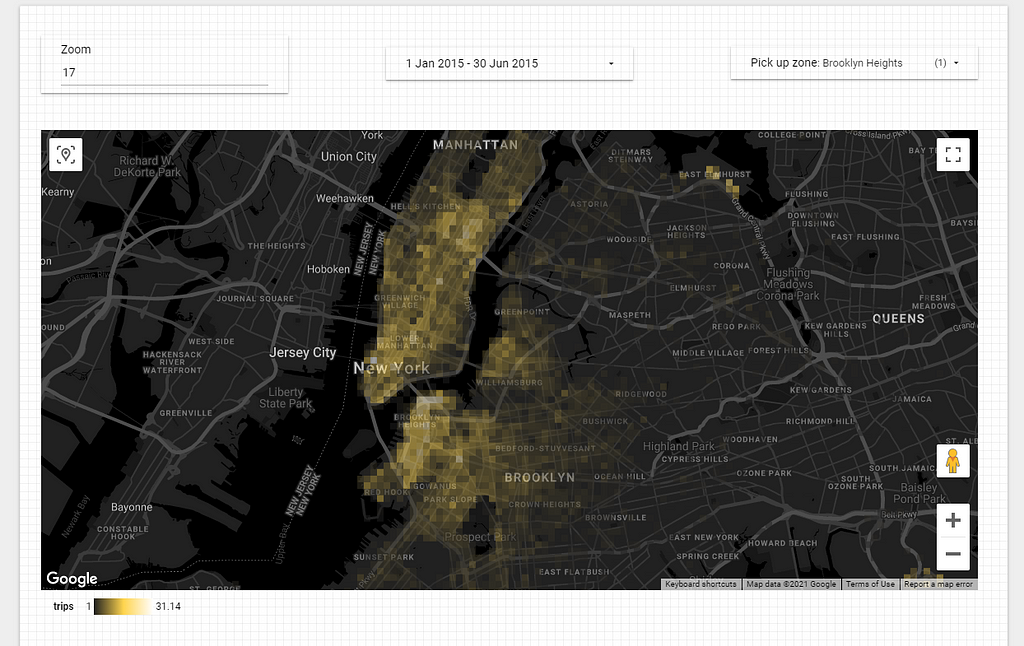
or different tile size:
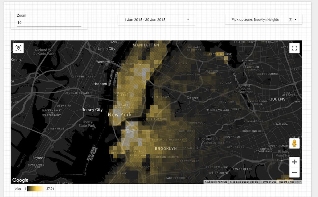
It is your time to experiment further!
Enjoy 😃!
Geographic heatmaps in Google Data Studio was originally published in Towards Data Science on Medium, where people are continuing the conversation by highlighting and responding to this story.
from Towards Data Science - Medium https://ift.tt/3wo4PYF
via RiYo Analytics

No comments