https://ift.tt/3p4Qz3W Combining Spotify and R — An Interactive Rshiny App + Spotify Dashboard Tutorial Learn how to make an intuitive Spo...
Combining Spotify and R — An Interactive Rshiny App + Spotify Dashboard Tutorial
Learn how to make an intuitive Spotify + Rshiny app that tells users things like their music personality, their most popular artists, and album comparisons
(Scroll to the bottom to see a live demo of the completed app in GIF form). This article details how one can use Rshiny to make an integrated Spotify app. This app uses the Spotify API and reveals how one can use Rshiny as an alternative to similar programs such as Python’s Streamlit or Javascript in an easier manner. Rshiny is an R package that easily allows a user to create web apps, and because it uses R, allows for more intuitive data visualization and manipulation than something like Javascript. To create an Rshiny app, it is best practice to have at least a ui.R (user interface) script, a server.R script, and a run.R script. The ui.R file works the same way an HTML file would, not in appearance but functionality. The server.R file acts like the .js file in a webpage, and this file is also where it's best to define all the functions. The functions and objects in this file make the ui.R file “work,” and it’s best to make a mental image of how the whole project will look visually before starting. I mapped out what each tab (aka page) should contain starting with the login page, then the popularity, sentiment, and user stats tabs. This translates directly to the ui.R script. Then the functions and objects created in the server.R script can be worked on, as they can now be built out. Finally, the run.R file is made, usually just a simple file that has a runApp function. The project could now be completed and deployed through Heroku or shiny apps.
I started this project because I wanted it to be easy for a user to type in their username and password for Spotify, where their information is then loaded and the user can see cool aspects of their music tastes, through different tables and visualizations.
Sadly, the Spotify package for R, called spotifyr, is not capable of user logins, and the user needs the actual Spotify API to be able to see their data (aka the client id and client secret). The app still works, it just takes a user to have the API for them to see their music tastes. Either way, this app was still fun to make and makes visualizations more interactive for a user.
I’ll be going over the layout for the app first, so here we go!
I wanted the app to have 4 different tabs which are:
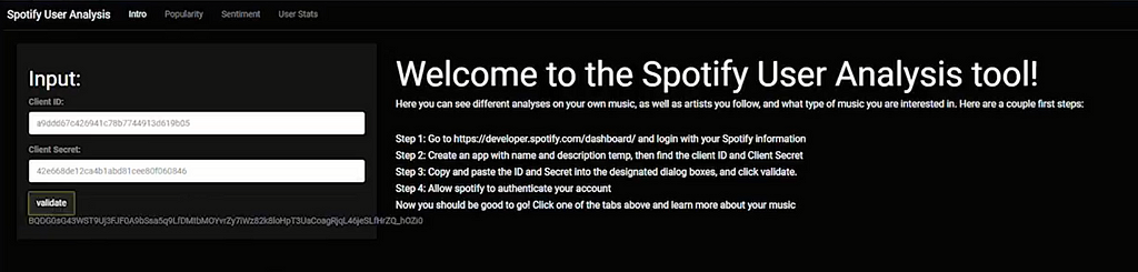
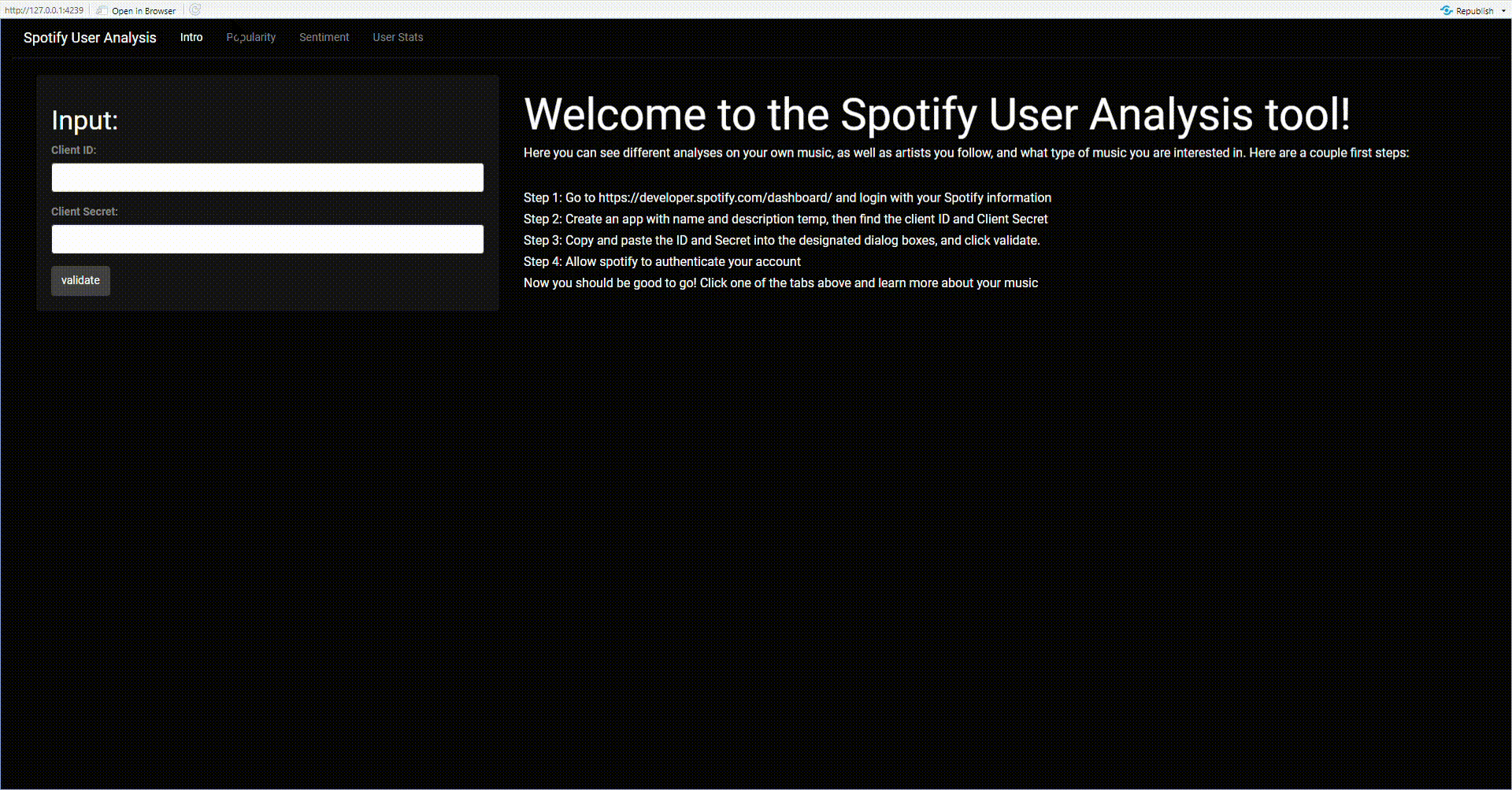
- Intro Tab — allows a user to input their client id and client secret, the API; it also gives instructions on how to get an API key to use the tool
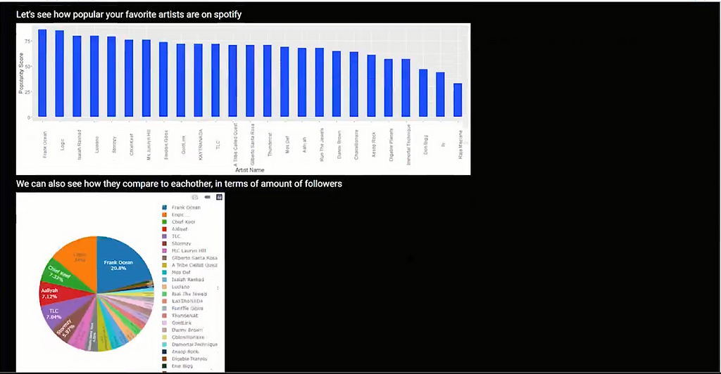
- Popularity Tab — shows different popularity metrics for artists a user listens to. It has a visualization that charts the popularity of a user’s most listened-to artists (I set it to 25 artists) from Spotify’s internal popularity metric from 1–100. It also compares these artists by followers on a pie chart.
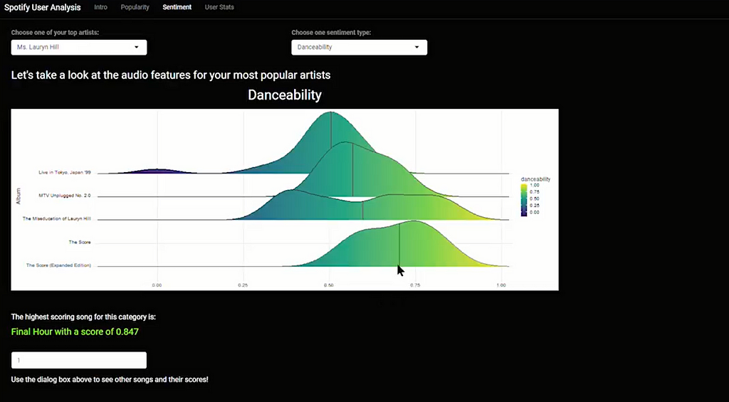
- Sentiment Tab — probably the most complicated tab, it allows a user to scroll through their most popular artists’ (top 25) albums, and see the sentiment score for each album. The sentiments are different attributes of the music, and they include: ‘danceability’, ‘energy’, ‘loudness’, ‘speechiness’, ‘acousticness’, ‘liveness’, ‘positivity’, and ‘tempo’. This tab also shows the song from the artist that has the most of that certain musical attribute. To take an example from the picture, the artist Ms. Lauryn Hill’s most danceable song is Final Hour, with a Danceability score of 0.847. I took inspiration for this ridgeline chart here.
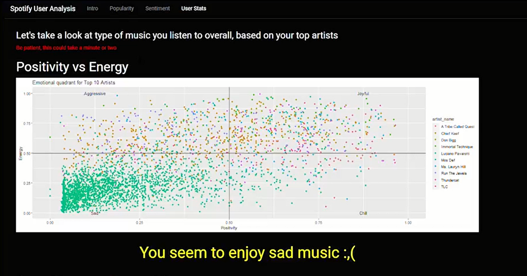
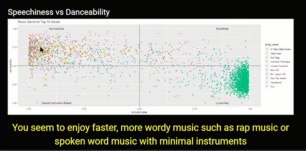
- User Stats — takes an overall look at the 10 most popular artists of the user, and charts the artist’s collective sentiment. It then judges the music personality of the user. In the example shown, the user seems to like Sad music because the Energy and Positivity are low on average for the music. Note that this is not the most accurate when it comes to non-english music. It also shows that the user probably likes rap music that is wordier in nature. I took inspiration for this visualization here.
These are the type of things I thought about before making this project, and I mapped most of it out before writing the code. Speaking of code, let's dive in!

I’ll start with the ui.R file, where all the “front-end development” takes place. The code will be shown with an explanation of what is going on after. I’ll include pictures as the medium doesn’t recognize Rshiny code.
Let's take a step-by-step look at the first tab:
- ShinyUI is where all of the user interface code is contained in. We need to add fluidPage to allow auto-adjusting page dimensions. Lastly, we need a navbarPage to encapsulate all the tabPanels (similar to unique HTML pages).
- The Intro tabPanel includes a sidebarPanel that allows a user to input their Spotify client id and client secret. The spotifyr package does not currently allow direct username and password entry, so the user must use the Spotify API. The first string arguments in textInput, actionButton, and textOutput are all variables that will be used in the server.R file.
- The mainPanel includes the basic instructions for someone to sign up for the Spotify API. Pretty self-explanatory, the h# are just different heading sizes in Rshiny.
- You might need to declare the client id and client secret before launching the app if you have issues.
Now the second tab:
- This Popularity tabPanel contains only a mainPanel, which holds 2 plots, named popularity_plot_output and follower_plot_output which we will create in server.R.
- There is also a data table called favorite_artists_table that will also be created in server.R.
Let's go to tab three:
- This Sentiment tabPanel has two fluidRows, which contain dropdowns for artist names and sentiment types (artist_name and sentiment_type respectively).
- After the two dropdowns, two text outputs exist. One before the plot sentiment_plot_output, and another before numericInput. The first text sentiment_text is just a plot title, while the second most_sentiment is an output from the numeric input box below. The way this works is that, whatever number a user puts in, will be the ranking of the song based on which sentiment is chosen in sentiment_type.
- The tags$style works as CSS does in web development and formats the given objects. Also, the br() just adds an extra space.
Finally, tab four:
- This final tabPanel has two textOutputs and two plotOutputs. We first create the plot energy_vs_positivity_plot_output which will show a user’s overall positivity and energy from the music they listen to. It will then show a textOutput named energy_vs_positivity that carries a statement about a user’s music personality based on their top artists.
This completes the ui.R file, now let’s check out server.R.

Now we are at the “back-end development” part of our Rshiny project. We need to make the variables and objects we defined in the ui.R file, and we will be using a lot of spotifyr functions to pull data from the Spotify API.
This part can be broken down into 2 sections. First I will talk about some functions necessary to show some of the visualizations and run the app, and then I will show the shinyServer function, which is similar to the shinyUI function.
- authenticate function: allows the spotifyr to authenticate the API, and allows all the data to be accessed. The arguments are just the client id and client secret.
- fav_artists function: makes a table that includes a user’s top artists, along with things like their popularity (ranked by Spotify), total Spotify monthly listeners, and genres of music. It uses the spotifyr function get_my_top_artists_or_tracks, and then uses R’s data manipulation function and the powerful pipe operator to slim down the table into the bare necessities. This function is mainly used in tabPanel two.
- fav_artists_datatable function: formats the table created from the last function to be user-friendly.
- audio_features_fav_artist function: creates a table that contains an artist's name, as well as some audio features included that Spotify measures for each song. These measures are danceability’, ‘energy’, ‘loudness’, ‘speechiness’, ‘acousticness’, ‘liveness’, ‘positivity’, and ‘tempo’. This function uses spotifyr’s get_artist_audio_features function and we do some string manipulation to change the title of valence to positivity. Used heavily in the fourth tabPanel. The only argument is artist_name.
- sentiment_datatable function: makes an R datatable from the previous function. Ended up not using this function, but it can be important in certain scenarios because plotly sometimes works better with datatable objects than normal R dataframes. Again, The only argument is artist_name.
Now we are in the actual shinyServer, where all the “complex ”aspects of the project are. It’s not necessarily complex, but all the objects originate from here, so if you seem to have issues with the actual visualizations or errors pulling data from the Spotify API, this is probably why.
- We need shinyServer to create the “back-end”, so we can create the validate function using the Rshiny eventReactive function (this function is used commonly as well as the reactive function, so read about it here), taking in the input$btn as a trigger and enacts the validate function we declared in ui.R. We can also save the validate function’s output as text using Rshiny’s renderText function.
TabPanel two has 4 objects: popularity_data, popularity_plot_output, follower_plot_output, and favorite_artists_table.
- popularity_data is just the dataframe object that holds the output of the fav_artists function we created earlier in server.R. We need to use an Rshiny reactive function to bring the function inside of shinyServer. This function is very important and is used commonly in server.R files.
- popularity_plot_output will be the object that holds the popularity bar chart graph, that compares the top 25 artists in a user’s library be Spotify’s popularity metrics. The syntax for these charts is pretty straightforward, as the more difficult problem is usually “what should the visualization be?”
- follower_plot_output is in a similar vein to the last plot, except it uses plotly. Plotly usually takes more data manipulation to create charts, but they are dynamic while the standard ggplots.
- favorite_artists_table is a simple table at the end of the page so that users can see specifics on each artist they follow
TabPanel three contains 4 objects as well: sentiment_data, sentiment_text, sentiment_plot_output, and most_sentiment.
- sentiment_data is the dataframe object of the audio_features_fav_artist function, with the input being the artist_name that the user chose in the dropdown for this page. We also use a reactive function to allow the use of the audio_features_fav_artist function we created earlier.
- sentiment_text just displays the sentiment the user chose in the dropdown, but with bigger font.
- sentiment_plot_output first gets the sentiment type chosen by the user and makes it lowercase with the casefold function. This is saved into a vector (or a 1D dataframe) called text, and text is used to organize the sentiment_data in descending order. Then to actually make the ggplot, we need to use text for the x-axis, since the text variable is dependent on the user’s input. This seems complicated, but we do this so that the chart will change based on user input.
- most_sentiment uses the same logic that the previous plot used to keep the sentiment names dynamic, and it basically just prints out the sentiment type and score for an individual track.
TabPanel 4 has 5 objects: top_artist_sentiment_data, energy_vs_positivity_plot_output, energy_vs_positivity, speechiness_vs_danceability_plot_output, and speechiness_vs_danceability
- top_artist_sentiment_data is basically meant to use the audio_features_fav_artist table but with the popularity_data as the index. This is done to get the audio for the top 10 artists in the user's library. This object is basically a dataframe of an artist’s name and all the audio features for all of the artist’s songs.
- energy_vs_positivity_plot_output plots this dataframe into a scatterplot, using color differentiation for each artist. I labeled each quadrant with different descriptions, aka “Anger” for music with higher energy but lower positivity. We use top_artist_sentiment_data to create this visualization
- energy_vs_positivity binds the scores for energy and positivity, and calculates a score, deciding what emotion best represents a user’s music taste. Then a statement outputs describing the user’s musical personality.
- speechiness_vs_danceability_plot_output is similar to the previous plot, except uses speechiness and danceability as sentiments.
- speechiness_vs_danceability also gives a statement describing the user’s musical personality.
That about settles it. All we need is the run.R file and our app is complete! Check it out below:
Looking at the process to make an Rshiny app might seem complicated to some, but it is actually much easier than attempting the same thing with Javascript or even Python’s Streamlit package. It also allows you to use the very powerful data manipulation tools that R provides in a working interactive data science app, that others can use and enjoy!
I hope this opened the eyes of some data science enthusiasts and app developers alike, and hopefully inspire more data-related apps with features that users would really appreciate, like direct and interactive visualizations of their favorite metrics.
Sources:
- GitHub - kingazaan/spotifyr-r-shiny
- GitHub - charlie86/spotifyr: R wrapper for Spotify's Web API
- Step by Step to Visualize Music Genres with Spotify API
- Exploring Spotify API in R
- Spotify personal data analysis
Combining Spotify and R — An Interactive Rshiny App + Spotify Dashboard Tutorial was originally published in Towards Data Science on Medium, where people are continuing the conversation by highlighting and responding to this story.
from Towards Data Science - Medium https://ift.tt/3pdaUEk
via RiYo Analytics


ليست هناك تعليقات