https://ift.tt/3lYcb1v Photo by City Church Christchurch on Unsplash One of the proudest work I have done in my previous job is that w...

One of the proudest work I have done in my previous job is that we have built strong self-service analytics inside our organization.
To get around all the buzz around self-service analytics, a very simple yet powerful argument is that, for quite a long time a BI team of only two (me and another BI analyst) was the data “brain” of an organization of 300+, i.e., literally all numbers for both internal decision-making and external investor reporting come from our BI platform.
The key reason why we managed to do this or to quote a colleague’s words, “you guys are doing what other startups need a team of 10 analysts to do”, is that from the very early stage we started training our internal users to become effective and responsible data content consumers and some of them also creators. By doing so, most first-order questions (e.g., what is the sales number for this month?) can be answered by internal users on their own with little or no help from the BI team, and our BI team can focus on generating deeper insights for second-order questions (e.g., why is there a drop in the sales number for this month?) and more importantly, nurturing a data culture across the organization.
If ever I had any doubt about the importance of building self-service analytics, this should have been eliminated with my recent experience at the INSEAD MBA program. It was a big surprise to me when I found out that one core course called “Uncertainty, Data & Judgement” is all about the application of statistics (correlation, hypothesis testing, regression, etc) to answer real-life business questions and that we are encouraged, though not mandated, to use R to solve our business case — well, I did not expect to have a chance so soon to open R studio after leaving my job 😃. Another surprise, yet to come, is that we will have another core course called “Managing Customer Value” where we are expected to run segmentation analysis using Python. These two courses clearly tell a trend that can not be ignored anymore, that is, the ability to make good sense out of data should no longer be a privilege to a group of people with “data” in their titles. Rather, this power should be democratized and everyone who needs to make business decisions should be empowered to form high-quality judgments based on high-quality data.
Inspired by these two courses, I decided to do a throwback into my last five years of building self-service BI in a fintech startup and share some reflections.
Before diving into details, I want to share a few more supporting statistics on why I consider we have strong self-service analytics:
- When I left my ex-employer we were a team of 300, out of which 200+ have an active user account on our BI platform (we use Superset and Mixpanel).
- Our users span across all levels and all departments of the organization — be it marketing or sales, engineers or UX designers, junior managers or C-levels.
- On Superset we have 2.7K charts and 200+ dashboards that cover all aspects of our business.
- Over time increasingly more and more content is created by non-BI users. The latest figure as far as I could recall is that 50% of the dashboards that were created in the last 30 days were authored by users outside the BI team.
Looking in a hindsight, there are a few things I believe we have done really well to overcome common challenges and continuously improve our work.
📍Position the BI function as a dependable business partner rather than a service desk.
🎬 Create a business-friendly go-to BI glossary to onboard new joiners.
👟 Expectation management is the key to successful training — both for the BI team and for internal users.
🌱 Continuously mentor your colleagues to help them up-skill and become your data allies.
Positioning: The BI function is a dependable partner rather than a service desk.
Though not formally stated in any workplace doc or put as a slogan on the wall, I believe that when I joined the company as the first BI person (and for quite a long time), my interpretation of a BI function is never an information desk or a librarian who receives the orders and simply gives you the dataset you need. Instead, a BI function should be a dependable partner to business stakeholders.
The key difference between a service person and a partner is that a partner does not always say yes to all requests. A partner would challenge you if needed and try to solicit the real insights we need instead of taking literally your words as if they are the ultimate requirements to fulfill.
To make this positioning explicit to internal data users is essential — it reminds them that they have a stake in their requests, in a way that the quality of the data/insights delivery, as well as the interpretation, lies largely on their data literacy. In other words, to make high-quality decisions they need high-quality judgments, and high-quality judgments require high-quality data/insights which, in turn, demand high-quality questions from them. The inception of this image lays the foundation for building self-service analytics.
I shared one example of putting this into practice in my previous post What helped me become a better Data Analyst. Every time when you or your team gets a request from someone, instead of taking their requirements as how they are presented, try figuring together with your colleagues what their goals really are.
Onboarding: Create a business-friendly go-to BI glossary to onboard new joiners.
I want to share the documentation that serves as the cornerstone of our self-service analytics — a BI glossary. It is neither a metric layer definition nor a domain page, but rather a business-facing go-to page for key metrics and jargon at the company, especially for new joiners (not just for BI but also for other teams).
It is sorted in alphabetical order and each entry looks like the following:
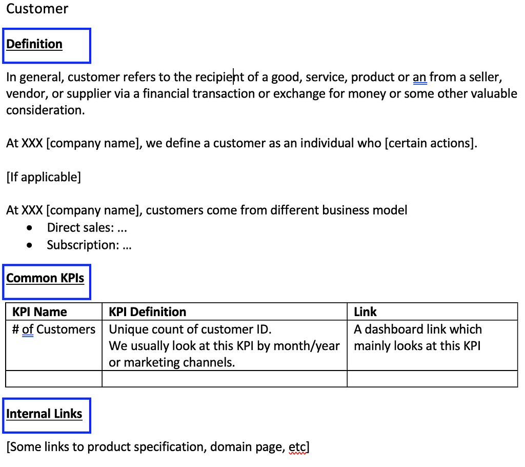
- Definition: we usually include both an industry-wide, general definition (since new joiners may be rather familiar with a general definition) and a company-specific definition.
- Common KPIs: here we include some metrics associated with this entity as well as a dashboard link. Note that this does not replace our metric definition (maintained with dbt) and should stay consistent with the metric layer. Hence, to reduce the frequency of updates, we only include 2–3 most commonly used KPIs that won’t change easily.
- Internal links: here we link to the true source of truth, i.e., some domain definition pages. Note that this page is not intended to be the source of truth for domain knowledge, but rather a less intimidating yet more business-friendly go-to page for key entities for new joiners.
Training: Expectation management is the key — both for the BI team and for internal users.
Like other companies, we organized regular training programs to teach our colleagues to use our BI platform, e.g., which datasets they should be looking at given their questions, how to create visualizations, how to write simple SQL queries, etc.
One thing I noticed that from the very beginning is that, although many participants said they are interested in data and registered for the training, few of them could really make it to the session or actually grew their skills. For example, after the sessions, I still got questions from participants that should have been solved by themselves. Not to say anyone was lying about their passion, stupid or lazy, I believe that better expectation management would lead to a more favorable outcome.
To be more specific, these practices might be helpful:
- Classify your training content into different levels to meet different demands. Not everyone wants to be a data pro — some might just want to look at their team dashboards to get a rough impression of how well they are doing. Not everyone has the right talents to become a data pro — some might already struggle with Excel. Hence, it will be too idealistic to expect everyone to gain the same value from the same training content. To overcome this challenge, I classified my content into three levels and defined the prerequisites and expected outcomes for each level: 1) data content consumers start with a preliminary knowledge of Excel and are expected to know where to find dashboards and to read visualizations after finishing Level 1; 2) data content creators start after Level 1 and are expected to create or transform simple visualizations based on given datasets to answer first-order questions, e.g., create a pie chart to show the age distribution of our users; 3) advanced data creators start after Level 2 and are expected to create advanced visualizations (e.g., histograms, sunburst plot, etc) and write simple SQL queries if they want more beyond the given datasets. When announcing training programs, these definitions are explicitly stated so that people know both what they can expect from each level and what they are expected to do to get there. They can choose freely where they want to be.
- State your expectation clearly and track the success of the training program. Once we define the three levels, we also design homework for each level and state clearly that participants need to do the homework so that they can advance to the next level. By doing so, we ensure only those who are truly passionate about data stay with the program. Moreover, this also helps the BI team track the success of the program. How to gentle enforce this is indeed a challenge, and frankly speaking, I found it hard to execute over time as the team grows.
Relationship building: Continuously mentoring your colleagues to help them up-skill and become your data allies.
One thing we started doing spontaneously is to have weekly touchpoints with key data users. This was later formalized as a weekly Data Clinic when the team had a new leader. Some examples of what we do here:
- BI team share recent insights that can be interesting for a broader audience other than those who request the insights. For instance, the Product Manager who is responsible for customer satisfaction recently asked us to analyze why there is a drop in retention rate, and then we found out that it is associated with a new monetization feature. This will be a perfect topic to discuss in a broader round involving the PM for monetization.
- We review the product instrumentation spec together with PMs, UX designers, and engineers and offer suggestions on the event name, event property, KPI definition, etc. If you’re interested, here is a summary of my learnings on product instrumentation.
- We offer instant support for quick technical questions, e.g., difficulty in writing a query or creating a visualization.
It is essential to identify potential power users/data content creators and build a good relationship with them. This can be easily done by answering some questions “Who usually come to you for data requests?”, “How deep are their questions?” and “How proficient are they with data?”. Once you have identified these users, give them more attention when they approach you for questions or help. Over time, they can be developed into the de-facto BI person as well as the go-to person for data questions in their own team. At my ex-employer, we were able to develop such power users in marketing, product, and strategy, and they helped share some traffic that was supposed to come to BI. 😉
Onboarding:
What is not discussed here is the tooling & technology part — I will share my learnings and reflections on this with a separate post!
What helped us build strong self-service analytics in a Fintech startup was originally published in Towards Data Science on Medium, where people are continuing the conversation by highlighting and responding to this story.
from Towards Data Science - Medium https://ift.tt/3E1dva7
via RiYo Analytics


No comments