https://ift.tt/2ZLYRVN Take advantage of Python, Plotly, and NetworkX to create interactive graphs to find similarity clusters Let us assu...
Take advantage of Python, Plotly, and NetworkX to create interactive graphs to find similarity clusters
Let us assume, as a running example, that my data is composed of word embeddings of the English language. I want to gain insights about the word distribution in the embedding space, specifically, if there are any clusters of very similar words, if there are words that are completely different from the rest, if there are words very similar to every other word, and so on. And I want to gain these insights visually, so that it is easier to understand and share with my collegues.
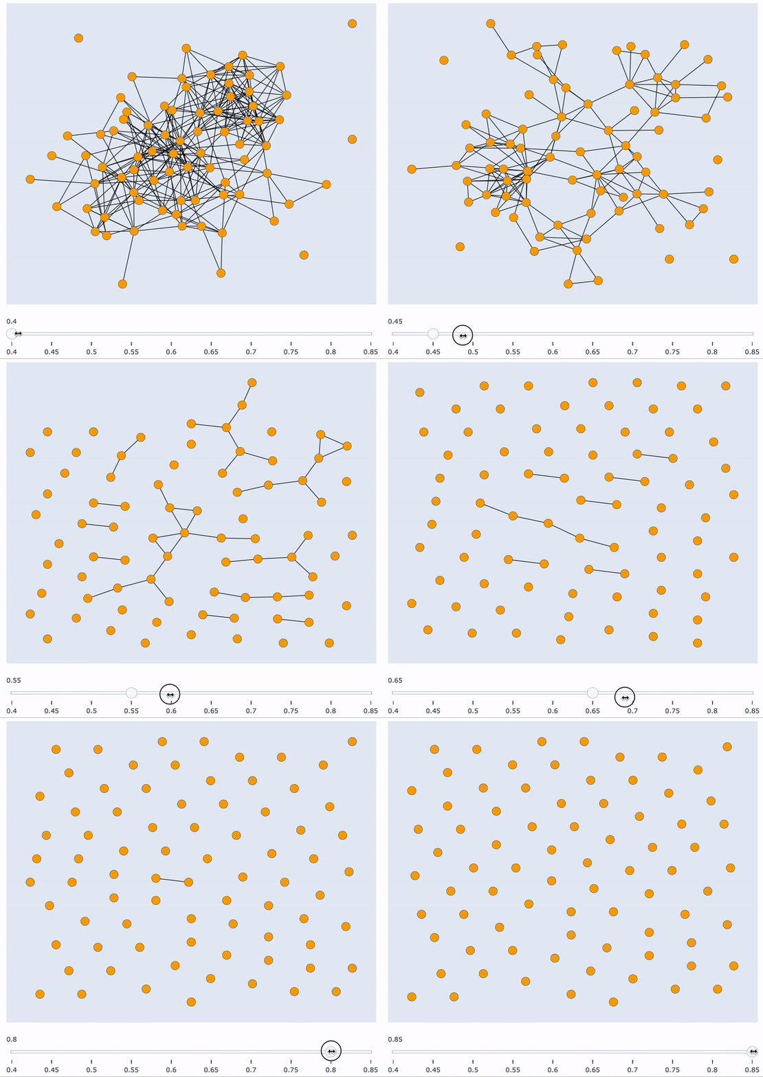
In this post I’m going to show you how to build an interactive visualisation tool to gain insights about similarity clusters of your data. There are various problems which require an intuitive understanding of the data distribution. Visualising this distribution in an interactive way (for this example, with respect to sample similarity) can give you exactly this intuition. Furthermore, it’s a great tool to present results to other people.
This is a very practical post, thus, I will go over the build details with more precision. My proposed implementation is completely dependent on Plotly and NetworkX.
This post is structured in 4 parts:
- Sample Similarity
- Graph Building
- Graph Drawing with Plotly
- Interaction Implementation
1) Sample Similarity
First things first. We want to gain insights about sample similarity clusters, thus, we need to first calculate the similarity each sample has with every other sample.
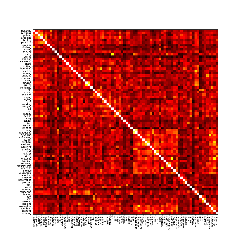
You can use any similarity measure that best fits your data. The ideia is always the same: two samples which have very similar feature vectors (in my case, embeddings), will have a similarity score close to 1. The more different these vectors are, the closer the similarity score will be to zero. For my running example, I will be using the cosine similarity.
Starting with an array of N word embeddings of arbitrary length, I create a similarity matrix of dimensions NxN, which specifies the similarity between every pair of data samples. In my running example, I have 78 word embeddings, each corresponding to a different word.
2) Graph Building
Given a similarity matrix, it is very easy to represent it with a graph using NetworkX. We simply need to input the matrix to the constructor.
Our graph will have N nodes (each corresponding to a sample in our data, which, in my case, are words), and N*N edges, representing the similarity between every pair of words. There are N^2 because every pair of nodes has a similarity score, even if it is very close to zero. The edge weight represents the similarity score.
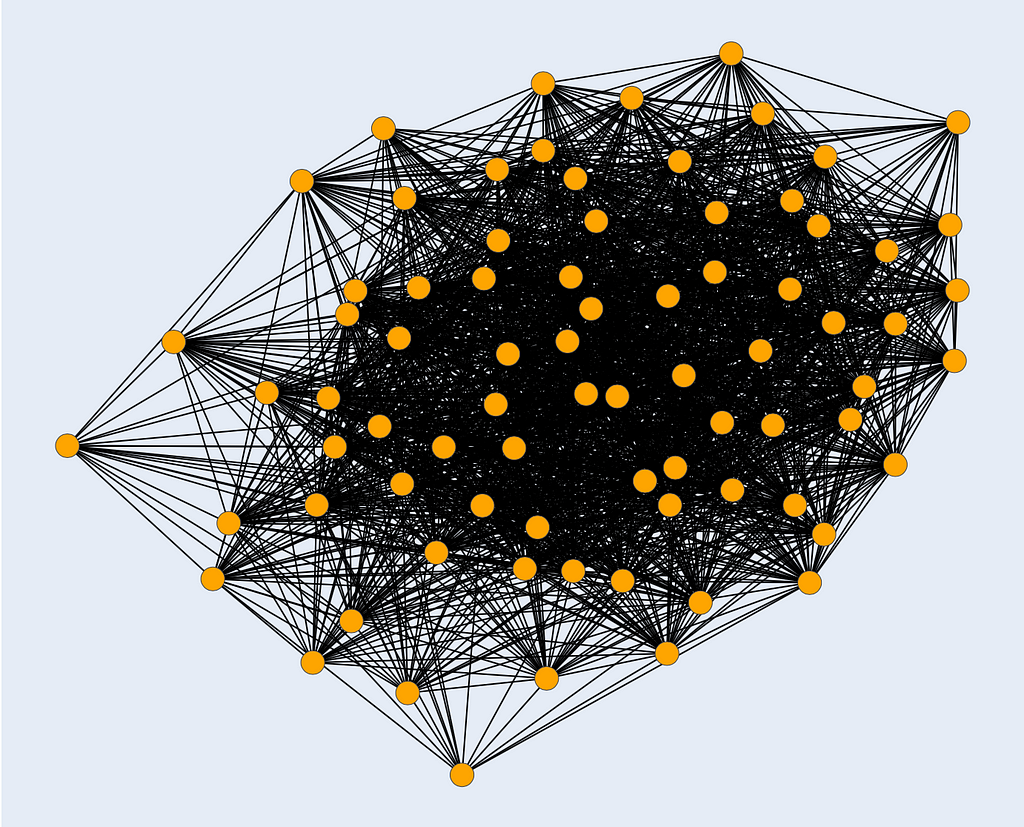
Visualising this graph in a static manner is not very insightful, mainly because every single pair of words is connected. The first thing we could do is remove all edges which have a weight very close to zero, and visualise the graph again. This is clearly not enough insight into the similarity clusters. The next thing we could do is iteratively define an increasing threshold in the interval [0, 1], remove all edges which have a weight lower than the threshold, and visualise the graph. However, plotting these graphs iteratively in a static manner is not visually appealing at all, and can make things harder to interpret.
The next sections will show you exactly how to plot all of these increasing threshold graphs in a single, interactive plot, with a similarity score slider at the bottom. Being able to freely manipulate this slider is very powerful in giving new insights about sample similarity and possible clusters.
3) Graph Drawing with Plotly
Plotly is the framework we will use to create our interactive plot. However, it does not support Plug&Play style graph plotting, as of yet. To circumvent this, we will plot our graph using two kinds of scatter plots: one for the nodes, and another for the edges.
Scatter plot for the nodes
This is a straightforward routine. Given a NetworkX graph, we loop over all nodes and collect their x, y position, color, and text (for on mouse hover info), which are all to be defined in a later section. We then simply use this information to create a scatter plot with Plotly’s interface. In Plotly’s language, the scatter plot is called a trace, which we return for later use.
Scatter plot for the edges
Things become a slightly trickier here. We need to create a trace for each and every edge in the graph. Think of an edge as a single scatter plot with two points linked by a straight line.
So, for each edge in a NetworkX graph, we get its two points’ positions and create a line plot connecting the two. We append this edge’s trace to the edge trace list, and return the whole list for later use.
4) Interaction Implementation
We are almost at the end. Now that we know how to plot the graph using Plotly, we can create an interactive slider which specifies the minimum similarity threshold, such that edges with a weight lower than the threshold are not displayed.
Even though the implementation is long, it is conceptually very simple. Basically, for each slider value (also called step), we create a complete graph plot with the routines we defined in the previous section. What we are doing here is “preloading” every single plot for each slider step. Thus, there is no magic involved in the interaction part of the plot: we are simply making a specific graph plot visible whilst all others are invisible for each slider step, creating the illusion we want. It is also here that we specify node position, color, and text.
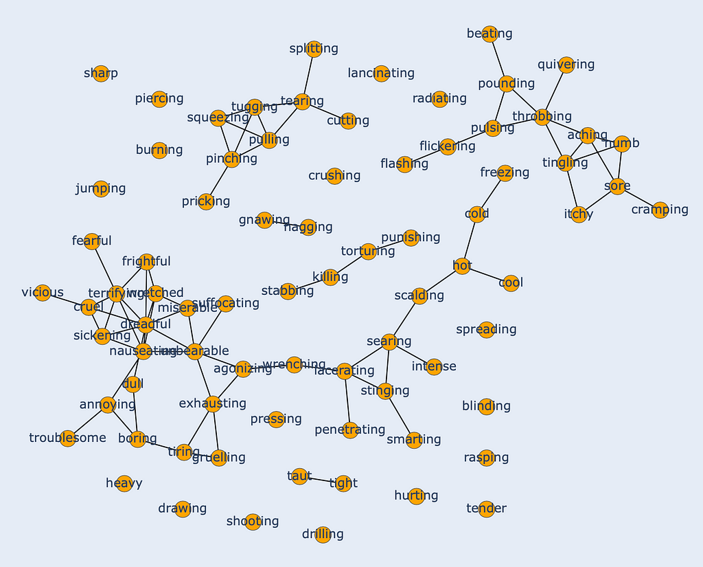
Finally, plot the similarity clusters in an interactive way!

Additionally, when hovering over the nodes you can easily see which words belong to which cluster. In the represented threshold on the image at the bottom, one can immediately see that “sharp” (top left) is not similar enough to any other word, whilst “dreadful” (cluster on the bottom left) is similar to a lot of words — hence the connection with a lot of nodes.
And this is how you can create an interactive visualisation tool to gain insights into the similarity clusters of your data samples. In a concluding note, it is important to note that this is not strictly defined for similarity. You can use this tool to visualise any kind of relation that you have between entities, as long as it makes sense to represent it with a graph. One simple example would be word co-occurrence in a corpus of documents. Finally, the generic approach is not strictly applicable to plotting graphs: you can create the interactive plot with scatter plots, bar plots, pie charts, and every other plot you can imagine. The important part is the interactivity and the ease of interpretation it provides.
Visualising Similarity Clusters with Interactive Graphs was originally published in Towards Data Science on Medium, where people are continuing the conversation by highlighting and responding to this story.
from Towards Data Science - Medium https://ift.tt/2ZEkA1h
via RiYo Analytics

No comments