https://ift.tt/3vI6wjo Image by Author A series of interactive world maps using Python’s Plotly library As the critical COP26 is appro...
A series of interactive world maps using Python’s Plotly library
As the critical COP26 is approaching, climate change activists from all domains are making efforts to influence and put pressure on the policymakers that will participate in the climate negotiations that will take place in Glasgow from 31 October to 12 November 2021.
One of the most striking and innovative initiatives came from the emissions tracking coalition Climate TRACE, which recently released the world’s first comprehensive accounting of global greenhouse gas (GHG) emissions based on direct, independent observation, covering the 2015–2020 period. Leveraging the power of satellite technology, remote sensing, Artificial Intelligence and Machine Learning, the inventory is intended to increase transparency in GHG monitoring and reporting, especially in those countries that lack the technology and resources to ensure a sound accounting of emissions data.
The inventory is available on the Climate Trace website, providing an intuitive and user-friendly interface to visualise the data and filter information by different variables. However, in addition to bar charts and line charts, I believe it would be also great to have maps to compare GHG emissions worldwide.
The aim of this post (and the incoming posts of this series) is threefold. First and foremost, it is intended to increase awareness about the current climate crisis. Second, it offers a great opportunity to analyse the fascinating and game-changing Climate TRACE emissions database, thus making it more visible and familiar so other researchers, climate scientists and data analysts can use it. Finally, it provides a coding tutorial for those interested in data analysis and visualisation with Python. More precisely, in this post, we will focus on how to make world maps using the powerful Plotly Python Graphing Library.
The code for this project is available in my GitHub repository. The maps (in both .png and .html format) are also available in my GitHub repository as well as my Plotly Studio account. Feel free to use and share: the more we are aware of the climate crisis, its causes and consequences, the more prepared we will be to address it.
Disclaimer: The dimensions of the following maps have changed slightly due to embedding. This resizing has affected the title, legend, and source text location.
The data
The main source of data is the Climate Trace emissions database, which you can download from the Climate TRACE website. Moreover, I have also used world population data from the World Bank, so I can calculate country emissions per capita.
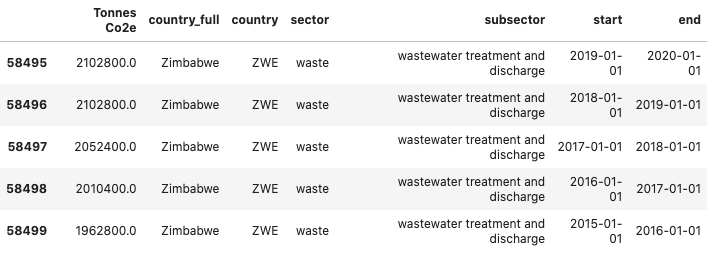
The inventory covers the 2015–2020 period, proving GHG emissions data (measured in CO2 equivalent) for 250 countries across 10 sectors and 38 subsectors. Below you can find who the data looks like:
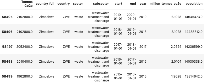
After some processing a few pre-processing steps, we can merge the population data with the emission data:
Here is the result:
Creating world maps with Plotly
Maps are great visualisation to understand the distribution and compare data across countries at a glance. Plotly’s Python graphing library provides the tools to create interactive, publication-quality graphs, including maps, that can be easily embedded in websites. For more information on how to upload Plotly graphs on your Plotly Chart Studio account and embed Plotly graphs on Medium posts, check this tutorial.
In essence, creating GHG emissions maps (and maps, in general), is a game of subsetting, filtering and group by operations. For example, we could create a map of GHG emissions by country in 2020, another map on GHG per capita by country in 2017, and a third map calculating emissions from Agriculture in 2015. Since there are many options, instead of writing a piece of code for every map, we can create functions that will create a map given a certain set of parameters.
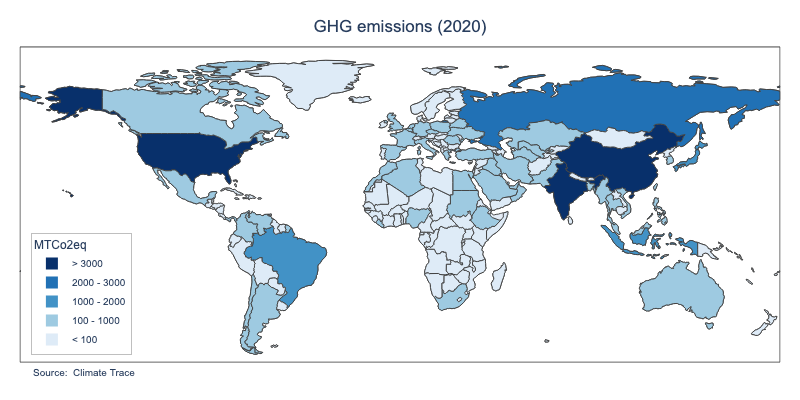
Below you can find a map showing GHG emission by country in 2020:
This map is the result of the combination of three functions that work in a Matryoshka-doll fashion (i.e. we just have to call a function, which will subsequently call another function, and so on). In our case, we will have to call the function show_map (metric, year, map_format=’img’), which will call the function df_metric (metric, year), which will call the function calculate_percentiles (df, metric).
show_map() mainly deals with the visualisation tasks. It uses Plotly syntax to create a choropleth map, control layout options (map framing, title, hover, legend and annotations), aesthetics properties (such as colours, font and text size) and configuration options (saving files on your local computer or in your Plotly Chart Studio account, and Plotly buttons). By default, the function saves the files in your local computer in .png format. PNG files are static images that do not allow interactivity. To allow this option, we just have to change the map_format parameter to ‘html’, so an interactive .htlm map will be created instead of in local.
To build the map, show_map(metric, year, map_format=’img’) relies on the data created by df_metric(metric, year). Depending on the metric we want to calculate — GHG emissions (‘million_tonnes_co2e’), population (‘population’), or GHG emissions per capita (‘co2eq_per_cap’) — and the selected year, the function will perform different operations on the dataframe to select the right data. One of the most important tasks is creating a new column called “range”, which segments and sorts data values into bins using the pandas function cut(). This column is key to differentiate countries by colours. I could have used a continuous colour scale, I think it is more effective to use a discrete colour sequence, as shown in the map legend. (For more examples on this, check the map visualisation on the World Bank data website.)
But how to segment the data so the colours in the map are meaningful? Since the values and scales of the metrics are different (e.g. GHG emissions are measured in million tonnes of CO2 equivalent, whereas GHG emissions per capita are measured in tonnes of CO2 equivalent per person), we need to toy around with the data until we find split values that make sense. This is done by the function calculate_percentiles(df, metric). The function returns two lists: the first is the list of percentiles to split the data depending on the metric; the second is the list of labels that will appear in the map legend. The values used to calculate the percentiles have been chosen after some experimentation with the distribution of the data in every metric.
Plotting emissions by sector
one of the coolest things in Climate TRACE data is that it provides the distribution of GHG emissions by sector and subsector. For example, the “Oil and Gas” sector comprises three sub-sectors: oil and gas production, oil refining and solid fuel transformation. Plotting this information is information in a map makes very much sense too. I have built a second set of functions that makes the magic: show_map_sector(sector, year, map_format=’img’), df_sector(sector, year) and percentiles_sector (df, sector).
The reasoning of the functions is pretty the same as the functions explained above. The only particularity is that for every sector, the emission information from its subsectors can be found in the hover box associated with each country. For example, below you can find the world map of emissions from the oil and gas sector in 2020.
Conclusion
I hope you enjoyed this tutorial. Feel free to use the Python code — namely, the show_map function — as a template for new world map visualisations with Plotly. As said before, the maps of the different metrics and sectors are available in my GitHub repository as well as my Plotly Studio account. Note that I have only created maps for the most recent year (2020). If you want to create maps for previous years, just download my code, install the required dependencies and change the year parameter.
In a forthcoming post of this series, we will further dig into the Climate TRACE database, providing new data analyses and visualisations that may contribute to increasing awareness and understanding of the greatest challenge of our time: climate change.
Analysing Climate TRACE Global Greenhouse Gas Emissions Data (Part 1) was originally published in Towards Data Science on Medium, where people are continuing the conversation by highlighting and responding to this story.
from Towards Data Science - Medium https://ift.tt/3jxmwjt
via RiYo Analytics


No comments